


Room Tour: A Bitty Ground Floor Becomes a Flexible Family Space
This house provided a lot of floor space, but was badly laid out. Before and after shots show its stylish reinvention
Kate Burt
18 January 2020
Houzz UK. I'm a journalist and editor, previously for the Independent, Guardian and various magazines. I'm now excited to part of the editorial team at Houzz UK & Ireland, bringing the best of British and Irish design, interiors and architecture to Houzz.com.
Houzz UK. I'm a journalist and editor, previously for the Independent, Guardian and... More
The previous owners of architect Angus Eitel’s house in West Sussex had lived in it for 30 years, during which time they’d had a rear extension built – “in quite a clumsy fashion, in my eyes,” says Angus, who runs fiftypointeight Architecture + Interiors. “The ground floor space didn’t have much logic to it. The kitchen was tiny and the connection with the garden wasn’t great.”
After living in the house for a few years, Angus came up with a solution and redesigned a new ground floor layout and extension.
After living in the house for a few years, Angus came up with a solution and redesigned a new ground floor layout and extension.
Room at a Glance
Who lives here? Architect Angus Eitel, his wife, and their three daughters, aged 15, 13 and 11
Location Slindon, West Sussex
Property A 1930s detached house with four bedrooms
Room dimensions 6 x 6m
Architect Angus Eitel of fiftypointeight Architecture + Interiors
Budget £100,000
Photos by Paul Craig
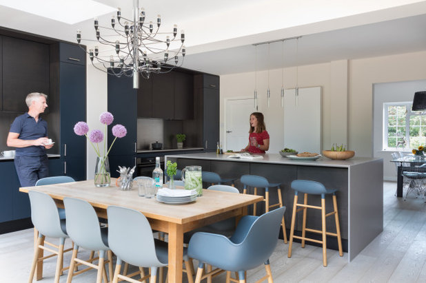
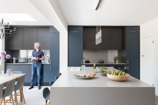
The view of the east-facing garden was a big factor in the design of the new extension. “There’s a nice aspect to it and the morning light coming in is lovely,” Angus says.
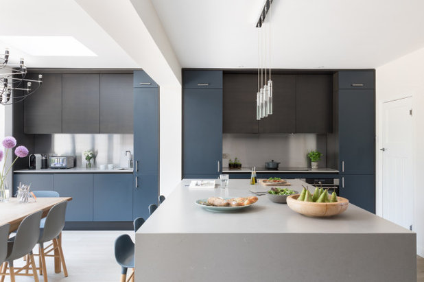
In terms of the design of the kitchen, the key was functionality – not least with kids in the house. “It’s not pristine, they can feel comfortable and relaxed here,” he says. “We also wanted a fairly flexible space that would work for shepherding the three of them out of the door at 7.30 in the morning.”
Who lives here? Architect Angus Eitel, his wife, and their three daughters, aged 15, 13 and 11
Location Slindon, West Sussex
Property A 1930s detached house with four bedrooms
Room dimensions 6 x 6m
Architect Angus Eitel of fiftypointeight Architecture + Interiors
Budget £100,000
Photos by Paul Craig
The view of the east-facing garden was a big factor in the design of the new extension. “There’s a nice aspect to it and the morning light coming in is lovely,” Angus says.
In terms of the design of the kitchen, the key was functionality – not least with kids in the house. “It’s not pristine, they can feel comfortable and relaxed here,” he says. “We also wanted a fairly flexible space that would work for shepherding the three of them out of the door at 7.30 in the morning.”
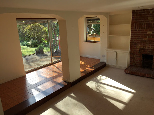
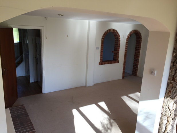
This shot of the space before it was renovated shows two of the biggest design issues.
“One of the problems was the great big column,” Angus explains. “It contained the waste pipes from the bathroom upstairs, as the external wall had originally been there.”
The other issue was the raised floor. “It was an awkward sort of garden room,” he says.
“One of the problems was the great big column,” Angus explains. “It contained the waste pipes from the bathroom upstairs, as the external wall had originally been there.”
The other issue was the raised floor. “It was an awkward sort of garden room,” he says.
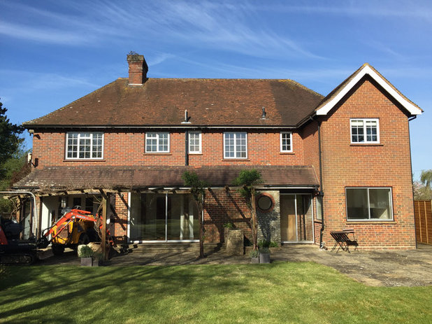
This photo shows the back of the house as it looked when Angus and his family bought it. The original kitchen was contained in the space beneath the pitched roof on the right.
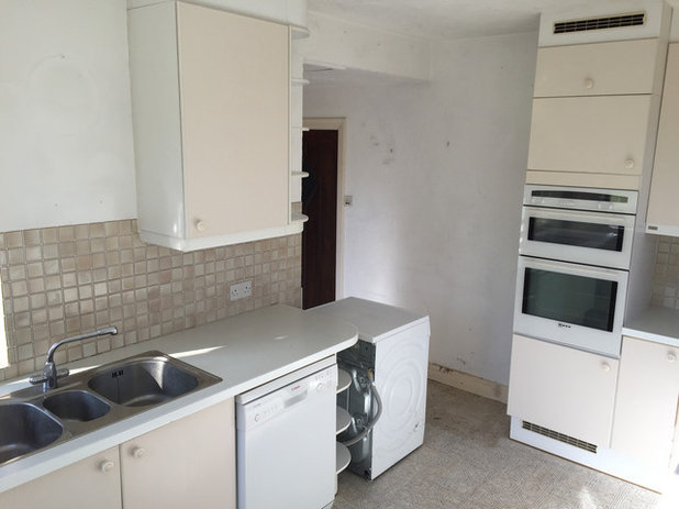
The original kitchen from the inside.
Browse reviews in the Houzz Professionals Directory to find the perfect local architect or building designer for your project.
Browse reviews in the Houzz Professionals Directory to find the perfect local architect or building designer for your project.
Angus’s new design levelled the floor and relocated the waste pipe. Still, the extension needed structural support and Angus was adamant that everything of that sort should be hidden.
Cleverly, this main support has been integrated into the bank of cupboards. It’s the white strip between the two dark grey blocks, one of which houses a breakfast area, the other the main cooking area.
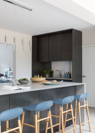
The kitchen-diner includes a breakfast bar at the island, where the children sit and do their homework while Angus cooks, as well as a large kitchen table and a separate, more formal dining table (just seen through the wide opening on the right). “It works particularly well when other families come over – there’s lots of space for everyone,” Angus says.
Bar stools and chairs, Normann Copenhagen.
Cleverly, this main support has been integrated into the bank of cupboards. It’s the white strip between the two dark grey blocks, one of which houses a breakfast area, the other the main cooking area.
The kitchen-diner includes a breakfast bar at the island, where the children sit and do their homework while Angus cooks, as well as a large kitchen table and a separate, more formal dining table (just seen through the wide opening on the right). “It works particularly well when other families come over – there’s lots of space for everyone,” Angus says.
Bar stools and chairs, Normann Copenhagen.
The view from the garden side of the original extension.
The door on the right leads to a utility room, home office and shower room. There’s also a family room in what was the garage, which the children used as a playroom when they were younger and in which they now watch television, while Angus and his wife use the original sitting room on the other side of the house (see floorplans, below).
“The logic is that this [whole area] can one day become a one-bedroom flat, as it has its own separate entrance,” Angus explains.
Chandelier 2097 30/50 by Gino Sarfatti; pendant lights over island, all Flos. Walls painted in Slate II, Paint & Paper Library. Ceiling painted in Supermatt White; woodwork painted in Timeless, both Dulux.
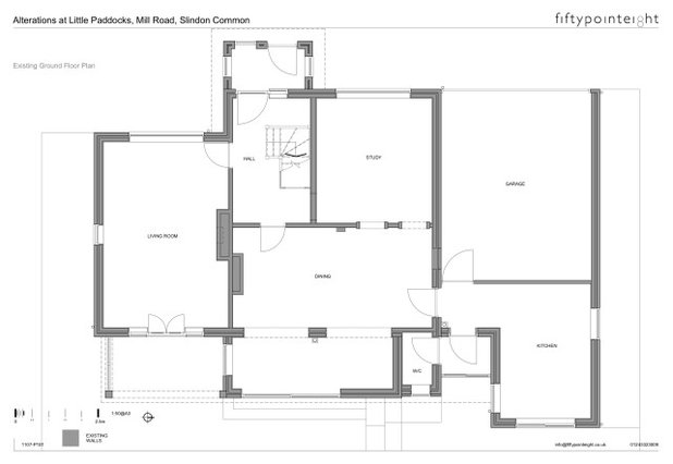
The original layout.
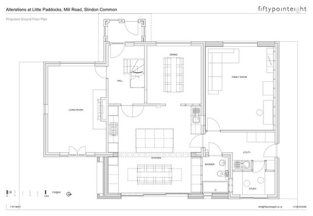
Angus’s layout.
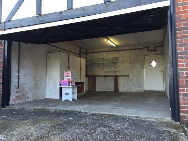
This view of the front of the house shows the garage as it was originally; this space is now home to the family room. The doorway remains and leads into what is now the utility area.
“The utility is more like a rear hallway, as it’s the circulation space for accessing these other rooms.”
“The utility is more like a rear hallway, as it’s the circulation space for accessing these other rooms.”
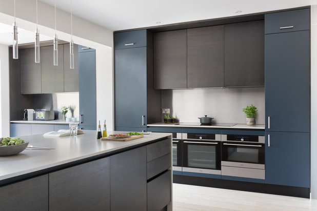
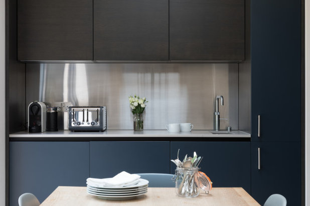
This zone in the kitchen contains two ovens, a microwave and a warming drawer beneath the hob. The tall blue units are for utensils and pans on the right and food storage on the left. Behind the doors are pull-out metal racks.
The units above the worktop include space for an extractor hood and frequently used cooking ingredients. “I wanted floor-to-ceiling cupboards,” Angus says. “I didn’t want to create a dust trap or have any storage on display.” The splashback is stainless-steel.
All fitted appliances, Gorenje. Extractor, Elica.
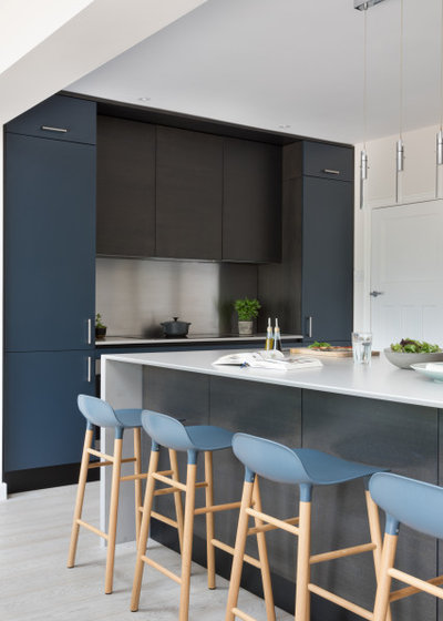
“We wanted a big island, something that had some presence,” Angus says. “Our previous house had a small island – people always gravitated towards it and it wasn’t big enough.
“There’s no hob or sink on this island – it’s effectively a prep, eating and homework area,” he says. “We consciously designed clear zones for the kitchen, so all the individual functions beyond that – washing up, cooking and so on – happen in different parts of the room.
The island does, however, house two undercounter fridges and an undercounter freezer, along with a set of drawers for utensils. Behind the stools, there’s 600mm-deep storage for non-everyday items, such as a food processor and a smoothie-maker.
Kitchen Units, GM Cucine; cupboard fronts a mix of grey oak veneer and a custom-sprayed finish in RAL 5008 Grey Blue. Worktops in 4004 Raw Concrete, Caesarstone. Oiled smoked oak flooring, Reeve Wood.
The block of units against the right-hand wall mirrors the two on the opposite side of the room, which, in turn, mirror each other. This bank of units contains the sink and conceals the dishwasher and bins.
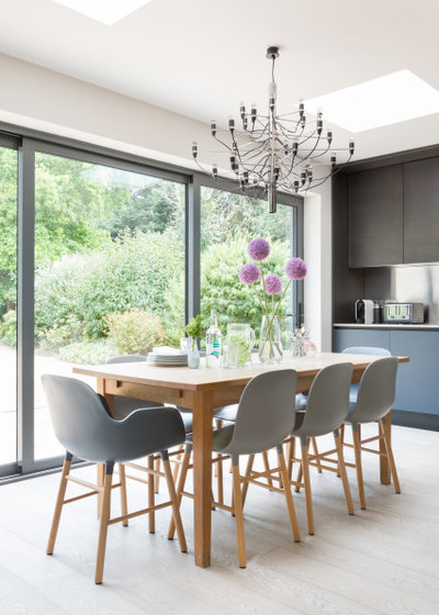
The view of the garden is framed by sliding doors. “The middle pane is fixed and the left and right sides slide over it. It works well with the layout and position of the table,” Angus says.
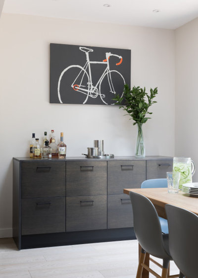
At the other end of the room is a drinks cabinet to match the grey kitchen units. It also houses the children’s craft equipment, tablecloths and the like. The artwork belongs to Angus, who says he’s “a little bit obsessive” about cycling.
Tell us…
What’s your favourite thing about the way Angus has transformed his home? Let us know in the Comments section.
What’s your favourite thing about the way Angus has transformed his home? Let us know in the Comments section.

What are you working on?

Related Stories

House Tours
Houzz Tour: Warm Tones and Luxurious Surfaces in a City Townhouse
An earthy colour palette, hidden storage and well-placed texture add character and practicality to this London home
Full Story

Room Tours
Kitchen Tour: A Gorgeous Extension With a Leafy Glasshouse Feel
By Kate Burt
When the owners of this terraced house extended, they were keen to retain its period feel and highlight the garden
Full Story

Gardens
Garden Tour: A Bare Roof Terrace Becomes a Pretty, Sociable Space
By Kate Burt
A retired couple got help transforming their large rooftop into a gorgeous, welcoming, multi-functional retreat
Full Story

House Tours
Houzz Tour: A Smart Layout and Genius Storage in a Victorian Home
Flipping the standard layout and carving out excellent storage have turned this tired house into a brilliant family home
Full Story

House Tours
Houzz Tour: A Victorian House Brought Impressively Up to Date
By Jo Simmons
A cohesive layout and warm colours combined with energy-efficiency measures thoroughly modernise this terraced home
Full Story

Kitchen Tours
Kitchen Tour: An Open, Airy Space Made for Entertaining
Combining two separate rooms has improved flow and created a sociable open-plan kitchen, dining and seating space
Full Story

House Tours
Houzz Tour: A Family Home Inspired by its Seaside Location
Coastal colours and practical design combine to create a house that will adapt as the family grows
Full Story

Kitchens
5 Inspiring Before and After Kitchen Transformations
Whether you want to boost storage, incorporate original features or maximise your space, take ideas from these designs
Full Story

House Tours
Houzz Tour: An Airy, Scandi Finish for a Tall Victorian House
By Kate Burt
From a tricky inherited bath to a sticky-out staircase, on-site problem-solving led to a seamless update for an old home
Full Story
House Tours
Houzz Tour: A 17th Century Cottage Gains Warmth and Character
The clever use of colour and pattern has revived this old building while creating a 21st century family home
Full Story
Good to read the comments - mostly positive! With regards the sink position - there is a second small sink on the same side of the room as the hob. You can see this on the very last photo. It has a boiling water tap / drinking water tap. This makes filling up water for pans etc for the hob very easy. This achieves a balance between the functional and the aesthetic (not wanting anything on the island).
It's amazing Angus, your family must be thrilled. You have balanced a multitude of different functions and requirements, whilst ensuring it looks stunning. The bar stools are a must, I find people use them first, creating a really sociable space to hangout in. That's one of the key ingredients isn't it, making the kitchen diner a hub all your family want to be in together.
Thanks for your kind comments Emma. Absolutely agree ... the bar stools are used for every occasion, morning to night! It’s definitely the most popular room in the house now.