


My Room: How We Gave Our Open-plan Kitchen-diner a Cosy Feel
Stylist Susanna Hawkins of interiors blog bySHNordic takes us on a tour of her kitchen-dining-living space
Amanda Pollard
21 March 2018
Senior Editor at Houzz UK and Ireland. Journalist and editor specialising in interiors and architecture.
Senior Editor at Houzz UK and Ireland. Journalist and editor specialising in interiors... More
Interiors stylist and blogger Susanna Hawkins and her husband designed their open-plan kitchen and living space with their family’s lifestyle in mind. They needed it to be practical, with access to the garden and plenty of room in which to cook and relax, but they also wanted it to feel warm and cosy.
Room at a Glance
Who lives here Interior stylist, photographer and blogger at bySHNordic, Susanna Hawkins, with her husband, two children and cat, Ebba
Location South Buckinghamshire
Property A Victorian house built in 1901 with four bedrooms and three bathrooms
Room dimensions Kitchen 9 x 6.4m; seating area 3 x 2.6m
Photos by Susanna Hawkins
When interiors stylist Susanna Hawkins and her husband bought their home in south Buckinghamshire, they liked the kitchen, but realised the layout didn’t function well for them. It was in the middle of the house with a conservatory behind it, and the only access to the garden was through a lean-to shed.
“We bought the house in 2011 from a lovely older couple who’d lived here for 42 years,” Susanna explains. “The space was nice, but it didn’t really work for us as a family.” They hoped to extend and create direct access to the garden, as well as adding some extra kitchen worksurfaces.
See 8 kitchens that integrate appliances beautifully
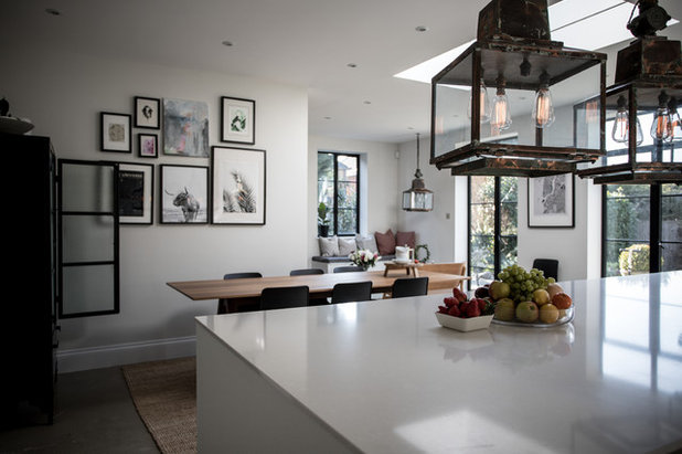
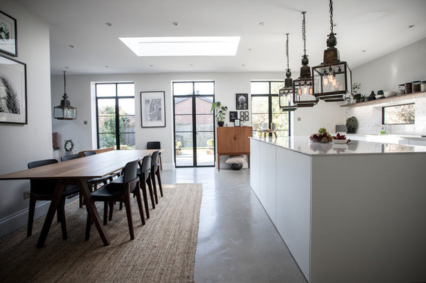
The starting point for their design was a set of antique lanterns, which now hang over the kitchen island and seating area. “My husband and I had visited this really nice antiques shop. I’m not sure if we were a little tipsy, but we came out with four gigantic lanterns that had previously been used as street lamps,” Susanna laughs. “We didn’t have any space for them, so they sat in a cupboard until we could work out what to do with them.”
When it came to designing the new space, the lanterns provided inspiration both for the size of the island and the room’s scheme. “We kept the design quite simple so the lights could take centre stage,” Susanna says. “We also made sure the island was large enough to fit three of the lanterns above it.”
Lanterns, Blighty Antiques.
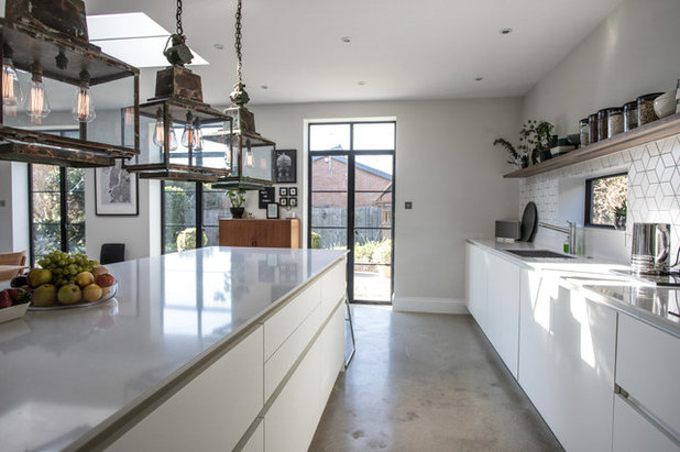
The new space was created by extending into the side return across the full width of the house. Now the rear wall is home to three sets of French windows, which lead out into the garden. “The black-framed doors were something I was keen to fit in the space,” Susanna says. “These aluminium versions were within our budget and are nice and warm.
“We went for French windows rather than bifold doors because I like the way they break up the space and allow us to display other items along the wall,” she explains. “Also, I didn’t think I’d want doors that open really wide in the summer. People assume that because I’m from Finland, I like the cold, but in fact it makes me even more keen to stay warm indoors!”
“We went for French windows rather than bifold doors because I like the way they break up the space and allow us to display other items along the wall,” she explains. “Also, I didn’t think I’d want doors that open really wide in the summer. People assume that because I’m from Finland, I like the cold, but in fact it makes me even more keen to stay warm indoors!”
The kitchen is streamlined and practical, with plenty of worktop space along the back wall and on the island. “We chose a reputable German manufacturer, but went for their most affordable range to keep costs down and enable us to splash out elsewhere,” Susanna says.
Kitchen, Leicht.
Kitchen, Leicht.
The sink and tap were also cost-friendly finds. “They were both customer returns that were sitting in the garage of the kitchen firm’s owner,” Susanna says.
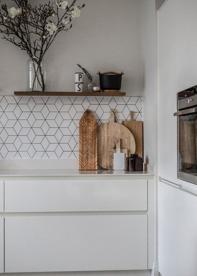
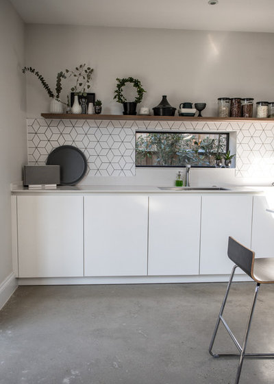
The white units are set off by a Silestone worktop with an off-white fleck in it, which is more forgiving of marks and scratches. To add some interest to the simple kitchen, Susanna chose geometric tiles for the splashback and positioned a couple of wide shelves above them. “I like to display stuff, so that’s why we didn’t have wall units,” she says. “Most of the items have a lid or are stored upside down to avoid dust.”
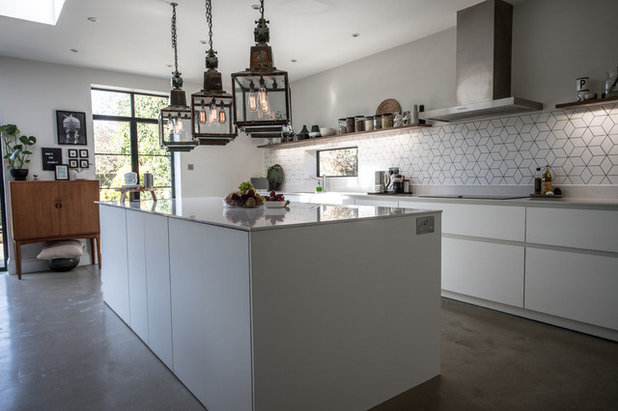
The walnut-veneered shelves, wooden accessories and houseplants give a warm contrast to the smooth white and grey surfaces. “We also added a little window above the sink,” says Susanna. “We’re growing some plants outside it, but nearly killed them the first year, so they’re still on their way to recovery.”
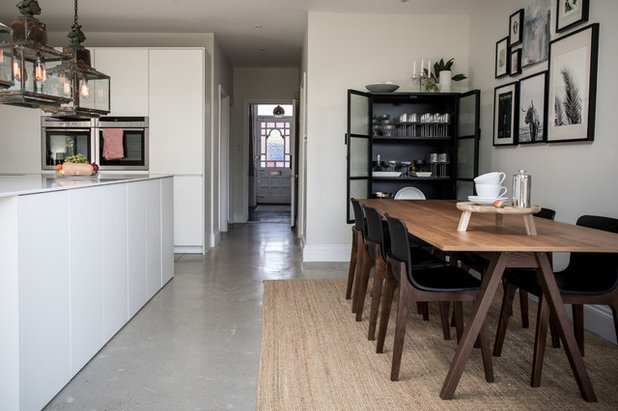
There’s handy storage in both sides of the island – drawers in the kitchen area and cupboards opposite the dining table. “We like to eat at the table, so we only needed to pop in one bar stool as a perch, giving us more room for storage,” says Susanna.
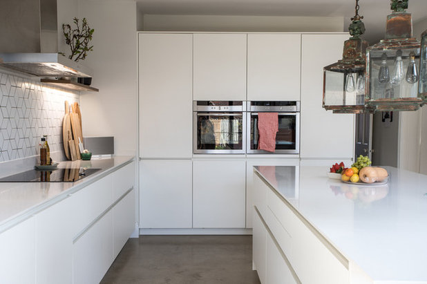
At the end of the kitchen is a bank of tall units, which house the ovens and fridge-freezer. The couple decided to have underfloor heating installed beneath the polished concrete floor to keep the large space warm and cosy.
Find barstool inspiration for minimal, modern kitchens
At the end of the kitchen is a bank of tall units, which house the ovens and fridge-freezer. The couple decided to have underfloor heating installed beneath the polished concrete floor to keep the large space warm and cosy.
Find barstool inspiration for minimal, modern kitchens
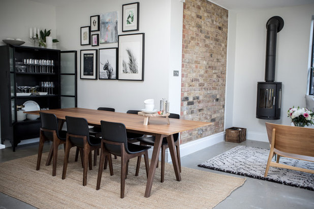
The dining area is directly opposite the kitchen, with a table that’s large enough to seat 10 people. “I’d seen a lovely table that was quite expensive, but with kids, I couldn’t see the point of spending so much,” says Susanna. “This one is from Ikea and a fraction of the cost. It’s been really good. I’m not sure how practical the rug is with children, but I really like having it, as it softens the space.
“We measured the area carefully to be sure we could fit in this black dresser,” she says. “A lot of my better dining items are in here, such as a vintage set that was a gift from a relative.”
Chairs, Bluesuntree. Dresser, Made.com. Dining table, Ikea.
“We measured the area carefully to be sure we could fit in this black dresser,” she says. “A lot of my better dining items are in here, such as a vintage set that was a gift from a relative.”
Chairs, Bluesuntree. Dresser, Made.com. Dining table, Ikea.
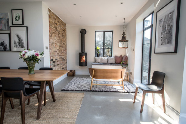
There’s also a cosy seating nook at the rear of the room. “We really like window benches, so we asked the builders if they could make one for us,” explains Susanna. “The seats have great storage inside for our garden cushions. I sit here quite often, and I think it really makes the room. Our cat likes it as well, as she can look out at the whole room without anyone sneaking up behind her.”
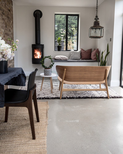
Opposite is a beautiful Hans J Wegner bench, which Susanna says is “probably the most expensive item I own. People often assume it’s not comfortable, but it’s so well made that it’s extremely comfy,” she says.
Rug, La Redoute. Wood-burning stove, Morso.
Rug, La Redoute. Wood-burning stove, Morso.
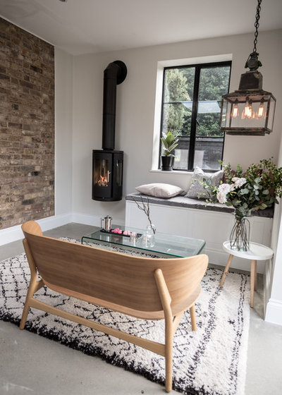
Susanna chose a glass coffee table simply because it was the least-fussy option. “I already have a lot of stuff going on here, so this fitted in more easily.”
The seating area is heated in the colder months by a wood-burning stove, which makes this corner feel wonderfully snug. The couple decided to leave the wall here exposed – it adds some warm character to the cosy space, and helps to zone it off from the other two distinct areas in the open-plan space.
Read Susanna’s blog.
Tell us…
What’s your favourite spot in Susanna’s open-plan space? Share your thoughts in the Comments section.

Related Stories

House Tours
Houzz Tour: Warm Tones and Luxurious Surfaces in a City Townhouse
An earthy colour palette, hidden storage and well-placed texture add character and practicality to this London home
Full Story

Room Tours
Kitchen Tour: A Gorgeous Extension With a Leafy Glasshouse Feel
By Kate Burt
When the owners of this terraced house extended, they were keen to retain its period feel and highlight the garden
Full Story

Gardens
Garden Tour: A Bare Roof Terrace Becomes a Pretty, Sociable Space
By Kate Burt
A retired couple got help transforming their large rooftop into a gorgeous, welcoming, multi-functional retreat
Full Story

House Tours
Houzz Tour: A Smart Layout and Genius Storage in a Victorian Home
Flipping the standard layout and carving out excellent storage have turned this tired house into a brilliant family home
Full Story

House Tours
Houzz Tour: A Victorian House Brought Impressively Up to Date
By Jo Simmons
A cohesive layout and warm colours combined with energy-efficiency measures thoroughly modernise this terraced home
Full Story

Kitchen Tours
Kitchen Tour: An Open, Airy Space Made for Entertaining
Combining two separate rooms has improved flow and created a sociable open-plan kitchen, dining and seating space
Full Story

House Tours
Houzz Tour: A Family Home Inspired by its Seaside Location
Coastal colours and practical design combine to create a house that will adapt as the family grows
Full Story

Kitchens
5 Inspiring Before and After Kitchen Transformations
Whether you want to boost storage, incorporate original features or maximise your space, take ideas from these designs
Full Story

House Tours
Houzz Tour: An Airy, Scandi Finish for a Tall Victorian House
By Kate Burt
From a tricky inherited bath to a sticky-out staircase, on-site problem-solving led to a seamless update for an old home
Full Story
House Tours
Houzz Tour: A 17th Century Cottage Gains Warmth and Character
The clever use of colour and pattern has revived this old building while creating a 21st century family home
Full Story
I love the seating nook. It's beautiful.