Houzz Tours


My Houzz: A 1970s Home Gets an Exterior and Interior Makeover
An extension and facelift outside and an open-plan layout on the ground floor gave this house a new lease of life

On the plus side, the house Kate Cooper viewed was spacious enough for a family; on the downside, the front garden wasn’t visible from inside the house. “It was covered in cars and driveway,” says Cooper, who’s an architect.
Undistinguished, the 1970s house needed radical steps to make it fit for 21st century living. Not only was an open-plan layout created and the views to the front and back gardens opened up, but an extension was added and the exterior was revamped with insulated render and new roof tiles. To see more, take a tour of the interior and exterior revamp of this 1970s property.
This article is from our Most Popular stories file
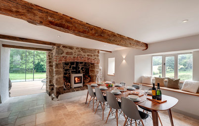
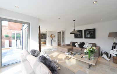
This view looks towards the new extension from inside the entrance hall. The couple opted not to create a classic hallway. “The house is at the end of a quiet road and drive, and no one comes past, so we weren’t worried about screening the front door,” Cooper says.
The original – conventional – staircase was further back and ascended in an L-shape. It was exchanged for this unfussy design with open risers to maintain the view out to the front garden.
Robin Day Club sofa, Loft.
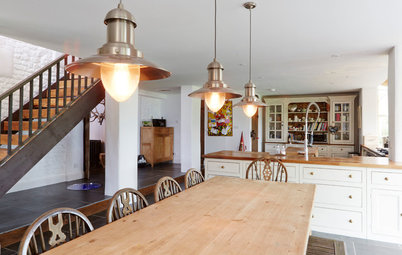
How to transform the structure of a 1960s or 1970s home
The original – conventional – staircase was further back and ascended in an L-shape. It was exchanged for this unfussy design with open risers to maintain the view out to the front garden.
Robin Day Club sofa, Loft.
How to transform the structure of a 1960s or 1970s home
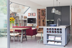
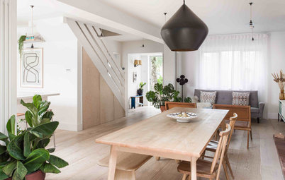
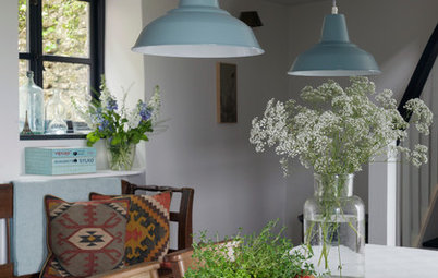
The revamped entrance to the house opens towards the kitchen, with the dining table and a small, garden-facing seating and TV area to one side.
Wall-hung cabinetry in the dining area matches the kitchen units. “It’s quite close to the kitchen, so we wanted to be consistent, but also make it look more like a sideboard and increase the sense of space,” Cooper says. “There’s some lighting on the underside, so it glows a bit and is nice at night as background lighting when we’re having dinner.”
Wall-hung cabinetry in the dining area matches the kitchen units. “It’s quite close to the kitchen, so we wanted to be consistent, but also make it look more like a sideboard and increase the sense of space,” Cooper says. “There’s some lighting on the underside, so it glows a bit and is nice at night as background lighting when we’re having dinner.”
The transformation of the ground floor opened up views through the house and out to the garden. “We also created a double-height space and opened up to the roof to put in roof lights,” Cooper says.
Here, the kitchen can be seen from the hallway in its position overlooking the back garden.
Here, the kitchen can be seen from the hallway in its position overlooking the back garden.
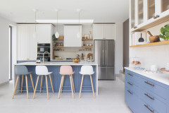
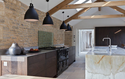
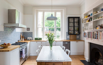
For the kitchen, the couple wanted warmth, so it would feel like a living space. Opting for the attractive tones of oak created a finish that wouldn’t show its age by virtue of its colour or level of gloss.
Kitchen cabinetry, Ben Heath. Imo bar stools, Pinch Design. Artek A330S Golden Bell pendant lights, Skandium.
Kitchen cabinetry, Ben Heath. Imo bar stools, Pinch Design. Artek A330S Golden Bell pendant lights, Skandium.
“A lot of the parquet flooring was existing,” Cooper says. However, French limestone was laid in-between the kitchen units so the floor would be more washable.
The open-plan layout suits family life. “We tend to be the nominated hosts for family gatherings,” Cooper says, “and we like a sociable kitchen. We spend most of our time in here and the kids do their homework while we’re cooking.”
Oak cladding was added to the support column to bring it into the scheme.
Oak cladding was added to the support column to bring it into the scheme.
Cooper took a decision to use small-scale accessories to add colour. “I find big colour statements overbearing, and I didn’t want something I would tire of quickly.”
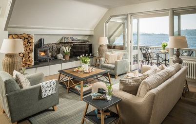
Ideas for creating vignettes in your living room
Ideas for creating vignettes in your living room
Originally, the couple had set aside a room to be a formal dining space (see next photo), but they didn’t use it, preferring instead a combined kitchen-diner.
There’s also a small, comfy seating area by the patio doors that lead to the back garden right next to the dining table. Here, guests can sit and chat or have drinks while the chef cooks.
Skovby SM 38 dining table, Taskers of Accrington. Vienna chairs, Benchmark Furniture. Flos Smithfield pendant lights, Heal’s.
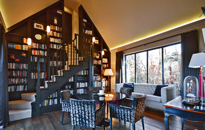
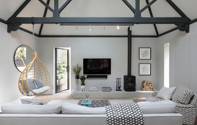
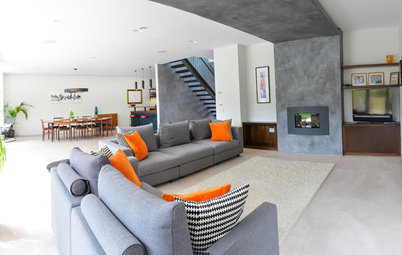
The ground floor has two separate living areas to the left of the hallway; the rooms have a double-sided wood-burning stove in-between them to cosy up both spaces.
This smaller room – nearest to the hall – is where the formal dining room used to be, and it fulfils many needs. “It’s a quiet space, or an activity space, or a chatting social area,” Cooper says. “The kids do Lego or games here, and I read magazines. Our parents like it when they visit.”
This smaller room – nearest to the hall – is where the formal dining room used to be, and it fulfils many needs. “It’s a quiet space, or an activity space, or a chatting social area,” Cooper says. “The kids do Lego or games here, and I read magazines. Our parents like it when they visit.”
Cooper has collected ceramics over time. “Most of them are 1970s West German pottery with a bit of Scandinavian glass,” she says. “I like the fact they add bright colour. They’re fun to collect – you can still find a lot of them around, they’re not extortionately expensive, and you can get the same glaze in different shapes and forms.”
The larger of the two living rooms is on the other side of the stove, furthest from the hallway. “This room is for Saturday night TV, films, Xbox and lounging,” Cooper says.
Originally, this area felt isolated at the end of the house, but the double-sided wood-burner makes it feel connected to the other spaces.
The roll-top desk came from Cooper’s Welsh grandparents.
Side tables, Made.com.
Originally, this area felt isolated at the end of the house, but the double-sided wood-burner makes it feel connected to the other spaces.
The roll-top desk came from Cooper’s Welsh grandparents.
Side tables, Made.com.
Cooper’s office is to the right of the hallway on the ground floor, and looks across the front garden. The house was extended here, so the back half of the room benefits from original parquet, while the new part is finished with parquet reclaimed from the hall.
Table and chairs, Benchmark Furniture.
Table and chairs, Benchmark Furniture.
Upstairs, the master bedroom scheme continues the soft, neutral tones that Cooper finds calming to live with. The chair is a vintage Scandinavian design.
Wardrobes, Heal’s.
Wardrobes, Heal’s.
The wall behind the bed is painted in a warm grey. “It’s my dabble with colour, just to make it feel a little more cosy and to close it in, as it’s quite a big room,” Cooper says.
The oak floorboards are new and keep the colour palette consistent. “My husband didn’t want to lay any more parquet – he’d had enough!” Cooper explains.
Feature wall painted in Charleston Gray, Farrow & Ball. Tight Space storage bed, Loaf.
The oak floorboards are new and keep the colour palette consistent. “My husband didn’t want to lay any more parquet – he’d had enough!” Cooper explains.
Feature wall painted in Charleston Gray, Farrow & Ball. Tight Space storage bed, Loaf.
The en suite to the master bedroom is generously sized, so a freestanding bath was included as a focal point under the roof light.
Repeating the strategy from the bedroom, Cooper chose to differentiate one wall of the en suite. Here, mosaic tiles above the basin create the contrast.
Mosaic wall tiles, Fired Earth.
Mosaic wall tiles, Fired Earth.
Cooper’s children were young when their rooms were decorated. “My daughter and son were fed up with me being boring with colour, so [I said] they could choose,” she recalls.
Stuva bed, Ikea.
Stuva bed, Ikea.
Cooper’s daughter opted for pink in her room.
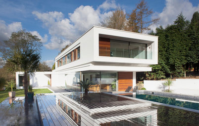
The exterior of the house also had a complete facelift. “We put insulated render on the outside, and changed the windows, guttering, fascias and roof tiles,” says Cooper.
The garage was there when the family bought the house, but it’s been updated with timber cladding. The drive has been moved to the side, transforming the view from the house to the front garden, which has been landscaped with terraces and patios.
Here’s what the house looked like before its makeover.
The couple did the work on the house without moving out. “My youngest was two at the time, and at one stage there was no roof, no front wall, and we were sleeping in a room in a plastic zip tent,” says Cooper. “It was a nightmare looking back, but we’re both in the business, so it’s not as if we didn’t know what to expect.”
The bulk of the building work took place over a six-month period. “We finished off bits and pieces and did the landscaping as and when,” says Cooper.
The bulk of the building work took place over a six-month period. “We finished off bits and pieces and did the landscaping as and when,” says Cooper.
The garden was the last element of the extreme makeover to be completed. “The back garden was a slope of grass, so we levelled it and created two terraces,” says Cooper.
Get the look – shop this home’s style here
Impressed by the makeover of this 1970s home? Let us know in the Comments section.
Get the look – shop this home’s style here
Impressed by the makeover of this 1970s home? Let us know in the Comments section.

Sponsored
Reload the page to not see this specific ad anymore
Who lives here Kate Cooper, husband Andy and their three children
Location Newbury, Berkshire
Property 1970s detached
Size 4 bedrooms, 4 bathrooms
Architect and designer Kate Cooper of Absolute Architecture
Photos by David Parmiter
The 1970s house was revamped inside and out with an extension right across the front, and walls being removed from the central section. “We opened up a slot right through the middle of the house,” says Kate Cooper, “and we knocked the hall, kitchen and breakfast room together.”
The new front door is just visible behind the small tree at the edge of the lawn. You can see how the house looked before the renovation further down.