Houzz Tours

Kitchen Tours
South East Kitchen
Kitchen Tour: An Imposing Extension Shrinks to Let in More Light
Cleverly reconfiguring this kitchen extension helped it to flow much better and connect with the garden

When the owners of this Georgian house called in architect Angus Eitel of fiftypointeight Architecture + Interiors, their home was in need of some TLC. The building had, for many years, been used as offices and with that came the removal of original features and no requirements for the layout to work well for family life. Previous owners had turned it back into a house, but that hadn’t given it the full overhaul and restoration the new owners felt it needed.
“The thing that really let the house down was the kitchen,” Angus says. “It was in an uninspiring – and huge – modern extension.” This was demolished and a new, smaller version put in its place that reinvigorated the whole of the downstairs.
“The thing that really let the house down was the kitchen,” Angus says. “It was in an uninspiring – and huge – modern extension.” This was demolished and a new, smaller version put in its place that reinvigorated the whole of the downstairs.
The previous extension was two-storey and its depth took up a lot of the garden. You can just see the top of it here, over the back wall.
“It wasn’t originally designed as a domestic extension and it killed the garden,” Angus says. “Our response was to reduce the footprint, which estate agents go nuts over, but this allowed us to create a full-width addition.”
The new extension projects around two metres less than the original. “It’s much more in proportion now. We gained by building into the side return, but also by making all the spaces work better. The net reduction in useable floor space was actually pretty limited.”
The newly enlarged courtyard was given a very simple treatment to preserve the budget for the interiors. It feels very private, in part thanks to the tall, ancient flint and brick wall on the listed building next door.
Here’s another shot of the extension Angus removed. The glass bricks seen at the bottom were the sole outlook from the kitchen across the then very small courtyard garden.
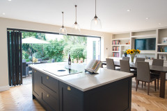
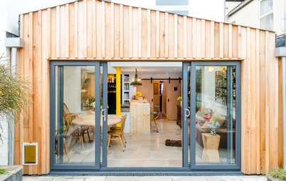
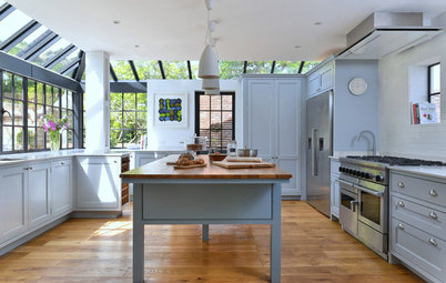
There are now aluminium-framed French windows, flanked by glass panels, opening the kitchen up to the outside and letting in tons of light.
The extension is zinc-clad with a zinc roof.
Wine fridge, Liebherr.
The extension is zinc-clad with a zinc roof.
Wine fridge, Liebherr.
The kitchen has plenty of storage. The island, which has an induction hob and a flush-mounted ceiling extractor above it, has one full side of cupboards. On the other side are drawers for utensils, pots and pans.
On the far wall, to the right of the ovens, is a section of wall, created not as a support, but as a visual divide to section off this part of the kitchen. Here, there are three tall pantry units.
Opposite the tall cupboards is a space that works as a utility area/little cloakroom/boot room and also contains the boiler and water tank. The door to this is just out of shot, in the kitchen.
22mm classic oak varied-width flooring, Dinesen. Extractor, Elica.
From left to right in this photo there’s a tall, integrated fridge-freezer, wall units above the sink, which has a boiling-water tap, a standard dishwasher (next to the oven stack), two ovens with storage above and a warming drawer below, plus a single dishwasher drawer at the bottom.
The worktops are Carrara marble.
Kitchen units sprayed in RAL 7035 Light Grey, GM Cucine. Combi steam oven; single oven; warming drawer, all Gaggenau. Stainless-steel sink, Neptune. Flex Pro3 boiling-water tap, Quooker. Fridge-freezer; standard dishwasher, both Gorenje. Single dishwasher drawer, Fisher & Paykel. Handles on both dishwashers, Buster & Punch.
“In the old house, you could never get any appreciation of how the spaces connected,” Angus says. “But now the kitchen connects with the terrace and with the dining room, which connects to the living room. It’s not a vast open-plan space, these are distinct rooms, but they’re all connected. It all flows.”
At the entrance to the kitchen from the dining room, there’s a glass panel/lightwell in the floor, which overlooks the basement.
The doors here were originally a window, and this was the back of the main house (see before and after floorplans at the end of the story).
The doors here were originally a window, and this was the back of the main house (see before and after floorplans at the end of the story).
Here’s a closer look at the glass panel on the threshold of the kitchen. The utility area is behind the wall on the left where the picture is hanging; the door into it – a timber and glass sliding design – faces the island.
This is a view from the basement looking up through the glass panel to the extension ceiling. Directly above is a rooflight that Angus designed in.
“The big worry about a full-width extension was: ‘How do we still get light into the basement?’ The response was this stacking of the roof light and the glass panel. It means a vertical shaft of light goes from first floor level down to the cellar, so the quality of light is surprisingly good for a space [the basement] with no windows,” Angus says.
“The glass also creates a nice divide between the old and new parts of the building and the transition between the two styles,” he adds.
The basement is currently used as a playroom and space for the children to hang out.
The connection between all the spaces downstairs is vastly improved. This is the view from the living room at the front of the house.
Angus also blocked up a door that was where the lamp is, which led from the hallway into this room (there’s still a door from the hall into the dining room). “You didn’t need it. The new design of the ground floor just sucks you towards the garden.”
Angus also blocked up a door that was where the lamp is, which led from the hallway into this room (there’s still a door from the hall into the dining room). “You didn’t need it. The new design of the ground floor just sucks you towards the garden.”
The original extension, complete with side return.
The original extension seen from upstairs in the main house.
Another view of the same space from inside.
The front exterior of this large Georgian home.
The floorplan for the original house.
Angus’s plans for the ground floor and new, smaller extension.
Tell us…
What do you think of the way the extension was reconfigured in this house? Share your thoughts and extension experiences in the Comments section.
Tell us…
What do you think of the way the extension was reconfigured in this house? Share your thoughts and extension experiences in the Comments section.


Sponsored
Reload the page to not see this specific ad anymore
Who lives here? A family with three children aged between 11 and 20
Location Central Chichester
Property A Georgian townhouse in the conservation area with four bedrooms and four bathrooms
Room dimensions Around 5m x 4m
Designer Angus Eitel of fiftypointeight Architecture + Interiors
Main contractor Hambrook Construction
Kitchen design Pascoe Interiors
Budget £150,000 for the extension and kitchen fit-out
Photos by Richard Gooding Photography
“The owners wanted a show-stopping kitchen at the heart of the home that had a direct connection to the outside,” Angus says. “This was something the previous kitchen didn’t have. They wanted lots of natural light.”