


Kitchen Tour: An Elegant Design to Complement a Victorian Home
A style sympathetic to the period of the house and a more open feel were the key requests for this kitchen revamp
Sarah Warwick
13 May 2018
Houzz Contributor. I'm a freelance journalist and editor writing for nationals, magazines and websites. A serial house revamper, I love great design, beautiful interiors and practical solutions.
Houzz Contributor. I'm a freelance journalist and editor writing for nationals, magazines... More
A stone floor with bits of tile missing and units that could be called functional, but not much else, left the owners of this East Sussex home uninspired. However, transforming the kitchen of their Victorian semi-detached house had to wait, as work needed to be completed on the floors above.
Once the other revamps were done, though, it was finally time to give the kitchen a look that lived up to the property’s architecture.
Once the other revamps were done, though, it was finally time to give the kitchen a look that lived up to the property’s architecture.
Kitchen at a Glance
Who lives here A couple and their three young children
Location Hove, East Sussex
Property A semi-detached Victorian house with four bedrooms and three bathrooms
Kitchen dimensions 6 x 3.5m
Designer Michael Rogers at Design Interiors, with furniture from Davonport
Photos by Darren Chung
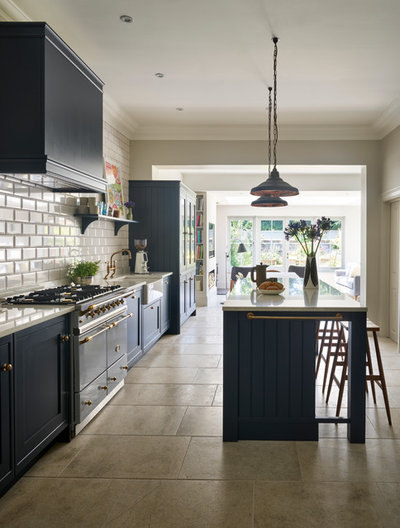
The Victorian house had been extended previously, so designer Michael Rogers had space to create the new kitchen within the updated open layout. The challenge was to design a room sympathetic to the architecture of the house, yet with a contemporary, uncluttered feel.
Who lives here A couple and their three young children
Location Hove, East Sussex
Property A semi-detached Victorian house with four bedrooms and three bathrooms
Kitchen dimensions 6 x 3.5m
Designer Michael Rogers at Design Interiors, with furniture from Davonport
Photos by Darren Chung
The Victorian house had been extended previously, so designer Michael Rogers had space to create the new kitchen within the updated open layout. The challenge was to design a room sympathetic to the architecture of the house, yet with a contemporary, uncluttered feel.
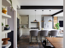
The open-plan cooking-dining-relaxing space used to open to the garden via bifold doors. “The owners never liked them and they didn’t have the right look for the house,” Michael says. He replaced them with more in-keeping French windows and sidelights with walls beneath.
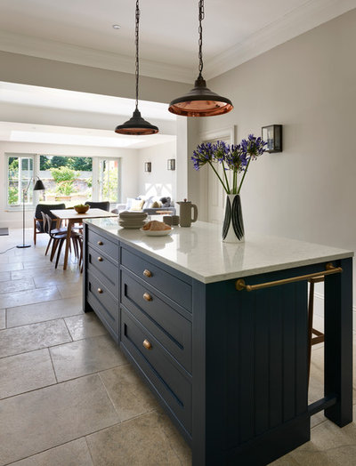
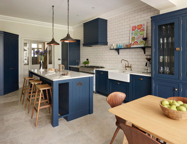
The room’s width and the couple’s desire for an island dictated the layout. “Because the kitchen is open to the dining room and there’s a door from the hall at the other end, we decided not to put any units on the inner wall,” Michael says. “We had to get everything into the single run of wall space.”
Find a kitchen designer for your project on Houzz
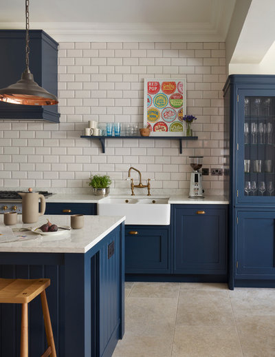
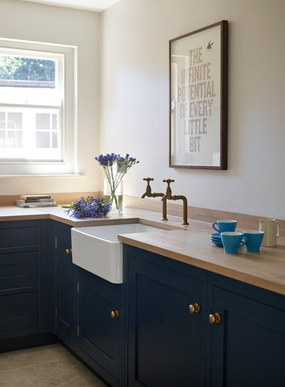
Working together, the designer and homeowners decided on a classic door style in a dark blue finish teamed with a light worksurface. Underfoot, limestone tiles were chosen for their attractive colouring and pleasing texture that help give the room warmth.
Michael had used metro tiles in his design for the couple’s bathroom, and they liked the brick pattern, so the style was repeated in the kitchen with a lighter grout than upstairs. To keep the room feeling open, there are no wall units, so there wasn’t a natural finishing point for the tiles. Instead, they’re used right up to ceiling height. “By tiling the whole wall, it became a feature, with the kitchen’s remaining walls kept plain,” Michael says.
Units painted in Bond Street, Mylands. Davey Lighting School pendant lights in weathered copper with a polished copper interior, available at John Lewis.
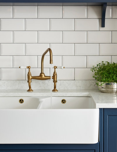
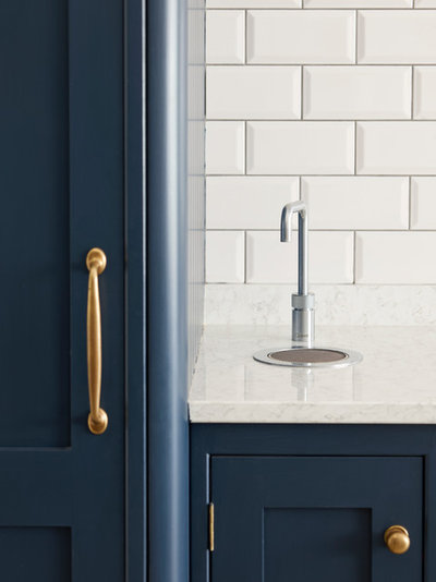
A butler sink was a worthy complement to the look of the cabinetry, and the tap has an antique brass finish that adds to the room’s menu of traditional ingredients. Handles and hinges throughout the kitchen are in similar warm metallic tones.
Sink, Villeroy & Boch.
Shop a huge range of kitchen taps on Houzz
Sink, Villeroy & Boch.
Shop a huge range of kitchen taps on Houzz
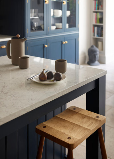
The worktop is a composite stone. “It has a nice vein pattern running through it and makes a colour contrast with the units,” Michael says.
Michael added a shelf above the sink so the wall wasn’t left empty. A bold print and a few coloured glasses on display brighten the otherwise restrained palette of the room, and give it an unmistakably 21st century touch.
Pendant lights were hung above the island. They have an industrial aesthetic that works with the metro tiles and metal accents in the scheme.
Bar stools, The Conran Shop.
Pendant lights were hung above the island. They have an industrial aesthetic that works with the metro tiles and metal accents in the scheme.
Bar stools, The Conran Shop.
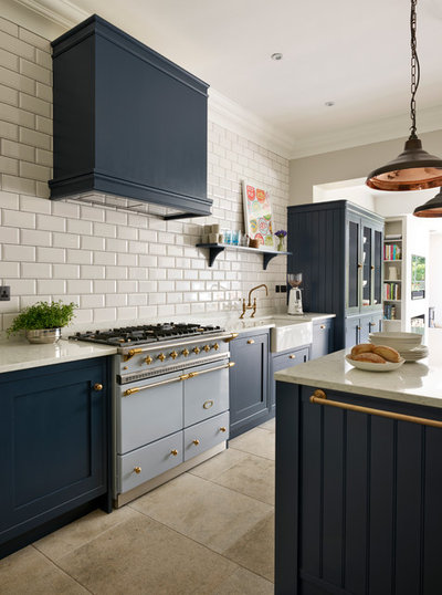
A large range cooker is a standout feature of the kitchen. Above is a standard canopy extractor. “We made a housing for it that’s in keeping with the kitchen’s style,” Michael says.
Lacanche range cooker, Design Interiors.
Lacanche range cooker, Design Interiors.
With young children using the kitchen, the couple wanted the boiling-water tap to be out of their way, so it was sited at the end of the worktop run.
Boiling-water tap, Quooker.
Boiling-water tap, Quooker.
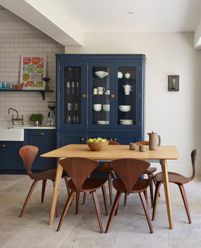
Without wall cupboards in the room, it was necessary to create sufficient storage in other ways, and the couple liked the idea of a dresser. “It makes a connection between the kitchen and dining room areas,” Michael says. Positioned right by the dining table, it means all that’s needed for setting the table is immediately to hand.
Transalpina extending table in oak, available at Twentytwentyone.
Transalpina extending table in oak, available at Twentytwentyone.
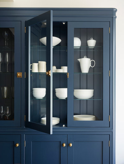
Internal lighting and glass shelves make the dresser a display space as well as a functional addition to the room. Behind the shelves, the back of the dresser is made from tongue-and-groove panelling that continues the room’s traditional elements. It’s used on the end of the run of units and beneath the breakfast bar, too.
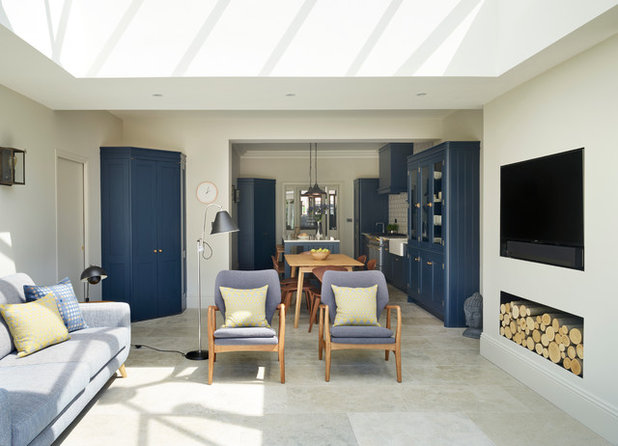
The kitchen-diner leads into a seating area, with furniture upholstered in tones that complement the kitchen cabinetry. Here, Michael constructed a false chimney breast to house the TV and a log store for the wood-burning stove that’s just to the right of the new feature (not seen).
Opposite the dresser is a larder cupboard built into the corner of the room. To its left is a door to the utility room. “It was a normal hinged door before, but the owners wanted it to disappear, so we put in a sliding pocket door,” Michael says.
Opposite the dresser is a larder cupboard built into the corner of the room. To its left is a door to the utility room. “It was a normal hinged door before, but the owners wanted it to disappear, so we put in a sliding pocket door,” Michael says.
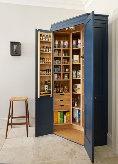
The larder cupboard combines shelves, drawers and door-hung racks to pack in generous storage for dried goods.
Is this the most desirable kitchen feature right now?
Is this the most desirable kitchen feature right now?
The utility room behind the sliding door repeats the style of cabinetry, handles, sink and taps used in the main room. Only the worksurface is different, at the couple’s request. Here, English oak was used, continuing the period-inspired scheme.
Tell us…
What do you think of this combination of period and contemporary style? Share your thoughts in the Comments section.
Tell us…
What do you think of this combination of period and contemporary style? Share your thoughts in the Comments section.


Related Stories

House Tours
Houzz Tour: Warm Tones and Luxurious Surfaces in a City Townhouse
An earthy colour palette, hidden storage and well-placed texture add character and practicality to this London home
Full Story

Room Tours
Kitchen Tour: A Gorgeous Extension With a Leafy Glasshouse Feel
By Kate Burt
When the owners of this terraced house extended, they were keen to retain its period feel and highlight the garden
Full Story

Gardens
Garden Tour: A Bare Roof Terrace Becomes a Pretty, Sociable Space
By Kate Burt
A retired couple got help transforming their large rooftop into a gorgeous, welcoming, multi-functional retreat
Full Story

House Tours
Houzz Tour: A Smart Layout and Genius Storage in a Victorian Home
Flipping the standard layout and carving out excellent storage have turned this tired house into a brilliant family home
Full Story

House Tours
Houzz Tour: A Victorian House Brought Impressively Up to Date
By Jo Simmons
A cohesive layout and warm colours combined with energy-efficiency measures thoroughly modernise this terraced home
Full Story

Kitchen Tours
Kitchen Tour: An Open, Airy Space Made for Entertaining
Combining two separate rooms has improved flow and created a sociable open-plan kitchen, dining and seating space
Full Story

House Tours
Houzz Tour: A Family Home Inspired by its Seaside Location
Coastal colours and practical design combine to create a house that will adapt as the family grows
Full Story

Kitchens
5 Inspiring Before and After Kitchen Transformations
Whether you want to boost storage, incorporate original features or maximise your space, take ideas from these designs
Full Story

House Tours
Houzz Tour: An Airy, Scandi Finish for a Tall Victorian House
By Kate Burt
From a tricky inherited bath to a sticky-out staircase, on-site problem-solving led to a seamless update for an old home
Full Story
House Tours
Houzz Tour: A 17th Century Cottage Gains Warmth and Character
The clever use of colour and pattern has revived this old building while creating a 21st century family home
Full Story
surprised to see the comments on 'blue' -- it looks dark green on my laptop!
Looks great. I have saved the colour reference Bond Street, Mylands. Definitely very blue, your laptop might need some colour adjustment Timiduser.
Empathising...not sympathizing!!!
Isn't predict text wonderful!!!