Houzz Tours

Kitchen Tours
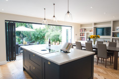
South East Kitchen
Kitchen Tour: A Traditional Look for a Sensitively Converted Barn
A new handmade kitchen and utility room look beautifully at home in an old agricultural building

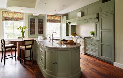
The owners of this barn conversion outside Canterbury approached Herringbone Kitchens because they wanted a handmade wooden kitchen and utility room to complement the aesthetic of the old building they were about to convert into a home.
The company’s lead designer, David Tenters, was brought in at the start of the project, so he was able to guide the family as to the best location for the kitchen in what was then an empty shell, as well as suggest sensitive finishes and a layout that took into account the remains of an ancient flint wall.
The company’s lead designer, David Tenters, was brought in at the start of the project, so he was able to guide the family as to the best location for the kitchen in what was then an empty shell, as well as suggest sensitive finishes and a layout that took into account the remains of an ancient flint wall.
With this living area on one side and the dining area off to the other, the kitchen is perfectly located to be the interlinked hub David had pictured.
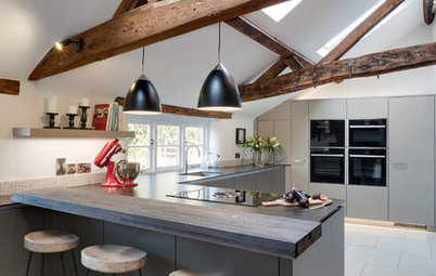
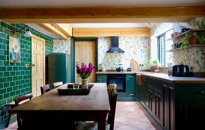
“Because it’s so open-plan, we didn’t want it to look too ‘kitchen-y’,” David says, referring to the way the floor-to-ceiling units almost look like a wall from afar.
“It would look much fussier if it was white or a paler colour, as you’d have seen the shadows and gaps around the doors,” he continues. “It being black means the shadows are lost, so you get a flatter backdrop to the room, which makes it less of a detail.”
For the same reason, he also veered away from any open shelving, which could have looked cluttered.
A tumbled limestone floor adds to the contemporary rustic feel.
Easily scour reviews of kitchen designers in your area.
David had to design the units around the remains of an ancient flint wall; you can see it here at the far end of the kitchen on the left. It’s around 40cm high and turns a corner at the back of the building, running under the base cabinets. The solution to incorporating it was to build units that are shallower in the bottom sections and deeper at the top.
“Because [the cabinets are] bespoke, we were able to build them in the workshop to fit perfectly around the wall and then bring them to site, ready to be installed,” he says.
This did mean that the obvious location for a dishwasher and bin unit – flanking the sink – wasn’t an option. Instead, these have been located along the other wall.
A generous island was on David’s original brief. “It’s pretty big – roughly 2.4m x 1.2m,” he says. “It features four deep drawers plus a cutlery drawer, a wine cooler on the living room side, and sociable seating that wraps around the corner.”
The worktop is quartz and the cabinets are finished with classic brass cup and bar handles and knobs, lending a lovely traditional feel to the kitchen.
Burnished brass door hardware, Armac Martin.
The worktop is quartz and the cabinets are finished with classic brass cup and bar handles and knobs, lending a lovely traditional feel to the kitchen.
Burnished brass door hardware, Armac Martin.
Here you can also see how the living space in the barn’s open-plan layout connects to the kitchen.
David also designed a matching utility room, accessed through the opening to the right of the tall run.
The frames and doors of the cabinets are all made from sustainably sourced hardwoods and painted in water-based paint. “Because the cabinetry is painted, it can be repainted if the owners want a change, so it should last for years to come,” David says.
He chose a very soft shade of black so it would also link with the building’s exterior, which has been clad in torched timber.
“I also suggested brass for the taps and hardware, rather than chrome or nickel, so it would tie nicely to the oak, as both have warm tones,” he says.
Units painted in Tudor Black, Herringbone Kitchens.
The owners wanted a freestanding fridge-freezer that dispensed ice and water. This design is charcoal, so it blends nicely with the cabinetry.
To the right of this there’s a full-height pantry with door-mounted spice racks, three drawers at the base and a ‘cold shelf’ made from a piece of the quartz worktop. These were traditionally seen in pantries for the storage of items now generally kept in the fridge – butter, pastry, cheese and so on.
On the left of the fridge are two single ovens, below which are the dishwasher and an integrated bin. They’re sited here because of the flint wall and the fact plumbing constraints meant they couldn’t go into the island unit, either.
Charcoal fridge-freezer, Siemens. Ovens, Neff.
David altered the height of the work surface below the window slightly, so as to be able to use the sill as a shelf and get the top of the upstand to line up with it.
Mounted above a double Belfast sink is a boiling-water tap.
Patinated brass tap, Quooker.
Mounted above a double Belfast sink is a boiling-water tap.
Patinated brass tap, Quooker.
What looks like a drawer on the top right-hand side of the island in fact contains a downdraft extractor, which means no need for a bulky suspended cooker hood.
However, for Building Regulations compliance, there’s a small extractor fan fitted into the wall, because the hob extractor couldn’t be ducted to the outside.
Pure induction hob, Bora.
However, for Building Regulations compliance, there’s a small extractor fan fitted into the wall, because the hob extractor couldn’t be ducted to the outside.
Pure induction hob, Bora.
Tucked in the far left corner of the full-height run of cabinetry is a breakfast cupboard that sits on the worktop, which continues inside. The door is bifolding, so that, when it’s open, it doesn’t encroach on the window.
This cupboard, at around 45cm deep, is not full depth due to a structural beam behind it. “It’s the perfect size for cups, glasses and a toaster and coffee machine, which can be pulled out to use,” David says. There’s no need for a kettle in there thanks to the boiling-water tap.
This cupboard, at around 45cm deep, is not full depth due to a structural beam behind it. “It’s the perfect size for cups, glasses and a toaster and coffee machine, which can be pulled out to use,” David says. There’s no need for a kettle in there thanks to the boiling-water tap.
And, of course, there’s plenty more storage space in the utility and boot room, the entrance to which can just be seen on the right.
Floor-to-ceiling cabinets at one end of the utility room contain the boiler; a stacked washing machine and dryer; hidden shelving and a slot for an ironing board; a reduced-depth space for more coats and shoes, and the fuse board and underfloor heating manifold.
David designed the bench and open coat storage, too (around a bit more of that flint wall). “We chose a wide stave oak top rather than a painted surface, not only to tie in with the fabric of the building, but because it’s very hard-wearing,” he says.
More: 7 Ways to Make the Most of a Small Utility Room
The result is a solid, welcoming kitchen built to last – just like the lovingly restored old barn it sits in.
Tell us…
What do you think of David’s design? Share your thoughts in the Comments.
Tell us…
What do you think of David’s design? Share your thoughts in the Comments.

Sponsored
Reload the page to not see this specific ad anymore
Who lives here? A family with secondary school-age twin boys
Location Just outside Canterbury, Kent
Property An old barn converted into a four-bedroom home
Kitchen area dimensions Around 3.5m by 4m within an open-plan space (measurements squared off where the cabinetry stops)
Designer David Tenters of Herringbone Kitchens
Photos by David Rannard of Click:Create Photography and Design
David first went to visit his clients’ home when it was still a derelict shell with a crumbling roof and no floors.
“I came into it really early and they’d just had Planning [Permission] agreed,” he says. “The architect was originally aiming for the kitchen to go where the [adjacent] dining area is now, but I was able to suggest this location instead. Here, it becomes the anchor to the dining and living areas, so you’re not tucked away when you’re in the kitchen – you’re in the hub of the house.”