Houzz Tours

Kitchen Tours
London Kitchen
Kitchen Tour: A Room That Beautifully Blends Cooking and Living
Three distinct but linked zones form an airy kitchen-diner/living space in this smart extension connected to the garden

This late Edwardian semi had the classic narrow back kitchen plus a view-blocking lean-to, and that coveted link to the garden just wasn’t there. So the owners asked Robert Wilson of Granit Architecture + Interiors to create a much more open family space.
Using almost the same footprint, Robert designed an airy extension that the family can all use and enjoy year-round. “It was about getting a single live/work/play space, particularly because they have young children. You can build the best playroom in the world, but they’re never going to play in it – they want to be underfoot,” he laughs.
Using almost the same footprint, Robert designed an airy extension that the family can all use and enjoy year-round. “It was about getting a single live/work/play space, particularly because they have young children. You can build the best playroom in the world, but they’re never going to play in it – they want to be underfoot,” he laughs.
The red dotted line on this plan of the proposed space shows the old wall of the awkwardly-shaped kitchen. The new room is on a similar footprint – with the extra area taking up only half of the side return – but a much better use of space.
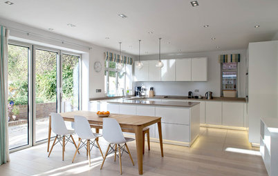
The L-shaped room divides nicely into three areas. Each has a distinct character, but they’re all subtly linked by touches of wood in the dining table, kitchen bar stools and living area media unit. “The couple already had the walnut dining table and this fed through to the other areas, adding a little bit of warmth,” Robert says.
The striking gold velvet sofa, chosen by the couple, chimes beautifully with the wood tones and brings warmth into the centre of the room. “I like yellow – it’s like sunshine,” Robert says.
The striking gold velvet sofa, chosen by the couple, chimes beautifully with the wood tones and brings warmth into the centre of the room. “I like yellow – it’s like sunshine,” Robert says.
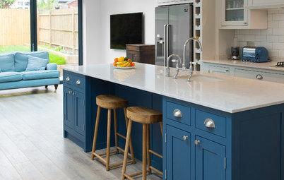
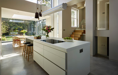
A substantial island and a run of cabinets with Shaker-style doors form the kitchen, which is more or less in the old spot.
Robert chose a pale colour for the perimeter units and dark for the island. “One of the things with these through rooms is you have a certain amount of kitchen to fit in and, if you’re not careful, you can end up with a room that’s actually just a very big kitchen, because there’s lots of kitchen furniture,” he explains. “This way, the big bank of units recedes and the island matches the sideboard in the dining area and they’re talking to each other, so it’s more of a kitchen with furniture in it.”
From the left, there’s a fridge, ovens and microwave, freezer, dishwasher, pan drawer, pull-out bin cabinet, and a double-door larder with internal drawers. There’s also a wine fridge and two large drawers in the island.
An extractor fan and Sonos speakers are fitted flush in the ceiling. “There’s a surround-sound system in this part of the house that also links to the TV,” Robert says.
Kitchen, Roundhouse. Main units painted in Pavilion Gray; island painted in Railings, both Farrow & Ball.
The island nicely separates the kitchen from the living area. “I’m a great believer in what I call defensible space,” Robert says. “You have your cook area and everybody else stays on the other side of the island.
“I think it works well as a kitchen,” he continues. “I’m not so much set on the cook’s triangle; I think it’s better to have the fridge in a slightly more communal space, so people can get drinks.”
The splashback and island worktop are marble-look sintered stone.
Calacatta sintered stone splashback and island worktop, Neolith. Unika island pendant lights in Grey, Northern. Luna 1-Light Dome dining room pendant, Wayfair.
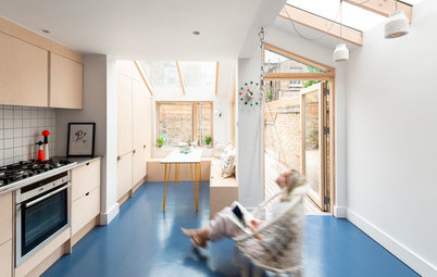
The dining space, though fairly small, feels airy and spacious thanks to glazing on two sides. The window seat is topped with walnut to chime with the table. The sideboard was made bespoke.
Make the challenge of finding the right people for your project easier by searching the Houzz Professionals Directory.
Make the challenge of finding the right people for your project easier by searching the Houzz Professionals Directory.
The living area has a subtly softer feel than the other zones thanks to the warmth and texture of the velvet seating, cosy rug and bare brick.
Just as the bespoke walnut media unit was designed to link with the dining table, so Robert has chosen the same porcelain flooring (with a bush hammered finish outdoors for grip) to connect indoors and out.
“If you start with something like a table, you think, ok that’s walnut, let’s stay with walnut as our main wood. Similarly, if you want indoor-outdoor, let’s pick a floor finish that works in and out,” he says.
The London stock brick is also a continuation of the garden wall and the extension as a whole.
The skylight at the far end of the living space keeps this potentially dark area illuminated and also directs rays into the sitting room behind the doors on the right, which would otherwise have been very gloomy. “Trying to maintain the same light levels as before is always important in extension projects,” Robert says.
Getting the light right in here was a challenge. “It’s south-west facing, so it gets a lot of sunlight, and the room could easily become overheated. However, if you didn’t have any skylights, it would be too dark,” he says. As such, there are only two quite modest roof windows – this one and a slice between the dining room and kitchen.
Getting the light right in here was a challenge. “It’s south-west facing, so it gets a lot of sunlight, and the room could easily become overheated. However, if you didn’t have any skylights, it would be too dark,” he says. As such, there are only two quite modest roof windows – this one and a slice between the dining room and kitchen.
There’s quite a lot of structure holding up the building, but Robert left the bottom of the beams protruding rather than having a false ceiling beneath them. “We wanted to keep it simple, but didn’t want to suddenly lose a whole lot of height, which is quite precious,” he says. “We painted them white so they disappear.”
A utility room has been carved out behind the kitchen – accessed through the white door on the far right seen here. It means Robert could move all of the laundry equipment out of the main room, keeping it both quieter and less crowded.
A utility room has been carved out behind the kitchen – accessed through the white door on the far right seen here. It means Robert could move all of the laundry equipment out of the main room, keeping it both quieter and less crowded.
Behind the utility room is an understairs cloakroom; Robert has hidden the boiler in here.
You might also enjoy How to Turn Your Understairs Area into a Cloakroom.
You might also enjoy How to Turn Your Understairs Area into a Cloakroom.
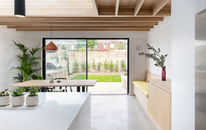
Both the living and dining areas have large glazed sliding doors and Robert also restored the original French windows into the sitting room, which means the house can really open up.
“The couple like having people round and everyone can spill outside and also back into the sitting room as well, so it works front to back,” he says.
“The couple like having people round and everyone can spill outside and also back into the sitting room as well, so it works front to back,” he says.
Pulling in yet more light from all directions is the projecting bay window in the dining area. “I love these,” Robert says. “They give you spare seating plus light coming from different sides, and they don’t really take up any space outside.”
Projecting bay window, Maxlight.
Projecting bay window, Maxlight.
Trying to get the paving exact was a challenge, as there are ground level differences. “From the alleyway to the side of the building [right] we had to get some steps up and raise the terrace without killing the tree,” he says.
Despite the challenges, though, the project all came together beautifully and the owners are delighted with their new space. “They were great clients,” Robert says. “And they’ve just recommended us to friends, so they must have been happy!”
Tell us…
What do you like about this airy family space? Share your thoughts in the Comments.

Sponsored
Reload the page to not see this specific ad anymore
Who lives here? A professional couple with two young children
Location Streatham, south London
Property A late Edwardian semi-detached house
Kitchen-diner/living area dimensions 7.2m x 7.8m at the longest point
Architect Robert Wilson of Granit Architecture + Interiors
Photos by Andrew Beasley Photography
The couple quite liked their existing kitchen, but as a space it wasn’t working for family life, as it was fairly narrow and an awkward shape.
“They had a dining table and chairs, but the room wasn’t big enough to get everybody in; it was all a bit of a squeeze,” Robert says. “There was also a funny little lean-to at the rear, so it was broken up.”