Houzz Tours


Kitchen Tours
London Kitchen
Kitchen Tour: A Bright, Connected Space with a Fresh Scandi Feel
Removing walls to improve the layout gave the owners of this Victorian property the modern kitchen-diner they longed for

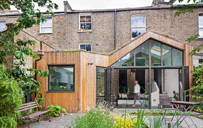
While the owners of this London maisonette could see their new home was full of potential, the kitchen and separate dining room looked tired and in need of an overhaul, and the layout of the rooms also needed a complete rethink.
“It was a bit of a hotch-potch really,” says Gemma Tucker of Balance Interior Design, to whom the couple turned for guidance. “It was a really small kitchen with plain cupboards, and it felt very dark. The owners, who are both academics, are keen cooks who like to entertain, and they loved the idea of connecting the dining and kitchen areas to create a better entertaining space.”
“It was a bit of a hotch-potch really,” says Gemma Tucker of Balance Interior Design, to whom the couple turned for guidance. “It was a really small kitchen with plain cupboards, and it felt very dark. The owners, who are both academics, are keen cooks who like to entertain, and they loved the idea of connecting the dining and kitchen areas to create a better entertaining space.”
The kitchen before the renovation.
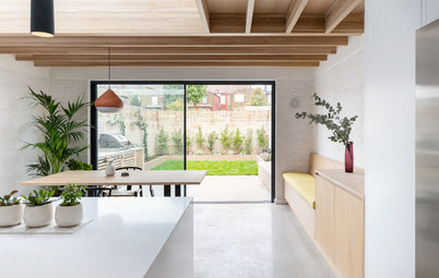
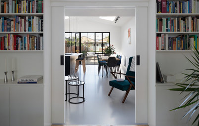
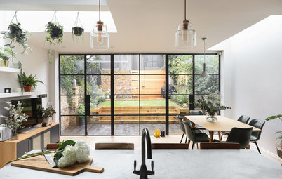
A floor-to-ceiling, Crittall-style screen was installed within a side wall to maximise light, and also enhance the proportions of the original features. “The stairwell was very dark and the banisters felt almost too big for the area, but the screen has made such a difference and gives a lovely connection between the spaces,” Gemma says.
“We decided not to go for the standard arrangement of equally sized sections in the screen to add some originality and interest, and also to allow the maximum view in that central panel area where the eye lands,” she says.
Screen, Fabco Sanctuary.
“We decided not to go for the standard arrangement of equally sized sections in the screen to add some originality and interest, and also to allow the maximum view in that central panel area where the eye lands,” she says.
Screen, Fabco Sanctuary.
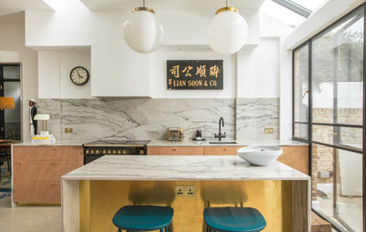
As the budget was tight, Gemma decided to limit spending on some aspects of the design while splashing out on others, so the overall feel is one of luxury. She reused the ovens from the existing kitchen, but then opted for a stunning ceramic worktop and splashback.
“It’s very simple and only 12mm thick, with a minimal overhang to keep it feeling clean and modern,” she says. “It also has quite a matt finish, which works well with the marble detailing and the general Scandinavian look.”
Tap, Mizzo. Wall lamps, Atelier Areti. Worktop and splashback, CRL Stone.
“It’s very simple and only 12mm thick, with a minimal overhang to keep it feeling clean and modern,” she says. “It also has quite a matt finish, which works well with the marble detailing and the general Scandinavian look.”
Tap, Mizzo. Wall lamps, Atelier Areti. Worktop and splashback, CRL Stone.
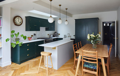
“We went budget on the kitchen cabinetry, but we added details such as a really beautiful knurled handle as a place to hang a tea towel at the end of the peninsula [see next image],” Gemma says. “I also wanted to have the cabinetry as close to full height as possible and that’s why there’s an additional run of units at the top, which is used as storage for occasional serveware.”
The off-white upper units feature push catches instead of handles to maintain that sleek aesthetic, but the dark green base units have knurled black handles.
Slab-front doors, Naked Doors. Carcasses, Howdens.
You might also like 23 Ideas for Green Kitchens.
The off-white upper units feature push catches instead of handles to maintain that sleek aesthetic, but the dark green base units have knurled black handles.
Slab-front doors, Naked Doors. Carcasses, Howdens.
You might also like 23 Ideas for Green Kitchens.
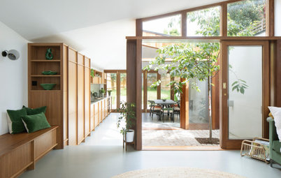
Gemma opted for a pale parquet floor that chimed with the Scandi vibe and also acted as a nod to the heritage of the building. “In our early discussions, the owners said they loved the look of Parisian apartments, so we went for classic herringbone flooring made from solid blocks of oak throughout,” she says.
By painting the walls off-white, Gemma made the double room feel even bigger. She chose a midcentury-style pendant to hang low above the table – the long cord makes the ceiling seem higher, but also creates some soft and intimate evening lighting when the owners are entertaining.
Walls painted in Pointing, Farrow & Ball. Pendant light, &Tradition. Chairs, Carl Hansen & Son.
The original orangey-brown marble fireplace slightly overpowered the other elements in the room.
Find interior designers in your local area and start the conversation about refreshing your home.
Find interior designers in your local area and start the conversation about refreshing your home.
Gemma installed a reclaimed marble surround instead, which was more in keeping with the serene space. As the owners are keen art lovers, she helped source some original artwork as a visual centrepiece.
Artwork, Mimi Zouch.
Artwork, Mimi Zouch.
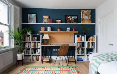
Gemma zoned the space to create a seating spot in the corner by the bay window, which overlooks the treelined street below. “As they’re both academics, they have a huge collection of books, and it’s a really lovely place to sit and read,” she says.
Built-in units are planned for beneath the floating shelves when the budget allows, but, for the time being, some Ikea units that fit perfectly are acting as convenient placeholders.
Built-in units are planned for beneath the floating shelves when the budget allows, but, for the time being, some Ikea units that fit perfectly are acting as convenient placeholders.
At the other side of the room are some original Victorian etched double doors that lead into the living room beyond, and can be opened up to create one large connected space.
“I love the view you get from the peninsula and all the combinations of the different zones, and the materials and colours – it all balances really beautifully,” Gemma says.
“But what I feel happiest about is the fact my clients speak so fondly about the utility of the space, and how it’s become such a hub of the home,” she says. “It’s connected, but there’s division for all the different functions. They just love that it feels very personal to them.”
Tell us…
What do you like about how Gemma has designed this bright, comfortable space? Share your thoughts in the Comments.

Sponsored
Reload the page to not see this specific ad anymore
Who lives here? A couple with one child
Location Crouch End, north London
Property A Victorian maisonette with three bedrooms and one bathroom
Room dimensions 34 sq m
Designer Gemma Tucker of Balance Interior Design
Photos by Anna Stathaki
The first thing Gemma worked on for the owners of this Victorian maisonette was the low level of light coming into the space. While the ceilings are high, the doors were not, so she decided to raise the door heights throughout to give a real sense of the building’s grand proportions and let light flow easily through the spaces.
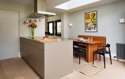
She also opened up the small kitchen to the dining room by knocking down the dividing wall to create an expansive kitchen-diner. Positioning a peninsula where the wall had been helped to zone the space into two natural halves, and create an impactful focal point.
“The owners love neutrals and natural finishes, and I wanted to bring some texture and interest to the back of the peninsula, as it faces the dining area, so we used walnut acoustic panelling,” Gemma says.
Acoustic panelling, Lignosi.