Houzz Tours
Kitchen Tours
Kitchen Tour: A Bold Modern Scheme Updates a Tired Victorian Semi
A smart mix of dark door fronts and exposed ply gave a period property the fresh contemporary look its owners wanted
With a love of entertaining but not enough room to enjoy doing it, plus a small child who was needing more space to run around, the owners of this Victorian property in Manchester had begun to feel the downstairs layout of their home wasn’t working for them. “The small kitchen was at the back of the house, and the overall feel was really tired,” designer Emma Rodgers of Lived In 365 says. “It just wasn’t suitable for family life.”
A radical rethink was in order. This meant removing a wall and introducing a couple of steps down into the living area to break up the space. After deciding to move the kitchen to the front of the property, keep the living room where it was and create a dining area in the old kitchen at the back, the owners asked Emma to come up with an idea for a “different” kind of kitchen scheme.
A radical rethink was in order. This meant removing a wall and introducing a couple of steps down into the living area to break up the space. After deciding to move the kitchen to the front of the property, keep the living room where it was and create a dining area in the old kitchen at the back, the owners asked Emma to come up with an idea for a “different” kind of kitchen scheme.
Hardwearing porcelain tiles were chosen for the floor in the kitchen, while real wood flooring adds a warmer touch in the living area. Pulling the entire space together is the same off-white wall colour, which is used throughout, helping to create a feeling of flow and openness.
Walls painted in Wevet, Farrow & Ball.
Walls painted in Wevet, Farrow & Ball.
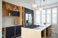
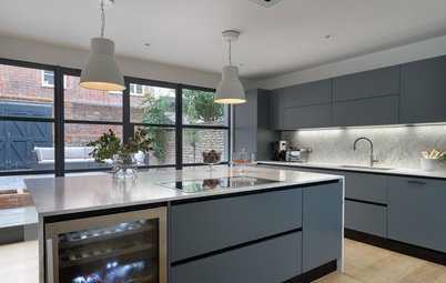
The plan evolved as Emma and Robert helped the couple to narrow down their colour choices. After first considering green and then blue for the door fronts, they settled on a dark blue-grey laminate.
“They loved the look of the exposed ply – that was one of the features they really wanted to show,” Robert says. “So we bonded the laminate onto birch ply doors to achieve it.”
Polyrey Touch anti-fingerprint laminate in Bleu de Prusse, International Decorative Surfaces.
“They loved the look of the exposed ply – that was one of the features they really wanted to show,” Robert says. “So we bonded the laminate onto birch ply doors to achieve it.”
Polyrey Touch anti-fingerprint laminate in Bleu de Prusse, International Decorative Surfaces.
The units continue into the living area in a paler shade. “[The owners] chose the same style of cabinetry, but in a different colour, to create continuity through the open-plan space, making sure it all feels connected,” Emma says.
Polyrey laminate in Blanc Artic, International Decorative Surfaces.
Inspired to revamp your kitchen? Find local kitchen designers and read reviews from previous clients.
Polyrey laminate in Blanc Artic, International Decorative Surfaces.
Inspired to revamp your kitchen? Find local kitchen designers and read reviews from previous clients.
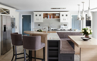
To keep the area above the island clear, the team went for a vented gas hob with a built-in extractor, while a flip-up socket provides extra power points. “The couple wanted to have this feeling of light and space, and anything blocky like a cooker hood would have looked heavy,” Emma explains.
The pendant lights were chosen as a nod to the era of the house, while a pale quartz worktop with light grey veining boosts the feeling of natural light.
Venting gas hob, Elica at AO. Backflip socket, EVOline at Appliance House. Quartz work surface in Lucca White, Chicstone.
The pendant lights were chosen as a nod to the era of the house, while a pale quartz worktop with light grey veining boosts the feeling of natural light.
Venting gas hob, Elica at AO. Backflip socket, EVOline at Appliance House. Quartz work surface in Lucca White, Chicstone.
“We talked to the owners at length about the amount of open shelving they were comfortable with having – obviously, there has to be a good balance,” Robert says. A sliding door on the shelving above the sink allows them the best of both worlds.
Emma specified a contemporary-style tap and an undermount sink for a neat, streamlined look.
Undermount sink; Pitone pull-out tap, both Waterline.
Emma specified a contemporary-style tap and an undermount sink for a neat, streamlined look.
Undermount sink; Pitone pull-out tap, both Waterline.
“There aren’t many tolerances with this style of kitchen,” Robert says. “We faced a design challenge, as there was a lowered steel beam above the fridge-freezer. We had to meet that with the cabinetry and make sure it was millimetre perfect.
“Usually when you have a kitchen, you’d have a filler piece that runs to the side of the wall and takes out any deviations, but with this style you can’t,” he says.
American-style fridge-freezer, Samsung. Ovens, Neff.
“Usually when you have a kitchen, you’d have a filler piece that runs to the side of the wall and takes out any deviations, but with this style you can’t,” he says.
American-style fridge-freezer, Samsung. Ovens, Neff.
The island is packed full of functional elements. As well as the hob, there’s an integrated bin cabinet along with two triple drawer cabinets. “We tried to give the couple as much storage space as possible, as it’s not an overly large kitchen,” Robert says.
The handleless effect was created by cutting a notch into the carcasses, so all the drawers and cupboards look flat, but are still easy to open. “Having a ply edge throughout already makes it look fairly busy, so to add handles into the mix would have been a bit too much,” Robert says. “This way, it keeps it minimalist.”
A concealed drawer makes the most of all the available space, and has a semicircle cut into it so it’s quick and easy to pull out.
On the other side of the island, a breakfast bar with room for three bar stools gives the couple that social aspect they longed for. Shallow shelving prevents it from looking too enclosed and provides room for cookery books.
This side of the room also features a larder, which is tucked neatly into the corner to allow plenty of circulation space around the island. It has integrated lighting to highlight the bespoke design.
“It’s always a pleasure to work on an exciting project like this, but I think the contrast between the natural edge and super-matt graphite frontages is really visually interesting,” Robert says. “And the clients are over the moon with it. They got everything they wanted, including something that looks really different.”
Emma agrees. “There are so many aspects to this kitchen,” she says. “It’s not just a set of cupboards and then more cupboards; there are lots of features going on and that continues even when you open up the drawers.”
Tell us…
What do you like about this plywood kitchen? Would you consider using the same material in your home? Share your thoughts in the Comments.
Tell us…
What do you like about this plywood kitchen? Would you consider using the same material in your home? Share your thoughts in the Comments.


Who lives here? A couple with a young child
Location Levenshulme, Manchester
Property A three-bed Victorian semi
Dimensions Kitchen, 17.6 sq m; living area, 16.5 sq m (including dining area, 7.2 sq m)
Designers Emma Rodgers of Lived In 365 and Robert Kemp of Kitchens by Kemp
Photos by Ade Hunter
The homeowners were after a contemporary, open-plan look along with a generous island unit, and were also taken with the idea of using exposed ply. Emma came up with a vision, then brought in bespoke kitchen specialist Robert Kemp to finesse the plan and ensure it was workable.
“They wanted something bright and airy, and their priority was creating a social and entertaining space,” Emma says.
Robert explains that, from a design point of view, it was a challenge. “They wanted an island and we had to make sure it was far enough from the steps down to the living area, and that there was a good walkway around the kitchen,” he says.