


Kitchen Tour: A 1930s Flat Beautifully and Sustainably Revived
Bringing this untouched old kitchen and dining room up to date while honouring the history required a skilful touch
Sarah Alcroft
16 December 2022
Houzz UK Editorial Team
Faced with a kitchen and dining area that could charitably be called “tired”, the new owners of this flat in a 1930s mansion block had a dilemma – how to respect the history of the handsome building while creating a home that would function for them and their soon-to-be-born baby.
Searching on Houzz, they came across the perfect professional to help them – designer Phil Thomas of Albert’s House. “They’d seen my work on Houzz and really liked the style of the projects I did – a blend of old and new – so contacted me through the site,” he says. “I like it when I can go into a character property and bring out its features.”
This was clearly a great project for him, then, as the finished kitchen-diner is both functional and characterful, and has given the family a cosy, inviting hub.
Kitchen at a Glance
Who lives here? A couple with a baby on the way
Location Highgate, north London
Property A three-bed flat in a 1930s mansion block
Room dimensions Dining area, 4.5m wide; kitchen, 2.5m wide; room length from dining window to kitchen window, 8.7m
Designer Phil Thomas of Albert’s House
Photos by Chris Snook
The couple wanted a kitchen-diner that would be a practical space for life with a small child and also nice for relaxed entertaining.
The key to creating it was removing the wall between the kitchen and dining room, the ghost of which can be seen in the steel beam above the sink. “Taking down the wall let light through into the kitchen, which had been very dark, and made a useful kitchen-dining-family space,” Phil says.
This meant the kitchen could be expanded into the former dining room, but making these deceptively simple layout changes wasn’t without its challenges. “Technically, it was quite difficult, as the whole of the structure is concrete – every wall, floor and ceiling,” Phil says, “so there was a lot of work involved. You couldn’t run any pipes through a void, because there weren’t any voids, so there was quite a bit of drilling involved.”
The survey revealed asbestos in the kitchen floor, too, so they had to call in a specialist contractor.
Before Photo
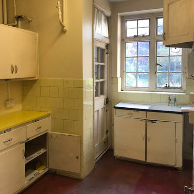
Apart from the wall coming out, Phil has kept the original layout, seen here. This door, which is still in place, leads to a service area where a bin can be stored, and there’s a pulley system down to the basement. The window overlooks the communal garden.
Find the right contractors for your renovation in the Houzz Professionals Directory.
Find the right contractors for your renovation in the Houzz Professionals Directory.
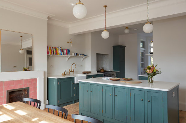
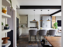
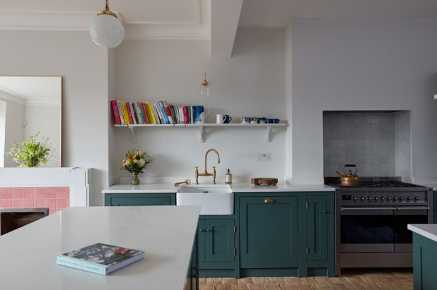
Now, Shaker-style units run down both sides of the kitchen, and an island separates the area from the dining zone.
The units out of shot on the right of the kitchen contain storage including pan drawers. “The cabinets are shallower on this side, because the window goes quite near to the corner and we didn’t want to block that off,” Phil says.
On the sink run, there’s a washing machine to the left of the sink and a dishwasher to the right, with slim cupboards flanking the range cooker and a tall cupboard in the corner hiding the boiler and a broom cupboard.
The three longer pendant lights – one over the dining table and a couple over the island – are vintage. The one in the kitchen is new, but in the same style. The wall lights – one over the sink and two over the opposite run – tie in, too, being brass.
“We didn’t want overkill with the lighting,” Phil says. “We definitely didn’t want spots – we couldn’t have had them anyway, because of the concrete – but in terms of the efficiency of the lighting, this arrangement works well.”
Pendant lights, Lassco.
More: How to Illuminate Your Kitchen Without Relying on Downlights
Before Photo
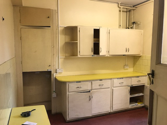
In this ‘before’ shot, the wall that was removed is on the left. The new range cooker has been fitted into the chimney breast and the new boiler cupboard is where the pipes are on the right.
“As it’s in a conservation area, we were quite limited in moving stuff around,” Phil says.
“As it’s in a conservation area, we were quite limited in moving stuff around,” Phil says.
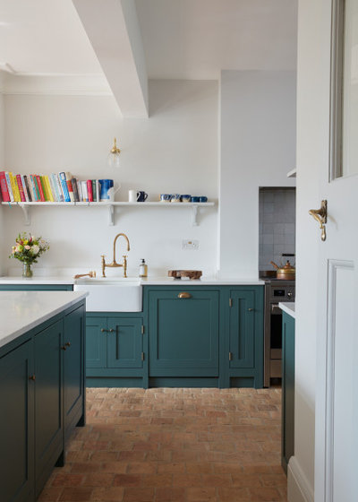
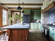
As there was no space to accommodate a tall fridge-freezer, Phil fitted two fridges and a freezer into this side of the island. There are storage cupboards on the other side.
The cabinets are painted in a soft green. “We were all quite sold on green for the cabinets,” Phil says. “When we were in the showroom looking at green palettes, the couple really liked this colour. They had green in mind from photos of projects I’d done previously. This is slightly brighter than those greens, but it really works. They didn’t want it to be too neutral.”
Phil kept the original internal doors and their handles (you can just see the kitchen one on the right) throughout the flat. “We just had the fittings dipped and made good,” he says. “Because they’re brass, we went for brass elsewhere, too.”
Cabinets painted in Malachit 10, Caparol. Tap; cupboard handles, all deVOL.
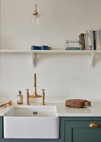
Phil kept the area above the worktops open, with one shelf over the sink and another above the units opposite the cooker. “We didn’t want it to feel too kitchen-like, and didn’t want to hem in the kitchen with all units,” he says.
The worktops are a Carrara marble-look quartz.
The worktops are a Carrara marble-look quartz.
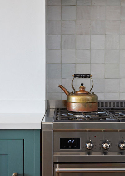
White zellige tiles have been chosen for the cooker splashback. “They aren’t completely white, so they have a nice warmth to them,” Phil says.
Zellige tiles, Habibi Interiors.
Zellige tiles, Habibi Interiors.
Before Photo
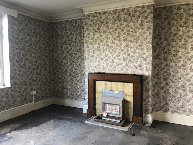
A lot of the cornices were intact, so Phil kept them. “There were just a few points where we had to match new ones,” he says.
The dining room fireplace surround and parquet floor were also restored. “There was a lot of lacquer and varnish to remove from the flooring,” Phil says.
The dining room fireplace surround and parquet floor were also restored. “There was a lot of lacquer and varnish to remove from the flooring,” Phil says.
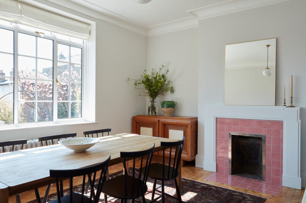
The team painted the old fireplace surround white and added new pink tiles. The windows had to be replaced. “We put in new aluminium heritage windows in the same style throughout the flat, as the old ones were in a pretty bad state,” Phil says.
Walls painted in French Grey Pale, Little Greene. Pink tiles, Marlborough Tiles. Windows from the Benenden Conservation range, The Heritage Window Company.
Walls painted in French Grey Pale, Little Greene. Pink tiles, Marlborough Tiles. Windows from the Benenden Conservation range, The Heritage Window Company.
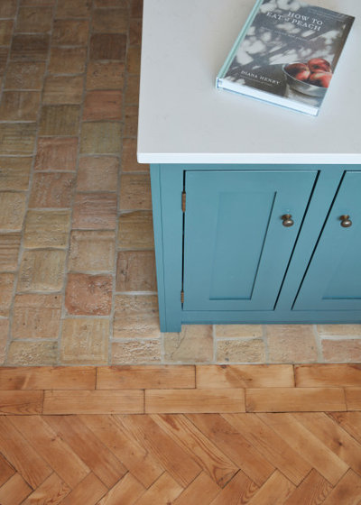
Because of the presence of asbestos, the original kitchen floor needed to be taken up, plus the kitchen now extends further, so new tiling had to be laid. “These are reclaimed terracotta tiles, which were all cleaned and made good,” Phil says. “The couple wanted the reclaimed tiles as a nod to the history of the building.”
As the dining room floor is now smaller, Phil had some pieces of parquet spare, so he could create a border, which matches the parquet edges in other rooms and creates a nice transition from wood to tiles. “I like the way the two floors are tied together,” he says.
Sustainability was at the heart of this project, with materials and fittings restored where possible and reclaimed items largely filling in the gaps. “We were really mindful of not just knocking loads of stuff out, and we also didn’t want to rip out the character,” Phil says. The work has transformed the home, yet retained a real feel of the period. “Everything mirrors the era of the property, but with a modern twist to it,” he says.
Because of that approach and Phil’s clever design eye, the kitchen-diner is now a gorgeous, warm and welcoming space.
Reclaimed terracotta tiles, Lapicida.
Tell us…
What do you like best about Phil’s sensitive renovation of this kitchen-diner? Share your thoughts in the Comments.


Related Stories

House Tours
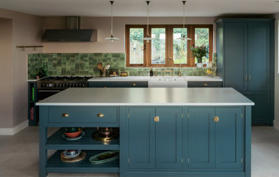
Houzz Tour: Warm Tones and Luxurious Surfaces in a City Townhouse
An earthy colour palette, hidden storage and well-placed texture add character and practicality to this London home
Full Story

Room Tours
Kitchen Tour: A Gorgeous Extension With a Leafy Glasshouse Feel
By Kate Burt
When the owners of this terraced house extended, they were keen to retain its period feel and highlight the garden
Full Story

Gardens
Garden Tour: A Bare Roof Terrace Becomes a Pretty, Sociable Space
By Kate Burt
A retired couple got help transforming their large rooftop into a gorgeous, welcoming, multi-functional retreat
Full Story

House Tours
Houzz Tour: A Smart Layout and Genius Storage in a Victorian Home
Flipping the standard layout and carving out excellent storage have turned this tired house into a brilliant family home
Full Story

House Tours
Houzz Tour: A Victorian House Brought Impressively Up to Date
By Jo Simmons
A cohesive layout and warm colours combined with energy-efficiency measures thoroughly modernise this terraced home
Full Story

Kitchen Tours
Kitchen Tour: An Open, Airy Space Made for Entertaining
Combining two separate rooms has improved flow and created a sociable open-plan kitchen, dining and seating space
Full Story

House Tours
Houzz Tour: A Family Home Inspired by its Seaside Location
Coastal colours and practical design combine to create a house that will adapt as the family grows
Full Story

Kitchens
5 Inspiring Before and After Kitchen Transformations
Whether you want to boost storage, incorporate original features or maximise your space, take ideas from these designs
Full Story

House Tours
Houzz Tour: An Airy, Scandi Finish for a Tall Victorian House
By Kate Burt
From a tricky inherited bath to a sticky-out staircase, on-site problem-solving led to a seamless update for an old home
Full Story
House Tours
Houzz Tour: A 17th Century Cottage Gains Warmth and Character
The clever use of colour and pattern has revived this old building while creating a 21st century family home
Full Story
Genius!
Wonderful. Im not keen on the pink tiles, but everything else is lovely.
Just so clever. What a beautiful sympathetic transformation.