Kitchen of the Week: Exposed Brick and Eclectic Flair
Homeowners embrace original details in the kitchen of their 120-year-old home while updating the layout for family life
Becky Harris
1 June 2018
Houzz Contributor. Hi there! I live in a 1940s cottage in Atlanta that I'll describe as "collected."
I got into design via Landscape Architecture, which I studied at the University of Virginia.
Houzz Contributor. Hi there! I live in a 1940s cottage in Atlanta that I'll describe... More
“After” photos by Karen Palmer Photography
Kitchen at a Glance
Who lives here: A couple and their two young boys
Location: St. Louis
Size: 215 square feet (20 square meters)
Designer: Jennifer Chapman Designs
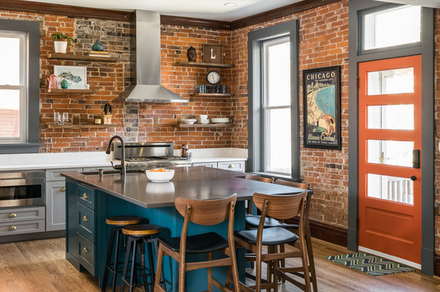
Sometimes your home will tell you what it’s supposed to be; you just have to listen. That’s the case for this St. Louis family, which wanted to work with what its 120-year-old home was saying to it rather than follow trends.
“The home had beautiful exposed-brick walls that we felt necessary to leave as a design element in the space,” interior designer Jennifer Chapman says. At the same time, the kitchen needed to serve as a relaxed hub for the family and friends and work with the adjacent living room, as the two spaces are open to each other.
Scope of work. This was a down-to-the-studs remodel that included closing off a back hallway door to gain more storage and counter space.
Style. Chapman calls the style historic-eclectic. “My clients were drawn to an eclectic, relaxed style. They did not want the design to feel too formal or designed,” she says. “They really wanted the casual, eclectic vibe they love.”
Kitchen at a Glance
Who lives here: A couple and their two young boys
Location: St. Louis
Size: 215 square feet (20 square meters)
Designer: Jennifer Chapman Designs
Sometimes your home will tell you what it’s supposed to be; you just have to listen. That’s the case for this St. Louis family, which wanted to work with what its 120-year-old home was saying to it rather than follow trends.
“The home had beautiful exposed-brick walls that we felt necessary to leave as a design element in the space,” interior designer Jennifer Chapman says. At the same time, the kitchen needed to serve as a relaxed hub for the family and friends and work with the adjacent living room, as the two spaces are open to each other.
Scope of work. This was a down-to-the-studs remodel that included closing off a back hallway door to gain more storage and counter space.
Style. Chapman calls the style historic-eclectic. “My clients were drawn to an eclectic, relaxed style. They did not want the design to feel too formal or designed,” she says. “They really wanted the casual, eclectic vibe they love.”
Before Photo
Before. “The layout did not make sense at all — there was no work triangle,” Chapman says. “There was little space for a table for their family of four.” There also was no workspace near the range, storage was sparse, and a lack of lighting made the space dark. The materials and finishes were a hodgepodge, the windows hung below counter height, and a clutter-magnet of a peninsula created too much division between the kitchen and living room.
The homeowners’ great ideas. The one element the family wanted to keep from the original kitchen was the exposed brick with all of its imperfections. And the biggest must-have for the new kitchen was a large island that would serve as a hub and create more connection to the living room.
Yes, You Can Use Brick in the Kitchen
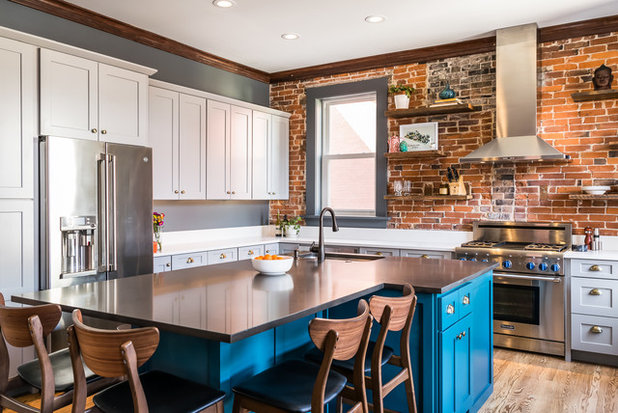
Layout. This large island, which fits the whole family plus guests, was key to creating a successful layout for a working kitchen that would also serve as a gathering space. The island, which contains the sink and dishwasher, helps form an easy work triangle with the refrigerator and range.
Island. The homeowners wanted the island to stand out from the rest of the cabinetry. “They fell in love with deep teal for the island,” Chapman says. The color invigorates the space and connects with touches of teal in the living room. The island measures 84 inches long, and at its widest point by the sink it’s 64 inches wide. There are outlets hidden along the base, and it also has a charging drawer.
Countertops. “The quartz countertops will be durable enough to withstand their kids’ homework and art projects and are easily cleaned after family meals,” the designer says. She used a dark gray quartz on the island and white quartz on the perimeter.
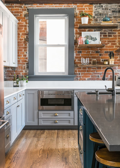
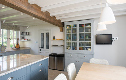
Range wall. The range wall, with its exposed brick and reclaimed-wood display shelves, serves as a strong focal point and makes for a nice view from the living room. The couple love to cook, and a large range was another must-have. A stainless steel range and tall vent hood against the antique brick lend a vintage industrial look. There’s a microwave drawer to the left of the range. The reclaimed-wood shelves (along with the walnut counter stools) warm up the room.
Island paint: Deep Sea Dive, Sherwin-Williams; island counter: Royal Grey, Vicostone; stools: Wayfair; reclaimed-wood shelves: Reclaim Renew; range: Thermador; vent hood: Zephyr; browse stainless steel wall-mounted vent hoods
Kitchen Layouts: Island or a Peninsula?
Island. The homeowners wanted the island to stand out from the rest of the cabinetry. “They fell in love with deep teal for the island,” Chapman says. The color invigorates the space and connects with touches of teal in the living room. The island measures 84 inches long, and at its widest point by the sink it’s 64 inches wide. There are outlets hidden along the base, and it also has a charging drawer.
Countertops. “The quartz countertops will be durable enough to withstand their kids’ homework and art projects and are easily cleaned after family meals,” the designer says. She used a dark gray quartz on the island and white quartz on the perimeter.
Range wall. The range wall, with its exposed brick and reclaimed-wood display shelves, serves as a strong focal point and makes for a nice view from the living room. The couple love to cook, and a large range was another must-have. A stainless steel range and tall vent hood against the antique brick lend a vintage industrial look. There’s a microwave drawer to the left of the range. The reclaimed-wood shelves (along with the walnut counter stools) warm up the room.
Island paint: Deep Sea Dive, Sherwin-Williams; island counter: Royal Grey, Vicostone; stools: Wayfair; reclaimed-wood shelves: Reclaim Renew; range: Thermador; vent hood: Zephyr; browse stainless steel wall-mounted vent hoods
Kitchen Layouts: Island or a Peninsula?
Before Photo
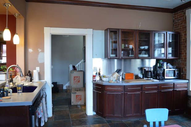
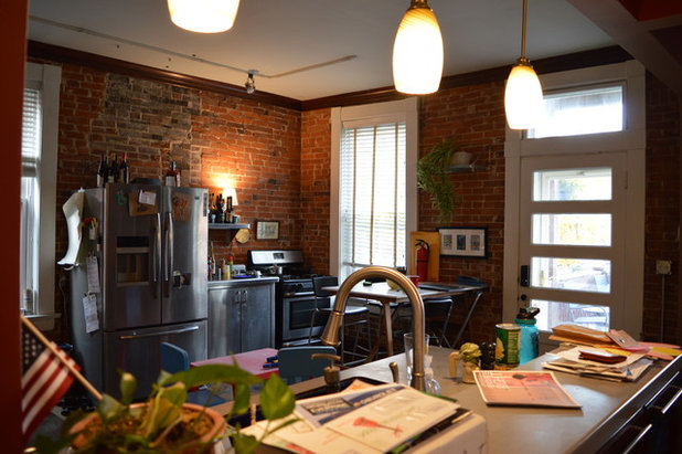
Before. This opening to the back hallway was mucking up the new layout plans. The peninsula to the left was removed as part of the remodel and the island replaced it functionally. If you look at that counter clutter on the right, the coffeemaker is now an integrated part of the new refrigerator, which has a hot water dispenser and a built-in Keurig machine.
Refrigerator wall. Getting rid of the unnecessary opening to the back hallway was a game-changer. It gave Chapman the right place to recess the refrigerator and provided the perimeter counter space and storage the family needed.
Chapman also shortened one of the long windows (seen here) to counter height so the counters could continue along the range wall.
Chapman also shortened one of the long windows (seen here) to counter height so the counters could continue along the range wall.
Cabinets. The simple Shaker style fits in with the loft-like look of the exposed brick.
Hardware. “We used a traditional cup pull on the drawers, but we selected a brushed brass finish to make it a bit more modern and warm up the cool gray and teal,” Chapman says.
Paint color. The window trim in the kitchen had been painted white and the homeowners planned on doing that again. But when they saw the grayish tint of the primer that went on the windows during prep work, they decided it was a better fit and opted for gray paint. The same hue continues on the refrigerator wall.
Cabinets: Waypoint; perimeter counters: Frosty Carrina, Caesarstone; browse quartz countertops
Before Photo
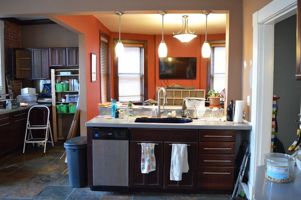
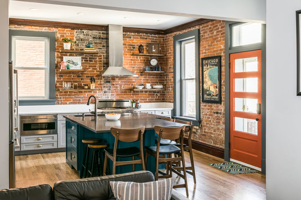
Before. This was the view to the living room. You can see how the peninsula and the pendant lights blocked it. “By removing the existing peninsula that divided the kitchen and family room and creating the large family island, the two spaces feel much more connected,” Chapman says. The homeowners decided to forgo hanging lights so the view would be clear.
The area on the left side of the photo is next to the door that leads to the backyard. Chapman turned it into a closed pantry space during the remodel.
The area on the left side of the photo is next to the door that leads to the backyard. Chapman turned it into a closed pantry space during the remodel.
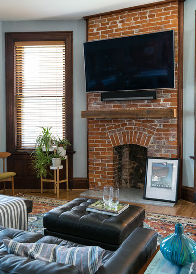
Living room. Because the living room is open to the kitchen, it was important that the two feel connected. One interesting part of the backstory really helped with this. The homeowners were set on revealing an original fireplace (seen here) they believed had been plastered over. Once Chapman and her team determined it was indeed there, they exposed it, did repairs to the brickwork and added a reclaimed-wood mantel and marble hearth. The exposed brick and the reclaimed wood play off the range wall and its shelves on the opposite side of the space.
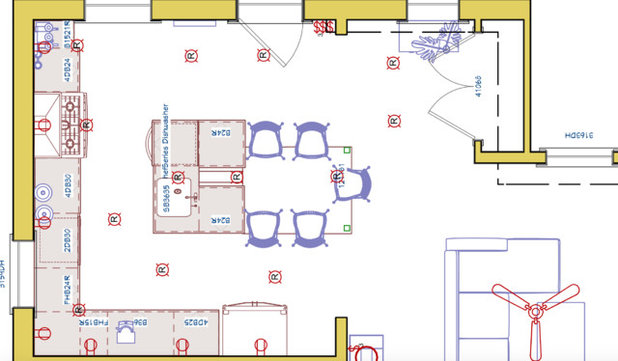
Floor plan. One element we don’t have a photo of is the new pantry, which is on the right side of this plan.
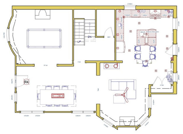
Floor plan. Here you can see that the access to the back hallway is easy enough through the dining room. Losing the entry from the kitchen gave the family the functional layout it needed.
Takeaways
More: See other Kitchens of the Week
Takeaways
- Listen to what your house and your heart are telling you rather than feeling like you have to follow trends.
- If you want your kitchen to feel more connected to a room it’s open to, replace a dividing peninsula with an island.
- You don’t have to place pendant lights over a peninsula or island if you want a clear view.
- Painting the island a different color from the rest of the cabinetry is a good way to add a big splash of color to a kitchen.
- Repeat elements in rooms that are open to each other to create connections. In this case it was the original brick, reclaimed wood and splashes of teal.
More: See other Kitchens of the Week

Related Stories

Houzz Tours
Houzz Tour: A Midcentury Home With a Strong Indoor-outdoor Link
By Becky Harris
A nature-inspired renovation has given this ranch house a relaxed mood and a connection to the outdoors from most rooms
Full Story
Kitchens
10 Smart Storage Tips for Your Kitchen Bins
Keep kitchen rubbish stylishly tucked away with these clever solutions
Full Story

More Rooms
The 5 Most Popular Laundry Rooms on Houzz Right Now
Get decorating ideas for your laundry or utility room from these most-saved photos on Houzz
Full Story
Gardens
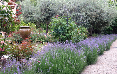
How Do I Create a Drought-tolerant Garden?
By Kate Burt
As summers heat up, plants that need less water are increasingly desirable. Luckily, there are lots of beautiful options
Full Story

Houzz Tours
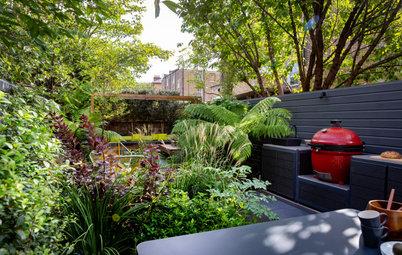
Houzz Tour: Warm Tones and Luxurious Surfaces in a City Townhouse
An earthy colour palette, hidden storage and well-placed texture add character and practicality to this London home
Full Story
Gardens
5 Inspiring Before and After Garden Transformations
Check out what a difference designers have made to these once dull plots, visually expanding spaces and creating privacy
Full Story

Houzz Tours
Kitchen Tour: A Gorgeous Extension With a Leafy Glasshouse Feel
By Kate Burt
When the owners of this terraced house extended, they were keen to retain its period feel and highlight the garden
Full Story

Gardens
How to Disguise Rubbish and Recycling Bins Outside Your Home
Need to hide unsightly bins in your garden or driveway? Take a look at these clever ideas for inspiration
Full Story
Renovating
21 Ways Designers Are Incorporating Arches Into Homes
By Kate Burt
Everywhere we look on Houzz right now, a cheeky arch pops up. How would you add this timeless architectural feature?
Full Story
Lifestyle
How to Improve the Air Quality in Your Home
Want to ensure your home environment is clean and healthy? Start by assessing the quality of your air
Full Story
An orange door? It's perfect!! This is such a fun kitchen.
LOVE THIS KITCHEN....historical eclectic and full of soul. And what a feat of archaology to uncover that beautiful fireplace. YAY!!
The best kitchen designs are those that make the owners feel great and have their unique take on what works for them on a personal level.