


How to Use Pantone’s Uplifting Colour of the Year 2021 Duo
Hello, yellow! Good day, grey! See how to use the two colours predicted to be both hot and cool in the coming year
Jennifer Ott
14 December 2020
San Francisco-based architectural color specialist and design writer. Jennifer's work has been featured in many print and online publications. Her recently-published book, "1000 Ideas for Color Schemes," is a beautifully illustrated and easy-to-navigate guide that takes the guesswork out of selecting the perfect color palette for your home or special event. For more information on Jennifer Ott Design, visit http://jenottdesign.com/.
San Francisco-based architectural color specialist and design writer. Jennifer's... More
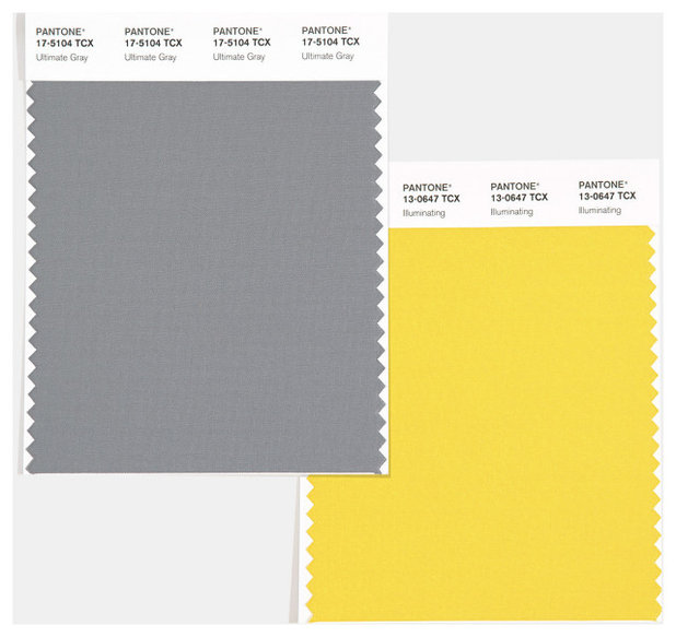
For only the second time since its first Colour of the Year announcement 20 years ago, the colour standards management company, Pantone Color Institute, has unveiled not one but two colours. ‘Illuminating’, a bright sunshine yellow, joins forces with neutral, grounding ‘Ultimate Grey’ as Pantone’s dual selections for Colour of the Year 2021.
Leatrice Eiseman, the institute’s executive director, says Pantone selected these colours to “highlight how different elements come together to express a message of strength and hopefulness that is both enduring and uplifting, conveying the idea that it’s not about one colour or one person, it’s about more than one”.
Leatrice Eiseman, the institute’s executive director, says Pantone selected these colours to “highlight how different elements come together to express a message of strength and hopefulness that is both enduring and uplifting, conveying the idea that it’s not about one colour or one person, it’s about more than one”.
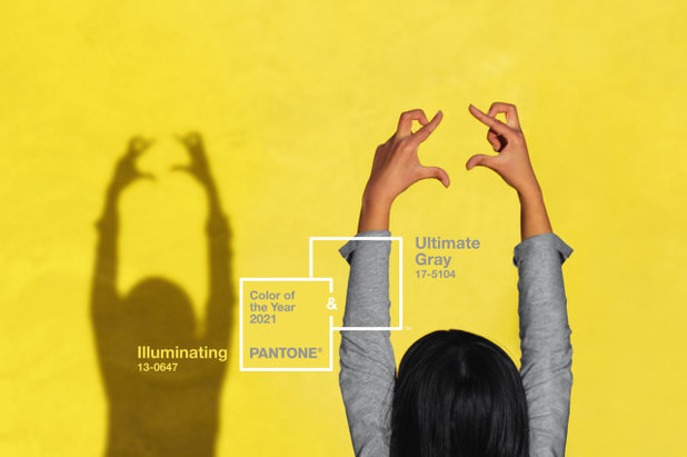
Eiseman adds that the combo is “practical and rock solid, but at the same time warming and optimistic – this is a colour combination that gives us resilience and hope. We need to feel encouraged and uplifted, this is essential to the human spirit.” Not a small ask for a pair of colours.
Pantone provides these colour trend forecasts for the various design industries, including interior design, fashion, beauty, packaging and multimedia graphic, so you can expect to see more of these hues in the coming year.
Pantone provides these colour trend forecasts for the various design industries, including interior design, fashion, beauty, packaging and multimedia graphic, so you can expect to see more of these hues in the coming year.
With regards to home décor, Pantone sees these two colours being used primarily in textiles and decorative accessories. They also mention my first thought when I saw ‘Illuminating’ – that it’s the perfect front door colour to pair with neutral ‘Ultimate Grey’ exterior finishes.
Here are more ideas and examples of how to bring this striking pairing into your home.
Here are more ideas and examples of how to bring this striking pairing into your home.
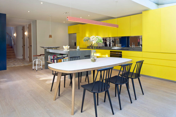
Furniture
It’s important to mention that we aren’t suggesting you should redecorate your home every year in the latest trendy colours. Rather, this is a good time to source items in these colours if you happen to be a big fan of them. Manufacturers of interiors items such as furniture will no doubt be introducing pieces in these colours. It will therefore be easier to find these hues in the coming year.
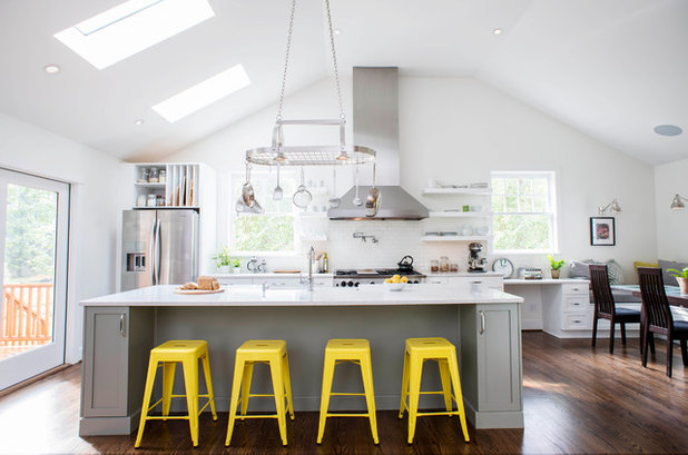
Furniture items such as bar stools and dining chairs are smart places to bring in a bold yellow hue. It’s a relatively small spot of colour and is easy to change in the future.
It’s important to mention that we aren’t suggesting you should redecorate your home every year in the latest trendy colours. Rather, this is a good time to source items in these colours if you happen to be a big fan of them. Manufacturers of interiors items such as furniture will no doubt be introducing pieces in these colours. It will therefore be easier to find these hues in the coming year.
Furniture items such as bar stools and dining chairs are smart places to bring in a bold yellow hue. It’s a relatively small spot of colour and is easy to change in the future.
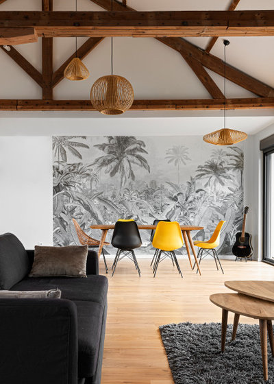
The dining space shown here, and the previous kitchen, include plenty of medium grey to serve as a neutral backdrop to the striking yellow.
Flooring
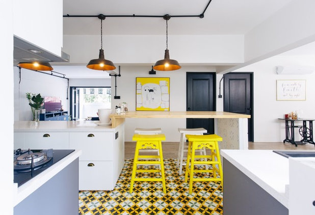
If you’re a big fan of bright yellow and want to make a statement with it in a more permanent way, check out your options in flooring. These beautiful, bold tiles are the focal point in this otherwise neutral kitchen palette of grey, black and white.
If you’re a big fan of bright yellow and want to make a statement with it in a more permanent way, check out your options in flooring. These beautiful, bold tiles are the focal point in this otherwise neutral kitchen palette of grey, black and white.
Kitchen cabinets
A yellow and grey kitchen can catch the eye and brim with energy and personality. The colour combination can work well in modern spaces, as shown here, as well as in more traditional spaces (see below).
A yellow and grey kitchen can catch the eye and brim with energy and personality. The colour combination can work well in modern spaces, as shown here, as well as in more traditional spaces (see below).
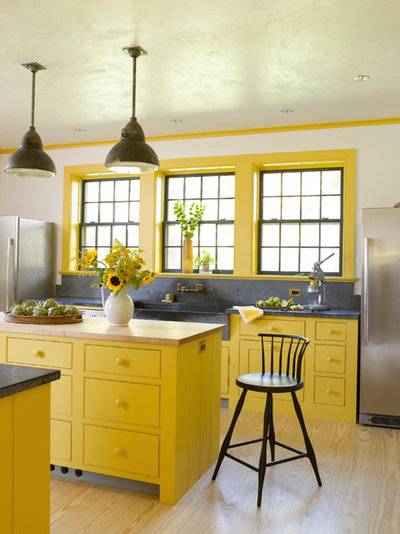
If you go all in with a vibrant yellow for your kitchen, be sure to bring in plenty of soft neutrals. Mid-grey hues offer a nice cool contrast, and crisp whites keep it bright.
This palette also plays nicely with most wood tones. A pale wood floor keeps both of these spaces light and lively as well as warm and welcoming.
This palette also plays nicely with most wood tones. A pale wood floor keeps both of these spaces light and lively as well as warm and welcoming.
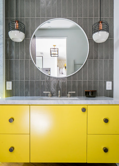
Bathroom cabinets
Of course, your kitchen shouldn’t get all the fun colour. In fact, I would argue that bathrooms are among the best spaces to inject lively colour, because they’re not spaces you’re spending hours upon hours in, unlike your bedroom, kitchen or living room.
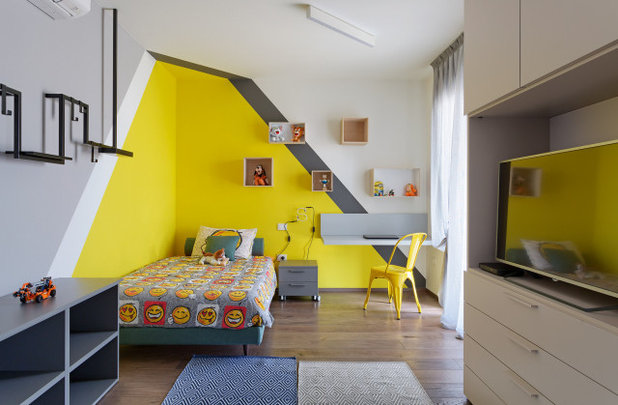
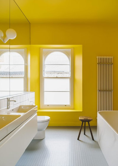
This yellow hue might not be the best choice for your bedroom if you’re seeking a soothing night’s sleep, but in the bathroom, it’s a fantastic punch of colour to help you wake up in the morning.
Of course, your kitchen shouldn’t get all the fun colour. In fact, I would argue that bathrooms are among the best spaces to inject lively colour, because they’re not spaces you’re spending hours upon hours in, unlike your bedroom, kitchen or living room.
This yellow hue might not be the best choice for your bedroom if you’re seeking a soothing night’s sleep, but in the bathroom, it’s a fantastic punch of colour to help you wake up in the morning.
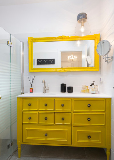
As with the kitchen examples, adding a healthy dose of a hue similar to Ultimate Grey in the form of wall or floor tiles helps ground the bold yellow hue. Tiles are also more difficult and expensive to change, so using a neutral for those items is a smart move.
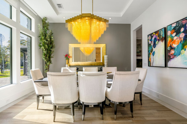
Lighting
Light up a room with this sunny hue via a sparkling yellow-hued light fixture. The grey wall here serves as the perfect backdrop to the beautiful pendant.
Light up a room with this sunny hue via a sparkling yellow-hued light fixture. The grey wall here serves as the perfect backdrop to the beautiful pendant.
Accent area
One of the easiest, most budget-friendly and impactful ways to bring colour into a room is through a painted accent area.
One of the easiest, most budget-friendly and impactful ways to bring colour into a room is through a painted accent area.
Because a bright yellow hue can be overwhelming in large doses, just a small splash of it, combined with grey, goes a long way and makes a strong visual statement.
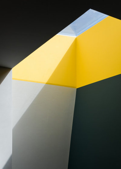
This skylight looks like a piece of abstract art with its yellow and grey colour-block paint job. I imagine that the splash of yellow also helps the sun shine into this London space even on an overcast day.
This skylight looks like a piece of abstract art with its yellow and grey colour-block paint job. I imagine that the splash of yellow also helps the sun shine into this London space even on an overcast day.
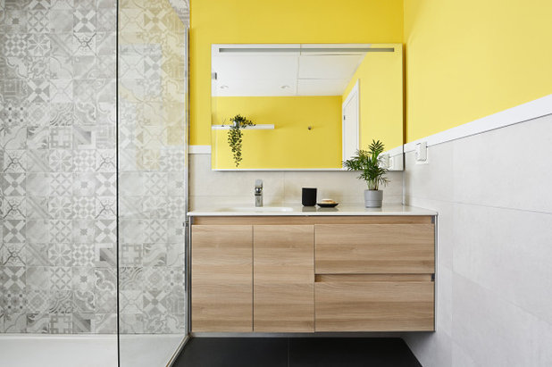
Speaking of bringing in some sunshine, if you have a light-deprived room in your house, think about adding a small bit of summery yellow to the upper wall. With a grounding dark grey on the floor and soft, textured grey on the shower wall, the splash of sunny yellow on the upper wall gives this bathroom a light-filled and spacious vibe.
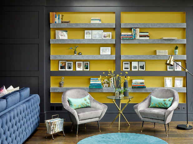
Because of its eye-catching qualities, yellow can help highlight spaces and items that are worth showing off. The back of this built-in bookcase is a fun spot in which to use an accent colour. Grey works as a contrasting base colour that allows the yellow to take centre stage.
Ready to refresh your home? Read reviews of painters and decorators in your area on Houzz.
Ready to refresh your home? Read reviews of painters and decorators in your area on Houzz.
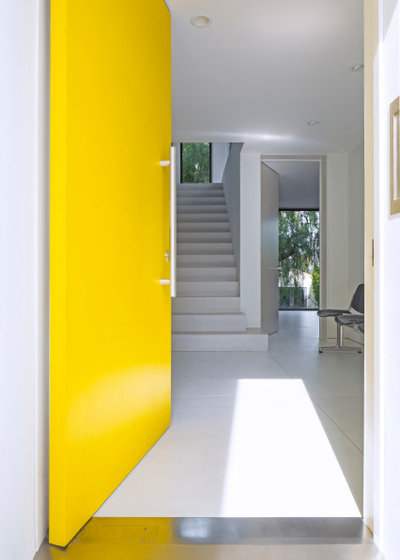
All of the wall
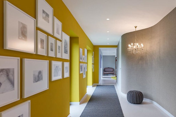
Here’s an example for the lovers of bold colour. Rather than a small accent, go big and paint an entire wall in the hue. This hallway demonstrates how well these two colours work together.
Similar to the bathroom example, hallways are an excellent place to play with bold colour, since they are pass-through areas of the home and not spaces we hang out in for long stretches of time.
Don’t neglect your ceiling when adding colour. This is a lot of yellow, but it works here because the space is so clean and minimal. It can handle the visual punch of so much strong colour because there’s no clutter competing for attention.
Textiles
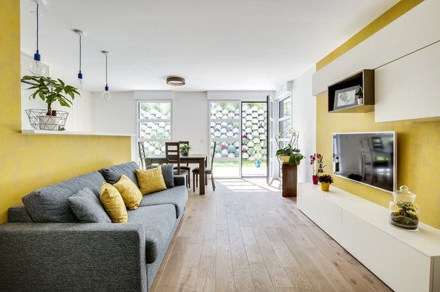
Pantone recommends bringing their Colours of the Year into the home via textiles. This is a great option for those who like to play with colour trends, but don’t want a huge commitment or hit to the purse. With a grey or similarly neutral hue for your sofa, you can go a little wild with a zesty yellow throw or decorative cushions.
Pantone recommends bringing their Colours of the Year into the home via textiles. This is a great option for those who like to play with colour trends, but don’t want a huge commitment or hit to the purse. With a grey or similarly neutral hue for your sofa, you can go a little wild with a zesty yellow throw or decorative cushions.
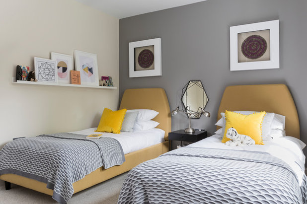
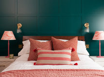
Now this is how I would recommend bringing a bold yellow into your bedroom: through small doses such as cushions. You could also add other bedding elements or a rug in the snappy hue. As long as soothing grey remains a prominent colour in the room, it will stay a serene space for sleep.
Another option for bringing in one or both Colours of the Year is through window treatments. Curtains allow you to show a little hint of colour (when they’re fully opened) or a large expanse of it (when fully closed). Window treatments can get expensive, but they’re fairly easy to change should you feel an itch to put up a new colour down the road.
Another option for bringing in one or both Colours of the Year is through window treatments. Curtains allow you to show a little hint of colour (when they’re fully opened) or a large expanse of it (when fully closed). Window treatments can get expensive, but they’re fairly easy to change should you feel an itch to put up a new colour down the road.
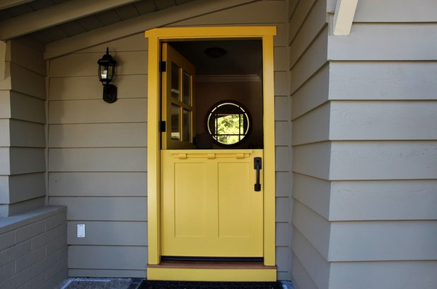
Front door
My favourite way to use a bold yellow with a medium grey is on the front door and exterior facade respectively.
Neutral grey-hued exterior materials will age well and allow you to bring in more exciting and interesting colours via your front door, landscaping or outdoor furnishings.
A happy hue such as yellow on the front door is warm and welcoming. Practically speaking, it’s a great spot to showcase a striking colour, because it’s typically applied with paint, making it relatively easy and affordable to change in the future. The grey facade gives you the flexibility of going with any other front door colour your heart desires in the future.
The message is pretty clear that this duo was chosen to convey a desire for balance and peaceful coexistence. Where ‘Ultimate Grey’ is grounding, inoffensive and reliable, ‘Illuminating’ yellow is bold, exciting, hopeful and optimistic. And perhaps what we do need most in 2021 is to feel reassured and resilient, but with abundant hope and optimism.
Tell us…
What do you think of Pantone’s choice for Colour of the Year 2021? Share your thoughts in the Comments.
Tell us…
What do you think of Pantone’s choice for Colour of the Year 2021? Share your thoughts in the Comments.


Related Stories

More Rooms
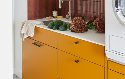
The 5 Most Popular Laundry Rooms on Houzz Right Now
Get decorating ideas for your laundry or utility room from these most-saved photos on Houzz
Full Story
Dining Rooms
The 5 Most Popular Dining Rooms on Houzz Right Now
By Kate Burt
Vintage furniture, great lighting and top tables – feast your eyes on dining room ideas collated from your own clicks
Full Story
Colour
8 Clever Ways to Use Strategic Colour Blocking in Your Home
By Kate Burt
Paint can do so much more than refresh your walls. Explore ways to highlight features, zone areas and trick the eye
Full Story
Utility Rooms
15 Richly Coloured Utility Rooms
The trend for strong, earthy tones has reached the utility room, with hues from plum to ochre to deep green adding depth
Full Story

Kitchens
Which Kitchen Worktop Colour Should You Choose?
By tidgboutique
Consider these popular colours and styles to get the look you want, no matter which material you use
Full Story
Colour
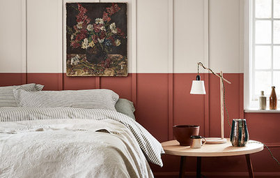
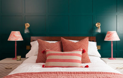
8 Ways to Work a Rust Red and Blue Palette in the Bedroom
By Kate Burt
We’re seeing variations of this combination all over Houzz right now. Check out these tips for trying it yourself
Full Story
Colour
Creative Ways to Make a Feature of Structural Beams
Turn your RSJ into something more than just functional with these clever ideas from our Houzz Tours
Full Story
Gardens
9 Ways to Enjoy Colour in Your Garden All Year Round
By Kate Burt
However your garden grows, you can add colour with hardscaping, furniture and accessories
Full Story
Gardens
What Will We Want in Our Gardens in 2024?
Discover the gardening trends homeowners will be bringing into their outdoor spaces this spring and summer
Full Story
Kitchens
What to Expect at the Biggest Kitchen, Bedroom and Bathroom Show
Plan ahead with our rundown of what’s in store at the kbb Birmingham event this March
Full Story
My dark cold mud room.
Great article.
Literally deciding on either a rasberry or a nice Yellow for three of our walls in our kitchen diner ,
which I know Are completely different but my choice and my husbands , maybe this has swayed me now to the yellow 🤔🙏😍