


How to Choose a Paint Colour You Can Live With
See 8 tips and tricks that can help you commit to a colour you’ll love
tidgboutique
16 November 2020
Toronto Interior Design Group is a trusted one-stop-shop residential interior design concierge boutique-style firm crafting timeless interiors.
Toronto Interior Design Group is a trusted one-stop-shop residential interior design... More
While many homeowners are attracted to bright colours, I often find my clients are most concerned with making sure the palette in their home feels “liveable”. After all, a colour you love in a stunning photo may not be a colour you’ll love to see on your walls every day. With that in mind, here are some tips for choosing a paint colour you’ll enjoy in real life.
Don’t buy paint on the spot
It’s important when you begin the process of selecting a paint colour to start with a wide palette of options.
When you go to a paint store, don’t worry about choosing the best possible colour while you’re in the shop. Your goal should be to arm yourself with a variety of options so you can make the best possible choice later. This usually means gathering more swatches than you think you’ll need – and even colours you don’t think you’ll want.
Choosing subtle colours, as opposed to bold and saturated hues, can be the trickiest, as the more subdued the tones in the paint, the harder they will be to see in a paint chip. For this reason, it’s wise to grab some paint chips that are similar to the colour you think you want, but a bit off. Grab the paint chip that appeals to you at first glance, but also take two swatches on either side of it for variety.
When you look at these paint chips again at home, you may find that one you didn’t think you liked is actually the right one for your scheme.
When you look at these paint chips again at home, you may find that one you didn’t think you liked is actually the right one for your scheme.
Bring your own swatch
When you go to the paint store, don’t go empty-handed. Bringing a piece of art or fabric as colour inspiration can be useful, but something even simpler can help you see colours correctly: a white sheet of paper.
In the store, a pale colour may look virtually white, but in your home it will probably contrast with some bright white elements, such as the ceiling, architrave or even something as simple as a light switch or lampshade, rendering the colour much more noticeable.
Bringing something pure white – and also pure black if you have it – will give you something to contrast against the paint swatches in the store to help you see the undertones more clearly.
For example, a “light” blue may seem lighter than the other blue shades on the same paint chip, but compared with a stark white, it might suddenly look a lot more saturated.
Find an interior designer or painter and decorator in your area to help you refresh your home.
For example, a “light” blue may seem lighter than the other blue shades on the same paint chip, but compared with a stark white, it might suddenly look a lot more saturated.
Find an interior designer or painter and decorator in your area to help you refresh your home.
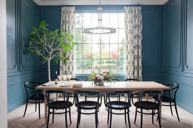
As mentioned, it can also help to use another design element of the room as colour inspiration. It’s usually recommended to choose colours that are a bit lighter or toned down from the true hues in the inspiration piece, lest they be too saturated for a full wall.
Try some space experiments
Once you’ve taken many paint swatches home, that’s when you can truly decide which colours will work. As you may know, colours can look quite different in your real-life lighting than in the bright fluorescent lighting of a store.
It’s also important to consider that colours will look different relative to other hues in the room, different positions (on a wall versus on the ceiling, for example) and at different times of the day.
Tape paint chips to the wall where they will be applied, and view them during the time of day you will be in the room the most (for example, in the morning or evening for your bedroom). Take your time to do this with individual colour swatches on their own, so each colour swatch isn’t visually competing with a rainbow of other options.
You might also like 8 Hallway Colours That Aren’t White or Grey.
You might also like 8 Hallway Colours That Aren’t White or Grey.
Go big and go home
Another huge factor that can change how you perceive a paint colour is the size of the swatch. No matter how carefully you look at it, a tiny paint store swatch will never fully show you what a colour will look like on a full wall. For this reason, designers will often apply a ‘paint strike’, a large stroke of paint, directly to the wall to see how it will look in real life.
Another huge factor that can change how you perceive a paint colour is the size of the swatch. No matter how carefully you look at it, a tiny paint store swatch will never fully show you what a colour will look like on a full wall. For this reason, designers will often apply a ‘paint strike’, a large stroke of paint, directly to the wall to see how it will look in real life.
This is an effective technique for helping to compare a shortlist of colours once you’ve narrowed down your selection. It can also help you to see how a single shade looks in different finishes if you’re debating between, say, eggshell and matt.
If you don’t want to have to live with messy walls for a while, you can also order large-format paint samples from many companies. It will cost you a few pounds for a small selection of swatches, but it can save you a lot of money in wasted paint if it means you don’t end up with the wrong colour.
Alternatively, you could paint A4 sheets of paper with a selection of colours using tester pots.
Alternatively, you could paint A4 sheets of paper with a selection of colours using tester pots.
Take your time
To some, painting a room, and then painting it again later to change the shade, isn’t a big deal. After all, paint is one of the easier elements of a space to change if you make a mistake.
For others, the effort and expense of repainting is a major pain. If this is you, it’s worth taking the time beforehand to really sit with a colour option before taking the plunge. The more time you take to sit with the choice, the less likely you are to get swept up in a passing fad or sudden impulse.
Do you love a colour right now because it’s a true favourite, or is it just a passing infatuation? Looking back at older saved photos will help you see what hues you’ve truly gravitated towards for the long haul.
If you think you’ve settled on a favourite shade, keep a copy of the paint chip with you as go about your life. When you find yourself in a friend’s home, a cosy restaurant or another inspiring space, hold the paint chip up to nearby surfaces to see if it seems lighter or darker, brighter or more muted than colours you’re drawn to.
If you think you’ve settled on a favourite shade, keep a copy of the paint chip with you as go about your life. When you find yourself in a friend’s home, a cosy restaurant or another inspiring space, hold the paint chip up to nearby surfaces to see if it seems lighter or darker, brighter or more muted than colours you’re drawn to.
Make a commitment
Once you’ve selected and purchased a paint colour, it’s time to commit. Paint will look quite different during the painting process, and it’s important not to judge the colour until it’s been applied properly in the necessary number of coats – at least two, but often three or more, depending on the product and shade.
Once you’ve selected and purchased a paint colour, it’s time to commit. Paint will look quite different during the painting process, and it’s important not to judge the colour until it’s been applied properly in the necessary number of coats – at least two, but often three or more, depending on the product and shade.
It’s wisest not to judge the colour at all until at least the next day, and to give yourself some time to adjust to the change in your space before jumping to any conclusions.
This is especially true with darker shades, which will visually shrink the space in a way you’ll need a little time to get used to.
This is especially true with darker shades, which will visually shrink the space in a way you’ll need a little time to get used to.
Get a second opinion
Still worried you won’t be able to live with your choice? Having a design professional come to your home for a colour consultation can give you a lot of insight, especially because they will typically come armed with paint-swatch decks in every colour, bringing the entire paint store to you.
Still worried you won’t be able to live with your choice? Having a design professional come to your home for a colour consultation can give you a lot of insight, especially because they will typically come armed with paint-swatch decks in every colour, bringing the entire paint store to you.
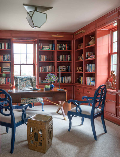
Another option is to choose a time-tested signature colour of one of your favourite designers. While a colour shown in a single photo may look different in real life, if you try a designer’s go-to hue, you can rest assured that this colour looks great in many spaces.
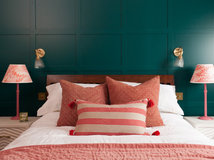
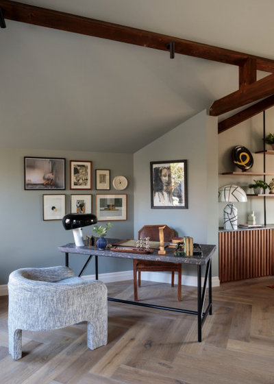
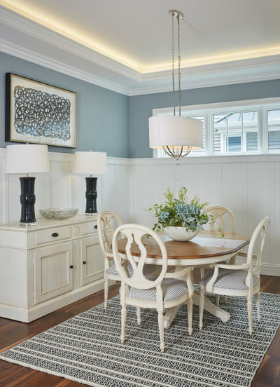
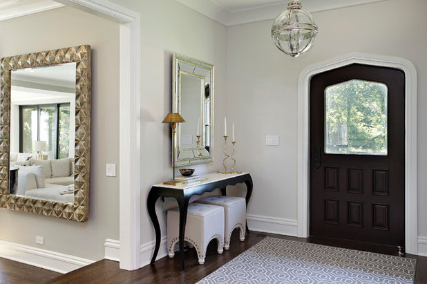
For example, I’ve used Benjamin Moore’s Classic Gray in a multitude of projects, because it’s sumptuous but subtle, and it always just works. It’s used here in a project by another designer.
For example, I’ve used Benjamin Moore’s Classic Gray in a multitude of projects, because it’s sumptuous but subtle, and it always just works. It’s used here in a project by another designer.
Don’t think about it
Any artist can tell you that the more you stare at something, the harder it becomes to truly see it. Sometimes the best thing you can do while trying to choose a colour is to take a break for several days and come back to your options with a fresh perspective.
When you come back, look at your selections and go with your gut. Ultimately, if you really love a colour – light, dark, soft or bright – it will feel liveable, so there’s no reason to choose any hue but the one that feels right to you.
Tell us…
Are you wondering which colours are right for your home? Will these tips help your decision? Share your thoughts in the Comments.


Related Stories

More Rooms
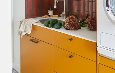
The 5 Most Popular Laundry Rooms on Houzz Right Now
Get decorating ideas for your laundry or utility room from these most-saved photos on Houzz
Full Story
Dining Rooms
The 5 Most Popular Dining Rooms on Houzz Right Now
By Kate Burt
Vintage furniture, great lighting and top tables – feast your eyes on dining room ideas collated from your own clicks
Full Story
Colour
8 Clever Ways to Use Strategic Colour Blocking in Your Home
By Kate Burt
Paint can do so much more than refresh your walls. Explore ways to highlight features, zone areas and trick the eye
Full Story
Utility Rooms
15 Richly Coloured Utility Rooms
The trend for strong, earthy tones has reached the utility room, with hues from plum to ochre to deep green adding depth
Full Story

Kitchens
Which Kitchen Worktop Colour Should You Choose?
By tidgboutique
Consider these popular colours and styles to get the look you want, no matter which material you use
Full Story
Colour
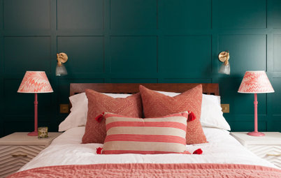
8 Ways to Work a Rust Red and Blue Palette in the Bedroom
By Kate Burt
We’re seeing variations of this combination all over Houzz right now. Check out these tips for trying it yourself
Full Story
Colour
Creative Ways to Make a Feature of Structural Beams
Turn your RSJ into something more than just functional with these clever ideas from our Houzz Tours
Full Story
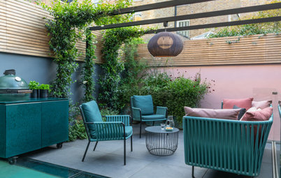
Gardens
9 Ways to Enjoy Colour in Your Garden All Year Round
By Kate Burt
However your garden grows, you can add colour with hardscaping, furniture and accessories
Full Story
Gardens
What Will We Want in Our Gardens in 2024?
Discover the gardening trends homeowners will be bringing into their outdoor spaces this spring and summer
Full Story
Kitchens
What to Expect at the Biggest Kitchen, Bedroom and Bathroom Show
Plan ahead with our rundown of what’s in store at the kbb Birmingham event this March
Full Story
A very useful article.
It's crucial to strike a balance between vibrant hues and ones that make your space feel comfortable and ""liveable."" One great tip is to get sample pots of colors you're considering and test them on your walls. Lighting and surroundings play a big role, so observing how the colors look in your specific space is key.
"It's crucial to strike a balance between vibrant hues and ones that make your space feel comfortable and ""liveable."" One great tip is to get sample pots of colors you're considering and test them on your walls. Lighting and surroundings play a big role, so observing how the colors look in your specific space is key."
Moreover, consider the mood you want each room to evoke. Soft neutrals or calming pastels often create a serene atmosphere, while pops of color in strategic areas can add character without overwhelming the space.
For expert advice and a wider array of color choices, paint shops are your go-to! These places are like color wonderlands, offering professional guidance and various color swatches to help you visualize your ideas. Plus, they often provide insights into trending colors and complementary palettes.