


Houzz Tour: Iconic Design Accents in a Contemporary Canadian Loft
Furniture classics from the 50s and 60s mix with cool concrete and white walls to create the perfect backdrop for entertaining in style
Mary Jo Bowling
9 March 2015
Houzz Contributor; writer, reader, serial remodeler.
Designer Stephane Chamard won this job when his client, a single physician with a penchant for entertaining, saw Stephane’s personal home on Houzz. ‘However, he didn’t want a home that looked anything like that project,’ the designer says. ‘He asked for the same sofa, but that is all.’ What the client did want was a minimally decorated place with a 1960s vibe where he could entertain his friends. Stephane obliged with an interior that just might appeal to a young Don Draper – if the Mad Men character lived in a Canadian loft.
Houzz at a Glance
Designer Stephane Chamard
Location Ontario, Canada
Size 1,600 square feet (149 square meters); 2 bedrooms, 1 bathroom
Stephane says that when his client purchased the loft home, which is in a former office building, it was a large, open concrete space, save for the bathroom. He designed walls that enclose two bedrooms. The private quarters are up front and run against one wall. The public spaces – the living room, dining room and kitchen – are at the back of the home in an open, window-lined space.
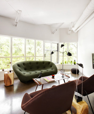
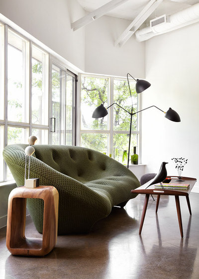
When possible, Stephane selected original vintage pieces to furnish the home. The sofa seen here is new, but the armchairs, lamps and coffee table were around at the time the mythical Draper was launching his ad agency career.
Stephane says he often chooses multiple lamps to light a space, because he prefers the moody look of lamplight and because they bring the illumination to a human level.
One request from the client: no carpet. ‘He loves to have people over for drinks,’ the designer says. ‘I think it is a maintenance issue. It’s much easier to wipe up a concrete floor than a carpet.’
Sofa, Roche Bobois. Armchairs, vintage Womb chairs by Eero Saarinen for Knoll.
Designer Stephane Chamard
Location Ontario, Canada
Size 1,600 square feet (149 square meters); 2 bedrooms, 1 bathroom
Stephane says that when his client purchased the loft home, which is in a former office building, it was a large, open concrete space, save for the bathroom. He designed walls that enclose two bedrooms. The private quarters are up front and run against one wall. The public spaces – the living room, dining room and kitchen – are at the back of the home in an open, window-lined space.
When possible, Stephane selected original vintage pieces to furnish the home. The sofa seen here is new, but the armchairs, lamps and coffee table were around at the time the mythical Draper was launching his ad agency career.
Stephane says he often chooses multiple lamps to light a space, because he prefers the moody look of lamplight and because they bring the illumination to a human level.
One request from the client: no carpet. ‘He loves to have people over for drinks,’ the designer says. ‘I think it is a maintenance issue. It’s much easier to wipe up a concrete floor than a carpet.’
Sofa, Roche Bobois. Armchairs, vintage Womb chairs by Eero Saarinen for Knoll.
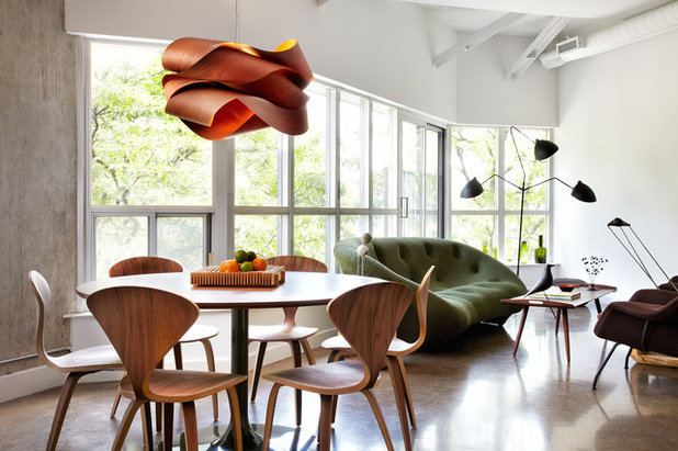
The lines of the sofa, dining room light fixtures and dining chairs illustrate Stephane’s philosophy of introducing curvaceous lines in an angular space to add interest. ‘Otherwise the space would be too square, too rectangular,’ he says. ‘This way it’s more sensual.’
Chairs, vintage Cherner. Table, vintage Knoll. Pendant light, LZF.
Discover more about the Cherner chair
Chairs, vintage Cherner. Table, vintage Knoll. Pendant light, LZF.
Discover more about the Cherner chair
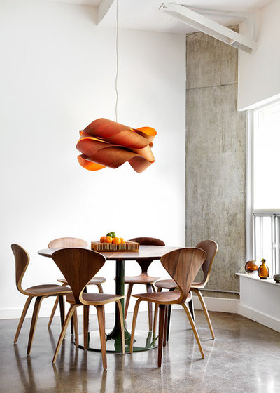
Stephane gave the vintage table a modern twist by having it painted a dark green.
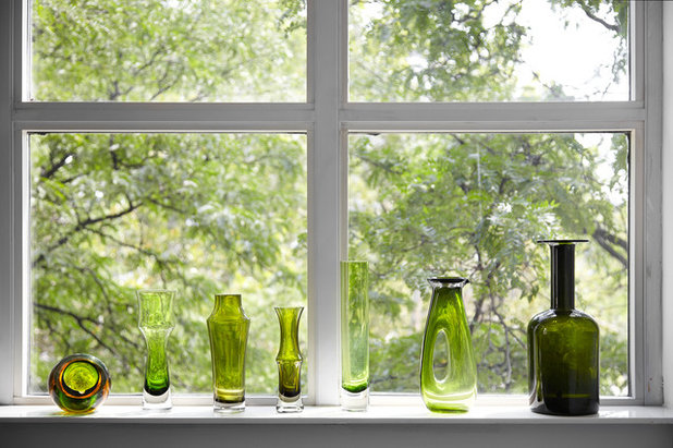
Stephane was influenced by the views of the leafy treetops outside the window. Drawing on that, he brought in shades of green and brown, which happened to be popular in the 1960s. These green vases were found around shops in Toronto.
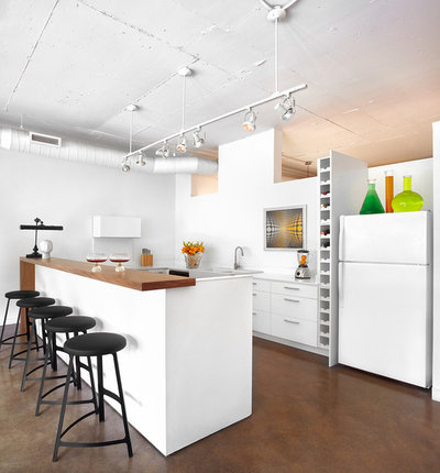
Perhaps no other single person in North America has such a long kitchen worktop. The reason is simple: ‘He likes to have four or five friends over for a glass of wine,’ says Stephane. ‘For him this is the best way to entertain.’
Here you can see that the bedroom walls don’t go to the ceiling. Because the client lives here by himself, he doesn’t have the privacy concerns of a family or someone who has a lot of overnight guests. The wall allows the spaces to share natural light.
Here you can see that the bedroom walls don’t go to the ceiling. Because the client lives here by himself, he doesn’t have the privacy concerns of a family or someone who has a lot of overnight guests. The wall allows the spaces to share natural light.
Stephane chose simple black stools that look sculptural against the white worktop.
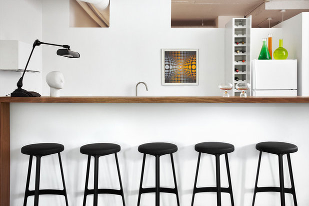
A vintage Victor Vasarely print – the artist who helped put grooviness into the Mad Men era – sets the design tone.
A vintage Victor Vasarely print – the artist who helped put grooviness into the Mad Men era – sets the design tone.
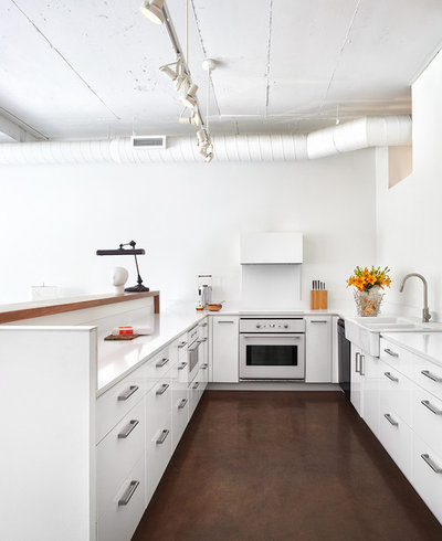
The Ikea kitchen makes a sleek statement. The desk lamp at the end of the worktop casts a small pool of light, which makes the space seem more intimate when just a couple of people visit.
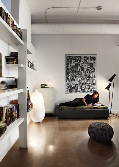
One of the bedrooms serves as a guest room and an office. For the daybed the designer chose a cashmere fabric for the base and a camouflage-print fabric (found at a local military supply shop) for the seat. ‘It’s a G.I. Joe thing,’ he says.
A collage of Bruce Weber’s fashion photography is a placeholder until the perfect piece of art can be found.
A collage of Bruce Weber’s fashion photography is a placeholder until the perfect piece of art can be found.
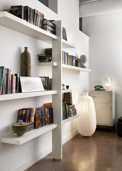
The shelving unit is an Ikea hack. Many people love the clean good looks of the company’s Lack shelf. But it’s difficult to display anything besides lightweight accessories on it due to its limited load-bearing capacity. Stephane solved the problem and made the Lacks bookworthy by installing a single vertical support and staggering the shelves off it.
Shelves, Lack from Ikea
Shelves, Lack from Ikea
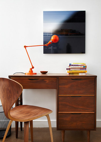
A vintage desk and chair are on the opposite wall. ‘Many old desks from this period are small, but you don’t always need a huge desk,’ Stephane says.
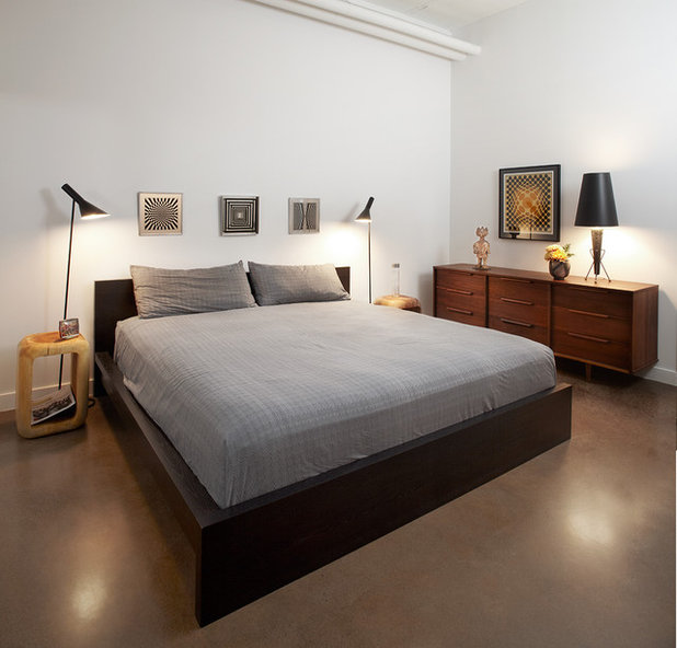
The client already owned this bed and wanted to keep it. The designer said he made it seem less bulky by adding mirrored art above it; tall, thin light fixtures beside it; and more Vasarely art over the vintage dresser. ‘By surrounding it with interesting items, you are distracted from how visually heavy it is,’ he says.
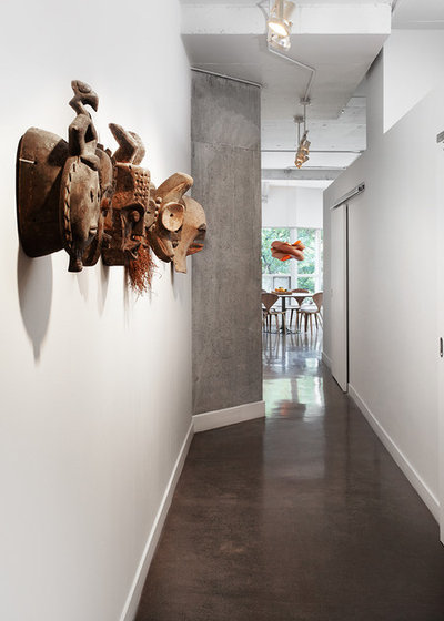
The hallway is a stretch of white walls and concrete (the bedrooms are to the right). Stephane decided the space needed contrast and texture, so he hung African masks.
Browse more polished concrete
Browse more polished concrete

The contrast between the white backdrop and the intricate carvings gives the wall an art gallery look.
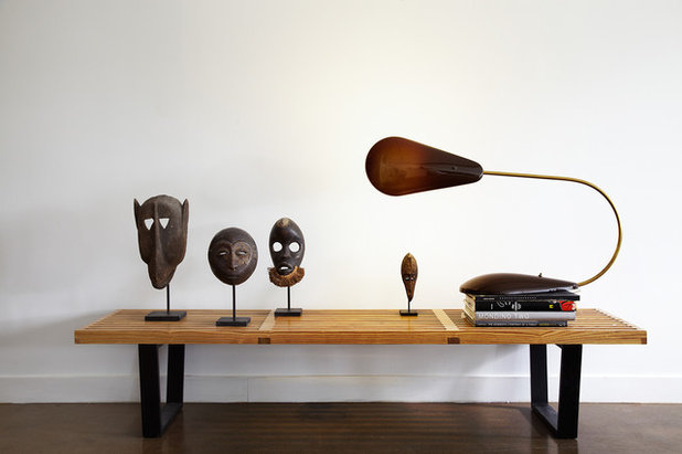
On the other side of the concrete pillar, a bench displays more masks and a Bakelite desk lamp. ‘Walking down this hallway at night is very dramatic,’ says Stephane. ‘The light on the masks makes them stand out and casts great shadows.’
Designing for a single person was a change of pace for the designer. ‘When you work for a couple, there is a certain amount of negotiation between them, which is necessary to create an interior shared by two people,’ he says. ‘In this case I had to please just one client. Every project has its challenges, but this one was fun.’
TELL US…
What do you like about this loft? Share your thoughts and ideas in the Comments below.
TELL US…
What do you like about this loft? Share your thoughts and ideas in the Comments below.


Related Stories

House Tours
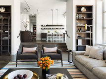
Houzz Tour: Warm Tones and Luxurious Surfaces in a City Townhouse
An earthy colour palette, hidden storage and well-placed texture add character and practicality to this London home
Full Story

Room Tours
Kitchen Tour: A Gorgeous Extension With a Leafy Glasshouse Feel
By Kate Burt
When the owners of this terraced house extended, they were keen to retain its period feel and highlight the garden
Full Story

Gardens
Garden Tour: A Bare Roof Terrace Becomes a Pretty, Sociable Space
By Kate Burt
A retired couple got help transforming their large rooftop into a gorgeous, welcoming, multi-functional retreat
Full Story

House Tours
Houzz Tour: A Smart Layout and Genius Storage in a Victorian Home
Flipping the standard layout and carving out excellent storage have turned this tired house into a brilliant family home
Full Story

House Tours
Houzz Tour: A Victorian House Brought Impressively Up to Date
By Jo Simmons
A cohesive layout and warm colours combined with energy-efficiency measures thoroughly modernise this terraced home
Full Story

Kitchen Tours
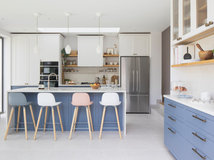
Kitchen Tour: An Open, Airy Space Made for Entertaining
Combining two separate rooms has improved flow and created a sociable open-plan kitchen, dining and seating space
Full Story

House Tours
Houzz Tour: A Family Home Inspired by its Seaside Location
Coastal colours and practical design combine to create a house that will adapt as the family grows
Full Story

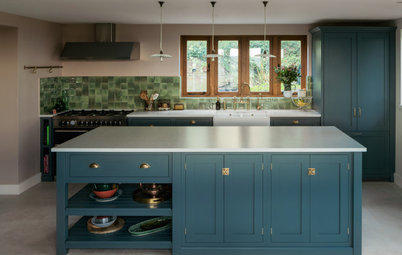
Kitchens
5 Inspiring Before and After Kitchen Transformations
Whether you want to boost storage, incorporate original features or maximise your space, take ideas from these designs
Full Story

House Tours
Houzz Tour: An Airy, Scandi Finish for a Tall Victorian House
By Kate Burt
From a tricky inherited bath to a sticky-out staircase, on-site problem-solving led to a seamless update for an old home
Full Story
House Tours
Houzz Tour: A 17th Century Cottage Gains Warmth and Character
The clever use of colour and pattern has revived this old building while creating a 21st century family home
Full Story
Simple and user friendly home.
Stunning. What excellent taste. The Cherner chairs had me at the start.