


Houzz Tour: A Scandi-inspired Redesign Upgrades a Family Home
Improved flow, a glazed side extension and a soothing colour palette have gently revitalised this Victorian house

Keen to update their much-loved period home, the owners of this property contacted Stephen Nash of All & Nxthing. Having bought the Victorian semi-detached home seven years ago, they were now more than ready to create the family-friendly space they desired.
“The couple had spotted our previous projects on Houzz and, after making initial contact, were thrilled to discover we had also worked on a friend’s home, too,” Stephen says.
Rethinking how the family used their living space was key and Stephen had numerous smart suggestions. The ground floor, as in many London houses, was long and thin, and the rear kitchen, although roomy, was very much a space for food preparation rather than somewhere the family could enjoy time together. Upstairs, the rooms needed a refresh and there was potential to rejig doorways, add more storage and tailor fittings to suit the family’s lifestyle.
A standard side-return extension was definitely not on the cards with this project. “My clients share a love of Danish and industrial design and it was partly this sense of pared-back honesty that drew them to some of our previous projects,” Stephen says.
“It was important to create a contemporary and practical space that also felt warm and welcoming, and that incorporated some of the beautiful natural wood found in the living room.”
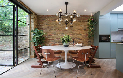
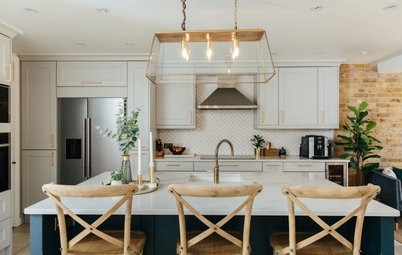
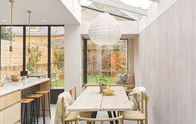
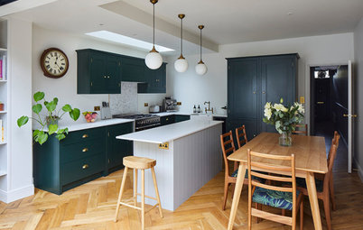
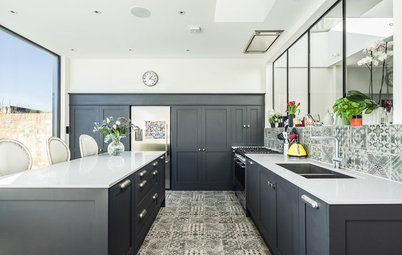
The team stripped the rear ground floor back to its supporting steel joists and added industrial-style French windows and a partially glazed roof. This instantly opened up the space and filled the dark kitchen area with natural light.
Covering the 8m-long side return with a single expanse of glass would have been prohibitively expensive, so Stephen designed a series of smaller panes interspersed with oak braces. These not only provide extra support, but cover the joins to create the sense of a seamless finish. The whitewashed brick wall adds a stunning, textural contrast.
“It was important to create a contemporary and practical space that also felt warm and welcoming, and that incorporated some of the beautiful natural wood found in the living room.”
The team stripped the rear ground floor back to its supporting steel joists and added industrial-style French windows and a partially glazed roof. This instantly opened up the space and filled the dark kitchen area with natural light.
Covering the 8m-long side return with a single expanse of glass would have been prohibitively expensive, so Stephen designed a series of smaller panes interspersed with oak braces. These not only provide extra support, but cover the joins to create the sense of a seamless finish. The whitewashed brick wall adds a stunning, textural contrast.
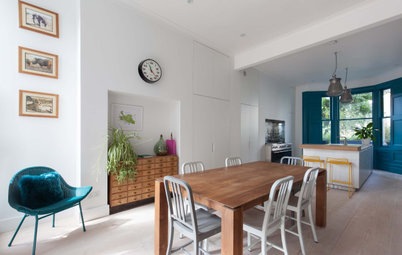
Deep blue bespoke kitchen units make a bold statement in the original part of the open-plan kitchen area. Stephen paid careful attention to the layering of texture to add depth to the industrial style in the room. For example, the terrazzo worktop features alongside fluted door fronts, tactile ceramic wall tiles and a traditional fluted farmhouse sink.
To give the seating area at the far end of the kitchen a cosy feel, Stephen added timber beams across the low ceiling.
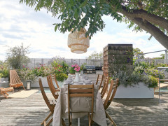
Matching floor levels and similar flooring materials create an almost seamless flow from indoors out.

Need a pro for your home renovation project?
Let Houzz find the best pros for you
Let Houzz find the best pros for you
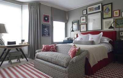
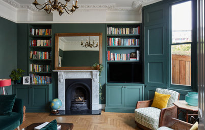
The main living room is positioned at the front the house and Stephen and the couple were keen to ensure it retained some of its period charm. “There’s a sense of responsibility when owning a period property,” he says, “and decisions on removing internal walls and period details, and altering the proportions of a space, have to be carefully thought through.”
After much deliberation, the team decided to remove the original coved ceiling, as part of it would have been disrupted anyway with the insertion of a new steel joist, but a sense of period charm was reinstated by adding ceiling mouldings. New wall panelling was also installed, creating an intimate and slightly formal edge to complement the original fireplace.
After much deliberation, the team decided to remove the original coved ceiling, as part of it would have been disrupted anyway with the insertion of a new steel joist, but a sense of period charm was reinstated by adding ceiling mouldings. New wall panelling was also installed, creating an intimate and slightly formal edge to complement the original fireplace.
The couple invested in a 30mm-thick solid oak parquet floor throughout the living room. “We retrofitted a wet underfloor heating system beneath the parquet to provide the family with a gently constant heat,” Stephen says.
A cast-iron radiator was also fitted (see previous image) to make a striking statement and is handy for boosting the room temperature when needed.
A cast-iron radiator was also fitted (see previous image) to make a striking statement and is handy for boosting the room temperature when needed.
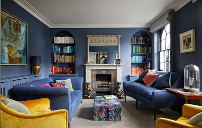
While eager to open up the living space, the couple also wanted to preserve the character of the home. So, while creating a sense of flow through the ground floor was important, they decided to go for a double-width doorway leading into the kitchen rather than removing the entire wall. This is practical while also helping to distinguish between old and new.
A new wood-burning stove was installed in the middle living area, creating a cosy reading spot. Fitted cupboards and shelving in the alcoves provide essential storage and an elegant display area.
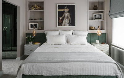
Upstairs, the main bedroom required a complete rethink to make the most of the space. Fitted wardrobes span both sides of the room, providing plenty of practical storage and helping to conceal everyday clutter.
The original tiled fireplace was a standout feature in the room and one everyone was keen to retain and highlight. Stephen expertly incorporated a graceful arch into the wardrobe design and topped the mantel with a curved antique mirror to add to the tranquil feel.
The original tiled fireplace was a standout feature in the room and one everyone was keen to retain and highlight. Stephen expertly incorporated a graceful arch into the wardrobe design and topped the mantel with a curved antique mirror to add to the tranquil feel.
Subtle panelling on the fitted cupboard doors softens the overall impact without proving too fussy or distracting. Stripped wooden floorboards and a neat Roman blind are simple touches that add to the calm mood.
“The double vanity unit made from solid oak has to be my favourite piece in the house,” Stephen says. Designed by All & Nxthing and made by local furniture-maker James Bowyer, it sits proudly in the family bathroom.
“The only original fitting left in this room is the window,” Stephen says. The decision to remove the only bath in the house and replace it with a generous walk-in shower was surprisingly easy for the family. Firm shower devotees, they knew it would help to free up floor space in the small room, which was further helped by moving the doorway, too.
“The only original fitting left in this room is the window,” Stephen says. The decision to remove the only bath in the house and replace it with a generous walk-in shower was surprisingly easy for the family. Firm shower devotees, they knew it would help to free up floor space in the small room, which was further helped by moving the doorway, too.
Simple elegance sums up the mood of the family bathroom. In keeping with the rest of the property, the décor features pale tones and simple materials that have been beautifully finished. The reeded glass shower screen is edged in brass to tie in with the high-quality fittings used elsewhere in the room.
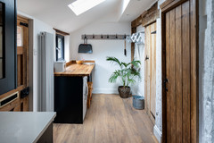
A downstairs bathroom was created as part of the ground-floor redesign and new kitchen extension. The concrete surfaces, a fluted concrete basin and solid brass fittings are a subtle nod to the pieces used elsewhere in the house.
Tell us…
What do you think of this redesign? Share your thoughts in the Comments.
Tell us…
What do you think of this redesign? Share your thoughts in the Comments.

Sponsored
Reload the page to not see this specific ad anymore
Who lives here? A couple and their two daughters, aged five and seven
Location London
Property A Victorian semi-detached house
Size Four bedrooms and two bathrooms
Designer Stephen Nash, All & Nxthing
Photos by Ben Waterhouse
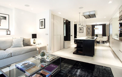
In order to create a multi-use space where they could relax, eat and socialise together, the couple’s instinct was to add a rear extension with a side courtyard, but Stephen felt extending to the side, too, was a more useful option.
“Incorporating the side return into the new kitchen area widens the narrow space and helps to balance the wider front reception rooms, creating a better sense of flow throughout the ground floor,” he says.
It also gives the space more potential, which was clearly shown when Stephen sent over a sketched plan complete with a kitchen island, dining table and TV area with a sofa. “I had a reply to that evening’s email at 9am the next morning saying, ‘Yes, that’s exactly what we want. Let’s go ahead!’” he says.