

Houzz Tour: A Riot of Colour With Retro Touches in a Small Flat
This petite apartment’s star attractions are its delicious colour palette and some daring designs

The owner of this apartment in Moscow was looking for a designer on Houzz and narrowed her search to professionals with colourful projects in their portfolios. The designer she eventually selected, Ekaterina Vladimirova, brought a riot of colour into this compact, four-room home.
However, the owners didn’t mind these shortcomings, as they were happy with the original layout. And they immediately fell in love with the fact that the apartment looks out onto trees, a rare perk in Russia’s most populous city.
Ready to find a professional to renovate your home? Look no further than the Houzz Professionals Directory, where you can see past projects and read client reviews for pros in your area.
Ready to find a professional to renovate your home? Look no further than the Houzz Professionals Directory, where you can see past projects and read client reviews for pros in your area.
The floorplan illustrates how all the rooms flow from a central hallway.
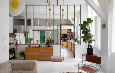
Bold design starts right at the entrance area, with an accent wall and a large custom mirror based on Ekaterina’s sketches. The owners and designer chose to hang it opposite the kitchen window to bring more natural light into the entrance. The rest of the walls and doors were painted white.
The tiles in the circle on the floor were sourced from a premium brand, but, to save money, the owners bought the beige background tiles from a budget range.
The tiles in the circle on the floor were sourced from a premium brand, but, to save money, the owners bought the beige background tiles from a budget range.
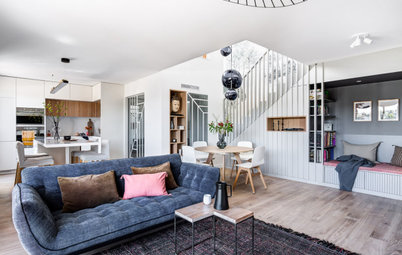
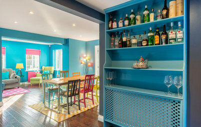
The designer divided the elongated living area into dining and TV zones. This division is underscored by the wall colours, with pale green closer to the window being replaced with a dark pine colour in the sofa area.
The round dining table, which was custom-made based on the designer’s sketches, can be significantly expanded to seat as many as 10 people. A vintage light fixture accentuates the dining set-up.
The round dining table, which was custom-made based on the designer’s sketches, can be significantly expanded to seat as many as 10 people. A vintage light fixture accentuates the dining set-up.
The owl sconces are another interesting detail in the dining area. They were supposed to be white, but the plaster was tinted a shade of flamingo. In a happy accident, they now match the sofa upholstery.
There are no knock-offs of western brands in this flat – only originals. In order to stay within budget, however, the designer and homeowners bought a lot of the furniture from local Russian manufacturers.
There are no knock-offs of western brands in this flat – only originals. In order to stay within budget, however, the designer and homeowners bought a lot of the furniture from local Russian manufacturers.
Here, they built an ethanol fireplace into the sideboard, which makes it possible to enjoy a real flame without a chimney. The central area was accented with a dark paint to make the flame stand out even more.
The owners were unsure as to whether they really needed a TV in the living room. Ekaterina had the wiring installed just in case, so the owners have the option. The connection points are currently hidden behind the painting.
The apartment has low ceilings, but the owners are tall. So the only suspended light fixtures are out of the way of high-traffic areas. Wall fixtures provide accent lighting instead.
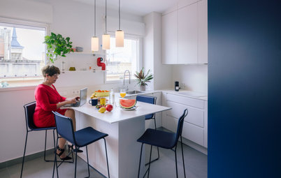
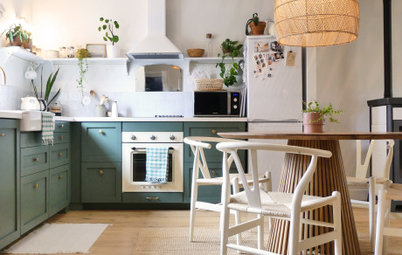
At the owner’s request, the main work area and sink in the kitchen were moved to the window – the brightest part of the room. The worktop is made of wood, as the owner emphasised that tactile sensations are very important to her.
To the left of the window is a niche with shelves for cookbooks, so they’re always on hand. The niche was outlined in colour, as was the boxing on the ceiling – they had to put in a bulkhead when they moved the extractor fan.
“The light fixtures in the kitchen came about thanks to Houzz. When she was planning the renovation, the owner saved glass workshop Delo Kontura’s profile. We selected glass in the correct colour palette and had fixtures made to order,” Ekaterina says.
The breakfast area is decorated by a backlit stained-glass window. “This feature was also requested by the owners: it adds interest to the otherwise restrained kitchen,” Ekaterina says. “The subject is not accidental: animals are a family theme and can be found throughout the flat. The wallpaper in the office, for example, has foxes on it.”
Stained-glass window, Vit-rage, the workshop of artist Svetlana Mikhaylova.
Stained-glass window, Vit-rage, the workshop of artist Svetlana Mikhaylova.
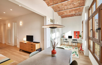
There used to be a narrow walk-in cupboard here, but it was removed to make room for a full office for the owner. The top of the walls were decorated with stylised fox wallpaper – this strip is the finishing touch of the decor in the room. This collection doesn’t come with borders, so the painters cut out strips of wallpaper and glued them on themselves.
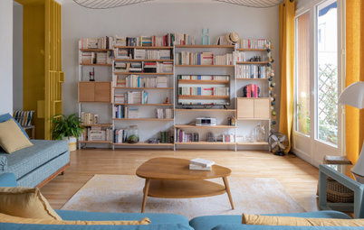
The wall-to-wall bookshelf is not only moveable, it also comes in two rows. This was the only way to accommodate the huge number of books the owners brought into the flat.
The wall-to-wall bookshelf is not only moveable, it also comes in two rows. This was the only way to accommodate the huge number of books the owners brought into the flat.
The owner is a screenwriter, so she asked for a large magnetic board to be inserted into the interior, where she could rearrange storylines. “I said, ‘Why a board when we could set an entire wall aside for this?’ We covered it in magnetic paint, then gave it a decorative finish,” Ekaterina says.
The previous owners had separated the enclosed balcony from the main space and put up tongue-and-groove wall panelling. The designer and homeowners saved and repainted this finish to make it look less like a sauna.
They divided the colours in blocks and used the same shades as in the rest of the flat for visual cohesion. For the finishing touch, they topped off the resulting reading nook with an unusual light fixture shaped like a squirrel.
They divided the colours in blocks and used the same shades as in the rest of the flat for visual cohesion. For the finishing touch, they topped off the resulting reading nook with an unusual light fixture shaped like a squirrel.
The focal point of the bedroom is the wall behind the bed. This was decorated with wallpaper in a floral pattern, with mirrors on either side to visually expand the space. To finish this room, the designer replaced the window frames: the owner wanted wooden ones.
Ekaterina also hung mural wallpaper in the owners’ teenage son’s room. On the whole, this room has a more restrained colour palette than the rest of the apartment.
The window is off-centre in the wall, so the bookcases were made to order in different widths.
The window is off-centre in the wall, so the bookcases were made to order in different widths.
The bathroom is very small, so the designer and homeowners decided to use white tiles as a backdrop, with decor to create interest.
As in the entrance, the decorative and background finishes are from brands at different price points – it made no sense to pay more for a basic white tiles for this project. The line of decorative tiles near the bottom illustrates the months of the year in order.
As in the entrance, the decorative and background finishes are from brands at different price points – it made no sense to pay more for a basic white tiles for this project. The line of decorative tiles near the bottom illustrates the months of the year in order.
Ekaterina was able to talk the owners out of combining the bathroom and toilet room into a single space. However, they still played around a bit with the shape of the toilet: it was one of the few permissible layout changes in the building. The added niche made it possible to introduce a small basin, turning this into a guest bathroom.
The Fornasetti wallpaper is covered with a protective acrylic varnish. Above the concealed-cistern toilet and wall-mounted flush button is a hatch that provides access to the plumbing. It was put in with a minimal gap and covered with the same wallpaper, rendering it invisible.
Tell us…
What’s your favourite room in this apartment? Share your thoughts in the Comments.

Sponsored
Reload the page to not see this specific ad anymore

Sponsored
Reload the page to not see this specific ad anymore
Who lives here? A family with a teenage son
Location Moscow, Russia
Size 89 sq m
Designer Ekaterina Vladimirova
Photos by Sergey Ananiev; styled by Julia Chebotar
The apartment is located in a prefabricated building constructed in the early 2000s as part of a test project for a building design that was then discontinued. This meant there were a number of structural challenges, from several load-bearing walls to low ceilings.