


Houzz Tour: A Revived Victorian House With a Showstopping Kitchen
Characterful features and thoughtful colour choices have turned this once-tired house into a warm family home
Cheryl F
24 June 2019
Houzz Contributor. I'm a London-based journalist with years of experience writing for the UK's top interiors titles. I love shopping for quirky accessories, have a passion for rummaging through vintage stores and I'm ever-hopeful of finding that elusive perfect paint shade.
Houzz Contributor. I'm a London-based journalist with years of experience writing... More
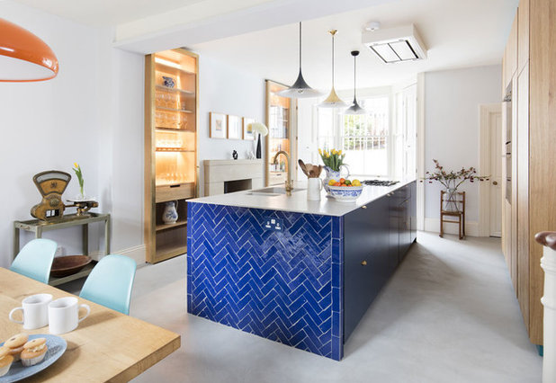
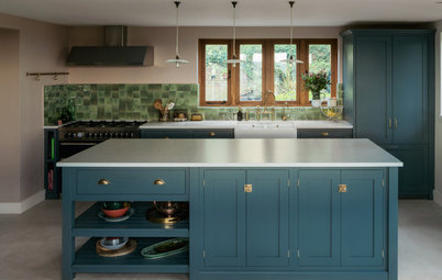
Large islands, offering additional storage and worktop space, are at the heart of many a kitchen, but the central unit in this period home is the main event in more ways than one. Glossy metro tiles at either end, arranged in a herringbone pattern, add a striking flash of cobalt blue for an uplifting feel on even the greyest of days.
“The owner wanted the antithesis of a glossy white kitchen,” says designer Mel Massey, who was brought in to revamp the whole of this four-storey Victorian terrace. “I see so many homes where I think, yes, that’s really beautiful, but what makes it stand out? The blue tiles soften the industrial elements in the room, and add a bit of life. Otherwise, it could just have looked too pristine.”
“The owner wanted the antithesis of a glossy white kitchen,” says designer Mel Massey, who was brought in to revamp the whole of this four-storey Victorian terrace. “I see so many homes where I think, yes, that’s really beautiful, but what makes it stand out? The blue tiles soften the industrial elements in the room, and add a bit of life. Otherwise, it could just have looked too pristine.”
House at a Glance
Who lives here? A single advertising professional with three teenage children
Location Stoke Newington, northwest London
Property A four-storey Victorian townhouse, including a basement containing the kitchen-diner
Size Four bedrooms and two bathrooms
Duration of the work Four months
Interior designer Mel Massey of Mel Massey
Photos by David Giles Photography
Mel’s brief was simple: to help the owner revamp his new home. The work was mainly cosmetic – “restoring the floorboards, painting walls and just adding that bit of magic” – but with a few major changes, including transforming an unloved basement into a cooking and entertaining space.
“The house was perfect for him [location-wise],” Mel says, “but it was very tired and not decorated in his style at all. My job was to turn it into a home.”
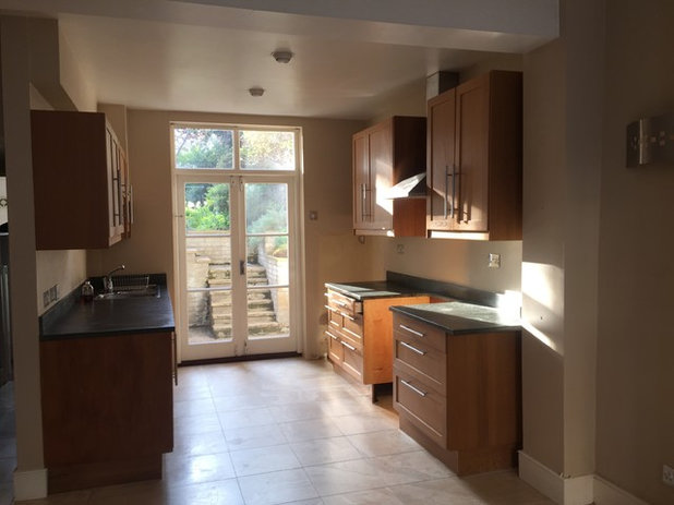
The gloomy basement kitchen was in a particularly poor state. “It was awful in here before – dull, depressing and dark,” Mel recalls.
“We completely reconfigured it. We took out a wall, which wasn’t structural, then took out the old kitchen cabinets, which were blocking the light and just didn’t fit the space,” she says.
“Suddenly, the light could flow from one end to the other – it was amazing. We also moved the kitchen from the back of the house to the front,” she adds.
The windows and doors were already in place. “We were really lucky we could work with what was there. They weren’t rotten or anything,” Mel says.
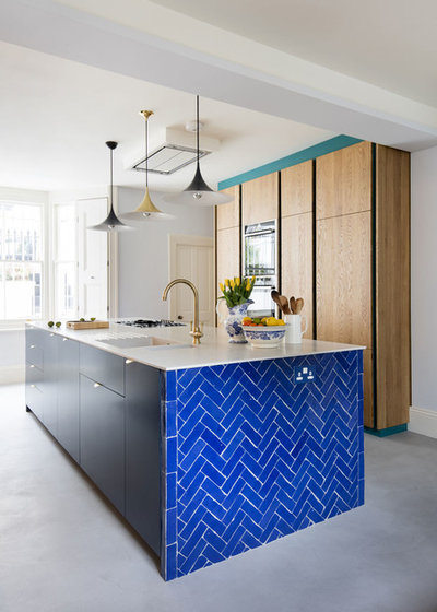
Apart from those striking cobalt blue tiles, perhaps the biggest change in here was the new floor, which instantly lifted the room.
“We wanted a hint of an industrial look,” Mel says. “Originally, we considered polished concrete, but it’s really expensive and takes ages to dry properly. We didn’t have the luxury of time, as the owner was renting somewhere, so we needed to find a cost-effective alternative.”
The solution was a concrete-effect topping called Pandomo. “We put down a subfloor, then underfloor heating, something over that and then the topping,” Mel explains. “It has concrete in it, but it’s not solid. It’s fast-drying, weathers well, is hard-wearing and looks amazing.”
Tiles, Bert & May. Island unit painted in Hague Blue, Farrow & Ball.
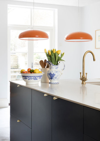
The worktop is crisp white Corian, while the tap has an aged-bronze finish for a heritage feel.
The orange pendants add another tone. “I think the orange goes really well with the blue and bronze tones,” Mel says.
Pangen pendant lights, FontanaArte.
The orange pendants add another tone. “I think the orange goes really well with the blue and bronze tones,” Mel says.
Pangen pendant lights, FontanaArte.
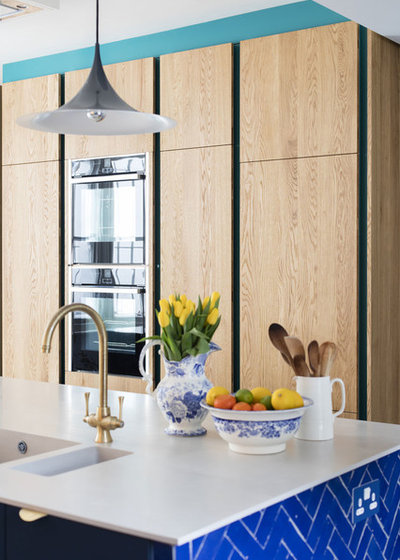
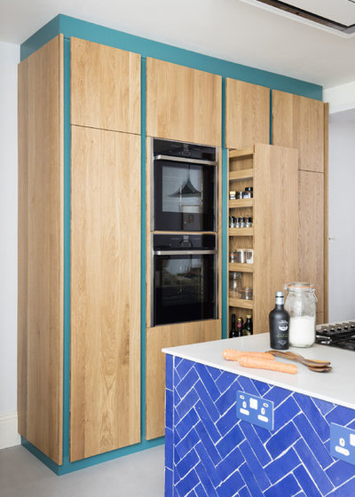
The owner wanted to max his storage space, so the tall, oak-fronted cabinets were made bespoke
“He was also really keen to have a double oven, because he cooks quite big meals with his family,” Mel says.
Kitchen units, Ashley Smith Furniture. Brass and grey pendant lights, Gubi.
“He was also really keen to have a double oven, because he cooks quite big meals with his family,” Mel says.
Kitchen units, Ashley Smith Furniture. Brass and grey pendant lights, Gubi.
The front of the house, where the kitchen now is, before the renovation.
Find the right people to help with your renovation in the Houzz Professionals Directory.
Find the right people to help with your renovation in the Houzz Professionals Directory.
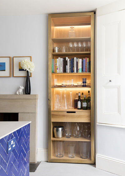
Two slim, bespoke oak and glass wall cabinets now fill the alcoves without jutting out too far into the room. “They make use of the dead space in the fireside alcoves and give much-needed storage space for the owner’s glassware collection,” Mel says.
White walls keep things simple, light and uplifting. “We wanted white, but not a bright, cold, stark one,” Mel says. “Because of the industrial look, we had to have a hint of grey.”
Walls painted in Celestial White, Little Greene. Alcove cabinets, Ashley Smith Furniture.
White walls keep things simple, light and uplifting. “We wanted white, but not a bright, cold, stark one,” Mel says. “Because of the industrial look, we had to have a hint of grey.”
Walls painted in Celestial White, Little Greene. Alcove cabinets, Ashley Smith Furniture.
Mel has painted the frame of the cabinets in a rich blue-green for an extra design details.
In this picture, you can see the beautiful oak detailing inside the cabinets on the pull-out rack.
Cupboard frame painted in Canton, Little Greene.
In this picture, you can see the beautiful oak detailing inside the cabinets on the pull-out rack.
Cupboard frame painted in Canton, Little Greene.
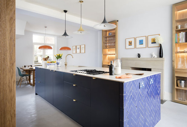
The island is definitely on the big side – for a very good reason. “We wanted the island to have plenty of space, as the worktop is literally all in the middle in this kitchen – there’s nothing around the sides,” Mel says. “We needed it to be as wide as possible, too, as the sink, hob are dishwasher are all in there.”
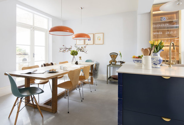
A relaxed, inviting dining area sits by the French windows. The oak trestle table and classic midcentury chairs were previous possessions that the owner brought with him to this house. “I don’t think we would have put anything too slick in here, as it would have looked contrived,” Mel says.
Eiffel chairs by Charles and Ray Eames; Series 7 chairs by Arne Jacobsen, both available at Heal’s.
Eiffel chairs by Charles and Ray Eames; Series 7 chairs by Arne Jacobsen, both available at Heal’s.
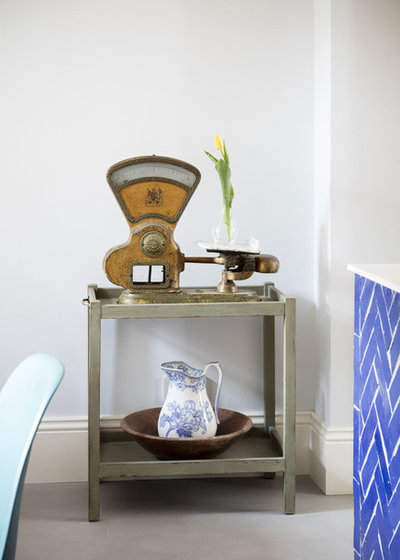
What’s inspiring about this room is how it combines different elements to create one special whole. “I think mixing up modern and vintage really makes a room,” Mel says.
The owner already had the vintage scales and trolley (flea market finds), but they fitted in perfectly. “He isn’t a minimalist, but he doesn’t want a lot of clutter, either,” Mel says.
The owner already had the vintage scales and trolley (flea market finds), but they fitted in perfectly. “He isn’t a minimalist, but he doesn’t want a lot of clutter, either,” Mel says.
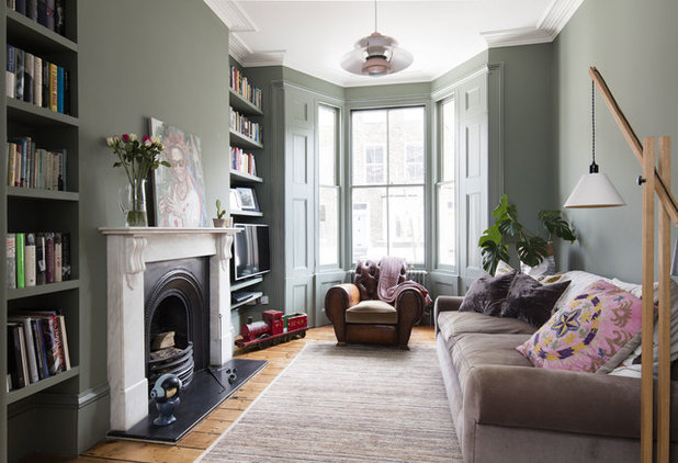
“I walked into this room and thought ‘those windows are amazing’,” Mel says of the elegant, knocked-through living room on the upper ground floor.
“We wanted to create a gentleman’s club vibe in here,” she explains. “The owner definitely didn’t want a bachelor pad vibe, too cold or masculine.”
The walls are painted in an earthy grey-green. “It’s such a gorgeous colour,” Mel says. “Painting the shutters and the woodwork in the same shade is what makes it. Because there are such big windows, and it’s an open-plan space, you can get away with it.”
Walls and woodwork painted in Card Room Green, Farrow & Ball. Sofa, chair and rug, existing possessions.
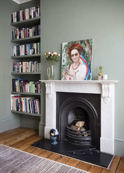
The owner is a bookworm, with an overflowing collection to match, so Mel filled the alcoves with shelves. “We built four sets to house his collection, making some larger to fit the bigger books.”
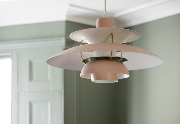
A sculptural light adds a classic midcentury touch; the rose-blush tones work beautifully against the grey-green walls.
PH5 pendant light by Poul Henningsen for Louis Poulsen, available at The Conran Shop.
PH5 pendant light by Poul Henningsen for Louis Poulsen, available at The Conran Shop.
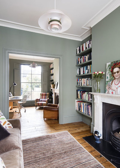
The floorboards throughout the broken-plan reception room have been sanded to refresh them.
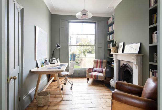
The back of the reception room has been turned into a home office. “This area is a study-cum-library for the owner,” Mel says. “He does quite a lot of work from home.”
Chair and desk, existing possessions.
Chair and desk, existing possessions.
The master bedroom was in need of a refresh.
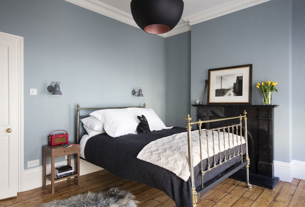
The cool grey tones have given the room a sophisticated feel.
“We ripped out the alcove cupboards in here and sanded the floorboards,” Mel says.
Again, period features such as the coving and fireplace add that extra-special something. “There are some lovely period features in this house,” she says.
Walls painted in Spruce 690, Paint & Paper Library. Here Comes The Sun Pendant, DCW Editions.
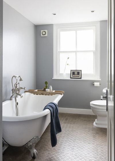
The bathroom has a similarly cool feel thanks to a grey and white colour palette.
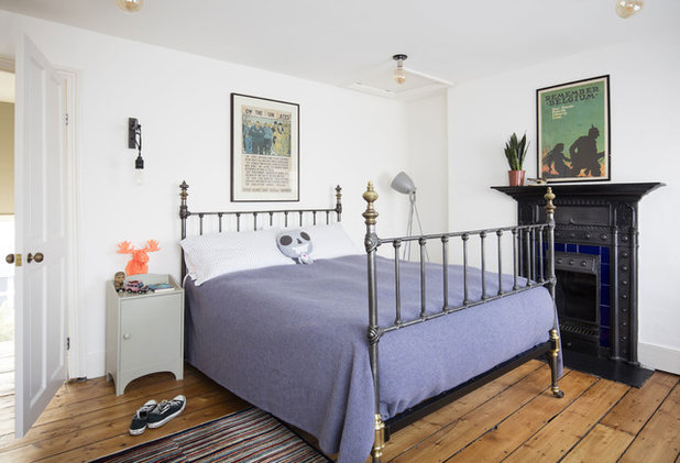
One of the children’s bedrooms is another example of elegant period simplicity, with sanded boards, an original fireplace and cool grey and blue tones.
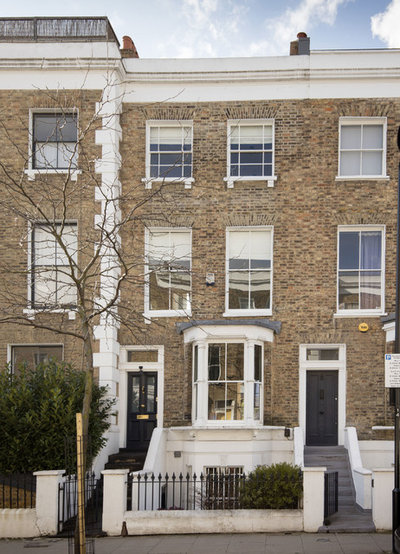
The exterior of the property.
Tell us…
What do you think of this refreshed Victorian home? Share your thoughts in the Comments section.
Tell us…
What do you think of this refreshed Victorian home? Share your thoughts in the Comments section.


Related Stories

House Tours
Houzz Tour: Warm Tones and Luxurious Surfaces in a City Townhouse
An earthy colour palette, hidden storage and well-placed texture add character and practicality to this London home
Full Story

Room Tours
Kitchen Tour: A Gorgeous Extension With a Leafy Glasshouse Feel
By Kate Burt
When the owners of this terraced house extended, they were keen to retain its period feel and highlight the garden
Full Story

Gardens
Garden Tour: A Bare Roof Terrace Becomes a Pretty, Sociable Space
By Kate Burt
A retired couple got help transforming their large rooftop into a gorgeous, welcoming, multi-functional retreat
Full Story

House Tours
Houzz Tour: A Smart Layout and Genius Storage in a Victorian Home
Flipping the standard layout and carving out excellent storage have turned this tired house into a brilliant family home
Full Story

House Tours
Houzz Tour: A Victorian House Brought Impressively Up to Date
By Jo Simmons
A cohesive layout and warm colours combined with energy-efficiency measures thoroughly modernise this terraced home
Full Story

Kitchen Tours
Kitchen Tour: An Open, Airy Space Made for Entertaining
Combining two separate rooms has improved flow and created a sociable open-plan kitchen, dining and seating space
Full Story

House Tours
Houzz Tour: A Family Home Inspired by its Seaside Location
Coastal colours and practical design combine to create a house that will adapt as the family grows
Full Story

Kitchens
5 Inspiring Before and After Kitchen Transformations
Whether you want to boost storage, incorporate original features or maximise your space, take ideas from these designs
Full Story

House Tours
Houzz Tour: An Airy, Scandi Finish for a Tall Victorian House
By Kate Burt
From a tricky inherited bath to a sticky-out staircase, on-site problem-solving led to a seamless update for an old home
Full Story
House Tours
Houzz Tour: A 17th Century Cottage Gains Warmth and Character
The clever use of colour and pattern has revived this old building while creating a 21st century family home
Full Story
cassandra, I haven't lived in the UK since the early 80s, but French TV is only marginally better than Italian, basically adverts interrupted by 'comedy', 'reality' & 'shock horror journalism', and ancient US soap operas/cop series. Political discussions are white men shouting over each other. No natural history, documentaries, not even gardening. The BBC has its problems, but at least there is Channel 4!
Gosh, what I'm missing out on, Deborah! Apart from the sinister fact that some (many?) TV's can now eavesdrop on your conversations and feed them back to Big Brother... and yes, this is true. It's in the small print; even made the media... I believe there are E.M.frequencies being emitted from the screens to make people addicted. This is a whole subject that one could discuss were this not Houzz and a kitchen reno post!
Love the space but not mad on the kitchen, not a fan of the random mixed materials/styles and I’m not sure about the crude tiling on the island end? To me the texture and shade are a complete miss with the rest of the room.