


Houzz Tour: A New Layout Maximises a Home’s Stunning Views
The secret to this beautiful design? Incorporating the home’s breezy surroundings and gorgeous sightlines
Agnès Carpentier
8 October 2021
With its white villas, bougainvillea and pine-planted valleys overlooking the Mediterranean sea, the La Corniche Boulevard in Marseilles, France, is a dream location. It was on one of the slopes of the Bompard neighbourhood that, in 2018, this family of four – a couple in their forties with two teenagers – stumbled on a great find on a classifieds site.
Already residing in the neighbourhood and on the lookout for a larger space, they jumped at the chance to buy this two-storey, 1930s building, which the previous owners had recently renovated. They knew right away that its location near Valmer Park was their dream spot, but the renovation was not to their taste and they planned a complete revamp. They knew the perfect professional to take it on: interior designer Chrystel Laport, who had just bought their previous home.
Already residing in the neighbourhood and on the lookout for a larger space, they jumped at the chance to buy this two-storey, 1930s building, which the previous owners had recently renovated. They knew right away that its location near Valmer Park was their dream spot, but the renovation was not to their taste and they planned a complete revamp. They knew the perfect professional to take it on: interior designer Chrystel Laport, who had just bought their previous home.
House at a Glance
Who lives here? A family with two teenagers
Location Marseilles, France
Size Three bedrooms and three bathrooms; 200 sq m
Date completed December 2018
Interior designer Chrystel Laporte of Un jour d’avril
Landscape architect Élodie Wehrlen of Côté Outdoor
Budget €200,000 (around £172,850)
Photos by Gabrielle Voinot
Before Photo
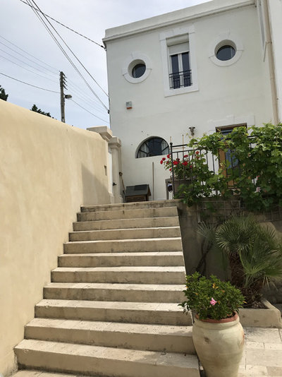
As you can see in this photo from before the renovation, the house was disconnected from its garden. Built on a steep slope, the outside space could be accessed through a little terrace perched atop a dozen travertine steps. The stairs seemed out of proportion, and the terrace was too small to have breakfast on. The owners were keenly aware of the paradox of a home with a garden they couldn’t enjoy.
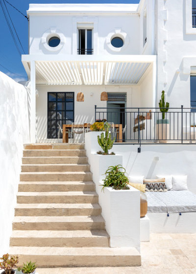
Chrystel agreed. She says the running theme of her work was “opening this home to the outside and recreating the living areas to make the best use of them”.
Since the terrace was the only place where they could easily eat outdoors, she reimagined it to make it more than just a dreary passageway. She put in a shady pergola, which echoes the graphic lines of the staircase. She also inserted a wide window with a low ledge, which looks out from the office.
The black railings foreshadow the plan for the window frames, most of which were left as they are for budgetary reasons, but will be replaced at some point in the future.
Love this renovation? Find a local interior designer who can help transform your home.
Inside the home, the air conditioning, electricity, plumbing, heating and windows had already been renovated, which worked out well for the new owners, who hoped to limit the cost of their renovation.
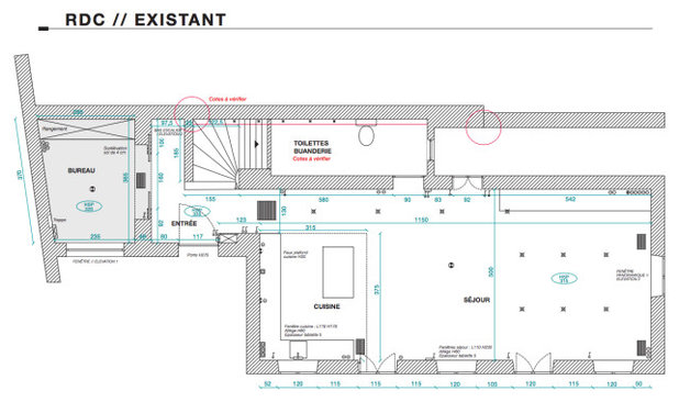
However, the couple didn’t like the layout of the home, seen in this original floorplan: they weren’t fans of its cordoned-off entrance hall or the long living room, and were unimpressed that the door of the toilet opened into the dining room. As for the décor, which had been put together with a large dose of plasterboard and tile, they thought it lost the home’s soul.
However, the couple didn’t like the layout of the home, seen in this original floorplan: they weren’t fans of its cordoned-off entrance hall or the long living room, and were unimpressed that the door of the toilet opened into the dining room. As for the décor, which had been put together with a large dose of plasterboard and tile, they thought it lost the home’s soul.
Wanting more quality in materials and layout, they gave Chrystel carte blanche to bring out the charm of this family home.
Before Photo
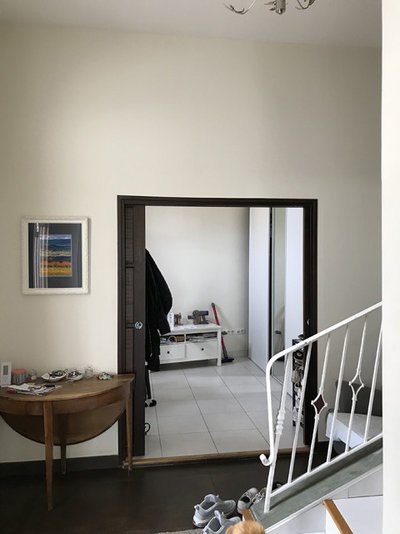
The entrance was previously cramped, jammed up against the staircase to the first floor. It was oppressive, and did not reflect the roominess of the grand home.
Chrystel was very attentive to the the owners’ desires right from the first visit, and collected inspirational photos that reflected their wishes. “These moodboards help me tailor the feel of the rooms throughout the project,” she says.
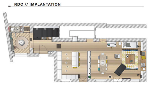
“I also paid attention to the home and looked at its plan in 2D. I always worked from the existing space and examined its lines of sight to create a surprise,” she says. As a former graphic artist, she’s always attuned to the best framing. So, for example, the staircase was modified so it would not open out facing the entrance.
“I also paid attention to the home and looked at its plan in 2D. I always worked from the existing space and examined its lines of sight to create a surprise,” she says. As a former graphic artist, she’s always attuned to the best framing. So, for example, the staircase was modified so it would not open out facing the entrance.
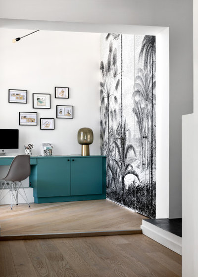
The office space to the left of the entrance retained its function, but Chrystel redecorated it for a warmer feel. The tiles, which had covered a heated floor, were replaced with wide boards in engineered oak. A custom-made desk matches a wall covered in a black-and-white panoramic wallpaper with a tropical print. The latter conceals an invisible door that leads to the cloakroom in its new location.
Before Photo
Before, the very long living room had a surprising layout. The sofa had been placed with its back to the window, facing the kitchen. “It was as though the home had been turned in on itself,” Chrystel says.
To make up for the cramped entrance, she sought to capture the gaze of anyone entering and draw it towards the back of the room.
To make up for the cramped entrance, she sought to capture the gaze of anyone entering and draw it towards the back of the room.
Chrystel had no doubt that she had to reorientate the room towards the home’s extraordinary views. “One could say this home has crazy views,” she says. “Just imagine: from the window, you can see all the way to the Sainte-Baume mountain range, and a bit to the right, the sea and the beginning of the Calanques!”
Before Photo
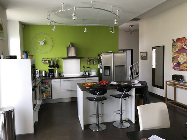
The kitchen had been recently redone, but the owners wanted more relaxing surroundings than its combination of lime green, chocolate and stainless-steel.
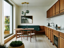
The kitchen had initially been set up so that one cooked facing the green wall, but Chrystel turned it back around towards the windows. She turned the work surface and sink towards the sea through the south-facing window.
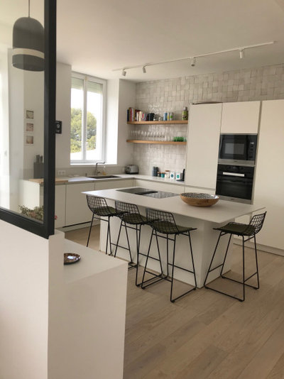
The cooking area on the island is equipped with a large induction hob with a hood, and overlooks the living room and its east-facing window through a glass divider.
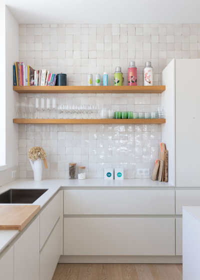
Chrystel designed the kitchen around cupboards from Leicht. The worktop is a compact laminate that matches the cupboards.
The cooking area on the island is equipped with a large induction hob with a hood, and overlooks the living room and its east-facing window through a glass divider.
Chrystel designed the kitchen around cupboards from Leicht. The worktop is a compact laminate that matches the cupboards.
“This house is on a hill and very bright, but it didn’t take on the very particular light of Marseilles. We rethought it to be a white box facing the sea, which would integrate it into its neighbourhood,” Chrystel says.
The feel in the kitchen is soft and minimal, contrasted by the high black metal stools and some of the appliances. This contemporary décor might have felt clinical, but it’s warmed by touches of wood and zellige tiles in the splashback. The hand-made Moroccan zelliges are also a reference to the Mediterranean culture that inundates the city.
The feel in the kitchen is soft and minimal, contrasted by the high black metal stools and some of the appliances. This contemporary décor might have felt clinical, but it’s warmed by touches of wood and zellige tiles in the splashback. The hand-made Moroccan zelliges are also a reference to the Mediterranean culture that inundates the city.
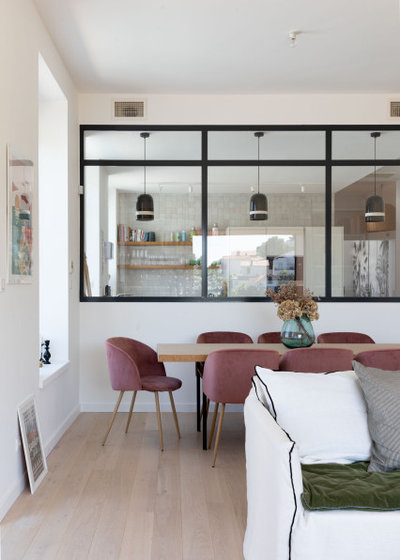
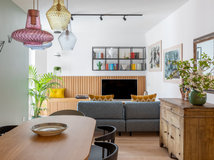
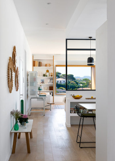
A glass and black steel divider hides the kitchen so it can no longer be seen from the living room. Just in front, the dining table – surrounded by its comfortable dusty pink chairs – creates a transition to the living room.
Note that the door to what had previously been the washroom is now located opposite the glass divider. The little room was converted into a laundry and storeroom.
Note that the door to what had previously been the washroom is now located opposite the glass divider. The little room was converted into a laundry and storeroom.
Before Photo
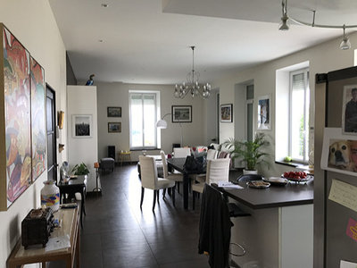
The kitchen and living area before the renovation.
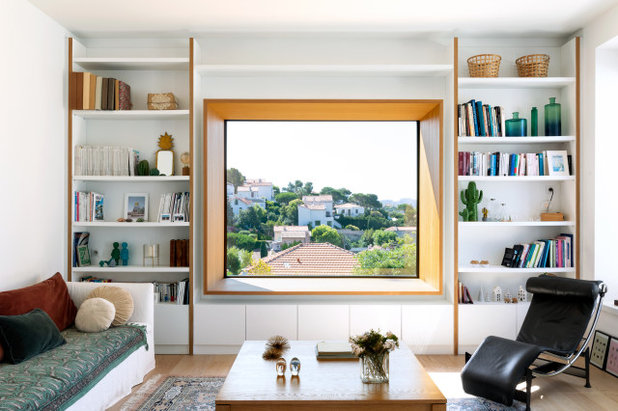
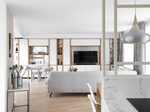
Chrystel proposed turning the living room around to face the outside and to take advantage of the home’s elevated vantage point by widening this window. The existing opening was enlarged and its sill lowered to a comfortable sitting height, so it can double as a bench.
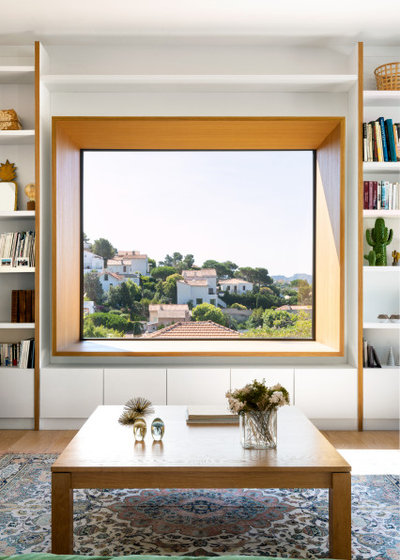
Lined in oak, the picture window frames this magnificent view like a painting. It’s become the focal point of this room and hasn’t failed to attract attention on social media.
“Since I published a photo of this spot for contemplation, people have asked me to reproduce it in many projects, but this has never succeeded as well as here, except in places where the view is, like here, extraordinary,” she says.
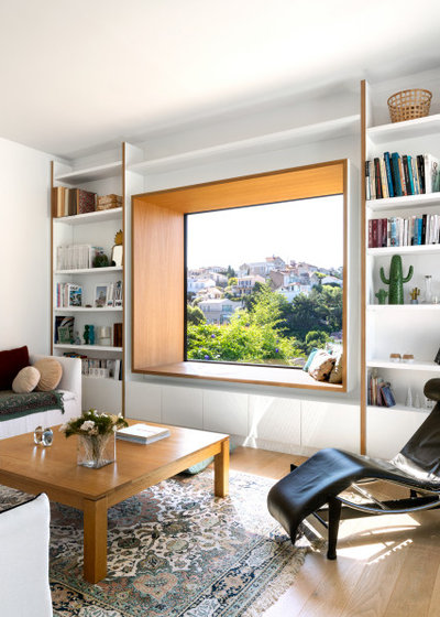
Two sofas and the iconic LC4 lounge chair, designed by Le Corbusier and Charlotte Perriand, offer comfortable perches to contemplate the dreamy view from this living area. As for the coffee table – this had once been a dining table; the owner simply sawed off its legs.
Before Photo
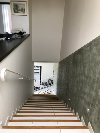
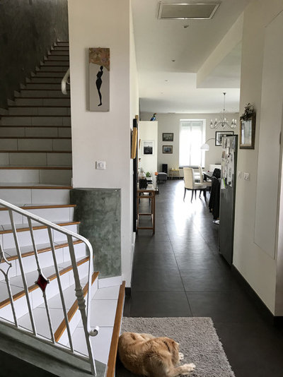
Chrystel got rid of the turn at the end of the original staircase, so it no longer comes out towards the entrance. The family also wanted to remove the wrought-iron railing, the floor tiles and the khaki plaster covering the bottom of the wall.
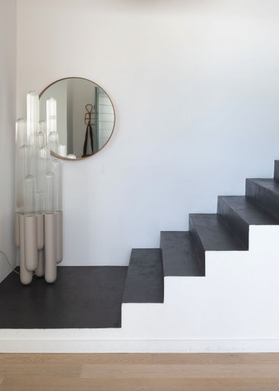
The treads are now finished in a black-waxed concrete, which is both contemporary and easy to wash and maintain. In the near future, a bookcase will go up the steps and liven up the wall. “The geometric effect of the staircase is important and the bookcase will reduce its unusual width.”
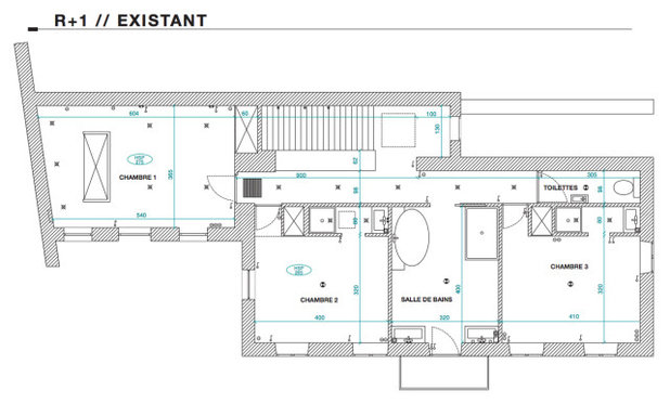
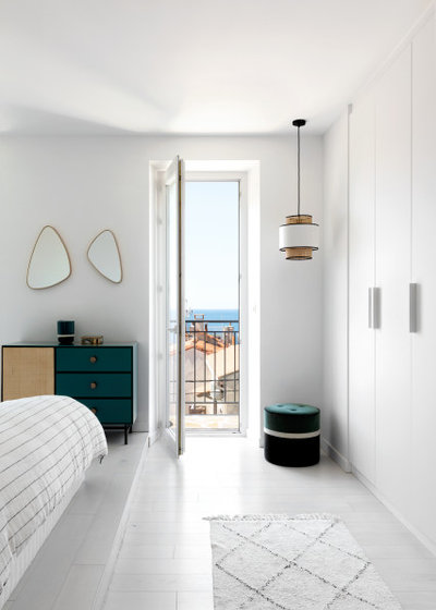
On the second floor, the layout of the bedrooms and bathrooms was not optimised. Only one of the three bedrooms lacked an en suite, but a large separate bathroom had been placed between the other two.
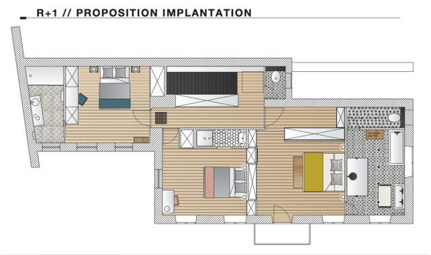
The owners’ son moved into the room above the office, which has now been equipped with an en suite. The daughter took the central bedroom, where the en suite was modernised.
The large bathroom was reattached to the last room. To shorten the hallway that had crossed the width of this storey, the locations of the room and the bathroom were swapped.
The large bathroom was reattached to the last room. To shorten the hallway that had crossed the width of this storey, the locations of the room and the bathroom were swapped.
Before Photo
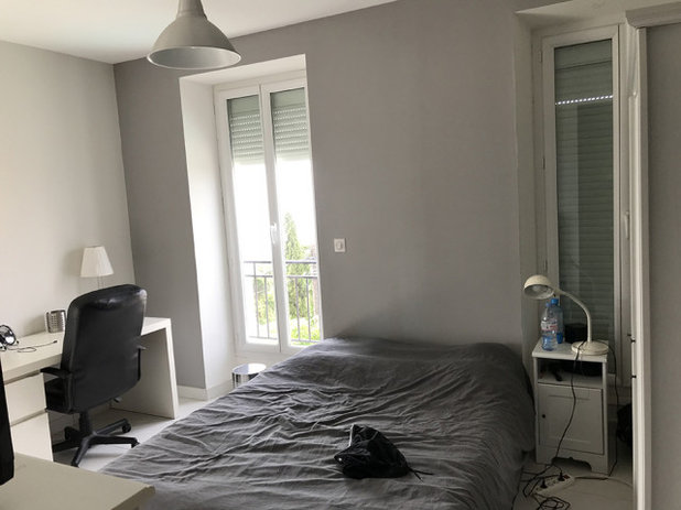
This is the main bedroom before works.
Swapping the main bedroom and the bathroom required major changes to plumbing, which explains the platform seen here: it makes it possible to run the piping along the floor.
In terms of décor, the room is completely white, with natural touches for a restful atmosphere. “As on the ground floor, we chose a bright, holiday feel and used simple, almost raw materials,” Chrystel says.
Chrystel has a fondness for details such as wardrobe handles. “It’s a simple grip made out of a length of wood, created by the carpenter. Almost raw, it’s very geometric,” she says.
Before Photo
The main bathroom on this floor had been decorated in yellow tiles with contrasting terracotta stripes.
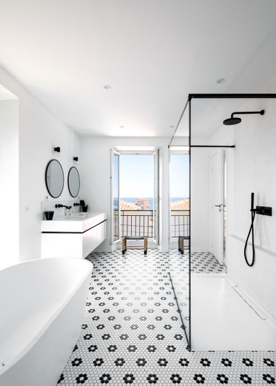
It’s no surprise that the main bathroom was reimagined in the bright and restrained style that characterises the rest of this renovation. Black flowers scattered throughout the white mosaic floor create contrast.
Even the fixtures, the frame of the shower divider and the hollow join of the vanity unit were decorated in black to elegantly underscore these boxes on a blank page.
Even the fixtures, the frame of the shower divider and the hollow join of the vanity unit were decorated in black to elegantly underscore these boxes on a blank page.
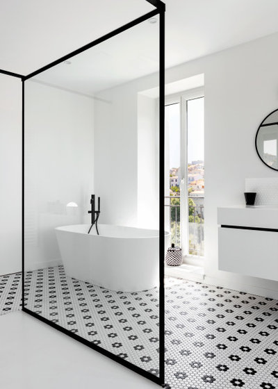
In this room, Chrystel likewise determined the layout of the fixtures based on the outside views. The freestanding tub takes up prime position by the window, the perfect set-up for contemplating the view in a relaxing bubble bath.
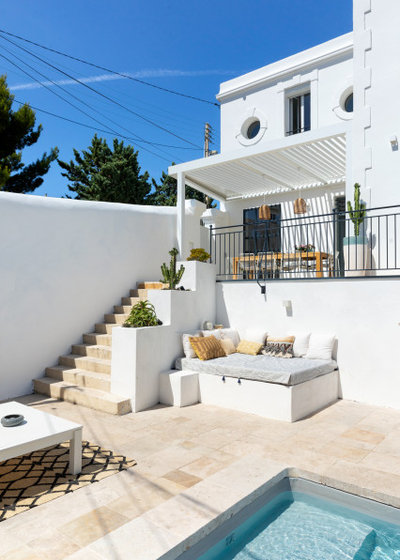
A year after renovating the interior of this home, the owners called Chrystel back to decorate the garden to fit with the interior. To perfect the rendering, she collaborated with a landscape architect.
Tell us…
What do you like about this home? Share your thoughts in the Comments.
Tell us…
What do you like about this home? Share your thoughts in the Comments.


Related Stories

House Tours
Houzz Tour: A Midcentury Home With a Strong Indoor-outdoor Link
By Becky Harris
A nature-inspired renovation has given this ranch house a relaxed mood and a connection to the outdoors from most rooms
Full Story

House Tours
Houzz Tour: Warm Tones and Luxurious Surfaces in a City Townhouse
An earthy colour palette, hidden storage and well-placed texture add character and practicality to this London home
Full Story

Room Tours
Kitchen Tour: A Gorgeous Extension With a Leafy Glasshouse Feel
By Kate Burt
When the owners of this terraced house extended, they were keen to retain its period feel and highlight the garden
Full Story

Gardens
Garden Tour: A Bare Roof Terrace Becomes a Pretty, Sociable Space
By Kate Burt
A retired couple got help transforming their large rooftop into a gorgeous, welcoming, multi-functional retreat
Full Story

House Tours
Houzz Tour: A Smart Layout and Genius Storage in a Victorian Home
Flipping the standard layout and carving out excellent storage have turned this tired house into a brilliant family home
Full Story

House Tours
Houzz Tour: A Victorian House Brought Impressively Up to Date
By Jo Simmons
A cohesive layout and warm colours combined with energy-efficiency measures thoroughly modernise this terraced home
Full Story

Kitchen Tours
Kitchen Tour: An Open, Airy Space Made for Entertaining
Combining two separate rooms has improved flow and created a sociable open-plan kitchen, dining and seating space
Full Story

House Tours
Houzz Tour: A Family Home Inspired by its Seaside Location
Coastal colours and practical design combine to create a house that will adapt as the family grows
Full Story

Kitchens
5 Inspiring Before and After Kitchen Transformations
Whether you want to boost storage, incorporate original features or maximise your space, take ideas from these designs
Full Story

House Tours
Houzz Tour: An Airy, Scandi Finish for a Tall Victorian House
By Kate Burt
From a tricky inherited bath to a sticky-out staircase, on-site problem-solving led to a seamless update for an old home
Full Story
Anyone else want to see the sleeping doggy in the "After" photo? :D
Splendid views brought inside. Before and after photos, along with the floorplans, are really helpful in appreciating the transformation. I wish we could also get a feedback from dwellers after they have lived in a place… what works, etc.
Anything would have been an improvement on the 'Before'! Chrystel has done an outstanding job in turning an ugly duckling into a swan. Every room beautiful, and the exterior sensational.