


Houzz Tour: A Mix of Surfaces Adds Character to a New-build Flat
A combination of sleek finishes and warm textures was key for bringing this modern apartment to life
Amanda Pollard
21 April 2020
Senior Editor at Houzz UK and Ireland. Journalist and editor specialising in interiors and architecture.
Senior Editor at Houzz UK and Ireland. Journalist and editor specialising in interiors... More
The owners of this Docklands flat had been renting out their home while they lived abroad, and the move back presented an opportunity to update it. They asked interior designer Omar Bhatti of Space Shack to help them make better use of the space and add some luxury and depth to their new-build home.
Flat at a Glance
Who lives here? A couple
Location East London
Property A new-build flat
Size Two bedrooms and two bathrooms
Designer Omar Bhatti of Space Shack
Photos by Chris Snook
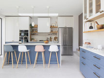
The original kitchen/living space in this Docklands flat felt more cramped than it does now. “There were two stud walls protruding either side of the kitchen,” Omar says. “The kitchen was in a little cube and it felt disconnected from the rest of the room.”
Omar removed the stud walls to create a fully open-plan space and to bring more light into the cooking area. The kitchen layout was changed from a U-shape to an L-shape. A small breakfast bar helps to separate the area from the dining and living spaces.
Who lives here? A couple
Location East London
Property A new-build flat
Size Two bedrooms and two bathrooms
Designer Omar Bhatti of Space Shack
Photos by Chris Snook
The original kitchen/living space in this Docklands flat felt more cramped than it does now. “There were two stud walls protruding either side of the kitchen,” Omar says. “The kitchen was in a little cube and it felt disconnected from the rest of the room.”
Omar removed the stud walls to create a fully open-plan space and to bring more light into the cooking area. The kitchen layout was changed from a U-shape to an L-shape. A small breakfast bar helps to separate the area from the dining and living spaces.
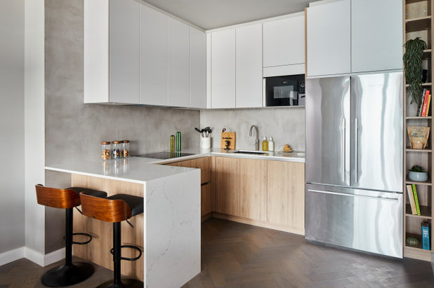
The starting point for the kitchen design was the couple’s American-style fridge-freezer. The team built a housing unit around the large appliance and installed flat-fronted units elsewhere.
Sleek, pale grey wall cabinets contrast with oak base units, which bring warm texture to the modern space. A white, marble-look quartz worktop adds another bright surface and is continued along the side end of the breakfast bar. “Otherwise there would have been too much wood,” Omar says. “As we didn’t use the worktop material on the splashback, this was also a good way to include more marble.”
Schmidt freestanding fridge-freezer, Fisher & Paykel. Integrated appliances, Neff. Microcement, Decora Cement. Bar stools, Wayfair.
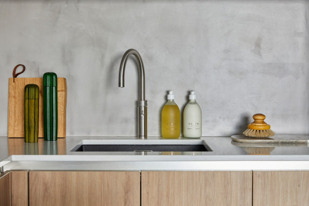
Omar decided to use interesting materials in order to add depth to the plain, new-build flat, so he chose microcement for the kitchen walls.
“We also went for an undermounted sink in a graphite colour for a sleek look,” he says.
Find kitchen designers in your area and read reviews from previous clients.
“We also went for an undermounted sink in a graphite colour for a sleek look,” he says.
Find kitchen designers in your area and read reviews from previous clients.
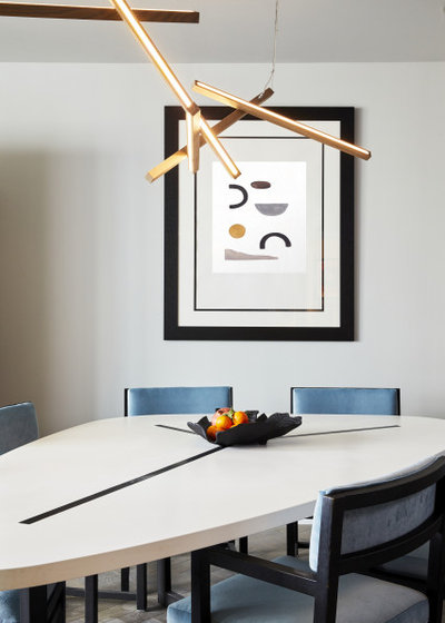
The couple already owned this curved dining table and Omar refreshed the chairs with light blue velvet upholstery. A modern chandelier hangs above to replicate the design on the table’s surface. “The timber rods tie in with the kitchen and add more warm texture,” he says.
Chandelier, Next Level Studio on Etsy. Dining chair covered by King’s Upholstery.
Chandelier, Next Level Studio on Etsy. Dining chair covered by King’s Upholstery.
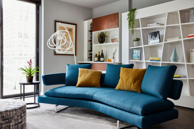
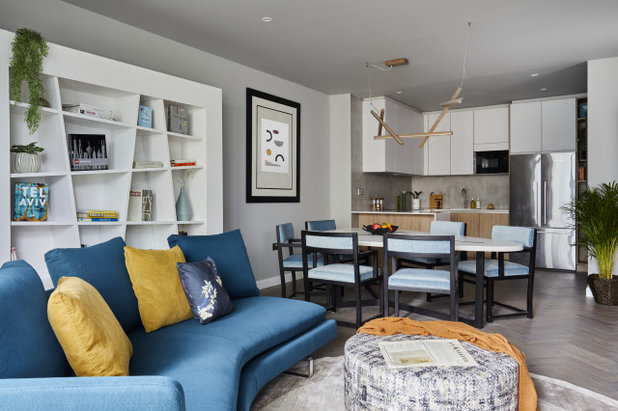
Soft curves and graphic lines continue in the living area. Omar chose a rounded sofa to contrast with the couple’s straight-edged bookcases. A circular rug and round occasional furniture add more gentle shapes to the space.
“The clients already owned the artwork in the flat, so we used the colours to inspire the scheme,” Omar adds.
Sofa, B&B Italia. Cushions and throw (seen in first image), John Lewis & Partners and Marks & Spencer. Round footstool, Wayfair. Rug, iRugs. Side table, Maisons du Monde. Walls painted in Pavilion Gray, Farrow & Ball.
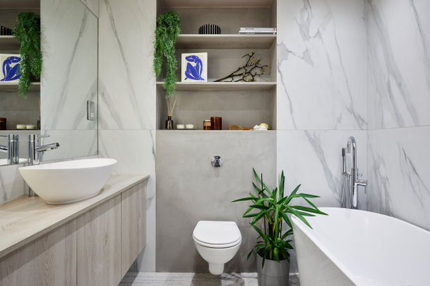
The layout of the guest bathroom stayed the same as the original space, but Omar transformed the look with new sanitaryware and materials.
“The couple really liked these huge, marble-look tiles for the walls, but didn’t want to put them everywhere,” Omar says. “So we added a sliver of microcement with integrated shelves to break them up.”
Travertine-look tiles; Imperial grey marble-look tiles, all Stone Empire. Freestanding bath, Soak. Mirror, Bridgeglass.
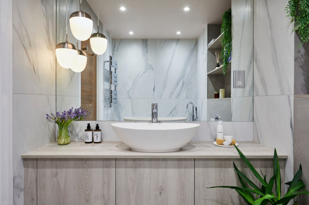
A freestanding bath sits opposite a wall-to-wall vanity unit. “The mirror above was cut to size and creates the illusion of space,” Omar says.
Simple LED downlights are complemented by a more interesting pendant at the side of the basin.
Pendant lights, Amara. Kitchen cabinets used for vanity unit, Howdens.
Simple LED downlights are complemented by a more interesting pendant at the side of the basin.
Pendant lights, Amara. Kitchen cabinets used for vanity unit, Howdens.
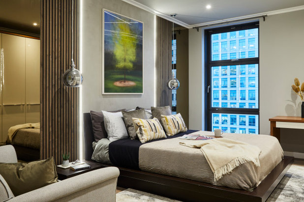
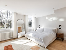
“The master bedroom underwent a huge transformation, even though we used the owners’ existing furniture,” Omar says.
To add character to the boxy room, Omar stripped off the wallpaper and designed a panelled wall behind the bed, with a section of microcement flanked by two fluted timber panels. The whole thing is framed by tinted mirrors on either side.
“The tree artwork inspired the use of natural woods,” Omar says. “It’s all flush and looks like one whole piece.”
Fluted wooden panels, The Wood Veneer Hub. Mirrors, Bridge Glass. Cushions and throws, John Lewis and Marks & Spencer.
The team also reupholstered the couple’s two-seater sofa and hung pendants as bedside lamps to save space on the surfaces.
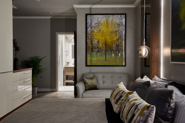
The original en suite, seen through the door in this image, was a small, 4 sq m space. The door was further into the room and the space was accessed through a corridor with wardrobes on the left. Omar’s team moved the door forwards into the corridor, and replaced the wardrobes with a 800mm x 1500mm walk-in shower, doubling the size of the room.
Sofa covered by King’s Upholstery. Pendant lights; rug, all Wayfair. Walls painted in Pavilion Gray, Farrow & Ball.
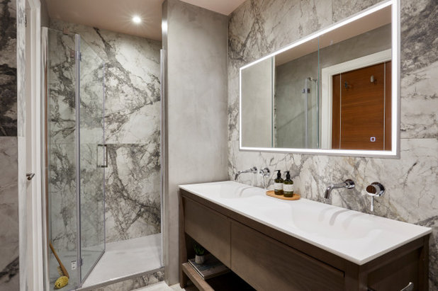
Next to the shower is a built-in vanity unit. Marble-look tiles have been used on the walls again, contrasting with the microcement on the shower enclosure and along the back wall (seen in the mirror).
Vanity unit, Lusso Stone. Basin, Amazon. Taps, Victorian Plumbing. Recessed mirror, Designer Bathroom Concept. Shower tray; enclosure, both Soak.
Vanity unit, Lusso Stone. Basin, Amazon. Taps, Victorian Plumbing. Recessed mirror, Designer Bathroom Concept. Shower tray; enclosure, both Soak.
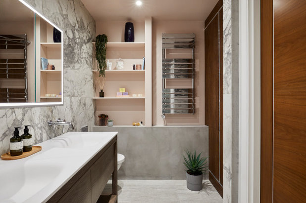
Opposite the vanity unit is a utility cupboard with a washing machine and tumble dryer stacked inside.
Travertine floor tiles and soft pink paint on the walls add a warm feel to the room.
Wall painted in Calamine, Farrow & Ball.
Tell us…
Which is your favourite room in this contemporary city flat? Share your thoughts in the Comments section.
Travertine floor tiles and soft pink paint on the walls add a warm feel to the room.
Wall painted in Calamine, Farrow & Ball.
Tell us…
Which is your favourite room in this contemporary city flat? Share your thoughts in the Comments section.

What are you working on?
Related Stories

House Tours
Houzz Tour: Warm Tones and Luxurious Surfaces in a City Townhouse
An earthy colour palette, hidden storage and well-placed texture add character and practicality to this London home
Full Story

Room Tours
Kitchen Tour: A Gorgeous Extension With a Leafy Glasshouse Feel
By Kate Burt
When the owners of this terraced house extended, they were keen to retain its period feel and highlight the garden
Full Story

Gardens
Garden Tour: A Bare Roof Terrace Becomes a Pretty, Sociable Space
By Kate Burt
A retired couple got help transforming their large rooftop into a gorgeous, welcoming, multi-functional retreat
Full Story

House Tours
Houzz Tour: A Smart Layout and Genius Storage in a Victorian Home
Flipping the standard layout and carving out excellent storage have turned this tired house into a brilliant family home
Full Story

House Tours
Houzz Tour: A Victorian House Brought Impressively Up to Date
By Jo Simmons
A cohesive layout and warm colours combined with energy-efficiency measures thoroughly modernise this terraced home
Full Story

Kitchen Tours
Kitchen Tour: An Open, Airy Space Made for Entertaining
Combining two separate rooms has improved flow and created a sociable open-plan kitchen, dining and seating space
Full Story

House Tours
Houzz Tour: A Family Home Inspired by its Seaside Location
Coastal colours and practical design combine to create a house that will adapt as the family grows
Full Story

Kitchens
5 Inspiring Before and After Kitchen Transformations
Whether you want to boost storage, incorporate original features or maximise your space, take ideas from these designs
Full Story

House Tours
Houzz Tour: An Airy, Scandi Finish for a Tall Victorian House
By Kate Burt
From a tricky inherited bath to a sticky-out staircase, on-site problem-solving led to a seamless update for an old home
Full Story
House Tours
Houzz Tour: A 17th Century Cottage Gains Warmth and Character
The clever use of colour and pattern has revived this old building while creating a 21st century family home
Full Story
I like it because it is Modern
So many great ideas. Love the shelving in the lounge area, pendant lighting in the bedroom. A modern flat with so much character.
👍🏻👍🏻Really loving what you’ve done. Just curious, where did you get the kitchen cabinets from?