


Houzz Tour: A Dull Flat Becomes a Guest-friendly Home
Layout changes and a considered palette create an apartment that's welcoming for visitors and convenient for homeworking
Sarah Warwick
20 August 2018
Houzz Contributor. I'm a freelance journalist and editor writing for nationals, magazines and websites. A serial house revamper, I love great design, beautiful interiors and practical solutions.
Houzz Contributor. I'm a freelance journalist and editor writing for nationals, magazines... More
A slightly worn, plain interior was one of the issues facing the owners of this east London apartment. “It didn’t represent them well because they like colour,” says interior designer Kia Stanford. Also on the professional couple’s list of requirements when they called her in? Plenty of room for guests, space for homeworking and bags of storage.
Apartment at a Glance
Who lives here A couple of young professionals
Location Spitalfields, east London
Property An apartment in a 1990s-built block
Size Two bedrooms and one bathroom
Designer Kia Stanford of Kia Designs
Photos by Anna Stathaki
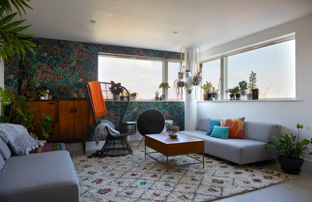
The owners of this city flat had a few items for the living room already when Kia Stanford took on their project. “They’d picked up artwork on their travels and had two sofas, the coffee table and the sideboard,” she explains. “But the configuration was tiny and cramped.”
Regular entertaining and frequent overnight guests made the problem with the layout particularly acute, so to relieve the discomfort, Kia reworked it to create more space. She also added in a focal point with a statement chair, and introduced some colour.
Who lives here A couple of young professionals
Location Spitalfields, east London
Property An apartment in a 1990s-built block
Size Two bedrooms and one bathroom
Designer Kia Stanford of Kia Designs
Photos by Anna Stathaki
The owners of this city flat had a few items for the living room already when Kia Stanford took on their project. “They’d picked up artwork on their travels and had two sofas, the coffee table and the sideboard,” she explains. “But the configuration was tiny and cramped.”
Regular entertaining and frequent overnight guests made the problem with the layout particularly acute, so to relieve the discomfort, Kia reworked it to create more space. She also added in a focal point with a statement chair, and introduced some colour.
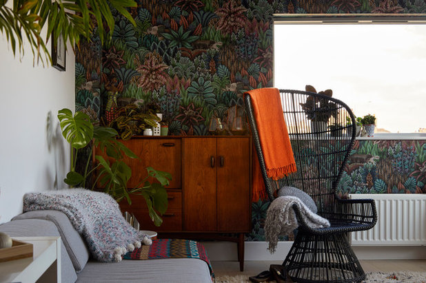
“It was important to make sure their plants were considered in the design,” says Kia. Now, some are floorstanding, some hanging and some on the window ledge. The pair’s love of greenery is also represented in the room’s wallpaper, as is their sense of fun. “There are animals in the design – it’s slightly whimsical.”
The paper was used over a limited area so it didn’t overwhelm the space, but it visually widens the rectangular room. “It doesn’t look out of proportion as it did before,” Kia explains.
The apartment isn’t overlooked, which allowed Kia to leave the window undressed to maximise daylight and views.
Singita wallpaper, Cole & Son.
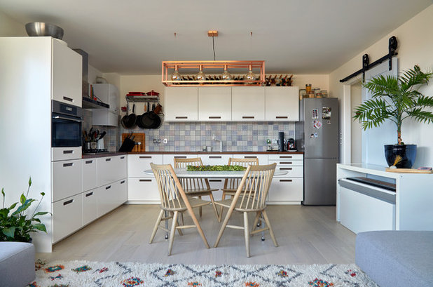
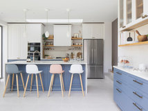
The couple had already chosen their new kitchen and designed its layout when Kia was called in, but she was asked to select the splashback and door handles to complement the rest of the apartment design.
One of the couple does all the cooking and wanted a practical chef’s kitchen. “Pots and pans are to hand and spices are within arm’s reach,” says Kia.
The dining table – which the couple already owned – is extendable to accommodate extra guests. Above it, standard track lights were exchanged for a statement light fitting.
Kitchen, Ikea. Oris light, Lucide.
Browse lighting in the Houzz Shop
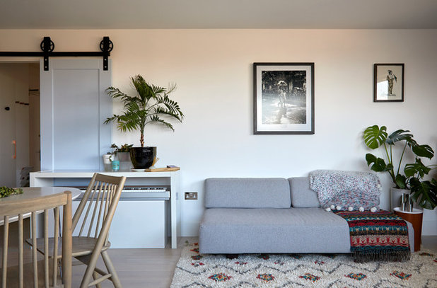
The couple wanted to be able to play music in the living-dining area, but didn’t want their keyboard to be too much of a feature, so a discreet space was found for it. “It can slide upwards to playing height,” says Kia.
A swing door into the space was swapped for a sliding one with a more interesting farmhouse-style mechanism.
The flooring here, as in other rooms, is white oak. “It needed something that flowed through the space,” says Kia. “Different thresholds would have divided the space.”
A swing door into the space was swapped for a sliding one with a more interesting farmhouse-style mechanism.
The flooring here, as in other rooms, is white oak. “It needed something that flowed through the space,” says Kia. “Different thresholds would have divided the space.”
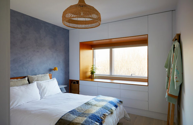
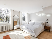
It was vital to introduce a decent amount of storage to the master bedroom, so bespoke cabinets were made to surround the window. “They loved the idea of the window seat,” says Kia. The teak veneer here matches the headboard, and has an orange tone that complements the blue of the wall. “We really wanted to stay away from anything that would feel washed out, especially as the flooring is white oak,” says Kia. “It has a lovely vintage feel as well.”
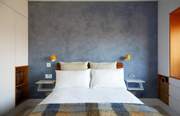
The wall behind the bed is finished in tadelakt, a plaster used in Moroccan designs. Kia chose it partly for its easy maintenance – it’s waterproof and hard-wearing – but its texture and shade add softness to the room.
The blue colour creates a restful ambience for the space. “They have a full-on lifestyle, so it has a calming feel,” she says.
The blue colour creates a restful ambience for the space. “They have a full-on lifestyle, so it has a calming feel,” she says.
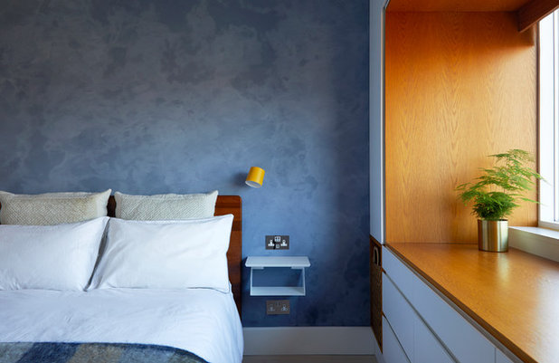
Wall-hung bedside tables are space saving, and Kia added in plug points with USB sockets incorporated above and below. “They can use different devices and charge multiple things,” she says.
Wall light, Normann Copenhagen.
Wall light, Normann Copenhagen.
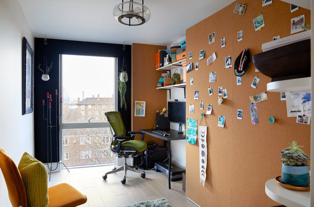
The second bedroom is an office for one of the couple – who works from home at least two days a week – as well as a guest bedroom. “It had to be somewhere you could work very easily, but not feel the room had been taken over by the working area,” says Kia.
The end wall is painted in a dark shade to frame the view.
Pendant light, Habitat.
The end wall is painted in a dark shade to frame the view.
Pendant light, Habitat.
The room is a true multi-tasker with space available in front of the cupboard doors for a workout.
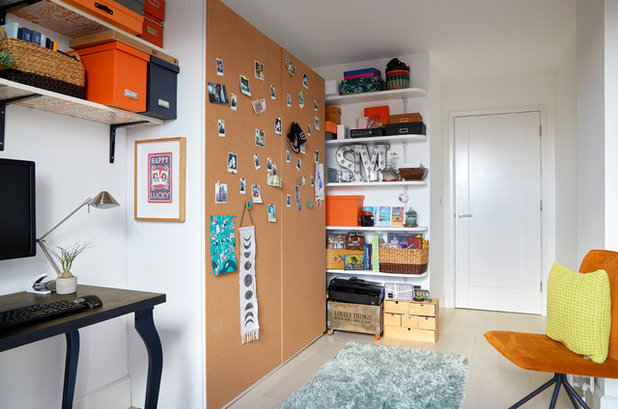
The doors themselves are decorated with Polaroid pictures of the couple’s own travels, and visiting friends and family can add images of their journeys.
The doors themselves are decorated with Polaroid pictures of the couple’s own travels, and visiting friends and family can add images of their journeys.
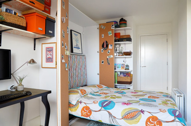
Hidden behind the folding cupboard doors is the guest bed itself. “Previously, the double bed took up half the room,” says Kia. “Even though they have guests staying quite often, they wanted the room to function mainly as an office.”
The pull-down bed was designed for the room and fits it perfectly. For comfort and convenience, there’s both a headboard and lighting in the cupboard.
Shelves were fitted to the adjacent wall. “Because the room has so many different functions, things need to be to hand,” says Kia. “Shelving tucked away but accessible was important.”
More fold-down bed ideas for small spaces
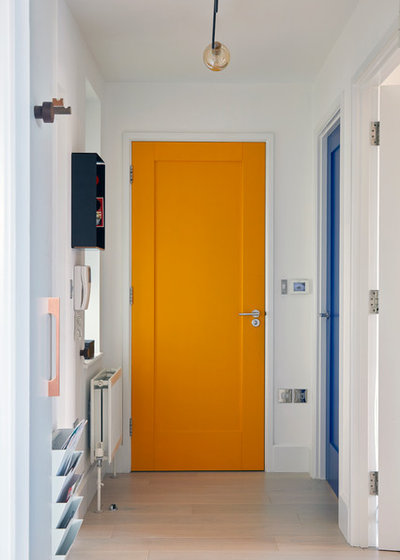
The hallway is filled with doors, so Kia livened up the space by choosing different colours for each one – yellow leads to the bathroom, dark blue to the master bedroom, and the living room door (behind the camera) is light blue.
With little space available, Kia designed places for the owners to stow their belongings when they come home, including some racks for post, a key box and hooks for umbrellas.
With little space available, Kia designed places for the owners to stow their belongings when they come home, including some racks for post, a key box and hooks for umbrellas.
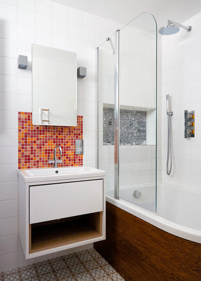
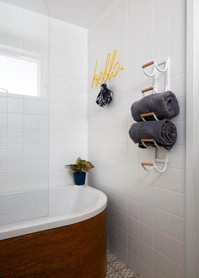
A disparity in the couple’s heights meant the old bath served neither well. Kia remedied the issue with a new bath that’s wider and deeper, and which also creates a bigger showering space.
The curved bath required a panel that could be moulded and a stained oak veneer was selected. “It brings in the darker colours in the rest of the property,” says Kia. “Each of the rooms has something that’s a nod to the 1970s, such as the sideboard in the living room and the teak in the bedroom.”
The niche at the end of the bath features a map of London centred on the flat’s location. “We wanted to bring in something that’s very much of the area,” says Kia. It’s made from ceramic that’s printed and sealed.
The bathroom has plenty of hidden storage. The poster conceals a set of shelves, as does the mirror.
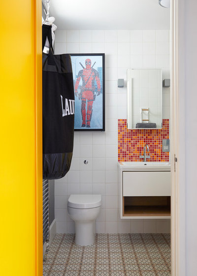
“We wanted to inject some fun in there, so we used a laundry bag that looks like a punch bag,” says Kia.
The basin splashback’s tiles also add a more playful note, as well as creating a bold accent colour against the white of the suite and remaining wall tiling.
On the floor are vintage-style patterned tiles.
Floor and splashback tiles, Topps Tiles.
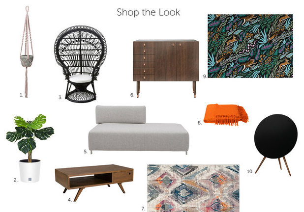
1. Bloomingville Rose Cotton Hanging Pot Holder
2. Artificial Caladium in White Pot
3. Woodstock Rattan Peacock Chair, Black
4. Fancy Scandinavian Coffee Table With Drawer, Cinnamon
5. BECKER Light Grey Sofa System Module
6. Morton Sideboard
7. Farrah Area Rug
8. Chiltern Fringed Throw Blanket, Burnt Orange
9. Persecution Wallpaper, Night
10. Beoplay A9, Black

What are you working on?


Related Stories

House Tours
Houzz Tour: A Midcentury Home With a Strong Indoor-outdoor Link
By Becky Harris
A nature-inspired renovation has given this ranch house a relaxed mood and a connection to the outdoors from most rooms
Full Story

House Tours
Houzz Tour: Warm Tones and Luxurious Surfaces in a City Townhouse
An earthy colour palette, hidden storage and well-placed texture add character and practicality to this London home
Full Story

Room Tours
Kitchen Tour: A Gorgeous Extension With a Leafy Glasshouse Feel
By Kate Burt
When the owners of this terraced house extended, they were keen to retain its period feel and highlight the garden
Full Story

Gardens
Garden Tour: A Bare Roof Terrace Becomes a Pretty, Sociable Space
By Kate Burt
A retired couple got help transforming their large rooftop into a gorgeous, welcoming, multi-functional retreat
Full Story

House Tours
Houzz Tour: A Smart Layout and Genius Storage in a Victorian Home
Flipping the standard layout and carving out excellent storage have turned this tired house into a brilliant family home
Full Story

House Tours
Houzz Tour: A Victorian House Brought Impressively Up to Date
By Jo Simmons
A cohesive layout and warm colours combined with energy-efficiency measures thoroughly modernise this terraced home
Full Story

Kitchen Tours
Kitchen Tour: An Open, Airy Space Made for Entertaining
Combining two separate rooms has improved flow and created a sociable open-plan kitchen, dining and seating space
Full Story

House Tours
Houzz Tour: A Family Home Inspired by its Seaside Location
Coastal colours and practical design combine to create a house that will adapt as the family grows
Full Story

Kitchens
5 Inspiring Before and After Kitchen Transformations
Whether you want to boost storage, incorporate original features or maximise your space, take ideas from these designs
Full Story

House Tours
Houzz Tour: An Airy, Scandi Finish for a Tall Victorian House
By Kate Burt
From a tricky inherited bath to a sticky-out staircase, on-site problem-solving led to a seamless update for an old home
Full Story
The living room sure looks like a perfect place to meditate.
A very individual, quirky and colourful flat, which is far better than bland and grey. But for me there is just too much going on in the living room - a mish-mash of pattern, colour and furniture styles which overwhelms a small space. I find it the opposite of calm and meditative - far too busy and lacking cohesion.
What a wonderful comfortable, workable space in London. I think it's great and I like the placement of the expandable dining table. I loved the wallpaper. For Americans it is such a good exercise to see small bedrooms and nice living spaces, practical, but not enormous kitchens. The whole thing comes together well. I'd be fine there!