Houzz Tours

House Tours

Houzz Tour: A 1960s Home Revamp Marries Old and New
A two-storey extension has been seamlessly integrated into an old house thanks to repeated materials and toning colours

This Chicago-area couple had bought the husband’s 1,800 sq ft childhood home and given it a refresh years ago. But as their family quickly grew from two to six, they needed more space. So they added a 700 sq ft, two-storey extension that includes a lounge area and boot room on the ground floor and a bedroom suite and laundry room on the first floor.
Interior designer Alessia Loffredo carefully balanced splurges and saves when designing the spaces in the extension, updating the existing kitchen and giving the rooms in the original house a refresh.
Interior designer Alessia Loffredo carefully balanced splurges and saves when designing the spaces in the extension, updating the existing kitchen and giving the rooms in the original house a refresh.
The designer also added new lighting, taps and quartz worktops that have the look of marble. “I love natural stone, but quartz was better for the budget,” she says. It’s also a more durable finish for a busy family.
A small but striking new detail is the cabinet hardware. “I chose oil-rubbed bronze, because it feels natural and will patina over time, which gives it personality,” Alessia says. “And this is a big family – this finish will never look dirty.”
In a kitchen renovation, Alessia recommends splurging on lighting and taps. “These really elevate a space and are worth the investment,” she says. The brass tap is from Rohl. The clients already had great appliances, including the Wolf range cooker, which allowed for some of the splurges. “If you have the money, put it towards appliances, especially [an integrated fridge]. It’s worth the investment,” Alessia says.
Across from the sink, in the lounge area, Alessia dressed up a built-in cabinet with a splashback and worktop. This allows it to serve as an elegant bar. She used the same worktop quartz and splashback tiles she used in the kitchen to connect the spaces.
Wood beams add a natural touch on the ceiling. The glass doors, meanwhile, provide an easy flow out to the deck.
Wood beams add a natural touch on the ceiling. The glass doors, meanwhile, provide an easy flow out to the deck.
The opposite side of the kitchen opens up to the existing dining room. Alessia gave this space a light makeover with paint, a statement chandelier, new chairs, new curtains and a new rug. “Using a rug here helps lend a feeling of separation from the kitchen,” she says. She kept her clients’ dining room table, but brought in caned chairs.
“We kept the colour palette consistent throughout the house for a cohesive feel, but each room has a twist of its own,” she says. In the dining room, this comes from the colourful, floral curtains and the glass bead chandelier.
“We kept the colour palette consistent throughout the house for a cohesive feel, but each room has a twist of its own,” she says. In the dining room, this comes from the colourful, floral curtains and the glass bead chandelier.
Previously, the woodwork and cornices had been painted white and the walls a colour. Alessia flipped this around, painting the panelling a soft grey and the walls ivory.
“We kept the colour palette the same throughout the house, but you have to test the colours in each room in natural light and at night,” she says. “We will often adjust a white paint to suit the light that’s specific to each room. It takes a lot of time to get this right.”
“We kept the colour palette the same throughout the house, but you have to test the colours in each room in natural light and at night,” she says. “We will often adjust a white paint to suit the light that’s specific to each room. It takes a lot of time to get this right.”
Across from the dining room is the original living room. The space to the right of the bench in the passageway used to be a coat cupboard.
“Because the owners were getting a new [boot room] in this addition, we were able to close off that coat closet and use the space as a pantry for the kitchen,” Alessia says.
Inspired to extend your home? Find reviewed architects and building designers in your area.
“Because the owners were getting a new [boot room] in this addition, we were able to close off that coat closet and use the space as a pantry for the kitchen,” Alessia says.
Inspired to extend your home? Find reviewed architects and building designers in your area.
The pantry is just large enough for U-shaped shelving. Alessia repeated the use of tongue-and-groove paneling inside it. There are electrical outlets in here as well, as the homeowners prefer to use the coffeemaker in the pantry rather than leaving it out on the kitchen worktop.
“The builder we used is an excellent carpenter,” Alessia says. “This is wonderful when you’re doing something semi-custom. He built these shelves, the [extractor] hood, the island additions, the locker system and more on site.”
Alessia had a niche cut into the wall to the right of the pantry to create an unobtrusive space for the fridge.
The new boot room is spacious and has open sections for each child to hang coats and bags and stash their shoes. There’s a coat cupboard on the opposite side of the room that the parents use.
The cubbyholes near the door serve as a landing zone and provide storage for the parents’ shoes, boots and bags. A mirror hangs above them. The wood on the top and the bench bring in natural warmth. The door leads out to the deck, which leads to the driveway.
“We needed something affordable and durable for the flooring in here, so we chose slate,” Alessia says. “My clients loved the idea of a [chevron] pattern, but it wouldn’t have looked right with the way the pattern met different elements in such a small space.”
Instead she used a herringbone pattern, which meets the corners and lines up with the elements in the room in a way that’s easy on the eye.
Upstairs, the extension includes the parents’ bedroom suite and a laundry room. Alessia matched the mouldings to the original part of the house for a cohesive feel.
She used a mix of soft textiles in a range of neutral colours for a relaxing vibe in the bedroom. “Their bedroom is not large and they wanted to fit a king-size bed in here. Keeping things neutral helps it feel bigger,” Alessia says.
She used a mix of soft textiles in a range of neutral colours for a relaxing vibe in the bedroom. “Their bedroom is not large and they wanted to fit a king-size bed in here. Keeping things neutral helps it feel bigger,” Alessia says.
The homeowners’ must-haves for their new bathroom included a soaking bath, a separate toilet room and a double vanity unit. A splurge was the underfloor heated, well worth the investment given Chicago’s long winters.
Alessia balanced the flooring budget by finding affordable marble tiles at a superstore. She continued the use of tongue-and-groove panelling in here to create cohesion with the rest of the home.
Alessia balanced the flooring budget by finding affordable marble tiles at a superstore. She continued the use of tongue-and-groove panelling in here to create cohesion with the rest of the home.
The designer sourced a beautiful readymade walnut vanity unit to save on the budget. “This one is beautiful and it’s very well made,” she says. She splurged on the taps and lighting. Arched mirrors, cylindrical and globe-shaped light fixtures and the bath add soft curves to the space.
The mirror’s reflection offers a glimpse of the room’s cathedral ceiling. A large wooden beam runs along its peak.
The mirror’s reflection offers a glimpse of the room’s cathedral ceiling. A large wooden beam runs along its peak.
The new laundry room is cheerful and spacious. “I love the potential in a smaller space. You don’t need a big budget and it’s a good chance to do something interesting,” Alessia says. “We had some fun in here, like with the penny mosaics on the floor.”
The colour palette inspiration came from a building she’d admired and photographed in Montreal. “It was this beautiful pale grey and ivory stone and all the trim and mouldings were senape [Italian for mustard]. I just loved the way it felt,” Alessia says.
The colour palette inspiration came from a building she’d admired and photographed in Montreal. “It was this beautiful pale grey and ivory stone and all the trim and mouldings were senape [Italian for mustard]. I just loved the way it felt,” Alessia says.
“My clients loved their top-loading washer and wanted to keep it, which meant we couldn’t cover it with a counter. So I designed a countertop space next to the machines,” Alessia says. She left the bottom open to make room for a laundry basket and reused part of the kitchen’s old worktops for the surface.
Alessia added tongue-and-groove panelling, with a beautiful botanical wallpaper above it. “This wallpaper was the right scale for this small space, and the colour palette was perfect, with its greys, ivory, blue and yellow,” she says. “My client loves to shop antique stores and thought this boy [in the artwork] looked just like her son. She originally wanted to put it in his room, but he didn’t like it, so we found a great spot for it here.”
For her daughter’s room, the mother chose the kaleidoscope-like wallpaper and Alessia selected the bedding and rug to go with it.
Alessia “shopped the house” for the end table. “This had been handed down through the family and it adds a nice touch of wood in here. And it works well as a [bedside table],” she says.
Synchronized wallpaper, RoomMates.
Alessia “shopped the house” for the end table. “This had been handed down through the family and it adds a nice touch of wood in here. And it works well as a [bedside table],” she says.
Synchronized wallpaper, RoomMates.
In one of the sons’ rooms, Alessia reused his furniture, but added a new navy quilt and a fun wallpaper. “There’s something soothing and peaceful about a hand-drawn design,” she says. “This one has firetrucks and policemen and all sorts of fun things on it. He loved it at first sight.” He also loves the vintage duck painting, a good replacement for the boy in the boat that wound up in the laundry room.
Tell us…
What do you like about this family home? Share your thoughts in the Comments.
Tell us…
What do you like about this family home? Share your thoughts in the Comments.


Sponsored
Reload the page to not see this specific ad anymore
Who lives here? A couple and their four young children
Location Outside Chicago, USA
Size Four bedrooms and two bathrooms; 2,500 sq ft (232 sq m)
Designer Alessia Loffredo of reDesign home
Contractor David Ligman of Ligman Construction Group
Photos by Ryan McDonald
“The biggest challenge of this project was to marry the new addition and the older part of the house,” Alessia says. The floors had been refinished within the past few years and the homeowners were happy with them, so she matched them in the extension. “The floor stain was the starting point for the colour palette of neutrals and greys,” she says.
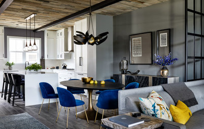
The kitchen, in what was previously the back of the house, was now situated as a central space between the existing dining room and the new lounge. This made it the most important space within the overall scheme. The peninsula marks the spot where the extension begins – the new lounge area is on the other side of it. Alessia used elements such as woodwork, the colour palette and lighting to create cohesion between the new spaces and the original house.
The kitchen was in pretty good shape – the homeowners had put in new cabinetry and appliances a few years ago, and they wanted to leave the layout intact. This was a huge help budget-wise. But the space needed a more sophisticated look to set the tone of the home’s fresh new style.
Alessia had SemiHandmade reface the cabinets and added the two worktop cabinets on either side of the range cooker for symmetry. She also designed a bespoke extractor hood. “This helped establish the range wall as a focal point,” she says. The splurge-worthy splashback features hand-glazed tiles from Clé.
Alessia also had her carpenter add legs to the existing island and wrap it in tongue-and-groove panelling. “This dressed it up and made it look custom,” she says.