


Houzz Tour: A 1930s Semi Modernised for Family Life
Clever extending and layout tweaks have given this house a vastly improved space for the growing family who live in it
Kate Burt
16 April 2023
Houzz UK. I'm a journalist and editor, previously for the Independent, Guardian and various magazines. I'm now excited to part of the editorial team at Houzz UK & Ireland, bringing the best of British and Irish design, interiors and architecture to Houzz.com.
Houzz UK. I'm a journalist and editor, previously for the Independent, Guardian and... More
The owners of this house first contacted Simon Heckford of Oasys soon after moving into their 1930s home. They were keen to upgrade and extend the kitchen into a family space where they could keep an eye on the children while cooking, and also wanted a greater connection to the garden.
The rest of the house needed some love, too, so Simon took on a full-house renovation, increasing the bedroom count, creating a generous-sized main suite, expanding the first floor and converting the loft.
The rest of the house needed some love, too, so Simon took on a full-house renovation, increasing the bedroom count, creating a generous-sized main suite, expanding the first floor and converting the loft.
House at a Glance
Who lives here? A couple with three young daughters
Location Redland, Bristol
Property A 1930s semi-detached house
Size Five bedrooms plus an office and two bathrooms
Designer Simon Heckford at Oasys Property Solutions
Kitchen design The Kitchen Partners
Photos by Faye Hedges
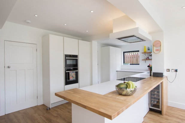
The extension isn’t full-width; the little window above the sink is where the old kitchen ended. The visible beam to the right in this photo shows the original external wall.
“The glazing was maximised to boost the connection to the garden, but also to get in as much light as possible,” Simon says.
Extension doors and windows, Techniglaze.
Who lives here? A couple with three young daughters
Location Redland, Bristol
Property A 1930s semi-detached house
Size Five bedrooms plus an office and two bathrooms
Designer Simon Heckford at Oasys Property Solutions
Kitchen design The Kitchen Partners
Photos by Faye Hedges
The extension isn’t full-width; the little window above the sink is where the old kitchen ended. The visible beam to the right in this photo shows the original external wall.
“The glazing was maximised to boost the connection to the garden, but also to get in as much light as possible,” Simon says.
Extension doors and windows, Techniglaze.
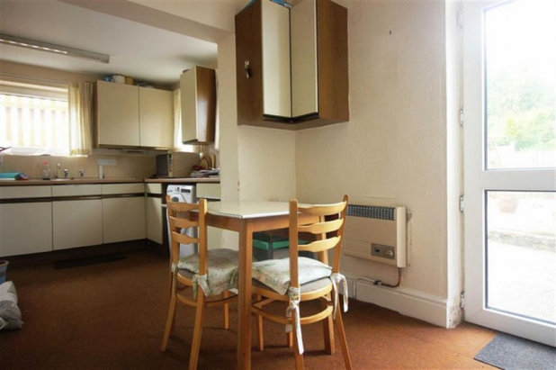
The kitchen before Simon’s redesign and extension was tight for the family of five.
The back of the house previously had little glazing at ground floor level to connect the interior with the garden.
The one-storey section of the house on the right contained some of the kitchen and the garage. This has since been extended upwards to add two new rooms, and been carved up at ground floor level to provide a utility space.
The door seen here on the right is the original kitchen door; on the left is the original dining room.
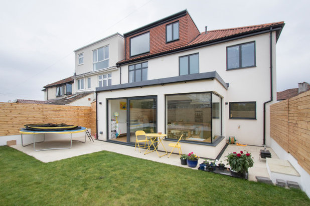
The redesigned house now has a rear extension, a new loft space and an extended first floor.
The owners had the windows throughout replaced to match the new extension’s glazing.
Ready to renovate? Find professionals in your area, read client reviews and see project photos in the Houzz Professional Directory.
The owners had the windows throughout replaced to match the new extension’s glazing.
Ready to renovate? Find professionals in your area, read client reviews and see project photos in the Houzz Professional Directory.
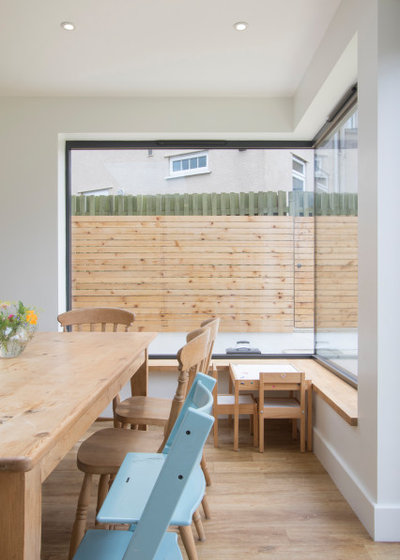
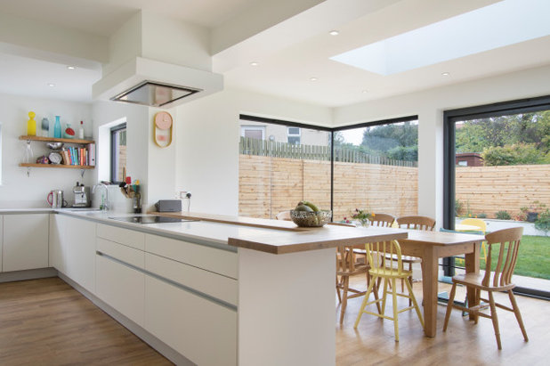
The corner window in the new extension is a special detail. Rather than having a pillar at the join, the continuation of the glass gives a panoramic effect. The steelwork in the ceiling involved to create this result is “complicated”, Simon says.
Oak-effect flooring, Amtico.
Oak-effect flooring, Amtico.
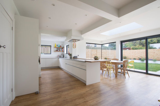
In this wider image, you can start to get an idea of the complexity of the supporting steels in the ceiling.
The back of the house is north-west facing, which means the space won’t be hit with glaring sunlight or need extensive shading solutions.
More: How to Fall in Love With Your 1930s Semi
The back of the house is north-west facing, which means the space won’t be hit with glaring sunlight or need extensive shading solutions.
More: How to Fall in Love With Your 1930s Semi
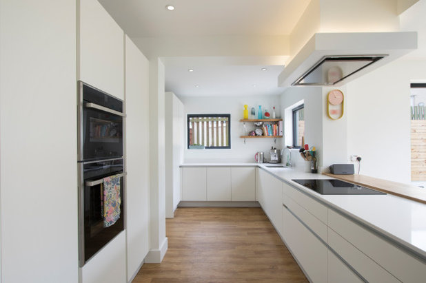
There are two doors out of the kitchen along the back wall. The most visible, here, leads to the hall. The second, tucked behind the bank of units containing the ovens and a supporting pier at the end, leads into a utility room, which was created by using some of the garage space.
There’s now an additional storey over the former garage and this part of the kitchen containing a home office and a bedroom.
The kitchen has plenty of storage; there’s a pantry next to the ovens, as well as an integrated fridge-freezer. There’s more cupboard space in the tall unit by the window (which was existing) and on the full length of the peninsula on the kitchen side.
The extractor fan is quite structural. “In part, this was to get the ducting out, but also to lower it to a point where it was efficient enough without obstructing the view of the garden,” Simon explains. It also contains atmospheric uplighting.
In terms of layout, Simon and the kitchen design company agreed about positioning the sink and hob so each affords a view across the garden. The space was also designed with the intention that the dining table would be bathed in natural light. “That’s always our aim,” Simon says.
In terms of layout, Simon and the kitchen design company agreed about positioning the sink and hob so each affords a view across the garden. The space was also designed with the intention that the dining table would be bathed in natural light. “That’s always our aim,” Simon says.
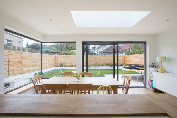
Rather than going for the skinniest (and most expensive) frames to give clear views across the garden, the clients opted for sliding doors. These allowed them to have just two panes.
With bifolds, Simon explains, they’d have needed more leaves. “More framework would have been visible and stacking would have impeded movement around the garden a little.”
With only freestanding furniture, the new space is flexible, and the layout can easily be switched around.
With bifolds, Simon explains, they’d have needed more leaves. “More framework would have been visible and stacking would have impeded movement around the garden a little.”
With only freestanding furniture, the new space is flexible, and the layout can easily be switched around.
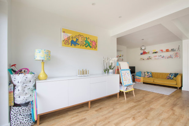
At the back of the new room, next to the kitchen but in its own little nook, there’s a cosy snug.
It’s a great space for the children to hang out while the grown-ups cook. It’s mainly used during the daytime, as there’s also a standalone living room at the front of the house.
Sideboard, Wayfair. Artwork, Keith Haring.
It’s a great space for the children to hang out while the grown-ups cook. It’s mainly used during the daytime, as there’s also a standalone living room at the front of the house.
Sideboard, Wayfair. Artwork, Keith Haring.
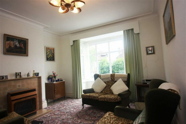
The formal living room at the front of the house previously had a very traditional look to it. Simon’s team gave it a refresh.
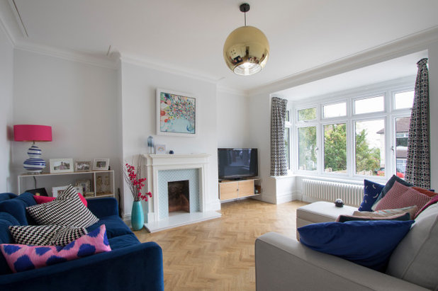
The room looks brighter, despite a fairly light touch. It got new windows, new flooring and a new radiator. One of the owner’s fathers retiled the original fireplace.
Flooring, Amtico. Blue sofa, Loaf. Fireplace tiles, Fired Earth.
Flooring, Amtico. Blue sofa, Loaf. Fireplace tiles, Fired Earth.
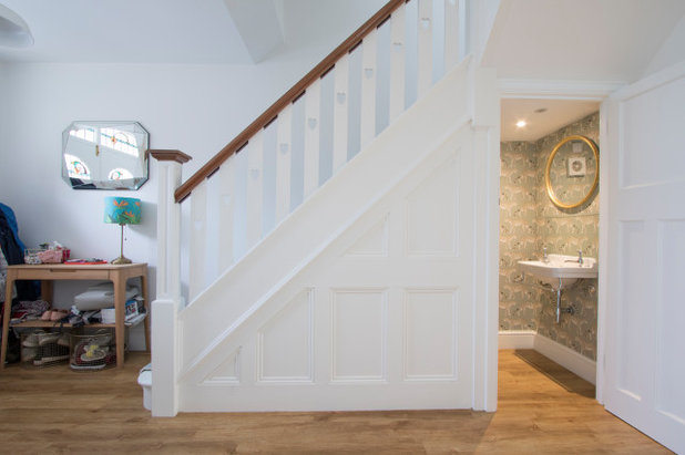
The cloakroom is new; the space had previously just been a cupboard.
Leopard Walk wallpaper, Cole & Son.
More: How to Turn Your Understairs Area into a Cloakroom
Leopard Walk wallpaper, Cole & Son.
More: How to Turn Your Understairs Area into a Cloakroom
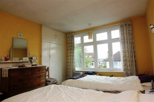
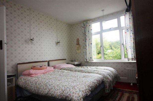
The first floor front bedroom as it originally looked.
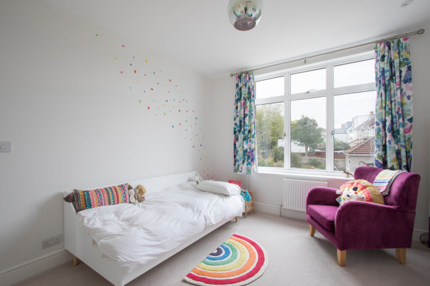
Now it feels light and bright. This room belongs to the oldest child and, again, got just the lightest of touches from Oasys. There were new radiators, new windows and complete redecoration, including removal of the fitted wardrobe.
The uPVC windows are all white on the inside and grey on the outside.
The uPVC windows are all white on the inside and grey on the outside.
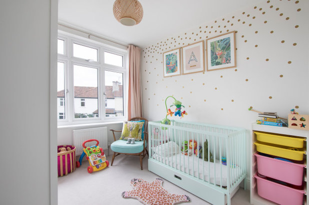
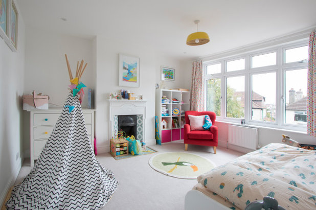
The smallest child’s room is at the back of the house – one of the two new rooms to have been constructed above the kitchen and garage.
Wall stickers, Bobby Rabbit.
Wall stickers, Bobby Rabbit.
The largest bedroom at the back of the house has lovely views across the gardens outside. It, too, was given an airy refresh by Simon’s team.
It now belongs to the middle daughter and has been redecorated and given new radiators and windows.
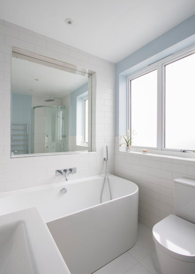
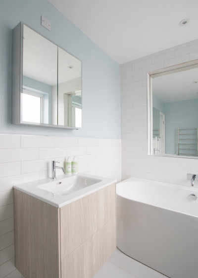
The family bathroom is on the same floor and had a complete refurbishment.
The room was originally a separate loo with a bathroom next to it. This photo is taken from the doorway into the room; to the right is a shower, just seen in the recessed mirror.
The mirror provides light and was created by digging one brick deep into what had originally been the exterior wall of the house (the new floor above the garage and kitchen now butts up against it).
Duravit toilet; Laufen basin; Vado taps; Waters Baths of Ashbourne bath, all Bathing Solutions.
The curved bath has the best of both worlds: it looks luxurious but also hugs the wall, making cleaning easier than a freestanding design with a void behind it.
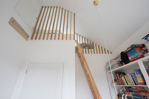
This room is the new office. It’s shot from this odd angle to highlight the clever storage space created at the top of the room. This high-up area, complete with a Velux window, fills what would have been hard-to-access eaves space connected to the adjacent room at the loft level.
“The challenge was to make it as visually appealing as possible,” Simon says, explaining the choice of attractive oak spindles and matching removable ladder.
When not in use, the ladder hooks onto the rail that’s just seen on the left of this photo. In this position, it also allows useful access to the hatch above it, which contains the boiler cylinder.
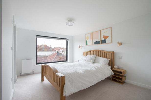
The top floor is devoted to the main bedroom and en suite.
The window seen here doesn’t open, meaning Simon was able to fit a single piece of glass for a cleaner outlook. The room is easily filled with fresh air, as there’s an opening skylight at the other end, as well as a regular window in the en suite.
Artwork, Tom Pigeon. Walls painted in White Chiffon, Dulux.
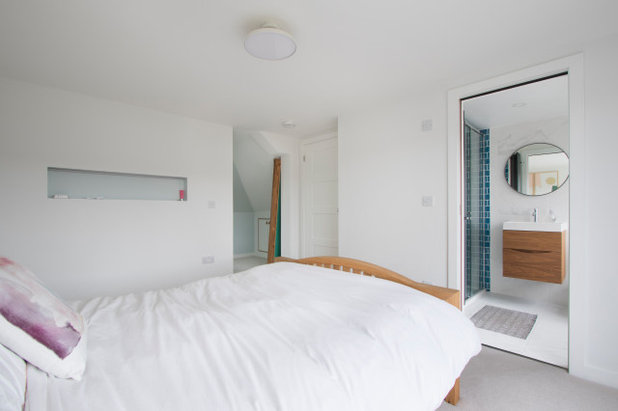
The space-saving pocket door at the foot of the bed leads into the en suite. The space to the left is an open-plan dressing room.
The wall between the two spaces is not structural, but the clients felt its presence would help to maximise the dressing room’s storage capacity.
A letterbox-shaped niche in the wall provides a handy shelf.
The wall between the two spaces is not structural, but the clients felt its presence would help to maximise the dressing room’s storage capacity.
A letterbox-shaped niche in the wall provides a handy shelf.
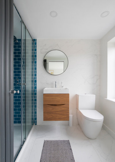
The en suite bathroom overlooks the garden and, apart from in the walk-in shower, is clad in porcelain marble-effect tiles. A floating cabinet boosts the sense of space.
Blue shower tiles, Fired Earth. Taps, Vado. Toilet, Duravit. Basin, Crosswater.
Blue shower tiles, Fired Earth. Taps, Vado. Toilet, Duravit. Basin, Crosswater.
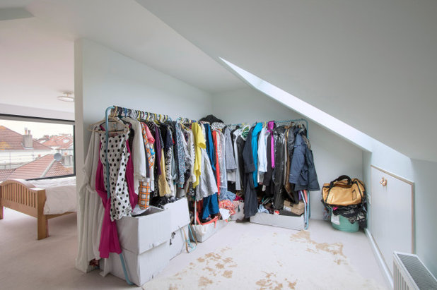
The large skylight in the dressing room gives views across Bristol.
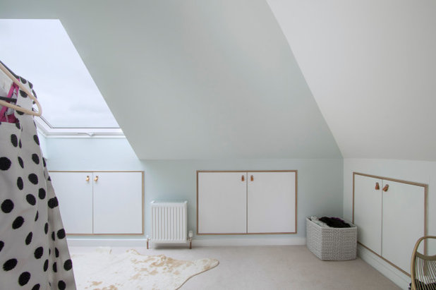
To give you an idea of the layout in terms of the previously seen office, the eaves storage on the far right would have led into that high up storage area accessed by ladder. Access, however, would have been near impossible, hence the decision to ‘give’ that eaves area to the other room, which is a floor below.
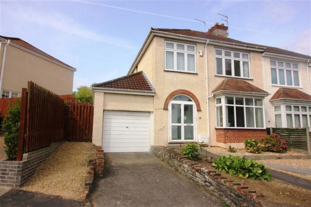
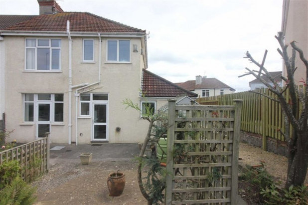
The front of the house and attached garage used to look like this.
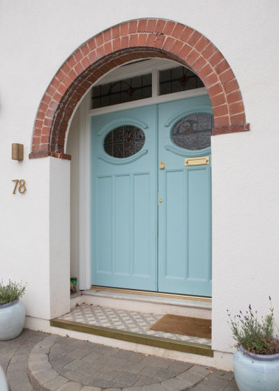
The original 1930s front door was refurbished by Oasys to improve its thermal performance and was also freshened up with paint and new furniture.
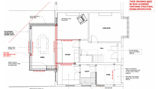
The ground floor proposed floorplan.
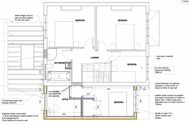
A plan of the first floor’s new design shows how the two new rooms over the garage have been configured.
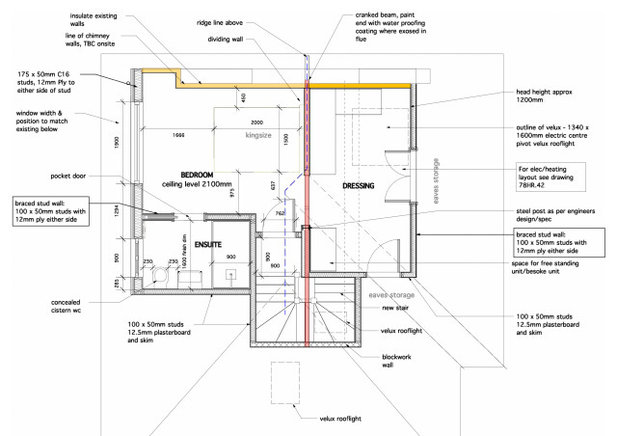
A floorplan of the new loft floor, which fills the building’s entire roof space.
Tell us…
What’s your favourite detail in this cleverly expanded family home? Let us know in the Comments.
Tell us…
What’s your favourite detail in this cleverly expanded family home? Let us know in the Comments.


Related Stories

House Tours
Houzz Tour: A Midcentury Home With a Strong Indoor-outdoor Link
By Becky Harris
A nature-inspired renovation has given this ranch house a relaxed mood and a connection to the outdoors from most rooms
Full Story

House Tours
Houzz Tour: Warm Tones and Luxurious Surfaces in a City Townhouse
An earthy colour palette, hidden storage and well-placed texture add character and practicality to this London home
Full Story

Room Tours
Kitchen Tour: A Gorgeous Extension With a Leafy Glasshouse Feel
By Kate Burt
When the owners of this terraced house extended, they were keen to retain its period feel and highlight the garden
Full Story

Gardens
Garden Tour: A Bare Roof Terrace Becomes a Pretty, Sociable Space
By Kate Burt
A retired couple got help transforming their large rooftop into a gorgeous, welcoming, multi-functional retreat
Full Story

House Tours
Houzz Tour: A Smart Layout and Genius Storage in a Victorian Home
Flipping the standard layout and carving out excellent storage have turned this tired house into a brilliant family home
Full Story

House Tours
Houzz Tour: A Victorian House Brought Impressively Up to Date
By Jo Simmons
A cohesive layout and warm colours combined with energy-efficiency measures thoroughly modernise this terraced home
Full Story

Kitchen Tours
Kitchen Tour: An Open, Airy Space Made for Entertaining
Combining two separate rooms has improved flow and created a sociable open-plan kitchen, dining and seating space
Full Story

House Tours
Houzz Tour: A Family Home Inspired by its Seaside Location
Coastal colours and practical design combine to create a house that will adapt as the family grows
Full Story

Kitchens
5 Inspiring Before and After Kitchen Transformations
Whether you want to boost storage, incorporate original features or maximise your space, take ideas from these designs
Full Story

House Tours
Houzz Tour: An Airy, Scandi Finish for a Tall Victorian House
By Kate Burt
From a tricky inherited bath to a sticky-out staircase, on-site problem-solving led to a seamless update for an old home
Full Story
Is there another form of heating as the size of the radiators appear very small for the size of the rooms?!
Wow. Congratulations on a fantastic home
I so appreciate the liberal amount of Before photos. They allow me more easily to see the remarkable transformation---and to wonder why the slim-barred windows in the living room were replaced by thicker glazing bars which would have cut down on the light.
Although a great and imaginative improvement on the original, I'm afraid the whole design is just a tad too impersonal and clinical-looking for me.