Houzz Tour: A 1913 Flat with Beautiful Period Features is Revived
See how an architect transformed a family apartment, balancing modern details with references to the past
Architect Mariapaola Mauri’s apartment in a semi-central area of Milan previously belonged to her parents, who decided to downsize. The property, built in 1913, had several beautiful period features, such as wooden floors and shutters, which Mariapaola wanted to retain, so when she began to renovate it, she used carefully considered colour choices as well as vintage pieces. She sourced furniture from renovation sites, antiques markets, and even the street when items were left out to be taken. The result? A warm, cosy, colourful home full of life.
The front door to the apartment is directly opposite the chair in the photo, which, like many of the items found here, was recovered from a renovation site where Mariapaola used to work. On the left is the entrance to the kitchen and the hallway leading to the bedrooms; the door at the end opens to a utility room. To the right, you can catch a glimpse of the living room.
“I didn’t change the doors; I kept the originals and just refreshed them,” Mariapaola says. “I only replaced the door to the utility room. As no light comes through there anyway, I preferred one without glass.”
The contrast strip that runs around the edge of the floor in the entrance dates back to the 1980s. “At first I wasn’t sure if I wanted to keep it, but I just couldn’t think of an alternative I was happy with,” she says. “After considering various options, I decided to have it renewed with a matt finish. We cleaned all the grout lines, which were almost all black. I really like the result.”
Find the renovation team you need in the Houzz Professionals Directory.
Mariapaola took out the original kitchen, designed in 2000, and changed the layout. “I also painted the cabinets under the window,” she says. “I chose a light pink colour to match the plinth, and I replaced the handles with brass knobs for a more edgy look. I also moved the fridge into an alcove.
“I decided to polish the terrazzo floor tiles,” she adds. “These were laid unpolished more than 20 years ago, and I didn’t want to replace them.”
Kitchen, Dada.
“I decided to polish the terrazzo floor tiles,” she adds. “These were laid unpolished more than 20 years ago, and I didn’t want to replace them.”
Kitchen, Dada.
Originally, there was a suspended ceiling with LED spotlights, which Mariapaola decided to replace. “I got rid of the false ceiling, took the shade from a Costanza lamp and created this solution,” she says.
Table and chairs, second-hand.
Table and chairs, second-hand.
Next to the fridge near the entrance to the kitchen there’s a bench. “Again, I found this at the old [renovation] site. It looks like it’s by Gio Ponti,” Mariapaola says.
The colour of the walls matches the colour of the cabinets under the window.
The colour of the walls matches the colour of the cabinets under the window.
In the living room, the feature wall was painted by hand. The sofa was originally red, but was reupholstered in blue fabric to match, as was the footstool. The lamp on the right is vintage, from the 1950s. Next to it is a Ptolomeo bookshelf. The painting on the left belonged to Mariapaola’s great-grandmother.
The alcove to the left was already there, while the white and walnut TV cabinet on wheels was designed by Mariapaola 20 years ago. Above the small yellow sofa is a 1970s lamp – the iconic Pistillo designed by Studio Tetrarch for Valenti Luce in 1969, later reissued as the SP Light.
All the windows on the street side were replaced. As the architect designed them herself, the shutters also had to be adapted. “With the joiner, we decided on the proportions, the moulding along the edges, the thickness, the width of the central panel, the glazing beads, hinges, and handles,” she says.
Blue upholstery fabric, Romo. Orbital coffee table by Cecilia Suarez and Julian Pastorino, Atipico.
Mariapaola is also a passionate photographer. She hung two photographs of the Reichstag in Berlin above the TV unit, while to the right of these is a photo of two figures outside the Liceo Parini in Milan, which she bought at an exhibition.
Need a pro for your home renovation project?
Let Houzz find the best pros for you
Let Houzz find the best pros for you
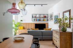
The dining area is also located in this room. The chairs were all passed on from family members. The table top is made from laminate, while the wall sconces were picked up at the Novegro flea market. Illuminating the table is an Artemide Tolomeo lamp, designed by Michele De Lucchi with Giancarlo Fassina in 1987.
The prints shown on the left-hand side are by graphic illustrator Alessandro Gottargo, aka Shout. Of the radiator beneath the prints, Mariapaola says, “I chose to paint this black to make it stand out.”
The prints shown on the left-hand side are by graphic illustrator Alessandro Gottargo, aka Shout. Of the radiator beneath the prints, Mariapaola says, “I chose to paint this black to make it stand out.”
The hallway leads to the study and the bedrooms. “I chose to replace the skirting boards, which were originally oak, both in the hallway and the lounge. I went for a higher design with moulding, made from high-density polyurethane, which I then had hand-painted for a higher-quality finish,” Mariapaola says.
Wallpaper was hung in the study. The chair is reclaimed and the iconic Costanza lamp was positioned on the desk. The bookshelf built into the alcove was already there. “I had it repainted with a brush, as I love the effect of brush strokes,” Mariapaola says.
“In general, I thought a lot about the colours and details in this apartment,” she continues. “I also searched for new light switches that were still in keeping with the overarching style of the house. Some still had the screws, which were typical of the 1960s, and so finding them wasn’t easy. I found some on eBay, notably the ones with four switches, and for the remainder I chose a basic range that had a vintage feel.”
Wallpaper, Cole & Son.
Mariapaola found this wardrobe, which is in the master bedroom, in the cellar. “It was repainted, and raised coloured trims were added to create a contrast.
“The walnut bed was painted to reinforce the light-pink tone that was in the kitchen and that dominates so many elements of the apartment,” she says.
“The walnut bed was painted to reinforce the light-pink tone that was in the kitchen and that dominates so many elements of the apartment,” she says.
To the left of the bed is an old chair, which was just picked up from the side of the road. Mariapaola opted for wallpaper behind the bed.
Wallpaper, Borås Tapeter.
Wallpaper, Borås Tapeter.
Elmetto lamp, Martinelli Luce. Bedside tables, second-hand.
From the bedroom, it’s possible to catch a glimpse of the en suite bathroom.
The daughter’s bed was unearthed at one of the renovation sites that Mariapaola regularly visits; the mirror is antique, and the painting on the bedside table is a portrait of the architect’s grandfather.
Wallpaper, Pip Studio.
Wallpaper, Pip Studio.
For the vanity top in the en suite bathroom, Mariapaola opted for Polarstone. “We chose ‘technical marble’, a type of engineered quartz that’s more resistant than classic Carrara marble, due to its precise resin content,” she says. “This was important, because I’d chosen a semi-recessed double sink, and to position it, various different holes needed to be created. The result was assembled by my trusted joiner.”
Tired of cleaning a glass shower box, she instead opted for a curtain.
“The tiles nod to the style of Piero Portaluppi, and their layout was inspired by the shop Olivetti in Venice,” she says. “Just like when I’m on a [renovation] site, I wanted to cover the walls in plasterboard from where the tiles finish, all the way up to the ceiling, to avoid that annoying step they usually create. It doesn’t look nice, and dust gathers there easily.”
Firenze hexagonal floor tiles, FAP Ceramiche. Set Gem wall tiles, Ceramica Sant’Agostino. Green 60 basins, Catalano. Milo taps, Cea Design. Portobello vanity unit, Maisons du Monde.
This photo shows the second bathroom. The table that the basin is sitting on is a family hand-me-down. An engineered top was chosen for this, too.
The bathroom is divided in the middle by a sliding door (open in this image). On the left is a metal cabinet that’s used to store cleaning products.
Basin, Flaminia.
Tell us…
Which features do you like in this home renovation? Share your thoughts in the Comments.
The bathroom is divided in the middle by a sliding door (open in this image). On the left is a metal cabinet that’s used to store cleaning products.
Basin, Flaminia.
Tell us…
Which features do you like in this home renovation? Share your thoughts in the Comments.


Who lives here? Architect Mariapaola Mauri with her husband and daughter
Location Milan, Italy
Property An apartment built in 1913 in the Liberty style (an Italian version of Art Nouveau)
Size Two bedrooms and two bathrooms; 120 sq m
Renovation year 2019
Architect Mariapaola Mauri of A di Architettura
Cost €50,000 (around £44,020), including €5,600 (around £4,930) for new windows and €3,000 (around £2,640) to restore the internal doors (for example, the kitchen door was saved and transformed into an internal sliding door)
When architect Mariapaola Mauri outgrew her home and needed a bigger place with a second bedroom, her parents offered move to a smaller house and leave their apartment to her.
She refreshed the interior, but with great respect. “I gave the apartment a facelift to make it more in line with my taste and style,” she says. “I didn’t change the layout of the rooms, but I had to redo the bathrooms, because they were more than 20 years old, and I also wanted to make them more functional.”