


Can You Guess Which Were 2019’s Most Popular Kitchen Tours?
Which was your favourite kitchen project on Houzz this year? Find out if it features in our top 10 most viewed list
Amanda Pollard
22 December 2019
Senior Editor at Houzz UK and Ireland. Journalist and editor specialising in interiors and architecture.
Senior Editor at Houzz UK and Ireland. Journalist and editor specialising in interiors... More
Dark, inky colours and a soft, pale palette are the two opposing schemes that dominate the favourite kitchen tours of 2019. Other themes include the use of natural wood and texture to add warmth, a connection to the outdoors and, of course, the ever-popular quest for super-practical storage – but with a distinct lack of wall cabinets.
This article is from our Most Popular stories file
This article is from our Most Popular stories file
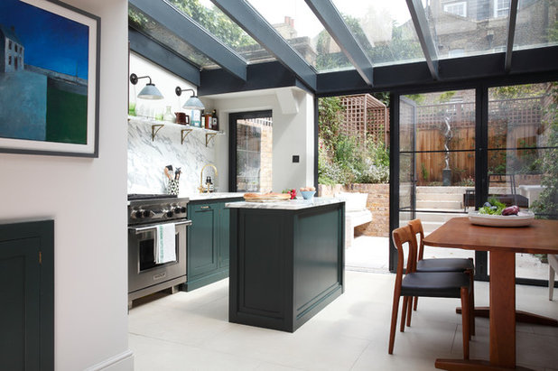
At number 10…
Smart space planning aided the design of this kitchen-diner. Sarah Ross of Sarah Ross Design moved the cooking area from the middle of the home into the existing rear extension, giving the owners a better connection with the outdoors.
To fit a kitchen and dining area into the narrow space, Sarah had to use some design tricks. The island, for example, features open shelving for storing plates. “Because the space is narrow, opening cupboards would have been awkward,” she explains.
Discover how this narrow room became a luxurious kitchen-diner.
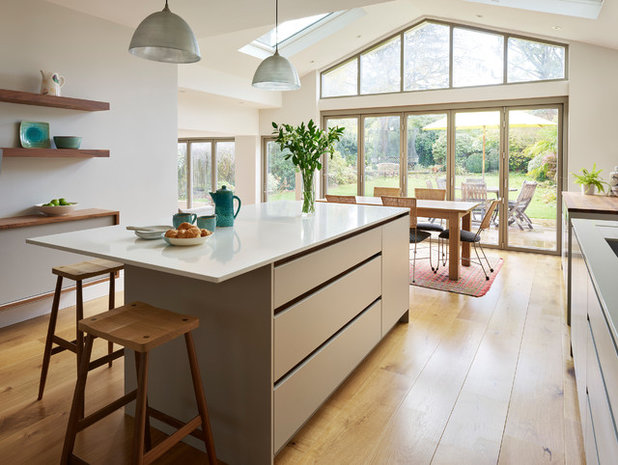
At number 9…
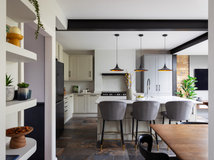
Here’s another modern kitchen that feels cosy. Jane Powell at Roundhouse combined sleek, flat-fronted cabinets with warm wooden elements to give the contemporary room a snug, inviting feel.
“The owners very much wanted the space to feel calm and open,” Jane says. The pale grey colour scheme and clever storage make the room feel uncluttered, and the sink- and hob-free island allows an uninterrupted view of the garden.
See how this kitchen was neatly organised to include masses of storage.
At number 8…
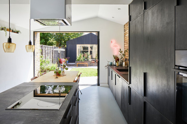
The extension at the back of this Edwardian home is a modern shell, but that’s not how the finished room appears. Rachel Healy of H Interiors added traditional cabinets, a reclaimed brick wall and some beautiful Crittall windows to give the space heaps of heritage character.
Other luxurious features include a hardwearing marble-effect worktop, brass handles, and a useful breakfast cupboard where the owners can keep their toaster and kettle off the surfaces.
Visit more of this open-plan extension lifted by Crittall windows.
At number 7…
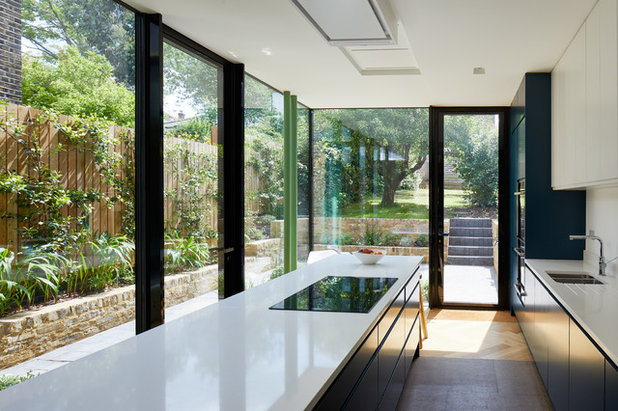
This space features a concrete floor and metal-framed glazing – elements that could have felt a little cold on their own. Roman Pardon of Pardon Chambers Architects gave it a warm feel with bespoke birch ply and oak cabinetry that resembles freestanding furniture.
He brought in even more texture by installing wall units with reeded glass doors and covering the splashback with gorgeously reflective zellige tiles.
Have a nose around this bright, open kitchen-diner.
Feeling inspired? Read reviews of architects and kitchen designers in your area.
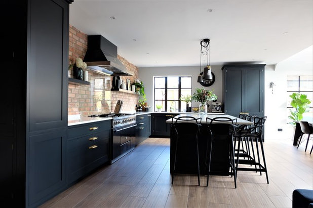
At number 6…
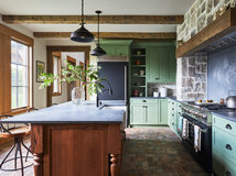
Some clever ideas went into the construction of this cool kitchen. Owner and architect Richard Andrews, of Richard John Andrews, wanted to create an expensive look without a hefty price tag, so he started with the cabinets. He used MDF for the carcasses and birch play stained with Indian ink for the doors and worktops.
The handles are recycled Ikea models and lighting and seating are upcycled and vintage finds. These cost-effective solutions are elevated by considered design, such as consistency of colour and materials and an interesting shadow gap below the worktop.
Visit more of this stylish extension kept on budget by smart design.
At number 5…
A side-return return extension helped to widen this narrow Victorian house, but there was no need to eat into the the garden too much…
A side-return return extension helped to widen this narrow Victorian house, but there was no need to eat into the the garden too much…
“We didn’t extend the full length, but stopped halfway to retain some of the courtyard,” architect Frederik Rissom of R2 Studio Architects explains.
With the extra 9 square metres of internal space the extension created, the owners were able to incorporate a dining room into their cooking area.
The kitchen itself features off-the-shelf cabinetry customised with dark blue paint. The long island unit, meanwhile, is perfectly positioned for a great view of the garden.
See more of this side-return extension that created a light dining area.
At number 4…
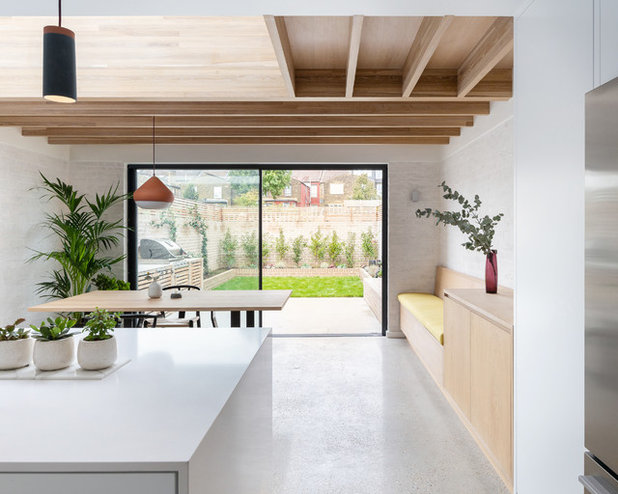
This kitchen might look minimal, but that simplicity was what made it so tricky to design. “If you’re exposing all the finishes, there’s nowhere to hide,” Lizzie Ruinard of neighbourhood studio says. “You can’t just disguise everything with plasterboard.”
Lizzie chose brick, concrete and oak as the main materials and kept them as natural and untreated as possible.
Another clever trick was to section off the back of the kitchen to fit in a slim utility room. It stops the long space feeling too cavernous and provides the owners with a useful laundry and storage area away from the cooking zone.
Take a peek around this old lean-to that became a clean, fresh kitchen-diner.
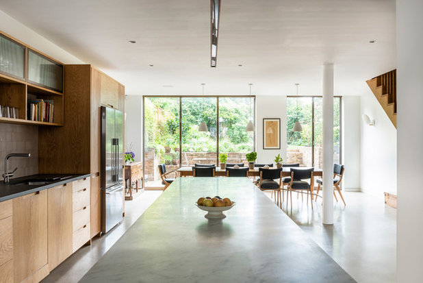
At number 3…
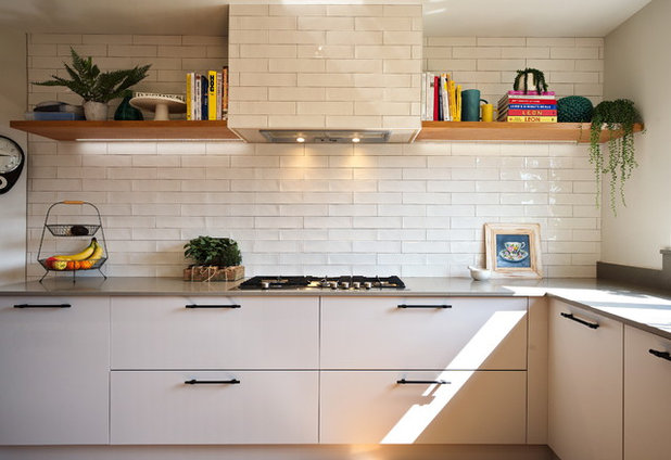
A brighter room with clear walls was the brief for this kitchen. The original cooking area had masses of wall cabinets, though, so Simon Lennox of Adornas Kitchens & Interiors had to be clever in order to give his clients the same amount of storage without cluttering the space.
Large drawers were key. “They provide much more storage than cupboards, as nothing is inaccessible,” Simon explains. A bank of floor-to-ceiling units at the side of the room makes a useful food storage zone.
Tour this cluttered kitchen that gained order, space and light.
The runner-up at number 2…
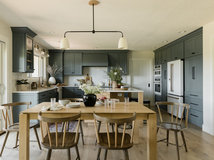
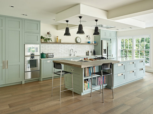
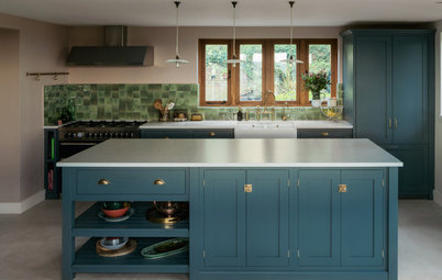
Was it the soft colour palette, the masses of storage or the multi-functional island that made this kitchen so popular? The answer is probably all of the above.
Elegant green, Shaker-style cabinets were given a matt finish to complement the smoked oak floors, while unusual handles add an interesting touch to the room.
Barry Sawyer at Brayer Design incorporated drawers, base units and tall units, including a super-useful breakfast cabinet with retractable doors and internal lighting.
See inside this open-plan space that’s perfect for entertaining.
And the winner is…
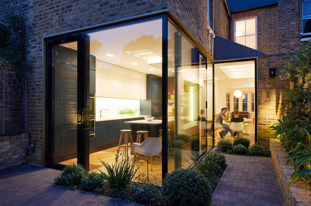
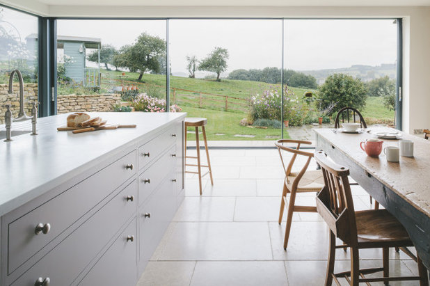
This view is pretty spectacular, but that’s not the only thing this kitchen has going for it.
The stylish, Shaker-style cabinetry and light grey quartz worktops give the space, designed by Matt Higgins of Sustainable Kitchens, a simple elegance. Pale hues and deeper blue tones perfectly complement the natural timber and exposed brick in the rest of the room.
There’s also the huge island with masses of storage, and the lack of wall units adds a feeling of space. But the real draw for many readers was the pantry…
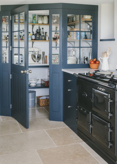
The walk-in cubicle with beautiful glazed doors, a marble-look worksurface and neatly organised storage shelves is a dream feature in this kitchen. The team fitted the home’s original dining room door to the cupboard, but placed it at an angle, so the pantry doesn’t protrude into the rest of the space too sharply.
Take a tour of this timeless, Shaker-style kitchen.
Tell us…
Is your favourite kitchen tour of last year among this selection? If not, which cooking space inspired you in 2019? Share your thoughts in the Comments section.
Take a tour of this timeless, Shaker-style kitchen.
Tell us…
Is your favourite kitchen tour of last year among this selection? If not, which cooking space inspired you in 2019? Share your thoughts in the Comments section.

Related Stories

House Tours
Houzz Tour: Warm Tones and Luxurious Surfaces in a City Townhouse
An earthy colour palette, hidden storage and well-placed texture add character and practicality to this London home
Full Story

Room Tours
Kitchen Tour: A Gorgeous Extension With a Leafy Glasshouse Feel
By Kate Burt
When the owners of this terraced house extended, they were keen to retain its period feel and highlight the garden
Full Story

Gardens
Garden Tour: A Bare Roof Terrace Becomes a Pretty, Sociable Space
By Kate Burt
A retired couple got help transforming their large rooftop into a gorgeous, welcoming, multi-functional retreat
Full Story

House Tours
Houzz Tour: A Smart Layout and Genius Storage in a Victorian Home
Flipping the standard layout and carving out excellent storage have turned this tired house into a brilliant family home
Full Story

House Tours
Houzz Tour: A Victorian House Brought Impressively Up to Date
By Jo Simmons
A cohesive layout and warm colours combined with energy-efficiency measures thoroughly modernise this terraced home
Full Story

Kitchen Tours
Kitchen Tour: An Open, Airy Space Made for Entertaining
Combining two separate rooms has improved flow and created a sociable open-plan kitchen, dining and seating space
Full Story

House Tours
Houzz Tour: A Family Home Inspired by its Seaside Location
Coastal colours and practical design combine to create a house that will adapt as the family grows
Full Story

Kitchens
5 Inspiring Before and After Kitchen Transformations
Whether you want to boost storage, incorporate original features or maximise your space, take ideas from these designs
Full Story

House Tours
Houzz Tour: An Airy, Scandi Finish for a Tall Victorian House
By Kate Burt
From a tricky inherited bath to a sticky-out staircase, on-site problem-solving led to a seamless update for an old home
Full Story
House Tours
Houzz Tour: A 17th Century Cottage Gains Warmth and Character
The clever use of colour and pattern has revived this old building while creating a 21st century family home
Full Story
They all look rather similar, with the exception of Numbers 2 and 3, and depend on having perfect gardens or open views , in both cases with nobody overlooking them. My choice would have been Number 2, partly because the colour is more pleasing, has recipe books, and looks like a working kitchen.
Hi, can you travel to Iran and do some of above designs??
I feel that the view from the winner was a huge factor in its popularity (and prob also that awesome walk-in cubicle) but one I really liked at the time, was No:6, designed and owned by Richard John Andrews. This photo doesn't do the room justice imo, but there were many green ideas in his project to create a delightful kitchen 'without the hefty price tag'.