


Can You Guess the Past Year’s Most Popular Kitchen Tours?
Kicking off on NYE 2019, we look back at the year’s kitchen tours and pick out the 10 that appealed to you most
Kate Burt
25 December 2020
Houzz UK. I'm a journalist and editor, previously for the Independent, Guardian and various magazines. I'm now excited to part of the editorial team at Houzz UK & Ireland, bringing the best of British and Irish design, interiors and architecture to Houzz.com.
Houzz UK. I'm a journalist and editor, previously for the Independent, Guardian and... More
Natural light, budget-stretching ideas, and challenges that turned into opportunities all feature in the past year’s most popular kitchen tours on Houzz. Does the countdown below reflect your favourites?
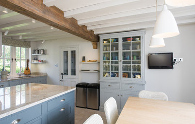
At number 10…
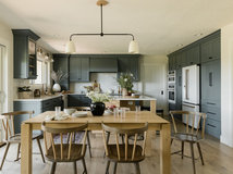
“Full of charm and personality…” Genius…” “Outstanding…” These are just some of the comments from you about this country kitchen creatively made over on a very small budget.
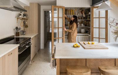
The original plan for this kitchen in North Yorkshire was that it would be extended. However, planning complications and budget shrinkage put the whole thing on ice indefinitely. So the owners called on interior designer Karen Knox of Making Spaces to work with what was already there instead.
Karen reconfigured the existing cabinets, painted the doors, removed wall units, added striking wallpaper, replaced the worktops, updated lighting and generally waved her designer’s magic wand over a number of other issues – aesthetic and practical – to give the owners what feels like a totally new kitchen. The result works so well, the extension may never need to be built.
Read the original story of this country kitchen stylishly updated on a budget.
“Full of charm and personality…” Genius…” “Outstanding…” These are just some of the comments from you about this country kitchen creatively made over on a very small budget.
The original plan for this kitchen in North Yorkshire was that it would be extended. However, planning complications and budget shrinkage put the whole thing on ice indefinitely. So the owners called on interior designer Karen Knox of Making Spaces to work with what was already there instead.
Karen reconfigured the existing cabinets, painted the doors, removed wall units, added striking wallpaper, replaced the worktops, updated lighting and generally waved her designer’s magic wand over a number of other issues – aesthetic and practical – to give the owners what feels like a totally new kitchen. The result works so well, the extension may never need to be built.
Read the original story of this country kitchen stylishly updated on a budget.
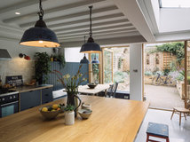
At number 9…
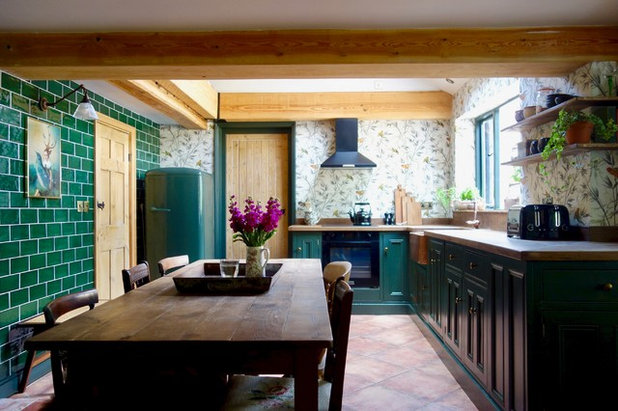
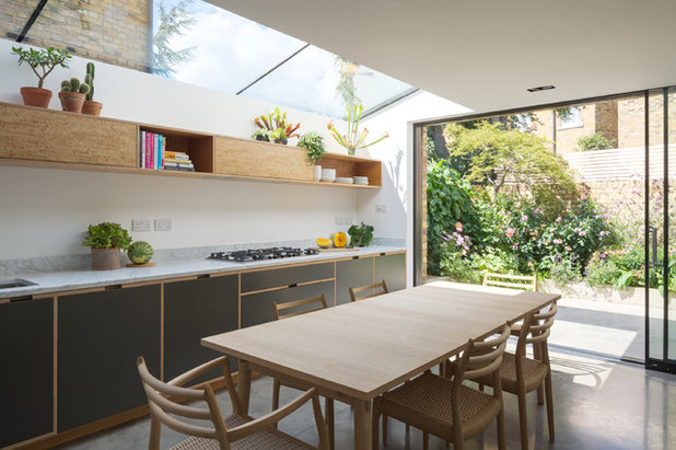
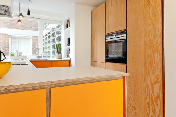
With its gloriously large rooflight and glazed sliding doors, the extension on this Victorian terrace was already light and airy when Alan Drumm of Uncommon Projects was brought on board.
He designed a new kitchen to suit the space using his firm’s trademark plywood cabinetry. He also incorporated subtle design details – from cork panels to an inside-outside bench – that help to tie the kitchen to the pretty courtyard garden.
“Really elegant and attractive, yet plenty of storage,” was one verdict on this kitchen, while another concluded it to be, “Perfect! Timeless … and full of great ideas.”
See the whole of this beautifully crafted space connected to the garden.
At number 8…
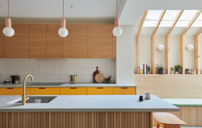
Extending at the rear and into the side return gave the owner of this kitchen in a Victorian mid-terrace house the space she’d dreamed of.
When it came to designing the kitchen itself, architect Richard Skinner of Archea worked closely with her to keep costs down while adding character. This involved using Ikea carcasses to create the kitchen’s structure, but with customised doors for a more personalised look. The wall units are wood-veneered MDF and the base and tall units are basic Ikea doors spray-painted dark blue. Beautiful, diamond-cut metal handles and Carrara marble worktops add a luxe finish.
“The project is a lesson in how to use off-the-shelf items in a very stylish way,” concluded one commenter.
Tour the rest of this characterful and sociable wraparound extension.
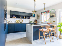
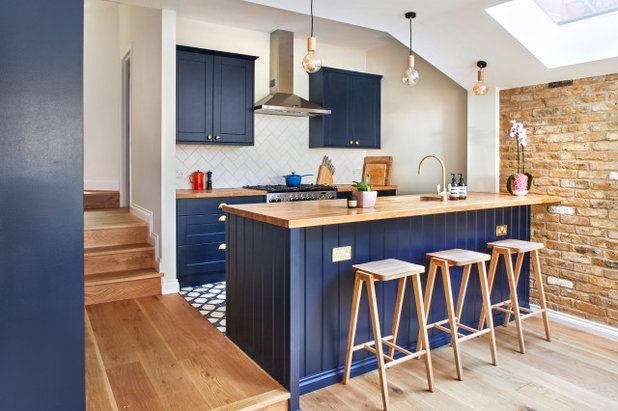
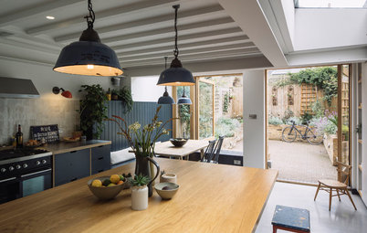
At number 7…
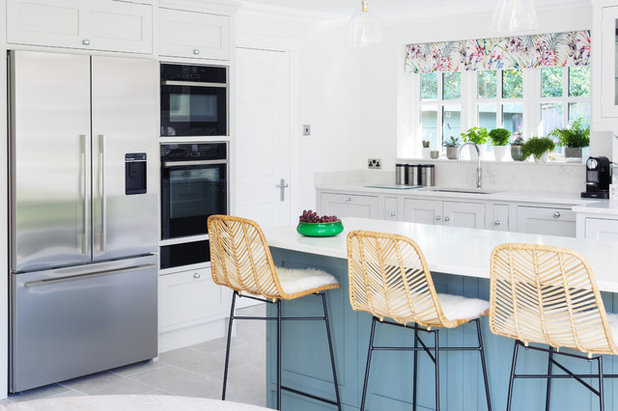
The owners of this kitchen, in a 1970s house, had already installed a new terrace and bifold doors, but the internal space needed to be reorientated to make the most of the view.
“We located the storage cabinetry along the darkest wall and positioned the island to look out towards the garden,” says designer Nicky Percival, who also made the most of a recessed area next to the doors to tuck in a dining table.
The warm blue of the island contrasts with the pale grey units and flooring. “The clients wanted a fresh, contemporary kitchen that wasn’t uber modern,” Nicky says, “so they went for a classic Shaker design with simple handles and limited moulding.”
And you were impressed by the result. “What a lovely bright, fresh kitchen. A traditional vibe but never stuffy. I love it all … Fabulous,” one commenter said.
Discover how bright hues added warmth to this airy kitchen.
Make the challenge of finding the right people for your project easier by searching the Houzz Professionals Directory.
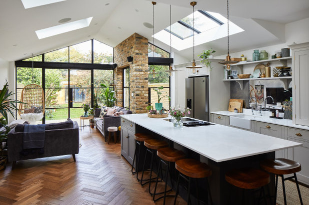
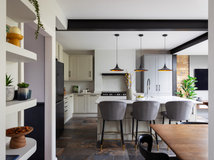
At number 6…
“The owners cook a lot and like to spend time in the kitchen, which had previously been quite small and dark,” says Fatimah Ishmael of Model Projects, the architectural designer who worked on this extension to a Victorian terrace. “They also wanted a utility room – really valuable, as they have three kids,” she adds, “and a snug area to keep the family together when the parents are cooking.”
The finished kitchen is packed with storage. It also has a large island containing a hob and lots of worktop space, as well as seating on both sides.
When an initial plan for a full-width extension was not approved, a ‘step-back’ was introduced, making the structure shallower on the kitchen side. What started as a compromise, however, has become a feature the owners particularly like, as the living space and kitchen now have a slight separation that really works for their busy family life.
Your conclusion? “Simply breathtaking,” is how one commenter summed up the design.
Take the full tour of this stylish new extension.
At number 5…
Packing functionality into a small space was at the heart of the brief to designer Alison Burfield of Transform-A-Space in Australia. The homeowner also wanted a modern finish with clean lines; some wood elements to add warmth, and an overall light and bright feeling.
“It was a very small space,” Alison says. “Small kitchens are harder to design than larger ones [and] the client particularly wanted more storage to help her declutter. You [also] need to fit in the essential items – fridge, hob, oven, extractor and sink – while ensuring the client won’t be knocking their hip against the worktop while frying up their eggs for breakfast.
A key feature to fit in was the peninsula, designed partly as a place for friends to sit while the owner’s young adult son (a passionate cook) prepared a feast for their guests. “We needed to ensure there was sufficient clearance for the bar stools, while not compromising on the internal clearance,” Alison says.
Check out the before photos of this once-cramped kitchen that’s now a Scandi delight.
At number 4…
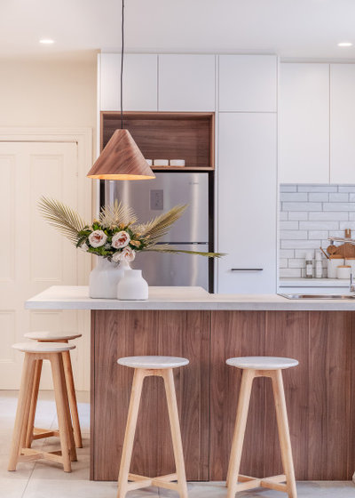
“All of the custom features are genius,” said one commenter of this small kitchen in a 1950s block of flats. “Soo practical. Soo cheerful. Soo handsome,” wrote another. More praise came for its size and sustainability credentials: “I love smaller kitchens! I also respect the eco-friendly design.”
The building the kitchen is in was designed by the renowned midcentury architecture firm, Austin Vernon & Partners. With the flat having such modernist credentials, Douglas Sutherland of Koivu wanted to honour its history when he redesigned the kitchen. “The [building’s lift] still has the original Formica in it,” he says.
Both he and the owner were keen for something period-sensitive. “Part of the brief was that the kitchen should be in keeping with that era,” he says, “and the Formica, the colour, and the wood detailing all came from that.”
See more of this sustainable design in a small midcentury flat.
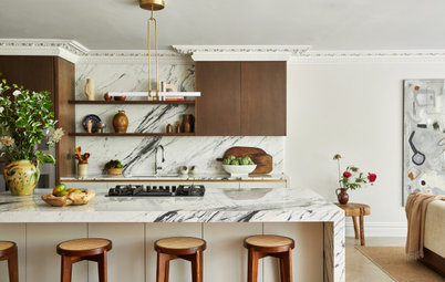
At number 3…
“A stunning kitchen! Beautiful layout and great use of space.” This comment reflects what lots of you felt about this kitchen, which is in an extension to a Victorian house.
An uneven site necessitated a room on two levels, with a step leading from the original house to this new space, where this kitchen sits. Eamonn Agha of Holland Street Kitchens turned this detail into a positive.
A typical open-plan kitchen often has the island in the centre, but here the cooking zone is located in the corner of the space, where the original building used to end. This area is on a higher level than the extension, so Eamonn turned the height difference into a design feature by lining up the peninsula with the step.
“It worked out really well, as it allowed regular-height worktops in the kitchen and a taller bar area on the other side,” he says.
Read more about how this dark blue kitchen with a farmhouse feel was designed.
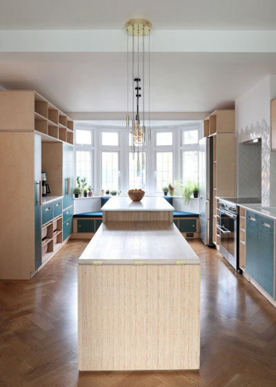
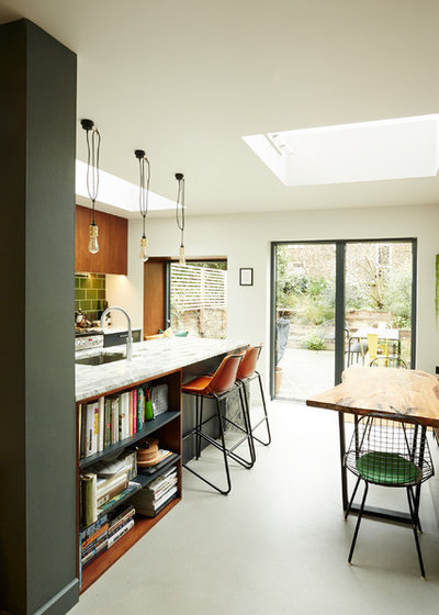
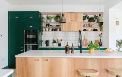
At number 2…
This birch plywood kitchen is located at the front of a Victorian home. The owners were keen to blend a contemporary cooking zone with the traditional elements of their property.
The layout consists of two runs of cabinets flanking a large central island. “There are two levels on the island – one for food preparation and the other for dining,” designer Soroush Pourhashemi of kitchen design company Lozi explains. The side panel of the eating area is, in fact, a flip-out surface.
“What a stunning kitchen! Beautiful layout and great use of space,” one commenter posted.
See how ingenious extras added practicality to this bright space.
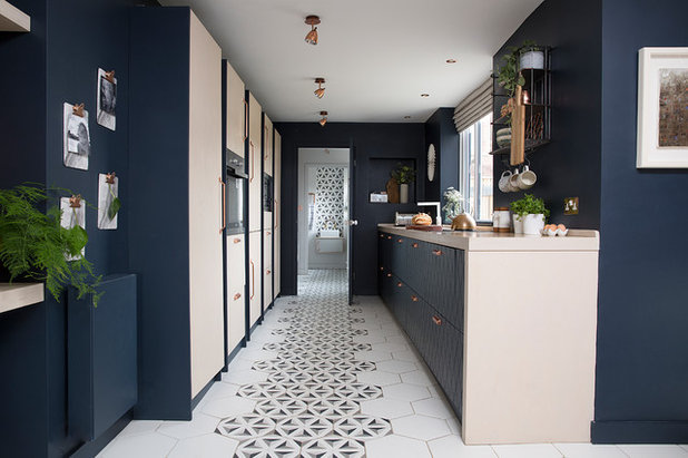
At number 1…
What do you think of the kitchen that sits in our top spot? Here’s what one reader wrote: “How great to see a small character property full of quirky charm transformed into an ideal family home.”
Indeed, this clever redesign, in a worker’s terrace, gave the clients all the space they needed – without the extension they’d originally been planning. The owner, Katie Lee, wanted a big, open-plan space the whole family could use, plus plenty of storage, and had already had plans for an extension drawn by an architect when she asked Cathy Dean to take a look.
“I don’t think you need an extension,” Cathy told her. “You already have the space you need.” Extension plans were duly scrapped and the designer reworked the layout, packing into the existing footprint the family kitchen/diner/living area/home office Katie wanted, along with a bijou boot room, a tiny utility and a wonderful sense of space.
Discover the full story of how this petite terrace gained space without being extended.
Tell us…
Which is your favourite design? Share your thoughts – and a link to your best-loved kitchen tour if it’s not included here – in the Comments.

Related Stories
Kitchen Inspiration
10 Smart Storage Tips for Your Kitchen Bins
Keep kitchen rubbish stylishly tucked away with these clever solutions
Full Story

Kitchen Design
Which Kitchen Worktop Colour Should You Choose?
By tidgboutique
Consider these popular colours and styles to get the look you want, no matter which material you use
Full Story

Kitchen Inspiration
5 Inspiring Before and After Kitchen Transformations
Whether you want to boost storage, incorporate original features or maximise your space, take ideas from these designs
Full Story
Kitchen Inspiration
5 Ideas for Kitchen Extension Layouts in Victorian Homes
By Kate Burt
Embarking on a rear extension project? Need layout ideas? Look no further...
Full Story
Kitchen Inspiration
16 Kitchens With Vertically Stacked Tiles
Looking for kitchen tiling inspiration? Browse this gallery of beautiful designs
Full Story
Renovating
Should I Live On-site During My Kitchen Renovation?
By Kate Burt
If you’re weighing up whether to stay put or ship out during your project, this expert guide is a must-read
Full Story
Bedrooms
What to Expect at the Biggest Kitchen, Bedroom and Bathroom Show
Plan ahead with our rundown of what’s in store at the kbb Birmingham event this March
Full Story
Kitchen Design
Which of These Kitchen Renovation Trends Would You Choose?
By Kate Burt
The 2024 Houzz Kitchen Trends Report is out. Dive into the highlights to see what’s topping your choices
Full Story
Kitchen Inspiration
24 Beautiful Bare Wood Kitchens
By Kate Burt
From pale and pared back to warm and textured, unpainted cabinets are suddenly everywhere. Which look do you like best?
Full Story
Kitchen Planning
How to Design a Multigenerational Kitchen
A space that successfully meets the needs of all those who use it is not only inclusive, it’s futureproof
Full Story
I loved the No.1 kitchen. Saved the photo. Just love the flooring.
I could totally live in no.6 all day long. Spacious, bright, great island/ seating area. 😍
I would have been astonished if Cathy Dean's kitchen magic hadn't featured somewhere - but I was overjoyed to see it in the Number 1 spot !! An utterly worthy winner, and I keep looking at it whenevr it pops up in a feature. I'm not a "blue" lover, but this combination of light French navy and pinky almond just does it for me. The unusual flooring is fabulous, as is the way it is continued into the cloakroom at the end. With the possible exception of numbers 4 & 5, it's also about the smallest listed. I have seen the insides of many similar terraced properties, and it's intriguing how many internal variations there can be on the theme. I'll say it again: this is absolutely outstanding ! I LOVE it - and clearly others feel the same way !