


9 Times Renovation Experts Thought Outside the Box
From conjuring up another room to cutting an unexpected corner, these projects were elevated by creative thinking
Amanda Pollard
13 February 2019
Senior Editor at Houzz UK and Ireland. Journalist and editor specialising in interiors and architecture.
Senior Editor at Houzz UK and Ireland. Journalist and editor specialising in interiors... More
Sometimes it’s those clever or off-the-wall decisions that can make all the difference to a renovation project. Take a look at how some lateral thinking helped these designers and architects get great results for their clients.
This article is from our Most Popular stories file
This article is from our Most Popular stories file
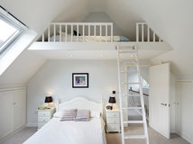
Piece it all together
A 50 sq m apartment is pretty small, but that didn’t stop the architect owners from converting their home back from a one bedroom flat to its original two bedrooms. To do this, they combined the kitchen and living space and fitted the layout together like a puzzle.
A 50 sq m apartment is pretty small, but that didn’t stop the architect owners from converting their home back from a one bedroom flat to its original two bedrooms. To do this, they combined the kitchen and living space and fitted the layout together like a puzzle.
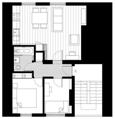
The bathroom, for example, was long and thin, while the adjacent bedroom had no storage. The answer? Rework the bathroom into a square and steal some space to add a wardrobe to the bedroom.
“We even made the bedroom niche a very specific size, so an Ikea wardrobe would fit into it perfectly,” architect Emma Perkin says.
Visit the rest of this one-bed flat transformed into a two-bed home.
“We even made the bedroom niche a very specific size, so an Ikea wardrobe would fit into it perfectly,” architect Emma Perkin says.
Visit the rest of this one-bed flat transformed into a two-bed home.
Reduce floor area to create space
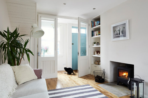
It might seem counter-intuitive to take away floor space from an already small living room, but in this home it worked. The designer created a hallway by fitting a timber and glass screen a little way from the front door to give privacy from the street and keep coats and shoes neatly out of the way.
“You don’t do anything near the door anyway, so you’re not losing any living space by adding a division,” architect Eva Byrne says.
Explore this tiny house made to feel bigger with smart design tricks.
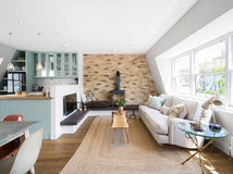
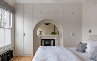
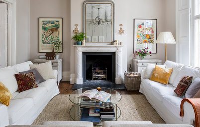
Go back to front
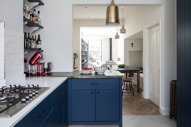
The owners of this Victorian home had a few privacy issues. Living near a popular football stadium meant people would queue up outside their living room window every weekend.
To help them feel more relaxed in their home, the architect decided to reverse the layout of the ground floor. The kitchen was moved to the front of the house, and the living area was positioned at the back, looking out to the garden.
This simple piece of lateral thinking has had a huge impact on the space, and has given the owners a private seating area where they can really unwind.
Discover more about the smart layout and storage in this Victorian home.
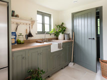
Mix high end and high street
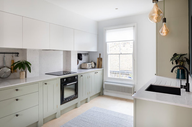
Even if your budget is tight, you don’t have to forfeit high-end features entirely. The designers of this apartment combined cheap and expensive elements to ensure their clients could stay on budget without having to compromise.
In the kitchen, the wall cupboards were sourced from a cost-friendly supplier, while the base cabinets were more expensive. The lower units get more wear and tear, so it made sense to spend a bit extra on these while saving on the wall cupboards.
Take a look at this tired flat that got a light- and space-boosting layout.
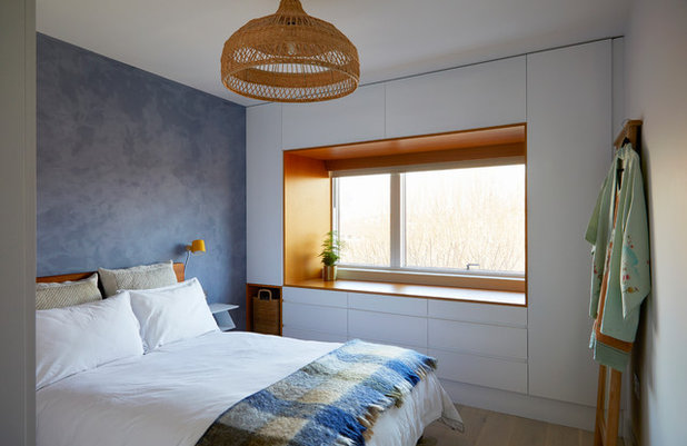
Combine a seat with storage
The interior designer tasked with transforming this flat didn’t let a large window get in the way of adding storage to the bedroom.
She designed bespoke cabinets that surround the window, creating a wall of useful storage. On top of this, the owners now have a beautiful, teak-veneered window seat.
Find out how this dull flat was turned into a guest-friendly home.
Read reviews of carpenters and joiners in your area.
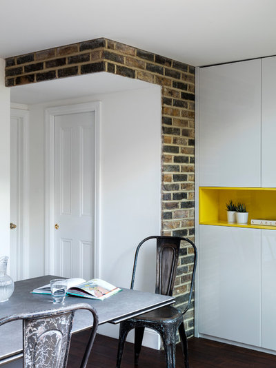
Leave the old in place
The architect who redesigned this Victorian flat, Lior Brosh, could have removed this corner from the dining area, but he chose to make a feature of it instead. The wall is part of a previous extension, so he kept it in place to highlight what was there before.
“I had the option to wipe out this extension completely,” Lior says, “but I wanted to keep the story alive.”
See how this Victorian flat was sympathetically restored.
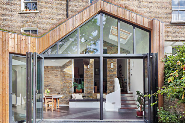
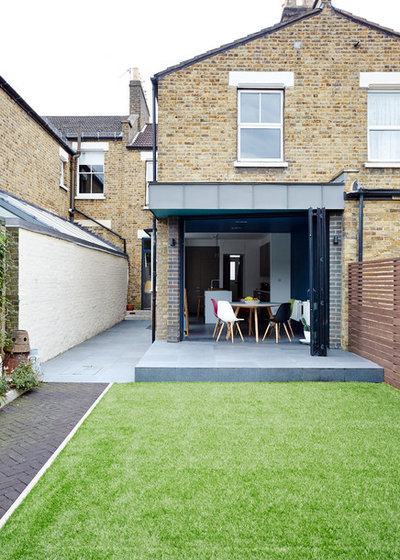
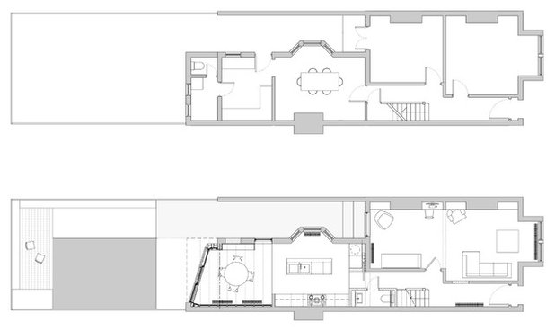
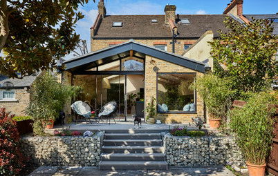
Don’t knock through
Here’s another example of a renovation that turned previous architecture into a feature. The owners and architects were keen to keep the original separation and proportions of this period home, while adding extra space to the property.
The solution was to build a beautiful pitched-roof extension on the back, but keep the original rear façade. The effect is almost magical, and by keeping the original window and door openings, plenty of light is able to flood into the living room behind the wall.
Take a tour of this clever extension.
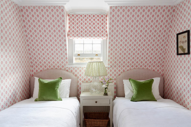
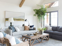
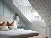
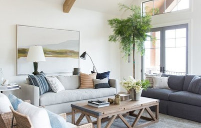
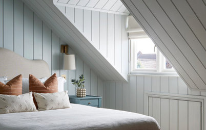
Play with symmetry
In an awkward space, a designer’s know-how can really come into its own. Take this guest room, for example – the space on either side of the window isn’t even, so design tricks have been used to make it work visually.
The high bedside table helps to correct the balance, while the patterned surfaces draw the attention away from the uneven architecture.
See more of this welcoming home with a warm, calm palette.
Swap big for small
There was already an extension at the back of this house when the owners moved in, but the space didn’t work very well. To create a more spacious feel, the architect went against the grain and replaced the old extension with a smaller one.
Seems odd? Well, the new extension has an angled opening that focuses the eye out to the garden and makes the space feel larger.
“Space wasn’t required, but making space was,” architect Richard Skinner says.
Discover more about how this dated extension was tweaked to create more space.
Tell us…
Did your renovation professional think outside the box? Share your experiences in the Comments section.
Discover more about how this dated extension was tweaked to create more space.
Tell us…
Did your renovation professional think outside the box? Share your experiences in the Comments section.


Related Stories
Decorating
Where Do I Start When Renovating or Redecorating My Home?
By Eva Byrne
Keen to get going on a project but not sure where to begin? Read this practical guide to getting started
Full Story
Gardens
How Do I Create a Drought-tolerant Garden?
By Kate Burt
As summers heat up, plants that need less water are increasingly desirable. Luckily, there are lots of beautiful options
Full Story
Architecture
21 Ways Designers Are Incorporating Arches Into Homes
By Kate Burt
Everywhere we look on Houzz right now, a cheeky arch pops up. How would you add this timeless architectural feature?
Full Story
Lifestyle
How to Improve the Air Quality in Your Home
Want to ensure your home environment is clean and healthy? Start by assessing the quality of your air
Full Story
Gardens
Can I Have a Lawn-free Garden That’s Kind to the Environment?
Try these tips to help you plan a garden without grass that’s still leafy and eco-friendly
Full Story
Sustainability
How Can I Incorporate Biodiversity Into My Building Project?
By Kate Burt
If you’re renovating, you have a brilliant opportunity to plan in nature-friendly touches at the outset
Full Story
Lofts
How Do I Begin a Loft Conversion?
Wondering where to start when converting your loft? Ask yourself these questions to ensure you plan well
Full Story
Living Rooms
Where Designers Would Spend and Save in a Living Room
By Cheryl F
It’s your main relaxation space, so what should you splurge or scrimp on in the living room?
Full Story

Architecture
Japan’s Riken Yamamoto Wins the 2024 Pritzker Architecture Prize
The architect is known for creating indoor-outdoor homes and buildings that foster a strong sense of community
Full Story
Working with Pros
How to Choose an Electrician
By Cheryl F
From what to ask to getting the best result possible, here’s what to know when you’re hiring an electrician
Full Story
Refreshing article where ingenuity and practicality has been prioritised over a huge project budget.
I really liked the 'not knocked through' extension. The window and door spaces give the new area a quirky feel and makes it all the more interesting.
I too liked the 'not knocked through' extension. Impressive! 'Swap big for small' is innovative and nice and I'm glad the architect 'left the old in place'. I love the vision the various architects and designers had for these properties.