Renovating
5 Times a Designer’s Radical Rethink Has Paid Off
The transformation of each of these spaces shows what a difference a bold vision can make

The job of a designer is to see what we homeowners often can’t – to have a vision and ideas we might not think of ourselves. Here are some of the best examples of just that.
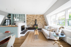
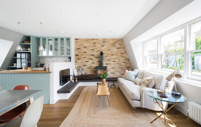
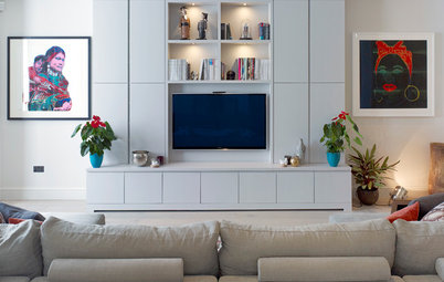
Kate encouraged the owners that a dramatic, deep blue theme used throughout the house would transform it. In fact, the change has made the rooms look lighter and brighter.
Kate also tinkered with several pieces of furniture and accessories to help the rooms feel bigger, as well as adding in lots of strong patterns and colours in the form of fabrics.
Take a tour around the rest of this transformed home.
Kate also tinkered with several pieces of furniture and accessories to help the rooms feel bigger, as well as adding in lots of strong patterns and colours in the form of fabrics.
Take a tour around the rest of this transformed home.
The budget facelift
Painting an entire space black is not for the fainthearted. The owners of this Victorian cottage had abandoned a planned extension, which would have replaced this garden room off the kitchen.
They run a business from the house and this room was intended partly to be the reception area, yet it felt like the neglected, unused furniture dump it had become. There were also masses of ugly cables trailing the walls and unsightly pipework.
The owners needed the space to look good on a budget. So when interior designer Karen Knox of Making Spaces came on the scene, she suggested a rather dramatic facelift: to paint almost all of it black.
And for less than £2,500, the room went from this…
…to this.
The black not only looks stylish, it performs a useful function, as Karen explains. “I always find that if you have loads of things you don’t want to see, paint them black,” she says.
Visitors will now be greeted in a smart, welcoming space.
See more of this budget-friendly makeover.
Make the challenge of finding the right people for your project easier by searching the Houzz Professionals Directory.
The big knock-through
This looks like a very ordinary 1970s terrace – and before its redesign, it had hardly been altered since it was built.
Enter architect Thomas Griem of TG-Studio, whose clever design made the interior open, light – and completely unrecognisable from what it had been. “[Originally] it was really 1970s inside,” he says. “Nothing was open plan and the whole place was very dark.”
Not any more. “We removed as many dividing walls as possible to allow it to be lit from the front and back,” Thomas explains. There’s now an uninterrupted view right through the property.
The house is arranged across six half-floors, and Thomas replaced the existing chunky, imposing staircase between them with a floating tread design, angled to create a better connection between each floor. He also fitted a glass balustrade for maximum light flow.
Check out the full story.
The house is arranged across six half-floors, and Thomas replaced the existing chunky, imposing staircase between them with a floating tread design, angled to create a better connection between each floor. He also fitted a glass balustrade for maximum light flow.
Check out the full story.
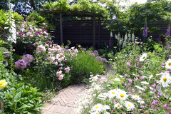
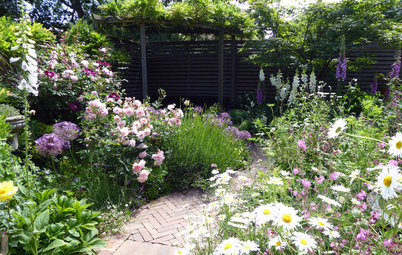
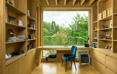
The sunken roof terrace
“Our clients purchased this live/work unit in a shell condition as a two-storey, open-plan property with a double-height ground floor,” explains Ran Ankory of Scenario Architecture, the lead designer for the project.
“They wanted to convert it into a three-storey property, with a two-bedroom flat for rent on the ground floor, and a three-bedroom flat and outside space as their family home above.” They also wanted views across the yet-to-be-created garden from their living room. Quite the architectural challenge…
Part of Ran’s ingenious solution gave his clients a sunken roof terrace (visible at the top of this image and in the next photo), with glazed sides, which allows the owners to keep an eye on their children playing outside and catch glimpses of greenery and sky.
Here is the clever, sunken section of the roof terrace seen from the exterior. It also offers a hidden area and a degree of privacy from the neighbouring homes.
See the whole of this creatively designed modern home.
See the whole of this creatively designed modern home.
The room reversal
To gain light, flow and, most of all, privacy in this Victorian terraced house, architect Trevor Brown of Trevor Brown Architects had a few tricks up his sleeve. Perhaps the most unconventional was to move the kitchen to the front of the building, switching it with the living room – the typical arrangement in Victorian terraces.
The reason was partly that the property is very close to a busy football ground, and can be overlooked at the front by passing crowds of fans.
The new back-to-front layout with a widened middle section has created a spacious yet intimate open-plan space – and the owners can enjoy their living area with a sense of privacy and views over the garden.
Take a closer look how the smart layout transformed this Victorian home.
Tell us…
Which of these ideas most wowed you and why? Share your thoughts (or your own dramatic turnarounds) in the Comments.
Take a closer look how the smart layout transformed this Victorian home.
Tell us…
Which of these ideas most wowed you and why? Share your thoughts (or your own dramatic turnarounds) in the Comments.


Sponsored
Reload the page to not see this specific ad anymore
When the owners of this Victorian mid-terrace home contacted Kate Lovejoy of Kate Lovejoy Interiors, their home was working pretty well, but they didn’t like the way it felt. So they asked her to make it less cluttered and more welcoming.
“The whole house was beige – very much an 80s leftover,” Kate explains. “The owners had seen lots of photos of homes with dark or bold colours and wanted professional advice – and the confidence – to see if it would work in their house, which is not that light-filled.” As such, the colours were the biggest change.