
5 of the Best Before and After Hallway Transformations on Houzz
See how these gloomy and cluttered entrances were totally turned around to offer a calm, bright welcome

Hallways, entrance areas and porches should be inviting and light, welcoming you home or giving guests a good feeling as they cross your threshold. Halls, however, are often dark and narrow, while porches and entrances can easily fill up with clutter that doesn’t seem to have anywhere else to live.
See how five designers tackled all these issues and more in the before and after reveals below.
See how five designers tackled all these issues and more in the before and after reveals below.
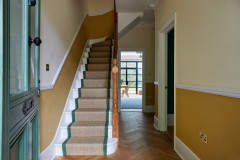
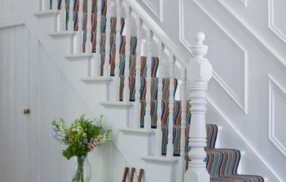
What do you think of version 2.0? This is the same hallway seen from the other end after its revamp. Repainting the walls (in Farrow & Ball’s All White) and adding a new, paler floor has transformed it.
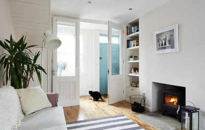
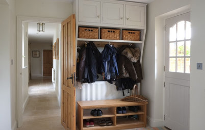
Tim also commissioned new joinery to add storage under the stairs, making it possible to recess those bulging coats that had previously narrowed the space.
See the whole flat’s transformation.
Tim also commissioned new joinery to add storage under the stairs, making it possible to recess those bulging coats that had previously narrowed the space.
See the whole flat’s transformation.
The sensitive reinvention
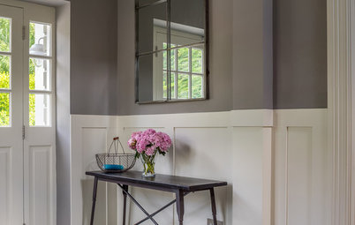
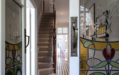
When Kate Clare at LOUD Architecture & Interior Design first saw this early 20th century house, it hadn’t been touched for years. Although her client was keen to respect the history of the house while updating it, some of the period features, not to mention extensive wear and tear, gave the place a gloomy feel.
When Kate Clare at LOUD Architecture & Interior Design first saw this early 20th century house, it hadn’t been touched for years. Although her client was keen to respect the history of the house while updating it, some of the period features, not to mention extensive wear and tear, gave the place a gloomy feel.
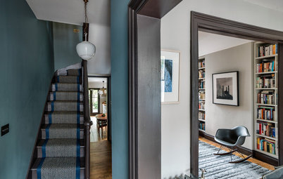
The hall (seen here looking towards the old kitchen at the back of the house), with its original dark wood panelling, was a particularly good example. Kate and the homeowner didn’t want to rip this feature out, so they looked for a way to refresh the room sensitively.
Here’s the hallway now, seen from a little further back. Kate changed the arrangement of doors into the original kitchen (now a bathroom) and the living area/kitchen – these are now accessed to the left and right of the round mirror.
She installed era-appropriate, solid oak chevron flooring and added a heritage-style radiator, a stair runner and a new front door, all in different shades of pink. But the biggest transformation was the decision to paint that dark wood panelling a soft, pale grey. The bones remain, but the mood is now bright and breezy.
Check out more before and after photos from this whole house renovation.
The light touch
Before interior designer Cécile Humbert got to work on this house just outside Paris, the hallway had no natural light when the front door (behind the camera) was closed.
Before interior designer Cécile Humbert got to work on this house just outside Paris, the hallway had no natural light when the front door (behind the camera) was closed.
Now, thanks to the removal of a wall straight ahead, there are views through to the garden as soon as you enter, and a glazed back door means light can flood in.
Cécile reworked the connections between spaces, too, opening up a second entrance to the kitchen (just seen beneath the wooden beam on the left), with internal windows either side of the doorway to allow light to circulate throughout the ground floor.
Discover the full story of this extensive renovation.
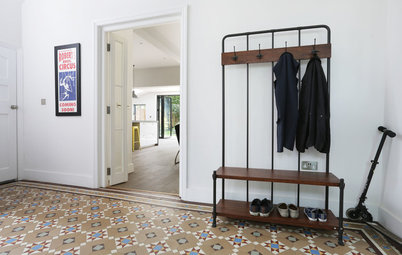
The cupboard cull
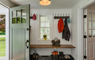
Before architect Laura Campbell of Convene Architecture got to work on this family home in Virginia, USA, its entrance was spacious but cluttered. The area was crowded by a coat cupboard (the door of which is ajar here) and darkened by its palette, and it also had steep, narrow stairs.
Part of the solution to opening up and brightening this space was the creation of a bootroom elsewhere for coats and shoes. This change allowed Laura to transform this area into a…
…beautifully airy spot, with crisp white walls. The structural changes included the removal of the coat cupboard, so the wall behind the bench could be moved back. Laura also reworked the staircase, widening it, changing the banister, and adding an extra riser and tread to make it less steep. She also fitted a new front door and a coat rack, which add character, but not clutter.
Take the full tour of this ‘urban farmhouse’.
Take the full tour of this ‘urban farmhouse’.

Need a pro for your home renovation project?
Let Houzz find the best pros for you
Let Houzz find the best pros for you
The period-sensitive refresh
Architect Brian O’Tuama was tasked with updating the whole of this Victorian house in east London. The brief was to give the place a refresh while respecting the era of the property. So out went the hall’s tired colour scheme and all that ginger pine…
Architect Brian O’Tuama was tasked with updating the whole of this Victorian house in east London. The brief was to give the place a refresh while respecting the era of the property. So out went the hall’s tired colour scheme and all that ginger pine…
…and in came this elegant monochrome scheme. The wall up to the dado rail was painted in a dark grey, with the rest in fresh, light-reflecting white, while the banister was updated with paler grey paint and a newly stripped and oiled handrail.
Brian also widened the doorway into the large living room, bringing extra light into the hallway. But it’s the tiled floor that really makes the difference, nodding to the Victorian era while also feeling crisp and contemporary.
“For simplicity, we designed a pattern that would be more cost-effective than having a bespoke one made,” Brian says. “They’re unglazed porcelain mosaics and the contractor simply had to replace a circle of black tiles with a circle of white ones at a predetermined spacing.”
See how Brian transformed the rest of this Victorian home.
Tell us…
Which of these hallway renovations do you like best? Share your thoughts in the Comments.

Sponsored
Reload the page to not see this specific ad anymore
This hallway belongs to a family flat that Tim O’Callaghan of Nimtim Architects completely renovated. There were clever reconfigurations throughout the house, but perhaps the simplest dramatic change the team made was the redecoration of the flat’s hallway.
Dingy paintwork, a dark floor and protruding coats all contributed towards the oppressive – and not very welcoming – feel of this space.