


27 Ideas for Decorating Your Fireplace Wall
The ultimate guide to choosing a colour scheme for the classic focal point in any room
Kate Burt
28 March 2018
Houzz UK. I'm a journalist and editor, previously for the Independent, Guardian and various magazines. I'm now excited to part of the editorial team at Houzz UK & Ireland, bringing the best of British and Irish design, interiors and architecture to Houzz.com.
Houzz UK. I'm a journalist and editor, previously for the Independent, Guardian and... More
What colour or colours should you paint your fireplace wall? Should the alcoves be the same colour or a different one? What about wallpaper – in the alcoves or on the chimney breast? What works with a marble surround? Will bare brick look good? And how many ways can you work an all-white scheme?
There’s so much to consider when decorating this part of a room. Let these ideas help you to shape your vision for your own.
There’s so much to consider when decorating this part of a room. Let these ideas help you to shape your vision for your own.
Show off against crisp white
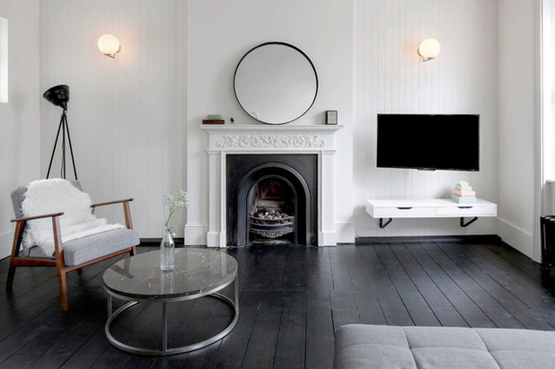
1. Let cast iron shine
The ornate black fireplace and white cast-iron surround in this scheme are feature enough on their own. Pure white walls let the fireplace shine, and a sprinkling of discreet black accessories (lamp, mirror, coffee table, radiator) create a pleasing partnership. Adding a warm dash of wood is a classic Scandi trick for taking the cool edge off a monochrome scheme.
If your cast iron isn’t looking as pristine as this, you can get specialist black paint to spruce it up.
2. Make your marble magnificent
Again, a striking fire surround creates its own colour scheme and needs little adornment to look its best. Not only are the walls and alcoves white here, but the floorboards have been whitewashed (you can find plenty of online tutorials and there are various oils and waxes that will help you to create this soft, sun-bleached effect).
Greys and black in the furniture and central artwork all link into the grey/black fire surround and its inky hearth.
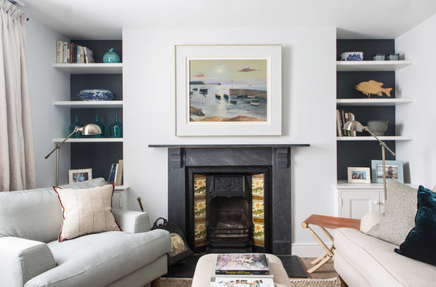
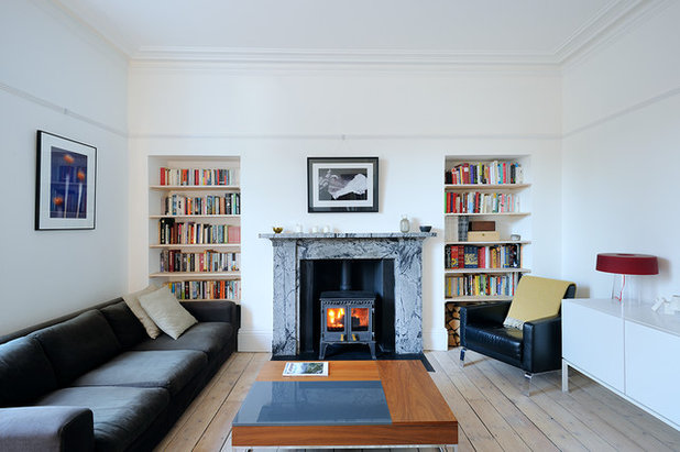
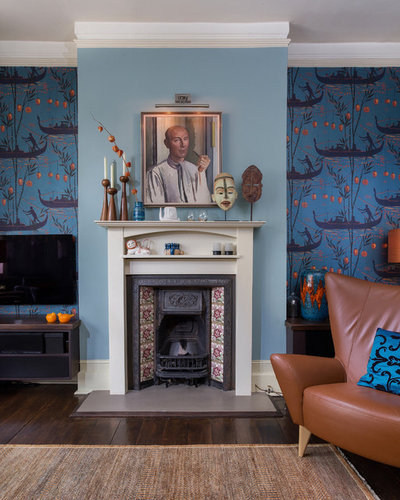
3. Tie in with tiles
Here, the colour scheme is as much about the framed painting as it is about the paint on the walls. Cleverly, especially as the effect is subtle, the colours in the artwork pick up on those within the old decorative tiles either side of the grate, as well as referencing the slate-y grey of the surround. The latter is then picked up behind the shelves in the alcoves.
Find painters and decorators in your area and read reviews from previous clients.
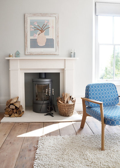
4. Perfect a pale scheme
Although white has dominated the previous rooms, this one takes the commitment further, thanks, in particular, to the white surround and hearth.
It’s not always obvious how successful all-white schemes work if you’re not used to creating them, but first off, they’re rarely totally white. Here, the rug is off-white, the painting is in soft pastels, and the stacks of logs and basket are a gentle, natural hue, with the floor an even paler version. This all adds depth without really making the room any less white.
If you already have a white stone surround in a sunny room, you might want to consider this idea. Alternatively, painting a wooden surround will give a similar overall look. Be aware, however, that in a dark room, this level of whiteness could appear grubby and grey rather than serenely pale and interesting.
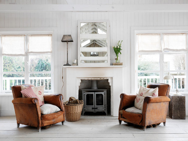
In this room, the same style idea is at play. With even more white (check out the floor, mirror and window dressings), there’s scope for it to still feel all-white despite the stronger injection of colour in the form of the chairs.
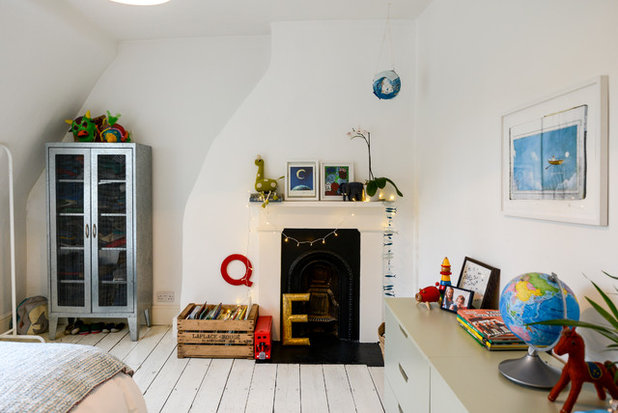
5. Add colour
Here’s another white surround, but a different style approach entirely. This child’s room has the brightening benefits of white paint, but colourful accessories ensure it doesn’t look so considered that it feels too grown-up for a small person’s sleepspace.
Here’s another white surround, but a different style approach entirely. This child’s room has the brightening benefits of white paint, but colourful accessories ensure it doesn’t look so considered that it feels too grown-up for a small person’s sleepspace.
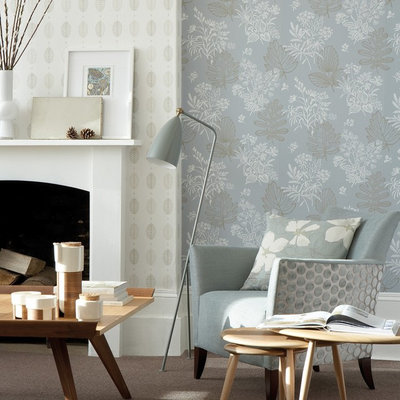
Pair with paper
1. Tailor your complementary tone
Wallpapering just the chimney breast is a classic approach. Paint alcoves in a pale shade that ties into the design to reduce their visual depth and create more of a classic look. Picking up on a dark tone instead will cause your alcoves to recede, visually, and the overall effect will look more dramatic.
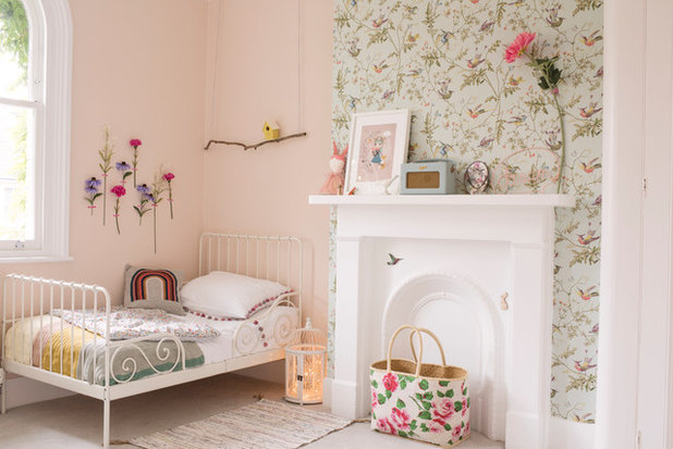
It’s a versatile option, as this very different take on the same idea in a child’s bedroom shows.
In this room, the idea has simply been reversed, illustrating the visual effect of a darker shade in the recessed areas and also how paper doesn’t need to be the element that makes the fireplace the focal point – a paler colour will bring it forwards and, here, does the job with beautiful simplicity. This idea will work with paper or simply two different shades of paint.
Browse fireplace images on Houzz to find more inspiration for your home.
Browse fireplace images on Houzz to find more inspiration for your home.
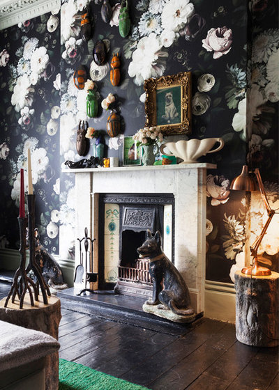
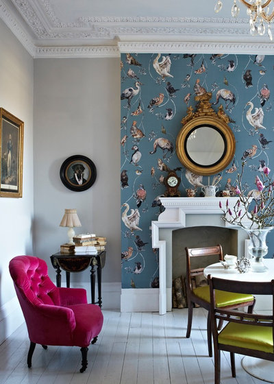
2. Be maximalist
The power of a dark shade is also illustrated perfectly in this bold, maximalist scheme. Here, though, papering the entire fireplace wall makes the fire less of a focal point.
It may look visually eclectic, but take note of the design trick at play: the colours pull together perfectly – the green in the tiles and the black of the cast iron are reflected in the floral paper.
Paint and wallpaper aren’t the only way to go, either. Here, two different but complementary papers create an interesting effect.
More: 10 times wallpapering a ceiling was the right strategy
More: 10 times wallpapering a ceiling was the right strategy
Make for a ,id-tone
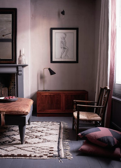
1. Keep it subtle
One step up from all white is to paint the walls behind your fire surround a nearly white colour. It’s elegant and classily unchallenging when done as beautifully as it is here. A grey-green tone like this is perfect if you like lots of plants or if your room has large windows with a leafy outlook.
If you veer from the palette set in your fireplace’s decorative tiles, be sure to choose something else that will tie them to the scheme – here, the painting above the mantelpiece does the job well (try blanking it out with your hand and you’ll see how visually significant it is).
2. Tie in your surround
For a more contemporary take on classic, paint the surround the same or a very similar shade to the walls, rather than white, which gives quite a traditional effect.
For a more contemporary take on classic, paint the surround the same or a very similar shade to the walls, rather than white, which gives quite a traditional effect.
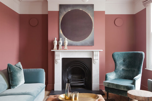
3. Match tones
If choosing a deeper or less neutral shade, consider the effect of nearby furniture. Here, the pale teal and dusky pink work so well as a team because they have a comparable depth of tone, creating a unified rather than cluttered backdrop for the fireplace, even though they’re very different colours.
If choosing a deeper or less neutral shade, consider the effect of nearby furniture. Here, the pale teal and dusky pink work so well as a team because they have a comparable depth of tone, creating a unified rather than cluttered backdrop for the fireplace, even though they’re very different colours.
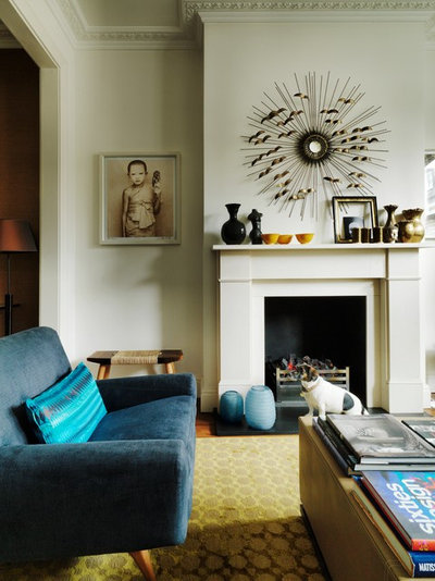
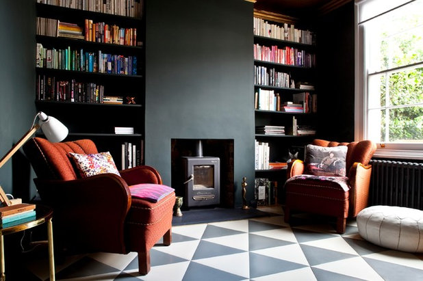
4. Back up the black
In the previous example, the black of the fireplace stands alone. But it can also be used to spark a repeating motif, the effect of which will play down the fireplace, using it to set the tone for the overall scheme rather than being its focal point.
In this example where, instead, it’s the flashes of yellow that stand out, you can see one way to do it: the simple trio of symmetrical black alcove cabinets, a large black picture frame and the cushion do the job. Deep grey walls further mute the effect and boost the grey tones in the surround, rather than the white ones.
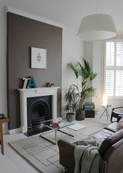
5. Choose a ‘hero’ neutral
Let the colour of your chimney breast tone with your furniture and accessories. Opting for a deep rather than a barely there neutral will help you out – the leathery brown of this wall is repeated in the sofa, armchair and plant pot.
Let the colour of your chimney breast tone with your furniture and accessories. Opting for a deep rather than a barely there neutral will help you out – the leathery brown of this wall is repeated in the sofa, armchair and plant pot.
Ramp up the raw
1. Expose a wall
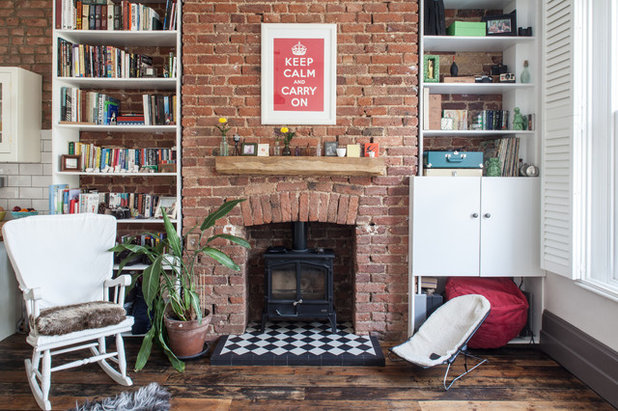
Bare bricks are often a way for a fireplace wall to achieve a homely, rustic look. Be sure that your room (and your taste) can take the warmth of brickwork. Check, too, what shade yours are before ripping plaster off the entire wall – depending on the age and style of your home, they can vary wildly (just check out the next photo by way of example).
Do also check with the Building Control department at your local council before denuding – there are some restrictions that may be relevant to your wall.
1. Expose a wall
Bare bricks are often a way for a fireplace wall to achieve a homely, rustic look. Be sure that your room (and your taste) can take the warmth of brickwork. Check, too, what shade yours are before ripping plaster off the entire wall – depending on the age and style of your home, they can vary wildly (just check out the next photo by way of example).
Do also check with the Building Control department at your local council before denuding – there are some restrictions that may be relevant to your wall.
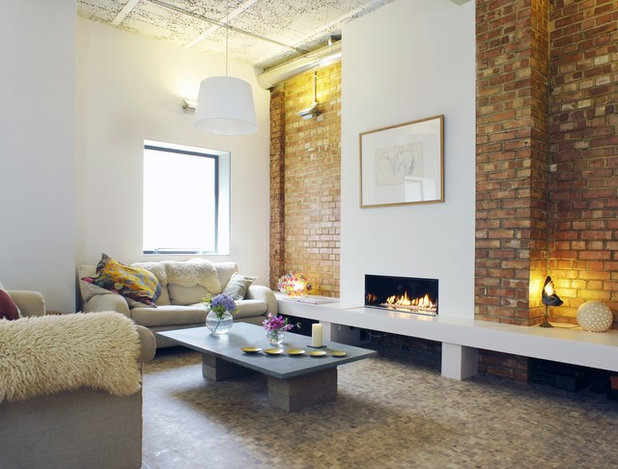
2. Bare your alcoves
In this contemporary room, the owners have done things the other way around. Keeping the chimney wall plastered allows for an ultra-modern fireplace, while revealing yellow-toned and tidier bricks, and letting them recede in the alcoves rather than giving them the dominant position (see previous photo), creates an altogether more modern look.
In this contemporary room, the owners have done things the other way around. Keeping the chimney wall plastered allows for an ultra-modern fireplace, while revealing yellow-toned and tidier bricks, and letting them recede in the alcoves rather than giving them the dominant position (see previous photo), creates an altogether more modern look.
3. Strip off
Bricks aren’t the only raw material that can be used to introduce texture to your space. Here, the wooden fire surround has been stripped back to its natural state. Keeping your décor crisp and low on colour will give it a contemporary edge. (Rich oranges, lavenders or sky blues paired with bare wood risk recreating a 1990s look – just think of the set of Friends for reference.)
Bricks aren’t the only raw material that can be used to introduce texture to your space. Here, the wooden fire surround has been stripped back to its natural state. Keeping your décor crisp and low on colour will give it a contemporary edge. (Rich oranges, lavenders or sky blues paired with bare wood risk recreating a 1990s look – just think of the set of Friends for reference.)
4. Nurture natural
Layers and layers of paint were stripped away to reveal the natural stone of this fire surround. The grey colour and plain style of the surround inspire almost spartan décor, so it’s a good choice for minimalists.
If you don’t happen to have a natural stone fire surround kicking about, look at micro-cements, which can be applied to wood to create a concrete effect.
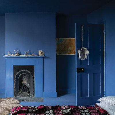
Embrace the blues
1. Take it to the floor…
…and the door, and up to the ceiling. This all-over scheme makes for a cosy space and would work well in rooms that don’t get much light, but it’s quite the style commitment.
Bear in mind that the different surfaces will take different paints (matt emulsion next to eggshell, for instance), so the finishes will vary slightly.
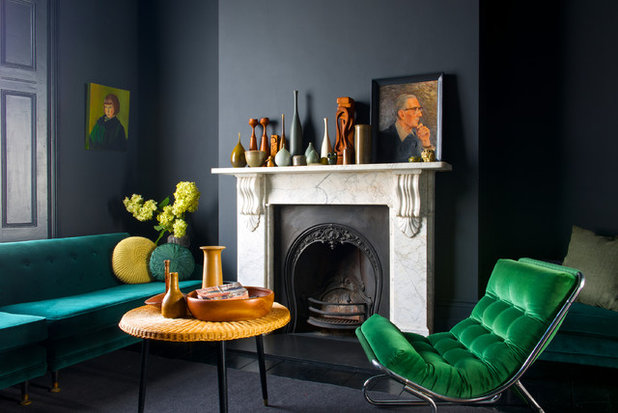
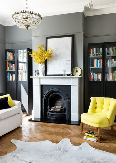
2. Mix your eras
This blackish/navy blue has a rather serious air, especially when paired with the grand marble fire surround. You could easily go for a combination like this, then build on it by choosing period-sensitive furniture in gently complementary colours – more pale grey, or white woodwork, for example.
The design twist comes in a couple of ways: one, in the form of the vibrant yellow and the jewel-coloured velvet upholstery. Two, in that the furniture and accessories are distinctly midcentury rather than antique. The dark-painted skirting boards add a non-traditional edge, too.
More: Here’s why we’re going nuts for velvet sofas
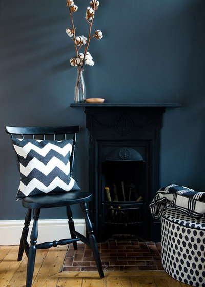
3. Bust a myth
That dark or navy blue and black don’t go is a myth. If, as here, your room has no paintable fire surround to come between the walls and a cast iron fireplace, don’t let that put you off this inky shade. See too (in the hearth tiles) how brown is another unlikely colour pairing that can really work.
That dark or navy blue and black don’t go is a myth. If, as here, your room has no paintable fire surround to come between the walls and a cast iron fireplace, don’t let that put you off this inky shade. See too (in the hearth tiles) how brown is another unlikely colour pairing that can really work.
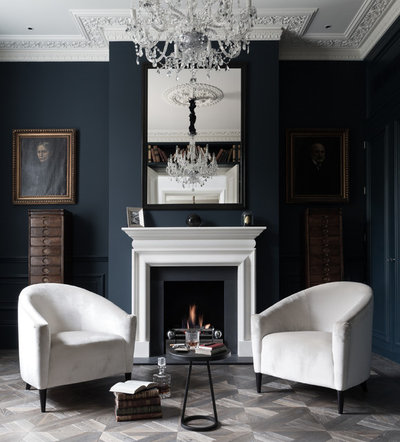
4. Make it formal with white
Navy and white combined exude smartness. And in a period setting like this room, dripping with Georgian architectural details and serious antiques, the effect is also classic and formal, rather than smart-casual-coastal, a look that also favours the combo.
Navy and white combined exude smartness. And in a period setting like this room, dripping with Georgian architectural details and serious antiques, the effect is also classic and formal, rather than smart-casual-coastal, a look that also favours the combo.
Don’t Forget Grey
1. Go deep
The many shades of grey have become something of a contemporary interiors classic, particularly dark charcoal versions. If you were going for the look above on a traditional fireplace with a surround, you could paint it and the skirting boards the same colour as the walls, and continue the colour into the alcoves.
Accessorise with rich, warm shades, which will stand out beautifully against the moody backdrop.
2. Present the unexpected
Grey isn’t just for the walls. Here, a smoke-grey surround looks striking against a pastel backdrop, reversing the loose tradition of a pale surround against a darker wall. For a twist on millennial pink, choose something with a little more lilac, or simply leave your plastered walls bare.
Grey isn’t just for the walls. Here, a smoke-grey surround looks striking against a pastel backdrop, reversing the loose tradition of a pale surround against a darker wall. For a twist on millennial pink, choose something with a little more lilac, or simply leave your plastered walls bare.
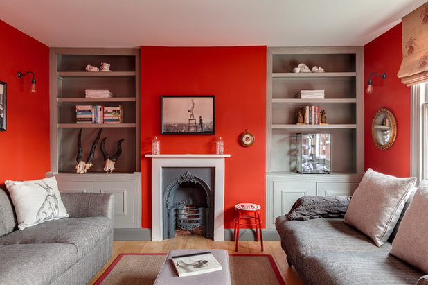
3. Throw caution to the wind
Grey, as seen already, is a fantastic foil for vibrant colours. Let it be the partner hue for a bright of your choice – here it’s a rich, rusty red, but emerald green, royal blue, varying yellows, hot pink… they all love grey. Do you dare?
Tell us…
How have you decorated your fireplace wall – and do any of these ideas tempt you to revamp? Let us know and share photos in the Comments section.


Related Stories

More Rooms
The 5 Most Popular Laundry Rooms on Houzz Right Now
Get decorating ideas for your laundry or utility room from these most-saved photos on Houzz
Full Story
Dining Rooms
The 5 Most Popular Dining Rooms on Houzz Right Now
By Kate Burt
Vintage furniture, great lighting and top tables – feast your eyes on dining room ideas collated from your own clicks
Full Story
Colour
8 Clever Ways to Use Strategic Colour Blocking in Your Home
By Kate Burt
Paint can do so much more than refresh your walls. Explore ways to highlight features, zone areas and trick the eye
Full Story
Utility Rooms
15 Richly Coloured Utility Rooms
The trend for strong, earthy tones has reached the utility room, with hues from plum to ochre to deep green adding depth
Full Story

Kitchens
Which Kitchen Worktop Colour Should You Choose?
By tidgboutique
Consider these popular colours and styles to get the look you want, no matter which material you use
Full Story
Colour
8 Ways to Work a Rust Red and Blue Palette in the Bedroom
By Kate Burt
We’re seeing variations of this combination all over Houzz right now. Check out these tips for trying it yourself
Full Story
Colour
Creative Ways to Make a Feature of Structural Beams
Turn your RSJ into something more than just functional with these clever ideas from our Houzz Tours
Full Story
Gardens
9 Ways to Enjoy Colour in Your Garden All Year Round
By Kate Burt
However your garden grows, you can add colour with hardscaping, furniture and accessories
Full Story
Gardens
What Will We Want in Our Gardens in 2024?
Discover the gardening trends homeowners will be bringing into their outdoor spaces this spring and summer
Full Story
Kitchens
What to Expect at the Biggest Kitchen, Bedroom and Bathroom Show
Plan ahead with our rundown of what’s in store at the kbb Birmingham event this March
Full Story
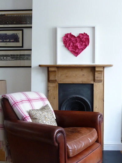
I love the colour pallet used for 'Mix your eras' so bold, rich and delicious!
Any suggestions for above my fireplace - the mirror you can see has recently smashed :-(
So beautifully done <3