dtunes

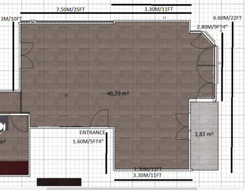
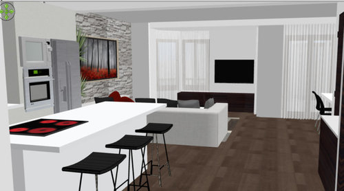
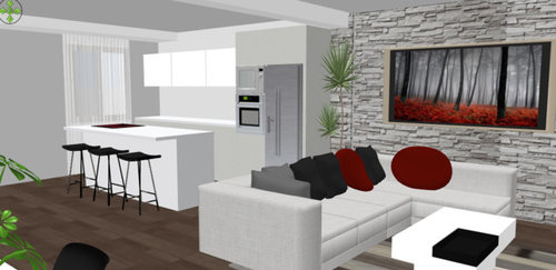
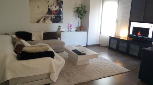
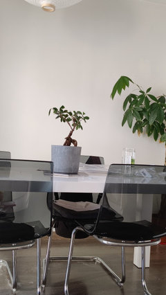
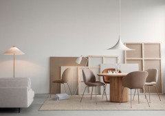
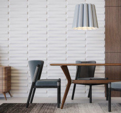
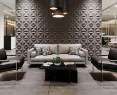
Open Plan Living/Dining/Kitchen Distribution

Adam
6 years ago
last modified: 6 years ago

I am planning to open up my living room space to a bedroom, as my current kitchen layout is over the other side of the flat and i would much rather have it nearer the living space. This is the floor plan and area to play with.


These are some of the ideas i have come up with


I have blocked up the window in this plan but ideally i would prefer to have the tv away from the window otherwise just have a curtain behind to stop the glare, but that would block out light, so not ideal either.

I would like it to be as light and airy and free flowing as possible without it feeling claustrophic. The plumbing and drainage is not a problem as it goes along the back wall.


Finally, the current living room before taking walls down.


Comments (167)

  • Denise Marchand
    3 years ago

    Bravo, Adam! Looks stellar to me and is definitely white. Welcome to my world of interior design where something always goes wrong and it's one big compromise. So welcoming walking into that luscious kitchen. Now I'll be looking forward to you posting favorite recipes (with wine pairings, of course). What backsplash tile have you been considering? That certainly was an exceptional choice of moving the kitchen from the back. Makes so much sense.


    Happy you have set up the living area with the tv in that position. So minimalistic, just like you wanted from the start, with plenty of space and taking advantage of the window light. Did you ever finalize the dilemma with the sofa? Is there room to set up the sofa as intended, with the chaise attached and adding one occasional chair at the window (instead of two, as proposed)?


    I am so sorry to hear about your illness. Sounds concerning and hope it's manageable. Everyone here in NY is anxious and hunkered down. I am moving to LA at the end of January and freaking out, as I didn't think my place would sell so fast. First day on the market and multiple offers. The logistics of the move, at this juncture of time, are shaky. Good thing I have connections moving furniture cross country. Time to cash in favors! I already have a place in LA, it's just the lock down and all. Trying to stay safe and follow all protocols.


    Enjoy your design work and be well.

  • Denise Marchand
    3 years ago

    It it were my place, I would put a lounge chair and ottoman in front of the window, on a slight angle, facing the tv. Lounge chairs are sculptural, and framed by the window would look awesome.

  • Related Discussions

    Open Plan Kitchen/Living Room
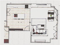
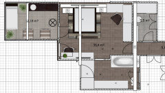
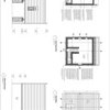
    Q

    Comments (5)
    Thanks for your comments. I think we've decided on wooden flooring throughout the open plan space but it's just what we do in living area. We had wanted carpet to get that warm cosy affect. We are considering under floor heating but I understand that can be expensive. I know we can put a rug down although I'm not sure whether that will have the desired warm and cosy feel. The other option is to fit carpet in a rectangle or circle shape in the living area. Just not sure how that's going to look and how best to join it to the wood so that it looks good. I've not seen open areas with carpet and tiles/wooden flooring...it seems that usually flooring is the same throughout with a rug in the living area. Any suggestions? I attach a plan which shows what it will hopefully look like. The dining table will go near to the patio doors. The sofa will be in an L shape with the back to the kitchen on one side and the other back to the dining area on the other side. Any flooring ideas would be appreciated!
    ...See More

    Open plan living

    Q

    Comments (1)
    Could you turn your sectional and chair to face the wall with the large painting, then wall mount the TV on that wall? If you remove the foosball table and take away some of the counter chairs, you could probably put a table in front of the sliding doors. Either way , you do need a larger area rug. Your sectional front legs should be on the edge of the area rug.
    ...See More

    wooden floor or tiles or half and half in an open plan living area

    Q

    Comments (5)
    Hi Gilluan I think either could work but it depends on the layout of your new room. if there is a distinct divide between the two spaces then you can separate the floor coverings. It certainly makes the living area feel warmer and more cosy if you have wooden flooring in that space. Equally a tiled floor is far more practical in a kitchen. I hope that helps, it's difficult to offer any more advice without seeing your plans or a photograph. Good luck!
    ...See More

    Open Plan Kitchen \ Living Design Advice

    Q

    Comments (0)
    Hi, We're looking for some design options for a house we are planning to buy. We love the house location but the kitchen \ living area is proving to be a bit of a dilemma. There is a lot of glass in the kitchen area with full length windows to the front and rear which limits the options for layouts. We had a kitchen design prepared but are unsure if this really makes the best use of the space - it includes a corner dining area which while using the space feels a bit cramped for a family of 5. Due to the door position into the kitchen the builders design looks odd as they have placed the kitchen table right in line of sight of the front door so placing the table there seems a no no. We want to have an island in the kitchen ( its plumbed etc for one ) which we can have up to 5 high seats around which is in the design. We would like to have a TV in the room ( again limited places to put one on the walls due to the glass ) and would like some suggestions on layouts there also ( maybe the TV has to go ! ) - without something that completely blocks the access to the rear doors. Any thoughts gratefully received !
    ...See More
  • Adam
    Original Author
    3 years ago

    Hi Denise!
    So happy to hear from you again and that you are doing well.

    It's an off white, but as one window is south facing and the other is north.. it looks more grey from one side and cream from the other and it bugs me a bit.. have even considered having the lowers repainted, but will wait until the backsplash and lighting is in to see how it looks.

    As for the backsplash, I had seen these big format tiles with a subtle design on them with a cement type base and really loved them and my plan B was some hexagonal cement coloured tiles to bring in some texture. The problem is that the grey in them doesn't like right with the "creamy" tone of the doors.

    Do you have any ideas of what you think would look good?

    They may also have to replace the worktop as they put paint thinner all over it and it's quartz.. so.. in that case I could go for a more off white colour on the countertop too instead of this bright flat white.. not sure..

    And the living room is definitely more practical like this and the extra light is appreciated, especially being north facing. Unfortunately, I can't fit the chaise lounge in as one piece and have had to separate it into two for now. I can go max 8ft long for the sofa and then have one or two accent chairs in the bay. Maybe a big ottoman you can bring forward to the sofa or use as extra seating too opposite.

    In addition, by changing the living room around like this, I managed to make the island 10 foot long in the end rather than 8ft and with extra storage and seating.

    I am also hesitating whether to put pendant lights above the island or not and looking at different options..

    Concerning my health, it's something that has to be alleviated with meds but has no cure and is progressive so we will see what happens, but I feel much better in myself for now 😅

    Anyway, let me know your thoughts if you can and I hope your move goes well and there aren't too many hiccups!

  • minnie101
    3 years ago

    Sorry to hear about your health. The kitchen looks fab, I’d just have one pendant down the seating end. Would you consider the split face tiles in the kitchen (I think green looks lovely with white, wood and black) and then just have the panelling in the tv area. I like 1/2 in the window facing the sofa as it makes it look cosier for conversation


  • minnie101
    3 years ago

    PS I like the cabinet colour

  • Adam
    Original Author
    3 years ago

    I like the colour, as I am more about off whites than whites, but it looks cream next to the worktop and clashes with the cement colours I had chosen, so maybe I should bring in some colour as you say. Sorry for being a bit of a newb, but what do you mean by split face tiles?

  • Carolina
    3 years ago

    Sorry to hear about your health problems. It does kind of throws everything upside down when you've got news like that, I know :-)


    Meanwhile: kitchen and living room look fab! I like the all white look. I can only see what you mean by cabinets looking slightly more cream than the worktop in one photo. But only because you mentioned it. I think it all looks really, really good.


    Gorgeous cat too :-)

  • Denise Marchand
    3 years ago

    Here's a good cement tile, but it may be too wild 'n crazy for you!


  • Denise Marchand
    3 years ago

    I, too, have no idea what a split face tile is.

    I had a feeling the sofa wouldn't fit end to end, but what about setting it up as intended? Of course, you want the dining room to stay at the other end of the room, but this is another option. You still have room for two occasional chairs. this was a suggested plan, way back when.


  • Denise Marchand
    3 years ago

    The kitchen color would drive me crazy too. Sorry.


    Look at it this way: When you look a a beautiful field of green, it's not just one color green. One color would make it look flat. Shades of a color give it more depth. At this point, you only have the cabinets, but when you see the view with the Joker art, it's not obvious. The problem happens like you said, different times of the day will make them look grey. the trick with white is you have to tint base with blue so that it looks bright white.


    Keep in mind that any tile you use on the backsplash will not be bright white either because of the clay color before glazing. A lot of tiles have a pink undertone. Yikes! You will really be crazy by then.

  • Adam
    Original Author
    3 years ago

    I intentionally didn't go for a bright white because I didn't want it to jump out like that and I have no other bright whites I'm the space. The problem is that worktop looks much brighter and it's pretty much the same colour placed side by side. In fact, the overheads look the same as the worktop and the panels too, it's just the lower ones on the back part next to the window. As I said.. they may need to change the worktop because it's had the shine taken out of it with the paint thinner they used on it..🙄.. in that case, may I should consider another colour.

    As for the sofa, Denise, those plans were if I opened up the balcony too, but it was way too expensive and you only gained like 6 feet more space, so I left the balcony there. Therefore, if I place the sofa that way, I can't open the French doors. I can get another sofa further down the line and sell this one. A small sacrifice to be made I guess 😅.

    And the tile is a bit wild for me yeah.

    https://pin.it/3KBWujz

  • Monica
    3 years ago
    last modified: 3 years ago

    Adam I am sorry to hear about your health, hope its not going to be problem long term for you. The kitchen looks fab and I love the tweaked sitting arrangement.Its texture you need and Minnie's suggestions are fab as always. the warm wood panelling on the TV wall would elevate and introduce some warmth. This is what split face tiles look like https://www.pinterest.co.uk/pin/359021401539447895/


    a different option

    https://www.pinterest.co.uk/pin/863565297277453090/

  • minnie101
    3 years ago

    Thanks (and a big hello!) Monica for posting the tiles 😊 💕

    sorry Adam, I only seem to be getting certain notifications of Houzz comments

    i can see the colour in the first pic as Carolina said but it doesn’t clash per se IMO as it doesn’t look a yellow cream. It’s so difficult as natural/artificial lighting will affect the colour. . If those were the tile samples i Think the middle one is probably the better of the 3 but personally I’d add texture especially as you don’t have the hob and greasy splashes to contend with.

  • Adam
    Original Author
    3 years ago

    It's meant to have a cool grey in it..

    https://www.farrow-ball.com/paint-colours/wevet

    I had 4 options and went for the one on the far right because I thought the bright white would have been too much and made the worktop look darker and duller.

    I love the split face tiles you posted as you can see from my 3d design. My only reservation is what you said.. more difficult to clean, although I have the hob on the island and not the back.

    These are some of the options I had.

  • Monica
    3 years ago

    They are not hard to clean at all Adam, invest in a little hand held steam cleaner and blast them once every few months. No problem

  • Monica
    3 years ago

    Successful white interiors in my opinion are those that have all different tones of white that together provide subtle interest. It will all work in the end ♥️

  • Adam
    Original Author
    3 years ago

    I did hold them up hold they would go and they seemed to be the same, but it depends on the light. The overheads are exactly the same colour as the lowers and also look different.. It's definitely the worktop throwing it off, so if they have to change it.. I think I will ask for a more subtle one.. and to be honest, I don't know how they are doing to fix the mess they made without changing the whole slab.

  • minnie101
    3 years ago

    I dont even know if it’s possible for a colour not to be affected by light or what’s around it, unless it’s a very dark colour that has little light reflectance value?? My kitchen is the same colour on cabinets and walls and it’s like 50 shades of grey (well it’s a very blue grey), mine is further complicated by the different materials and how much they absorb the paint!

  • Adam
    Original Author
    3 years ago

    I think the problem is when similar colours with cool or warm undertones are mixed.. just look a bit off. Anyway.. I will see how it looks once the backsplash and everything is in and at worst, I can always relacquer the lower cabinets a different colour. I love dark coloured kitchens and moody interiors, but the problem is that I had to go for what would look good in the conditions I have.

    I have always been in love with this flat, but I just don't have the light for doing something like this.. Mind you, my thick japanese blinds do take out a lot of light, but i really like them too..

  • Monica
    3 years ago

    I think I would disagree with you on the cool and warm
    All colours look different from the morning light to the evening light it’s not as simple as just choosing warm or cold.
    If you only ever choose cool colours your room would end up cold looking
    It’s why we all add wood to warm things up. Do not overthink it too much observe white interiors of renowned designers and you will be surprised to find that they are not as strict as you think

  • Adam
    Original Author
    3 years ago

    I was referring more to greys and whites. Maybe it's just me.. but I have a cool cement grey flowerpot on my table and it looks awful to me and clashes with everything so I want to change it. At the end of the day.. it all comes down to taste I guess.

  • minnie101
    3 years ago

    I think the top tile is my favourite although no idea of scale! I like the “texture” from the variation (or is that the light?!) and subtle pattern. Have you propped them up too?


  • Adam
    Original Author
    3 years ago

    The one you mention is non slip so it has that strange variation in it. Thinking about using the black and grey in my bathroom when I get round to it...

    Feeling kind of down about the kitchen because they are still giving me problems about fixing the worktop or replacing it and I can't tile until they've done that. In addition, the clash in colours is kind of grating on me a lot. The worst thing is that I paid extra to have that door colour, as I didn't want a stark white... Feeling that I made a big mistake 🙄

  • Denise Marchand
    3 years ago

    You are making yourself crazy again, Adam! Yes, the whites do not match perfectly, but that would happen to any surfaces that are not the same base product. If you look at a field of green, all the shades and tones of greens are different which is what makes it so lovely. Time to look around for a good tile. Just bring samples of every one you like and sit with the tiles a few days. Don't try to match anything. You wouldn't match art to a matte or wall color.

    Accessories need to be artistic and interesting. Pass on the simple grey cylinders. If you do go for solids, at least they should be whimsical and multi geometric. Like Ettore Sottsass vases.


  • Denise Marchand
    3 years ago

    Andy Blick Ceramic Tiles


  • Denise Marchand
    3 years ago

    Stainless Steel Tile Backsplash


  • Denise Marchand
    3 years ago


  • Denise Marchand
    3 years ago


  • Denise Marchand
    3 years ago

    Consider a backsplash:

    1) Brushed stainless steel in a geometric pattern or sheet.

    2) A slab of marble, carara or any slab you choose

    3) Thin linear ceramic tile in grey or black

  • Denise Marchand
    3 years ago

    i've used the "Discus" tile by Andy Blick which is gorgeous matte white. It was available at Ann Sacks Tile in NYC, but I'm sure available.

  • Adam
    Original Author
    3 years ago

    Thanks Denise! I had never seen those steel tiles before and they look pretty interesting. I have been learning towards a big porcelain slab with light veining to give a bit of interest, since I don't want anything too busy.

    As for accessories.. I need to choose some pendants (If I should even put any.. not sure), bar stools (the ones I have are old ones from my mother's which have been scratched to pieces by the cats) and I already have some bits and pieces. I am trying to pick up on some of the copper in the plugs and tap as well. My dad got me some handmade ceramic Sugar/salt/coffee holders for my birthday which have a nice design and go with my Japanese style bowls.

    Concerning the whites, it looks much better now that they have finally installed the overhead door and I have put in the led lighting. I really wanted this white because it's very soft and not the typical nuclear white, which would have stood out too much next to all the other muted tones I have.

  • Denise Marchand
    3 years ago

    Nice, Adam!

  • Denise Marchand
    3 years ago

    The sugar/coffee/salt vessels are wonderful. I love them. Who is the manufacturer? And nice faucet. Stainless steel backsplashes are simple and used quite a bit here. First time I saw the shaped stainless steel tiles. Subtle and sophisticated.

  • Adam
    Original Author
    3 years ago

    My Dad got them along with the black and copper ones from "Maisons du monde". They have a lot of really nice handmade pottery and dinnerware as well as furniture. I originally had a stainless steel tap and sent it back because I wanted more of a statement piece in the centre.. think it was the right decision and love the oversized sink and soap dispenser.. make me actually not mind washing up from time to time haha.

    I had never seen the stainless steel tiles shaped like that either. They look really different. I need to make a decision, but we are in lockdown over here at the moment and it's hard to shop around.

    I am trying to be a bitter braver with my decisions and my next project is my bedroom, en suite and walk-in wardrobe, so I will try and take some more risks there 😅

    Do you know any nice barstools, which aren't too fussy? Not sure whether to go for a pop of colour or go all black.. Would you see some lighting over the island? I don't want it to look overcrowded.. so not sure what to or not to put.

  • Denise Marchand
    3 years ago

    For pendant lighting over the island, take a look at Tom Dixon's Beat Pendant Lights. They come in different shapes, singles, multi fixture, black, white. These are what I would spec for your place. Plus I love the copper/gold interior for a warm tone for the light.


  • Adam
    Original Author
    3 years ago

    I have always liked them and they are on my original 3d plans I posted on here.. my only hesitation is that they are so bold and may look too heavy in the space. The island is 10 foot by 3 and something, but it's still a relatively small flat (by American standards I believe after watching too many home reno shows 🤣). Was also thinking of getting some black tube lights and customizing them with a bit of copper paint on the lower part.. Never been good with lighting 😅

    I think I like this style of bar stool after looking all the ones you shared. I am torn as usual, as it would look more minimalist and modern without the backrest but if I'm going to be sitting up there for a long time.. it's better to have some form of support. They seem to be a good compromise.. What do you think? And what colour would you go for?

    Currently trying to resolve my sofa problem too as using the chaise lounge sideways with the arm as a back rest is killing my back.. I'm starting to think that I may have to sell it and part ways.. 😢
    Problem is that over here everyone loves these big bulky sectionals with one and a half feet of backrest padding and really high headrests and I want something more streamlined but comfortable, but all the shops in my city seem to specialise in bulky sectionals, as that's what sells. Seen some nice ones only, but am hesitant to make such a big investment without testing it for myself...
    I would never buy a sectional again and I think a 3 seater with a foot rest is far more flexible and practical.. should have done that the first time round, but you live and learn I guess..

  • minnie101
    3 years ago

    Just jumping in but have you also considered the Gubi semi-pendant? It obviously has an oriental feel and also comes in copper if you wanted to pick that up and a few sizes

    where are you based re the stools?


  • barbaralawton
    3 years ago
    last modified: 3 years ago

    I would go with a black glass splash back as it mirrors, easy to clean and fits with the simple clean lines. It will add depth without taking anything away. Re stools, I would have one or two with a bright splash of colour that could be easily replaced when bored with them or wish to change the feel of things; the blue of the LED, the green of a plant, the orange picked up from a cushion are all examples (only one of the colours probably). A small way to be bold mixed in with black stools to pick up the splash back, pendant light or whatever. Simple clean lines.

  • Adam
    Original Author
    3 years ago

    Hey! I've just seen the last comments.

    I live in Spain and there doesn't seem to be as much choice over here as there is in the USA after browsing at lot..

    the Gubi light does look similar to one of the Tom Dixon beats shapes and I like the oriental vibe they give.. I am leaning toward that style for the pendants and will probably end up going with one.

    As for the splashback.. it's a nightmare.. I really have no idea.. I think dark like black and I think it will look to much and take away from the accents.. I think of grey and I think it's too boring and monocromatic.. I think of colour and I get scared lol.. really don't know and to be honest... I do regret going all white in the kitchen and not going with something darker or mid tone on the lowers at the back to ground it a bit more. I see so many kitchens on Instagram and Pinterest and I am always drawn to the darker ones.. but as I have a darker floor, I thought it would be too much. Anyway, it's done now and I guess we all have things we would do differently. I could always relacquer the lower doors quite cheaply if it came to it I guess. I really love Hague Blue by farrow and ball and have always wanted to use it but I think it wouldn't fit in anywhere and I'm not brave enough anyway🙈

    Some good news is that I have finally managed to get the stonemason to change the island worktop which he destroyed after cleaning it with paint thinner.. after 4 months of fighting and the carpenter also finished up all the last details this week.. after 5 months. Stonemason has offered to give me a big discount on the splashback if I put a slab on the wall but really have no idea.. options are Dekton, Silestone, Neolith and Compac colours.

    By the way.. just saw this flat on pinterest and it reminded me of mine a bit but well done and with a more interesting kitchen.. trying to get some inspiration from it:

    https://hot-walls.ru/portfolio/сердце-столицы-99/

    My favourite designs seem to all be Russian for some reason.. 😅

  • Adam
    Original Author
    3 years ago

    Also love that sofa.. have seen it in many different photos but can't seem to find the name of it or find anything similar. Using the chaise I have as a sofa is really killing my back so I'm probably going to have to buy a new one fairly soon.. but as always.. unsure about the best layout.

    I live alone with my cat and am thinking.. Do I want a nice deep sofa 8 ft aprox sofa and a comfortable accent chair in the bay and an ottoman by the TV which you can bring towards the sofa when you want, or is it better to have 2 sofas and an accent chair or ottoman? 🙈

  • Denise Marchand
    3 years ago

    Hi Adam! Finally caught up with your kitchen. Hope all is well with your health. I finally made the big move from NY to LA. It's gorgeous here and after the lousy winter in NY, it is much appreciated.


    I love Farrow & Ball Hague Blue. Will keep that in mind. It would be a major step forward for you to tip toe into the color of life.


    And love that site for Hot Walls in Russia. There has been very interesting modern interior design coming out of Russia lately. The combinations for the kitchen and baths are stellar. The finishing details on any project are the key elements to get what you want. But you can get wrapped up in the "what else is out there" syndrome. It's so much easier to design for someone else besides ourselves. I've been know to cry when picking out my own paint colors!


    Be assured that by keeping the base of your design classic and simple, allows you to explore creative options for finishing details. Consider a ceramic Hague Blue backsplash in the kitchen as a good option.

    Adam thanked Denise Marchand
  • Denise Marchand
    3 years ago

    I understand what you are saying about not getting comfortable in a chaise. Our client in Malibu CA insisted on recliners and recliner sofa in his media room. We did research and ended up with a very expensive custom room. The outcome is that all of the designers on the project ended up getting a recliner for their homes! So funny because we all hate the designs. There are some good looking well designed ones out there. I can't tell you how comfortable they are! I finally gave in and let my roommate fulfill his dream!


    Anyway, here's some pics. American Leather seems to have the best.


    https://www.scandesign.com/products/concept-recliner-cement


    https://www.bloomingdales.com/shop/product/american-leather-cirrus-comfort-air-recliner?ID=3235570&CategoryID=3865


    Adam thanked Denise Marchand
  • Denise Marchand
    3 years ago
    last modified: 3 years ago

    Farrow & Ball Hague Blue


    Porcelain Tile for Kitchen Backsplash


    https://www.tilebar.com/angela-harris-inspira-oxide-12x24-porcelain-tile.html

    Adam thanked Denise Marchand
  • Wumi
    3 years ago

    l like the leather high stools. For the living room I'd go with a 3-4 seater and an armchair in the window alcove.


    You kitchen is fabulous! Have you considered a glass tile or even a terrazzo. Otherwise a marble tile could also work well. I think you could definitely go with something either simple and contrasting in colour or a muted colour and busy pattern to break up the white slabs of the kitchen.


    Terrazzo


    Marble herringbone


    glass


    Thought this article might appeal to you :-)

    https://nordicdesign.ca/this-modern-scandinavian-style-apartment-is-a-lesson-in-warm-minimalism/?fbclid=IwAR2tYPvbOjiTpkT-cBdwIzK8HRDEOu2YI18o10lR0GID9d478fmiYirwzy8

    Adam thanked Wumi
  • Adam
    Original Author
    3 years ago

    Thanks Denise! With the chaise lounge I meant that having the sofa separated into two parts like I have it now is killing my back. The reason is that I have the chaise horizontally and have the armrest as a back rest..

    I'm still a bit lost with the kitchen, but it definitely needs some contrast.. The white I chose is still bugging me on the back lowers too, but I'll get the backsplash and accessories in and if I still can't bear it, I will relacquer the lowers on the back wall a different colour.

    The Russian designs seem to go quite dark on their palette and considering that I'm north facing at the front of the flat, it's a bit scary. I'm currently working on where my kitchen was before and turning it into a bedroom. There is a lot more light there and it leads on to a terrace so I could probably risk a bit more with darker colours there.

  • Adam
    Original Author
    3 years ago

    Here are some options..


  • Denise Marchand
    3 years ago

    Check out these 3D wall tiles, very interesting. Nice thing is can be painted, no commitment and easy to install. Thought instead of a stone wall behind the tv, this is sleek and modern. They also have felt fabric peel and stick tiles for acoustical purposes. Good for behind a bed.

    https://inhabitliving.com/products/seesaw-wall-flats-3d-wall-panels


  • Denise Marchand
    3 years ago

    The last pic would be less busy without the dramatic lighting. Was thinking in the bedroom wall behind the bed.


Ireland
Tailor my experience with cookies

Houzz uses cookies and similar technologies to personalise my experience, serve me relevant content, and improve Houzz products and services. By clicking ‘Accept’ I agree to this, as further described in the Houzz Cookie Policy. I can reject non-essential cookies by clicking ‘Manage Preferences’.