becky_kingdon

Sulking Room pink or Vardo for lounge?

Becky
3 years ago
last modified: 2 years ago

I'm overthinking this so need some input I think!

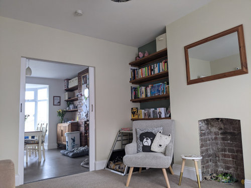
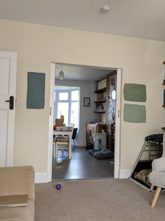
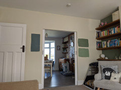
I have a 1930s house with south-facing lounge which is semi-open plan with the kitchen. It has a large bay window and is bright.

I don't particularly like the carpet (beige) or sofa (beige) but they're staying for the time being.

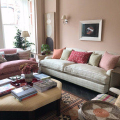
I fell in love with Sulking Room pink when I saw it online, but then also got a tester for Vardo as it caught my eye, and now can't choose between the two very different colours!

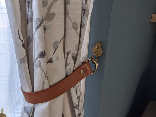
I'm planning to plaster and tile the empty fireplace (I don't want to put a log burner or anything in), and potentially put up a surround. I'm also going to move the curtains into the bay window and will change them as needed (they're too short at the moment as we moved in recently!)


.


Could I get some opinions on pink vs turquoise and whether I should do the whole room, or limit it to the alcoves and chimney breast?

Thanks in advance!

------------------

FYI:

This is how I would like to tile the fireplace


FINAL EDIT:

Finished room :)


Comments (31)

  • Sonia
    3 years ago

    I find Vardo a bit too bright, I prefer my blues a bit muddier - Oval Room Blue or Inchyra Blue, but hey that’s me! Im not sure about Sulking Room Pink. I much prefer Setting Plaster which has warmth, like a Tuscan villa. . Would go nicely with your sofa and chair, Sorry as I’m sure it’s not what you want to hear! Here’s Setting Plaster. and isn’t that room cosy.


    Becky thanked Sonia
  • Juliet Docherty
    3 years ago

    I'm totally with Sonia on this one. Both for me are too chromatic and colourful for your sofa etc. De Nimes is a lovely blue that is a bit more muted and not too overpowering. Setting Plaster is worth trying, there are lots of nice browny pink beiges in the charts at the moment.

    Becky thanked Juliet Docherty
  • Bonita Bryan
    3 years ago
    last modified: 3 years ago

    If it's a south facing room with lots of light, you can afford to go bold! Use the whole of the tester pot and paint a full length strip of lining paper and tape it to the wall behind your sofa. Do the same with the Sulking Room Pink. That way you can move it around the room to see what it looks like on different walls. Your tester patches are too small to give you an idea of it's likely impact in the room. I have sulking room pink in my hallway (not quite finished yet), it's a moody pink that doesn't feel too girly. I'm going for Vardo on two walls in my bedroom (south facing room). Don't forget to post a picture when you're done.

    Becky thanked Bonita Bryan
  • smac232
    3 years ago

    Another vote for Setting Plaster. There’s a sort of lilac/brown tone to Sulking room that to my mind, makes it more of a bedroom colour. Many years ago we had a south facing living room in Dulux Rose white (there’s a blast from the past for you) and it was the most restful and calming room we ever had. I don’t favour blues in a south facing room and I think that your idea of a soft pink is great.

    Becky thanked smac232
  • minnie101
    3 years ago

    I think I’d favour SRP over vardo but just for the alcoves. Vardo is pretty but I think too bright or for me personally anyway.

    i think I would try De Nimes as colourhappy suggested.

    I’m not too sure on setting plaster but just based on my own experience. I have a dual aspect bedroom, south and east. I had huge testers up for ages paying particular attention to the wall that gets south light (Although clearly not enough 😂). It may just be me but that wall at a certain time of the day is literally the colour of a salmon fillet although it looks lovely on the other walls!

    Becky thanked minnie101
  • Juliet Docherty
    3 years ago

    Salmon fillet! Funny how associations are so strong we can't turn them off. If anything reminds me of liver I can't go there!

  • Sonia
    3 years ago

    Minnie, Wild or farmed salmon? 😂😂

  • minnie101
    3 years ago

    😂 farmed, I’m not sure Tesco could stretch to wild!

  • Becky
    Original Author
    3 years ago

    Ah thanks all - good to get some more input. I painted the alcoves Card Room Green when I moved in, with the rest of the walls lime white, and I really dislike it. We redid the whole house and it's only the lounge that I'm not happy with, so that's something!


    I've got Hague blue in the hallway and one of the upstairs walls, so I think I might have a De Nimes tester pot that I could try in here as suggested above. I'll also make sure I do larger testers to get a better feel for the colours.


    The other tester in the photo is Peignoir which I wondered about using on walls that I didn't use SLP on. Interesting that Setting Plaster has been mentioned - I looked at it but wasn't sure if it would be too peachy for my tastes. I did also try Dead Salmon but immediately discounted it as it looked too brown.


    Is the general consensus that all walls should be the same colour?


    Thanks again, great to get suggestions.

  • Bonita Bryan
    3 years ago

    Personally, I'd go for it on all walls.

  • Kris Nocker
    3 years ago

    We've just put sulking room pink in our bedroom. The colour is beautiful, rich, and makes it feel so warm and cosy - however, we have two large windows at both ends. From what I can see this looks a bit darker as a room, if you do go for either of the colours, start with the chimney breast/alcove and leave it for a few weeks. If you still think you can get away with it add to the other walls.


    If you were going with sulking room pink look at a warmer colour for the other walls, while we were doing the painting the walls were initially white and it clashed because of the warmth of the pink and the starkness of the white.

    Becky thanked Kris Nocker
  • Carol Morrison
    3 years ago
    last modified: 3 years ago

    We used sulking room pink on our main bedroom wall. A little later we painted the main wall in the little nook off of the bedroom. It's so beautiful. It's bold and soft all at the same time! Change out your accessories if you want a different look. The SRP is so versatile! It goes with all our bedding, no matter what - some of our bedding was bought before we painted. I would have no hesitation in using it in any room! BTW, one of our spare rooms is referred to as the boudoir, (it houses all my girlie stuff!), but it isn't painted with SRP as it had been decorated not long before the main bedroom. Shame, as it would have been most appropriate! We live in an old croft in NE Scotland. PS since writing this, the April issue of the Red magazine has an article on rooms and guess what! SRP is featured!

    Becky thanked Carol Morrison
  • elaine stevens
    3 years ago

    I would just pick out a colour to paint the chimney breast and use that as an ascent colour for accessories in the rest of the room.

    Becky thanked elaine stevens
  • sallymcf
    3 years ago

    I would go with vardo to give the room a bit of a punch, especially as the room is light and bright, SRP a bit 'safe' and could look washed out.

    Becky thanked sallymcf
  • D P
    3 years ago

    consider Smoke glass. It is a superb colour, and you can paint the ceiling in the same colour as the walls. I have a 30’s home, a north facing front and a south facing back, open plan through room. Smoke glass looks super in the north and the south and on the ceiling. This wall colour goes well with every other colour. Its warming, clean, subtle

    Becky thanked D P
  • Suzanne
    3 years ago

    I can really recommend Neptune's range of paints. The teal or aqua colour would look stunning in your room.

    Becky thanked Suzanne
  • Wumi
    3 years ago

    I’m reading through the comments and imagining I don’t know the first thing about Farrow & Ball. It’s entertaining! 😂


    I‘d say go for Vardo. Lovely rich colour which will pop against your muted furniture and carpet. If you’ve got the ceiling height, I’d add in a picture rail and take the paint up to that.

    Becky thanked Wumi
  • Purple Fedora
    3 years ago

    oooooh I've just googled De Nimes and that looks like a wonderful colour!!

    I'd go for that rather than the muted pink or vibrant teal

    wish I'd seen that colour before I bought my recent colour 😏

    Becky thanked Purple Fedora
  • Becky
    Original Author
    3 years ago

    Thanks for the additional suggestions.


    I've ordered some De Nimes to sample, and I'm going to make sure I do some large swatches to get a better idea of how it'll look. Painting the alcove/chimney breast wall first might be best as suggested above, although I'll need to sort the fireplace first...


    Although it looks a bit dark in the photos (it was an overcast day when I took them), there's a huge bay window and open plan through to the bay windows in the kitchen/diner so I think we could get away with a strong colour in there. I think once the curtains are recessed into the window it'll open up the room more too.


    I'll post again when I've got some more testers done!

  • Carole Menzies
    3 years ago

    I used to have 1920s semi with a bay fronted lounge and had two light colours in there and it just looked so lifeless. Eventually I went dark and finally the room came to life! It was Benjamin Moore Hale Navy.

    Becky thanked Carole Menzies
  • Becky
    Original Author
    3 years ago


    So in a turn of events I've fallen into a rabbit hole... based on the suggestions here I tried De Nimes (left). Then I thought that I'd maybe prefer green rather than more blue downstairs, and branched out into Calke Green and Breakfast Room Green (both actually in Valspar as F&B testers not available).


    Any thoughts on these? The alcoves are currently Card Room Green, which is a bit too olive for me in this room.

  • Purple Fedora
    3 years ago

    definitely the left one. de nimes

    Becky thanked Purple Fedora
  • Sonia
    3 years ago

    I’m drawn to De Nimes the most, but I do like the greens. No decision really?

    Becky thanked Sonia
  • Juliet Docherty
    3 years ago

    De Nimes may go better with the rest of the things in the room, it's a lovely colour.

    Becky thanked Juliet Docherty
  • Bonita Bryan
    3 years ago

    de nimes for me too

    Becky thanked Bonita Bryan
  • AM
    3 years ago

    another vote for de nimes

    Becky thanked AM
  • AM
    2 years ago

    Looks great!

  • Sonia
    2 years ago

    Very sophisticated. Much nicer than Vardo!

  • Bonita Bryan
    2 years ago

    It looks fantastic. Thanks for posting

  • Jasmin Dallos-Foreman
    last year

    I love the curtains, and the colour! Where are they from?

Ireland
Tailor my experience with cookies

Houzz uses cookies and similar technologies to personalise my experience, serve me relevant content, and improve Houzz products and services. By clicking ‘Accept’ I agree to this, as further described in the Houzz Cookie Policy. I can reject non-essential cookies by clicking ‘Manage Preferences’.