aniq

Paint colour to warm up north facing room

aniq
3 years ago

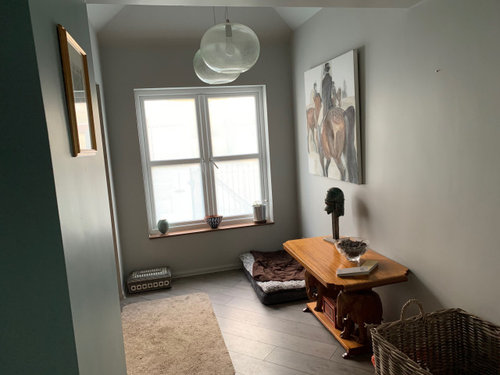
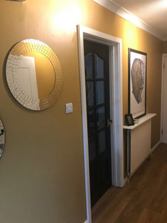
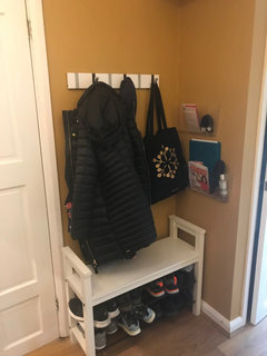
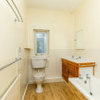
Hi. Looking for some ideas to warm up front hallway. Currently it is painted in FB Blue Oval Room and Pavilion Gray. It is a north facing room and these colours are feeling quite cold. The hallway opens into the kitchen which is decorated in LittleGreene Rolling Fog and Basalt. Ideally I would like something that would 'flow' into these colours and not be too much of a contrast.


Blue Oval Room is on the left of the picture and Pavilion Gray on facing and right hand wall.


Comments (31)

  • Marylee H
    3 years ago


  • Sonia
    3 years ago

    Someone on Houzz painted their hall a lovely bright yellow and it looks amazing. May not be your thing, but it certainly creates warmth. I think they used F&B India Yellow. I’ll try and find it.

  • Marylee H
    3 years ago


  • Sonia
    3 years ago

    The India Yellow Post was by Lena so you can search it above. I think it is called India Yellow in a hallway. Here’s a couple of pics of her hall that I copied from her post. I think the touches of black give it a lift.


  • Marylee H
    3 years ago

    Currently,


  • Marylee H
    3 years ago

    Pretty Yellow! 🌞

  • Juliet Docherty
    3 years ago

    I love dirty yellow, it' so uplifting. Farrow and Ball do archive colours such as Buff and Dauphin. Anything biscuity would be lovely, or maybe Jitney?

    aniq thanked Juliet Docherty
  • Marylee H
    3 years ago

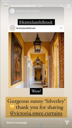
    This just popped up in my Insta account !


  • Marylee H
    3 years ago


    aniq thanked Marylee H
  • Lena
    3 years ago

    Sonia, you made me blush. 😊

  • Lena
    3 years ago

    I am looking into similar colours for my planned kitchen project. I’ll create a new post in order not to confuse things.
    Btw, happy New year!

    aniq thanked Lena
  • Sonia
    3 years ago

    Happy New Year Lena! I think you can’t get anything cosier than a lovely yellow. It’s not used enough! BTW you converted me to yellow 😊

    aniq thanked Sonia
  • minipie
    3 years ago

    I like the colour it is! A lamp would add warmth.


    If you want a change of colour, yellow based colours seem to work in N facing rooms. Vert de Terre or Setting Plaster for example.

    aniq thanked minipie
  • Chartwell 19
    3 years ago

    Very nice hall - I think the window looks bare which is maybe why it feels like that. Would you consider dressing the window somehow - roman blind would look nice, add some warmth and texture? Agree a lamp would look nice too.

    aniq thanked Chartwell 19
  • maria
    3 years ago

    I agree with Chartwell 19 it’s the window and not necessarily the wall colours. Dress the window will pull the look together.

    aniq thanked maria
  • PRO
    The Design Centre Ltd
    3 years ago
    last modified: 3 years ago

    To warm up a north facing space look for colours that contain red tints to offset the blue in northern light. Pink works well with grey so consider using FB Pink Ground or Setting Plaster for light walls and Dead Salmon or Sulking Room Pink for walls in a darker hue. These should flow nicely into the kitchen colours, though you could also retain one of the greys in the hallway and replace the other with a pink to introduce warmth while retaining the current sense of flow with the kitchen.

  • K V
    3 years ago

    We've just finished painting our hallway in dulux soft stone and our bedroom in dulux malt chocolate. Both are lovely warm colours and we are very happy with the choice.

  • K V
    3 years ago

    forgot to mention the soft stone looks slightly pink in certain light

  • Alison Nicholson
    3 years ago

    I have a decent size, 11 foot ceilinged, windowed, cloakroom, north facing. It’s always been a horrid room, as I followed ‘expert’ advice years ago, to use a warm green called Pea Green, by Dulux. It was grim, but couldn’t afford to redo it, as had whole house to strip of wood chip wallpaper, reline, and paint. Finally, after years, tried warm coloured bookcase style wallpaper. That was better, but still a dim gloomy room. However! Recently redid it by stripping off paper, and painting it F&B Pink Ground below the picture rail, and F&B Setting Plaster above the picture rail and on ceiling. Used F&B Blackened gloss, a silvery very pale grey, on woodwork. The floor tiles (yet to go down) are ca’pietra Venice Ocean patterned tiles in shades of grey. The colours are fabulous! What a difference. The room now looks warm, light, and welcoming, and the north light with those particular pinks works incredibly well.
    My hall is also north facing, with a small window, and there I’ve used F&B Pavilion Blue for walls and high ceiling, with the same gloss as the cloakroom. The doors are F&B Green Blue. Pavilion Blue is an incredibly pale aqua, rather than blue, and appears white as it goes on, but darkens a little as it dries. The hall now looks light, airy, and larger.

  • Marylee H
    3 years ago
    last modified: 3 years ago

    There’s an awful lot of misinformation about, which tells us that certain colours work for north facing rooms.


    The truth is a lot more flexible than that.


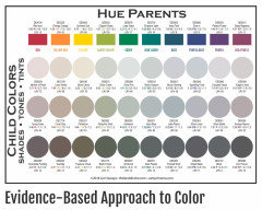
    It’s possible to find colours related to every single Hue Family here, to partner the light in a north facing room.


    (The colours below the saturated Hue Parents are just examples. EVERY single paint colour available to us, sits in one of these Hue Families.)


    The secret to partnering colour with available light in a north facing room? Nuance.


    Nuance = Value (how light or dark a colour is) + Chroma (how colourful or near neutral it is)

    considered at the same time.


    Light from a north facing room is more often moderate or dim in quantity. All colours which thrive well in those situations are all workable. Consideration for the other fixed finishes & furnishings needs thought too before assigning a colour.


    Colours which are lighter (higher Value) + slightly more colourful (more Chroma) than you may usually consider, do well. Such lighter, cleaner options are less inclined to be subdued in the same way as more greyed versions of the same colours. (This also includes the use of whites) They need enough lightness & colour, in order to punch through any tendency to gloom.


    North facing rooms with dim available light can also really pull off the darkest, most dramatic colours, which south facing rooms struggle to do.


    aniq thanked Marylee H
  • Elaine Keep
    3 years ago

    I agree that colour is subjective (some people really hate yellow- don't know why) I think the problem is that paint companies and style magazines promote looks- which become dated, e.g. grey. I don't like the current trend for dark colours. I had a pink hallway in a mansion flat years ago. No natural light and everyone loved it. My current house has a long narrow hall with some natural light. Dark flooring which I can't afford to replace just now. So 2 shades of yellow it will be. If anyone is serious about colour and has the money- get a copy of Le Corbusier colour theory, which explains the use of colour in architecture.

  • Juliet Docherty
    3 years ago

    I agree with a lot of the above comments, especially on the misinformation about North facing rooms. Colour is so subjective that definitive statements about it are not a good idea because it's complicated. North facing rooms can look a bit flat and so the greyed out neutrals can appear too dull. I agree about pinks, dirty pinks and red based neutrals can work really well in north rooms. Temperature is a feel thing and so is very personal, paint is not just the issue here but materials, they also convey a 'feeling' of warmth or coolness,

  • Alison Nicholson
    3 years ago

    I have to say that I don’t ‘get’ why people copy trends. I choose colours because I think they’ll look good to me, and suit the space, and I certainly don’t want to have to redecorate just because I find I can’t live with it. It’s taken me years with my present house’s north facing cloakroom, as I’d never had spaces with that particular north light, before, and I’ve lived in many different houses all over the world. Taking professional advice turned out to be wrong, as well, in that case. Fortunately, with the larger north facing and darker hall, I got it right, 15 years ago, and ever since it’s been a pale aqua, which looks both light, spacious, and oddly enough, being a cool colour, warm, rather than cold. It’s very easy on the eye, and acts almost as a neutral. But the other thing about following trends, is that you end up with the same thing as everybody else, and who wants that? Hm. Maybe some like to be part of a tribe? Perhaps that’s why magnolia paint used to be the go-to colour everywhere.

  • Juliet Docherty
    3 years ago

    @Alison Nicholson I totally agree. I can see how trends in furniture, etc have some logic to them at least, but paint colours, that makes no sense whatsoever. If something looks and feels right then it's right. It's all about selling paint and making profit.

  • Marylee H
    3 years ago

    Also I think the concept of warm & cool colours within Hue Families is often underused by many. Yet artists have always leveraged the notion to great effect.


    The idea of considering only a warm side and cool side to the colour wheel is a blunt tool by comparison.


    Something noted by you @Alison Nicholson with the pale aqua which felt warm in your context with your lighting.


  • twamleyk
    3 years ago

    I think sometimes one follows a trend without necessarily meaning to. In terms of interiors, we read magazines that reinforce trends and influence are choices, as the photos look great, or the products we see in the shops fit into that trend and so on and on. Not to mention the colours available. About six years ago I wanted to paint our dark north-facing study in dark green (after eating in the basement dining room of the Royal Academy of Arts, reminding me of a beautiful library form my alma mater), but I could not find a suitable green for love nor money. In the end, I painted it Stiffkey Blue, which later I realised was very 'on trend'. Now F&B has lots of greens, as I see they are 'on trend', but I am not in a new house and my new study would not suit such a colour.

  • Angela 'Donovan
    3 years ago

    I love the room as it is, paintwise, baskets.
    I'd get rid of the brown table and probably paint the windowsill too. otherwise I'm envious!

  • Lena
    3 years ago

    Elain Keep, thanks for the reference to Le Corbusier’s colour theory. I never heard about it before.
    Look exciting...

  • Lena
    3 years ago

    Sorry, Elaine... I never figured out how to correct posts on Houzz.

  • nancyorford
    3 years ago

    Don't go for yellow, it will look like marigold gloves! My flat was mostly yellow when I moved in (with 2 dark rooms it didn't feel warm).

Ireland
Tailor my experience with cookies

Houzz uses cookies and similar technologies to personalise my experience, serve me relevant content, and improve Houzz products and services. By clicking ‘Accept’ I agree to this, as further described in the Houzz Cookie Policy. I can reject non-essential cookies by clicking ‘Manage Preferences’.