Advice on layout for 1930s kitchen/diner/snug extension.
Julia
3 years ago
Sort by:Oldest
Comments (5)

Sponsored
Reload the page to not see this specific ad anymore
We are starting a small extension of our 1930s detached house in the new year. We have approved plans, builder etc and we are now at the stage of planning/ordering our kitchen.
So far we have seen Wren and Magnet and got plans from both although we are seriously considering DIY kitchens. I prefer the Wren layout but am not feeling inspired by either really and can't quite put my finger on why. Any thoughts/comments will be gratefully received! There may be something obvious I am just not seeing.
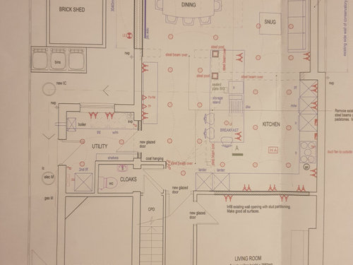
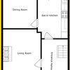
I have attached the layout of the new kitchen/diner/snug. Just to note that the island is showing at a right angle to the garden in the plan as it was initially planned to incorporate a supporting post. That is now gone thanks to more beams, which allows us a bit more flexibility layout wise. In order to have a better view of the garden it seemed to make more sense to have the island parallel to the garden.
Plan.
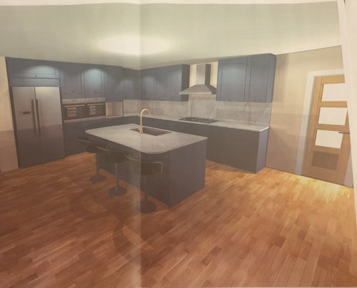
The Wren plan is the first pic below (apart from the greater symmetry they were able to include a walk in larder corner cupboard for our budget which Magnet couldn't.) Only one view of this plan as they sent us duplicate shots of the same perspective :-s The flooring is likely to be mid-tone engineered oak herringbone but TBC. Also not wedded to the colour, maybe that is what is putting me off. It feels quite dark.
I don't know if it feels somehow cramped considering the footprint of the new space.

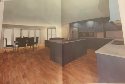
Magnet view 1
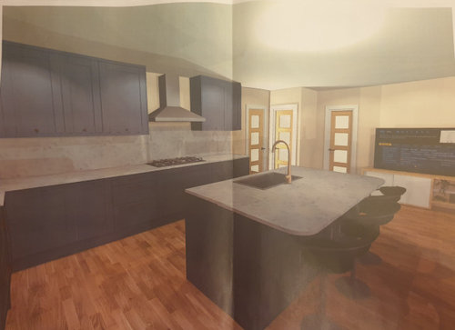
Magnet view 2
Magnet view 3 (ignore the TV that is not what we would put there)
Reload the page to not see this specific ad anymore
Houzz uses cookies and similar technologies to personalise my experience, serve me relevant content, and improve Houzz products and services. By clicking ‘Accept’ I agree to this, as further described in the Houzz Cookie Policy. I can reject non-essential cookies by clicking ‘Manage Preferences’.

CWD
JuliaOriginal Author
Related Discussions
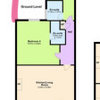
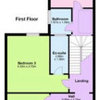
Any suggestions for our ground floor layout?
Q
Win a design consultation at The permanent tsb Ideal Home Show!
Q
Open Plan Kitchen & Living Area Advice Please...
Q
Help with dark, viewless kitchen and dining room
Q
Ellie
Ellie
Room-by-Room (UK) Ltd