gillianlewis196

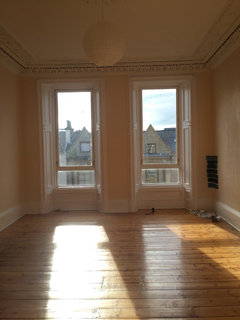
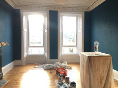
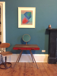
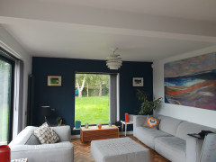
Dark paint inspiration

Gillian L
3 years ago
last modified: 3 years ago

We have a house that only has white painted walls. Partly because of the style of house but mostly because my partner thinks coloured paint makes rooms look smaller (?!?!)

We bought a painting we first saw lit on a dark wall, brought it home and, against the white wall, it has lost some of its magic.

i would like to paint the wall the painting is hung on Farrow and Ball Vardo to pick up on one of the colours in the painting and to make it appear to recede into the green hedge that runs parallel to the room as there are 4 floor to ceiling windows on that wall. The rest of the walls and ceiling will be white and there is a wide patio door on the adjacent wall.

To try to persuade my partner, I'm hoping to find some photos where a dark paint has been used walls beside uncurtained windows against a garden backdrop. Does anybody have photos they could share please?


Comments (43)

  • Sonia
    3 years ago

    Found these images on Pinterest. What a fabulous colour!

    Gillian L thanked Sonia
  • Juliet Docherty
    3 years ago
    last modified: 3 years ago

    Vardo is lovely, but it is very bright. Inchyra Blue is similar but slightly less saturated. Inchyra Blue looks good with lots of other colours, Skimming Stone particularly as a neutral on other walls looks less harsh than white. I have Inchyra Blue on my TV wall to make it disappear!


    Gillian L thanked Juliet Docherty
  • Related Discussions

    Dark and boring entryway

    Q

    Comments (2)
    I agree Dytecture. Just got that for mucky boots, did the job. Will definitely look for something more stylish when we decide on colours.
    ...See More

    Dark woodwork

    Q

    Comments (3)
    Here's a pic of the almost finished kitchen..... Any suggestions for the woodwork?
    ...See More

    I need to paint .... no sure how to use a. dark colour here

    Q

    Comments (3)
    Brighten the dining with a chandelier over the table and a new rug in the right size. It should be 4' wider and longer than your table top to allow for chair scoot and sit space without the chairs falling off the rug. Change out your red for yellow to add a pop of brightness. Will the mirror above the piano fit on the wall left of it so the new chandelier can be doubled for more brightness?
    ...See More

    Navy/dark blue furniture paint

    Q

    Comments (0)
    Hello, I'm currently looking at decorating my new house. I would like a consistent dark blue/navy colour throughout. I've found a Grasbo Vimle couch from Ikea and a dark blue/navy Billy bookcase (links below) which I'd like to have in the sitting room. I'm hoping to get white furniture for the rest of the house (dining table and chairs, bedside lockers, chest of drawers, etc.) and paint it to match. I'm wondering if anybody has any advice on a furniture paint colour which would match best? Most of what I've found are mid or light blue rather than dark blue/navy to date. Thanks in advance! Couch: http://www.ikea.com/ie/en/products/sofas-armchairs/fabric-sofas/vimle-3-seat-sofa-gr%C3%A4sbo-black-blue-spr-99206894/ Bookcase: http://www.ikea.com/ie/en/products/storage-furniture/bookcases/billy-bookcase-with-glass-doors-dark-blue-art-20323805/
    ...See More
  • Molie
    3 years ago

    We are considering Vardo but suspect it'll be too bright. We have also looked at Craig and Rose Bowery Blue and French Turquoise (latter is a bit meh but probably a safer option :))

    Little Greene Canton and Marine Blue might also warrant tester pots!

    Gillian L thanked Molie
  • Molie
    3 years ago

    I may go for a bright colour on the two shortest opposite walls as we have a long narrow living room.

  • Gillian L
    Original Author
    3 years ago

    Thanks for the pictures and suggestion. I agree that Inchyra Blue would be a better alternative (and is virtually a perfect match to the painting) but persuading him may be a challenge! Sometimes the Vardo pops but other times it looks a far less saturated colour (the third picture).

  • fifi589
    3 years ago

    Hi Gillian. I’m not sure Vardo is the right colour, would you consider something darker rather than lighter? I only ask because of the colour of your dining room chairs and the tone of the rest of the furniture, unless of course you were planning to change them. I love the painting and agree it should be highlighted.

  • Gillian L
    Original Author
    3 years ago

    The dining chairs are about to be recovered to a golden barley sort of shade - same tones as the sky in the painting. When we saw the painting it was on Railings. It should be on Railings. It’s never going to be on Railings 😊

  • yvonnegw
    3 years ago

    this is my room with downpipe and ammonite. it's a north facing room and works really well. We painted the wall when we got the sofa as didn't don't look as good against the white walls.. there are french doors to left.

    Gillian L thanked yvonnegw
  • Gillian L
    Original Author
    3 years ago

    its good to see that it still looks light even though north facing - as our room is too. We have a lot of windows and a skylight and I think it can handle a darker colour.

  • Glug Lug
    3 years ago

    Go for it! Do it while he's out! 😁 And tell him if he doesn't like it he can paint it boring white again. 🤷🏻‍♀️
    I persuaded my other half that the sitting room needed to go "jungle", with a leafy wallpaper in the recesses on either side of the chimney breast and a dark green chimney breast and one adjacent wall. He was doubtful but did it anyway. Now he loves it. 🤷🏻‍♀️

  • Gillian L
    Original Author
    3 years ago

    We both work from home and he's not going out any time soon so I don't know how I would get away with it 😀 He loved the boldness when it was in the gallery and agrees that it doesn't look right but thinks changing the frame is the answer. It's not ☹️

  • E D
    3 years ago

    Lol, Glug & Gillian. 😄

  • Jules Mc
    3 years ago

    He sleeps doesn't he Gillian? I'm with Glug 😂

  • Gillian L
    Original Author
    3 years ago

    Well, he does sleep - but I’ve got to live with him afterwards and that might not be much fun if we go back into full lockdown. Maybe it’s time to buy a tester, some lining paper and some blu-tac to convince him of the error of his ways 😀

  • Sarah U-S
    3 years ago

    It might be worth checking out the new paint range from Cox and Cox. It’s a small palette of colours but they have a lovely blue called Hainsworth.
    I’ve not used the paints myself but I know they’re made by Mylands of London - so very good quality.

    https://www.coxandcox.co.uk/paint/

    Gillian L thanked Sarah U-S
  • Juliet Docherty
    3 years ago

    There's a really easy solution to this. Buy a test pot of something ghastly (barbie pink for me) and paint it convincingly on some lining paper and say you saw it in a magazine. Pin it up next to the blue you like and he will choose the blue ( ;

  • E D
    3 years ago

    Yes, what was it they said?

    Test, Test, Test!

    😷😄

  • Gillian L
    Original Author
    3 years ago

    I may have to spring the colour ultimatum when he’s wanting to buy something over the top for his hobbies - a good bargaining chip 😀

  • Anthony (Beano)
    3 years ago

    Agree with @Juliet Docherty, a strong dark colour for that wall will look fantastic, I have two room with a very dark grey feature wall with goes really well, I’m just after painting my while livingroom white! it was dark grey bar one wall and for the ecletic look it was fantastic but the mid century in me never fully bonded with it, now it white I’m very happy.

  • Gillian L
    Original Author
    3 years ago

    White can be all you need, and especially as we have a lot of art, but sometimes you need a statement!

  • KK1000
    3 years ago

    Wall colour is not your problem, it’s the frame on the painting. It’s to dark and heavy for that sort of artwork. Reframe painting in lighter colour, take it to reputable framer and ask for help. I would not paint part of the wall.

  • Gillian L
    Original Author
    3 years ago

    I’m afraid I don’t agree KK1000. We have other works by the same artist with a much narrower frame and a white mount in the room (and unframed in other rooms). We saw it presented boldly and I think we are doing it a disservice currently.


  • Gillian L
    Original Author
    3 years ago

    Although I would consider it could be we need to move it to another room 😊

  • PRO
    Paintforme
    3 years ago

    Hi Gillian,

    Vardo would work well with the tiny line on the painting only, so maybe not the best idea?

    Try to find a colour that would complement the room.

    Hope this helps.

    Paintforme

  • PRO
    JAMEITE Hand-painted Silk Wallpaper Co., LTD
    3 years ago


    These are our custom murals. You can customize them if you like.

    www.jameite.com

    info@jameite.com

    Thanks!!

    zhang

  • 163 hrd
    3 years ago

    Why not green, if you want the wall to recede into the hedge?

  • Marylee H
    3 years ago


  • Jennie Barton
    3 years ago

    Sorry I Meant Dulux app on my previous post

  • Gillian L
    Original Author
    3 years ago

    I've used the Dulux app a long time ago. Maybe I'll give it a go - but I do now have a tester of Inchyra Blue.

  • Marylee H
    3 years ago


    Gillian L thanked Marylee H
  • Jacqueline Mack
    3 years ago

    Ooh, where can you access this? So helpful!

  • Marylee H
    3 years ago

    Hi - see website

    the land of color .com

    and on Instagram

    the_glassroom

    Gillian L thanked Marylee H
  • Jennie Barton
    3 years ago

    Just Google “Dulux Visualiser App” and download it onto your Tablet

  • vehughes
    3 years ago

    Here is a photo of our perfectly fine but plain room and a couple after that I hope help you convince your husband that dark colours don’t shrink a room, photo with our art too.

  • katewilson22
    3 years ago

    It’s only the front garden through the window so not all THAT leafy, but hopefully it gives an idea. Our walls are a very very dark green and I do tend to have lamps on during the day to make it feel cosy as the room doesn’t get the sun until late afternoon. I love it and it hasn’t made the room feel small, though there’s no denying that it’s darker than when it was pale yellow. Personally I like it, it’s a friendly dimness rather than a dingy darkness.

  • Sudhakar Patel
    3 years ago
    last modified: 3 years ago

    In my last house, for most of the rooms, I painted one wall in Dulux Dark Truffle and the rest in Mute Stone. I do like Katewilson22's decor above. In my current room I've put some darkish wallpapers on three walls, the easy ones, and left the window wall and ceiling brilliant white.

  • Monique
    3 years ago

    Hi,

    We had the same dilemma as you. We wanted to frame the garden and add a touch of colour instead of all white walls. The large artwork was picked up in a charity shop, and we loved the colours. We opted for the blue within the picture with white walls which frames the garden and we call it our moving picture because the garden changes all the time. At Christmas the tree goes in front of the window which creates a stunnig back drop especially with navy blue baubles. My husband said no at first, until it was it done and then he loved it. We agreed its only paint and if he really didn't like it we'd change it. We're 2 years on now and still love it.


  • PRO
    Absolute Project Management
    3 years ago
    last modified: 3 years ago

    Here are some images of Vardo next to a window with a mini garden. The property is very different from yours so might not do the job in terms of convincing him... but it is a good example of combining light and rich colours to keep it from being overwhelming.

    The key here is that if you combine a bolder colour with a neutral, make sure the neutral has a compatible undertone to it - i.e. a light grey with a hint of pink will usually sit uncomfortably next to a teal wall. Shown here is Strong White as a neutral.

    Also - on the 'colour makes a room smaller' issue - we've written briefly about why that isn't always true in this post on decorating with white (see the white lies paragraph); https://absoluteprojectmanagement.com/50-shades-of-white/


    Kitchen diner · More Info


  • Emma Lamb
    3 years ago

    Colour happy, I tell my customers to do that all the time! lol. I've even used that tactic and it works.

  • Avril
    3 years ago

    Love your picture, can I ask who the artist is please?

  • Gillian L
    Original Author
    3 years ago

    It's by an artist called Paul Denham https://www.paul-denham.co.uk/


    He mostly sells through www.gallerina.co.uk

  • Gillian L
    Original Author
    3 years ago

    Thanks everybody for your photos, the colour wheel information from Marylee and the blog from Absolute Project Management.


    We are in negotiation! :-D

Ireland
Tailor my experience with cookies

Houzz uses cookies and similar technologies to personalise my experience, serve me relevant content, and improve Houzz products and services. By clicking ‘Accept’ I agree to this, as further described in the Houzz Cookie Policy. I can reject non-essential cookies by clicking ‘Manage Preferences’.