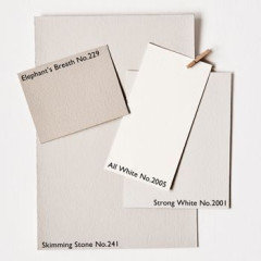
wevet , strong white or slaked lime 105
Hi
I need to paint our hallway next week which is both north facing upstairs and prone to a dreary light and south facing. I’ve got wevet in the south and north facing living room which I like with a rich team floor which can make it look quite warm at times. Other times wevet can look clinical.
I’ve got slaked lime deep in the kitchen and on some cupboards in the hallway. Slaked lime mid isn’t quite right - it looks a bit dirty/ dark.
In pictures slaked lime 105 looks so clinically white I don’t understand its appeal.
So shall I go for slaked lime 105 , wevet or string white ( too cold ?). Please help as I’ve had enough of thinking about it and I’m running out of time ... I would like a pale hallway to offer as a contrast with the slaked lime deep. I’m veering towards slaked lime 105 but is it cold ??
Comments (73)

Marylee H
4 years agoYou are right about the floor impacting the colours. The more near neutral they are, the more they are bossed around by the light and context. (Here, a strong deep floor colour from the Yellow/Red Hue Family)
Marylee H
4 years agoStrong White is at 99° on The Color Strategist Wheel. It has a Lightness of 90 so is that bit lighter than Slaked Lime Deep at 84. It also had half the Chroma of Slaked Lime Deep at 3.6 and 7 respectively. So Strong White is more neutral than 150. Strong White also has a -a value indicating greenness whereas 150 has a +a channel indicating redness.
australasia78
Original Author4 years agothis is amazing ! Interesting that 105 is quite a bit darker than wevet. I don’t want an undercoat look to my walls which wevet sometimes looks like , hence my leaning towards something a tad warmer and darker.
i changed my mind about s deep all over the kitchen as it looks so Brown on one side but not the other so will do a mix of mid and deep . Thank you for the figures I was neurotically going to phone Farrow and ball for their light reflective figures for wevet and strong white. Thank you a million !Marylee H
4 years agoYou are very welcome. 🌈 p.s. if you are doing a reasonable amount of renovation, you might consider investing in a Color Muse device. Costs about £55 from Amazon. It links wirelessly to your phone or ipad and measures colours in seconds. It will give you the Hue Angle°, Lighness, Chroma a and b channels of any colour of paint/fabric/tile/wood etc. So you don’t have to guess about colours and how they compare - You KNOW! 🤓
It’s been a Colour Revolution for me! 🌈Marylee H
4 years agoP.s. 105 isn’t darker than Wevet. 105 has a Lightness of 95 and Wevet a Lightness of 93.7. Wevet is more neutral than 105 as it has a Chroma value of 1.432 compared to 105 which has a Chroma of 4. So 105 appears more colourful and Wevet is more neutral.
australasia78
Original Author4 years agoSorry yes I even noted that when I read it. Need to sit down and carefully read 😊 thanks
Marylee H
4 years agoWhen you have measurable attributes, it makes it easier to compare & contrast details of a lot of colours quickly.
australasia78
Original Author4 years agoMary Lee could I be cheeky and possibly ask for a comparison between slaked lime mid and strong white ? 105 is going to be too light for my project , and as I want flow with 150 I think I have to go with slaked mid. Thank you if you can , understand if not.
australasia78
Original Author4 years agoSorry reading the info above I see you have already broken these down ! Thanks

Juliet Docherty
4 years agoGiven that colours look different on different walls at different times of day, it is so easy to tie yourself in knots. It is sometimes worth buying a 2.5 litre tin of paint (rather than a tester) and just painting it on. I would avoid images on Instagram as they are nearly always 'corrected' in terms of colour, temperature and light in order to get likes. Hope you get this sorted.
Marylee H
4 years agoHi! Strong white has a very similar Value (90.67) to Slaked Lime Mid. (91) (Value or Lightness tells you how light or dark a colour is) but it is that bit closer to a true neutral with a chroma of 3.6 compared to 5, of No.149. (The lower the chroma = the nearer to neutral. ) So Slaked Lime is a that bit more colourful.
Also Strong White contains an element of both green & yellow. Whereas Slaked Lime Mid contains both red & yellow. So perceptually I would suggest No. 149 might feel a touch warmer.
australasia78
Original Author4 years agoYes I’m now wearing towards strong white for the hallway as the sl mid is looking very warm against the floor ! Thanks Mary Lee.

Sonia
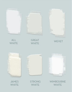
4 years agoJust to put a spanner in the works, how about Wimborne White or All White? Very bright and cheerful.........😊
 australasia78 thanked Sonia
cavgirl
4 years agoI’m a huge fan of the Slaked Lime spectrum. I know what you mean about it having a brown or even a purple tone in the Deep, but it does depend what it’s paired with. my floor is off white/very pale grey and as a result the Deep on the lower kitchen cabinets read as a very lovely, gentle soft grey. Mid is on my (few) upper cabinets and on my bead board splash back is paler and a tone warmer, whilst the 105 is a lovely white that isn’t stark. i did have pure brilliant white in there before (the room is north facing) and I hated it - it was dingy, cold, or both. The 105 is exactly what i wanted, a whitish soft soft grey that never reads cold—and doesn’t have strong green or yellow undertones which was my main issue with F&B.
australasia78 thanked cavgirlaustralasia78
Original Author4 years agoThanks - I’m buying the paint tomorrow so will have a good look at 105 and strong white in brewers. Our hallway is quite dark ( well it is feb!) so I’m now leaning towards 105 😬 how silly to get so wrapped up in paint !
australasia78
Original Author4 years agoUseful description of the slaked limes especially 105 and for 149 . I love the deep ( as do the kids !) just not anywhere near my brown floor !
australasia78
Original Author3 years agoI went with ammonite ok the hallway ( because of the difficult v warm floor) and slaked lime deep pretty much everywhere else. It’s similar to shaded white but greyer.
australasia78
Original Author3 years agoHi Mary Lee h
I know it’s been a long time but would you possibly mind comparing shaded white with slaked lime deep for comparable warmth and neutrality ? I need to choose between the two for a room which contains a lot of brown - floor and furniture but at the same time I do t like grey walls ! Thank you if you can !!australasia78
Original Author3 years agoThank you 🙏 I think shaded white might be a tough darker but there doesn’t seem to be much in it ?
Marylee H
3 years ago

Comparing their measurement,,,
They have almost the same Lightness value, but it appears with the lower Chroma, Slaked Lime Deep, is that little bit more neutral. So which you choose, depends what you are looking for,,,
They both belong to the Yellow Hue Family but seem to differ the most in Hue Angle°.Slaked Lime Deep is a deal closer to the Yellow-Red Hue Family than Shaded White. This may possibly show moments of peachiness, by comparison to Shaded White, which is that bit cooler.
Shaded White may have moments of greenness in comparison, due to its Hue Familylocation.
We know that in certain imbalanced light levels, low Chroma colours from this neighbourhood can shift purple. Of the two, should that effect of light occur, I would expect Shaded White to appear less purple, as it sits that bit further away from the Yellow-Red Hue Family.
Paint colours are best viewed in your space, with your lighting, before choosing - but in particular worth doing for near neutral colours such as these, which are far more affected by changes in light than more colourful colours.australasia78
Original Author3 years agoThank you - love that colour wheel and the breakdown you can provide. i Bought a tin of slaked lime deep but may have to keep it for another room and go for shaded white. With all the brown in that room, slaked lime deep Will have a peach tinge - I’ve seen that happen in another room Which it does at certain times of the day. In the same room it can also appear a bit green 🙃 thank you !!!
Marylee H
3 years agoThanks for the feedback! They are both lovely colours, but it’s great when you can tailor your choice to best fit the light & context, as you are.
Good luck!
🌈
Lynsey Taylor
2 years agooriginal poster can you perhaps post photos of uour hallway with the paint? i am interested as i am driving myself mad between slaked lime (105) slaked lime mid or wevet for my hallway which does not get much light, and has dark wood floors!
i dont mich understand all the technical detail above about numbers and woild lvoe to see yours or any advice! many thanks

Daisy England
2 years agolast modified: 2 years ago@lynseytaylor. I have Wevet in my kitchen. Below are 2 photos of it that show a close up of the wall against a white ceiling so you can see the difference and one of part of the room.

It is very light and works well in darker areas. Click on the image to enlarge. Hope this helps.australasia78
Original Author2 years agoSlaked lime was too blue in the end and cold . I don’t suggest it for a dark area but It does all depend on your particular location. What suits my house may not suit yours. The only way I have ever been able to choose with confidence is by painting the whole sample pretty much over a large area. It’s the only way to do it without making an expensive mistake !

Nicola Thomson
2 years agoHi, quick Q, did you end up using slaked like deep in your kitchen? I'm thinking about it for north facing lounge and want a bright neutral but nothing that looks white or cold. Thanks:)
Sonia
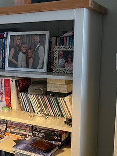
2 years agoHi Nicola, I painted 2 bookcases in Slaked Lime 105 and Slaked Lime Mid. The mid is decidedly muddier and murkier than the 105.
Nicola Thomson
2 years agoThanks Sonia, I'm going around in circles atm... guess that means I haven't found the right option yet...does 105 look close to white?
Sonia
2 years agoI would say 105 is a cream shade. First pic is 105 and the second pic is Mid. This is in a north-east facing room.

HU-400103044
2 months agoHi Marylee H, I know this is a long time ago but would you be able to give me a break down on the properties of F & B all white? It says it hasn’t got any pigment at all ?? However it looks creamy to me. I hope you don’t mind xx
Marylee H
2 months agoHi - All White is very high value, low chroma white from the warm side of the Green-Yellow Hue Family. So it’s very light and a very near neutral.
Completely neutral = zero chroma.
Very near neutral whites from this Hue Family neighbourhood are the ones most people think of as ’just white’.
In some settings you may get moments of that greenness.
When you say it has a creaminess to you, are you looking at a digital swatch or an actual paint swatch?HU-400103044
2 months agoAh ok Thankyou ok I deffo don’t think it’s the colour for me then. Yes was a swatch but my eye for colour isn’t very good at all. Thankyou
HU-400103044
2 months agoI’m trying to find a neutral off white that has a higher LRV that has no blue or green cool undertones but also that doesn’t read magnolia or too yellow vibes just a lovely soft warm white I’m thinking now slaked lime (little Greene) Loft white
Stock
Skirting or
Julie’s dream
I’m going to get samples today to try on the various walls in my hallway and landing. If you have any suggestions for me to try ? Thankyou for kindly replying xxMarylee H
2 months agoLoft is from a similar spot to All White and is likely to read quite similar.
Shirting is just a tiny touch darker.
Slaked Lime is darker again and looks very pretty in abundant lighting but sometimes it may feel a little greyed in a more dimly lit space.
Stock is too dark and too colourful to be classed as a white or off-white. In may appear a warm near neutral in some settings and you may see a degree of greenness in others.
Julie’s Dream is from the Yellow-Red Hue Family. ItIt’s both too dark and colourful to be considered a white or off-white. You are likely to read it with a peachy pinkness in relatively balanced lighting.HU-400103044
last monthWhat do you think of Wimborne White? Is there a good dupe for Wimborne white ? Or another brand in trade paint or Little greens closest one
Marylee H
last monthHi it’s worth taking a minute to consider that it is possible to quantify ‘how much colour?’ all these whites have. Chroma is the attribute which describes this.
Zero chroma = a true neutral (there aren’t any readily available on the high street)
The lower the chroma, the nearer it is to neutral.
If you are finding FB All White too creamy, then it is highly likely you will find Wimborne White more so, as it has almost 3 x more chroma. So it is nearly 3 x more colourful a colour.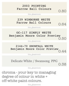
HU-400103044
last monthI can’t understand the fuss over slaked lime either in all the pics I’ve seen in houses they look quite dull and insipid almost greyish

Reload the page to not see this specific ad anymore


E D