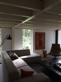
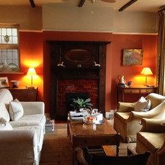
Warm white paint for a dark North facing living room in England
Evie C.H.
7 years ago
last modified: 6 years ago


Featured Answer
Comments (37)

Joanna Biddolph
7 years agoRelated Discussions
Need help on choosing paint for north facing sitting room
Comments (4)I have some suggestions, but none are cream tone. IMO, North facing rooms, because there is so little sunlight, need warmth which most light colors do not give for the chilly North room. BM Leapfrog accented with Asian blue and whites; BM Goldtone accented with cream and a painted blue ceiling; BM Slip accented with white and a really dark green velvet fabric....See MoreWRm pale grey for north facing room
Comments (9)To be honest I would be very careful with grey or anything with grey tones. We moved house last July and painted our lounge in FB elephants breath. In the north facing room it was very grey and sucked the life out of the room. We had to change it - very depressing. We have now used a paint from Little Greene - the paint quality is so much better than FB. Our decorator agrees. They might have a nice grey - but please be very sure of how it will look in your room!...See MoreAdvice on colours to bring a room together
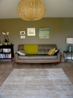
Comments (24)Susiem14, I think this room looks lovely and cosy and like your fireplace. I would add a few bits in cream and fawn/grey. Please don't be offended by the comment above... Everybody is different and we all have different budgets! I have recently changed my lounge to be neutral tones - still working on the cushions but sending you a photo of my new rug - was from Dunelm Mill - not expensive at all but v pleased with it....See Moreneed help for Living room,dining room
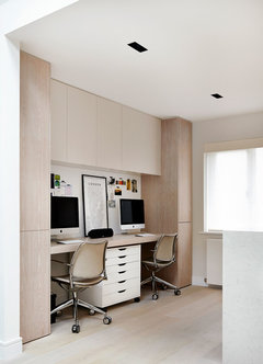
Comments (9)Thanks, I wasn't sure where the 9'4 measurement came in. If you're buying all new furniture then look for items on legs, as you can see the floor beneath it will make the space feel bigger. You can also use glass ie a glass coffee table or Louis ghost chairs for example. I'd also go for a large mirror over the hearth or not knowing your style could also have a ŵall of glass tiles for the same effect which will also bounce light. I'd go for a pale tone sofa and use warmer/darker colours for cushions if wanted. If you want a rug then I'd keep it in the same tone as the floor else to visually maximise floor space. I've drawn a very rough plan (not entirely to scale and obviously not knowing where doors etc are!). I assume you're wanting to buy furniture before you move in? If so do you have a similar size room where you could cut out paper templates of all furniture to see if the space works? I would mount the tv on the ŵall if you have one. Hanging it over a slim console (or slim cabinet for storage) means you can add art on the ŵall and accessorise the console so the tv doesn't become the feature of the ŵall. You could go for a coffee table or a small footstool which can double up as extra seating and table. I'd go for a round dining table, 3ft will seat 4 and you can pull it away from the corner when entertaining. i'd go for a 2 seater sofa (c5f?) but try and get a slim one. I don't know the size of the windows but blinds, shutters may also be an idea so curtains don't encroach on the floor space? In terms of decor do you want light and neutral or dark and moody then people can suggest paint colours?...See More
Juliet Docherty
7 years agoEvie C.H.
7 years ago
Carolina
7 years agoCarolina
7 years agoEvie C.H.
7 years agoJuliet Docherty
7 years agoCarolina
7 years agoCarolina
7 years agoEvie C.H.
7 years agolast modified: 7 years agoEvie C.H.
7 years agolast modified: 7 years agoEvie C.H.
7 years agoCarolina
7 years agoCarolina
7 years agoCarolina
7 years agoJuliet Docherty
7 years agoEvie C.H.
7 years agoCarolina
7 years agoJoanna Biddolph
7 years ago
Sarah West
7 years agoJuliet Docherty
7 years agoJoanna Biddolph
7 years agoJuliet Docherty
7 years agoEvie C.H.
7 years agoEvie C.H.
7 years agominnie101
7 years agominnie101
7 years ago
Sinead
7 years agoEvie C.H.
7 years agoJoanna Biddolph
7 years agolast modified: 7 years agoEvie C.H.
7 years agoJoanna Biddolph
7 years agoCarolina
7 years agoCarolina
7 years agoEvie C.H.
3 years ago


Sponsored
Reload the page to not see this specific ad anymore


Juliet Docherty